My COLORS subscription had to be renewed a few weeks ago. I reflected on the prior year of Field Notes shipments and the old editions I got my hands on in that time, and I pondered whether a new subscription was worth it. They’re just memo books after all.
The biggest factor playing on my thoughts was my overall excitement toward a Field Notes COLORS announcement. I remember a rush of excitement when Arts & Sciences was announced last summer and I was technically impressed with last spring’s Shelterwood edition.
However, since then, I haven’t felt it. Unexposed annoyed me because the edition signalled the end of my complete collection, and although I sang Ambition’s praises throughout the Christmas season, I’ve since pushed Ambition way down my list of favourites.
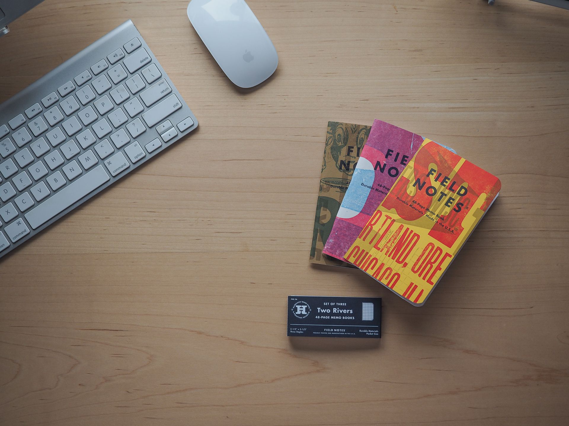
Initially, Two Rivers was no different. Sure, the edition looks cool. The books are completely unique. And they even support a good cause. But, again, I didn’t feel it. Once again, I felt let down.
Then I cracked open the plastic.
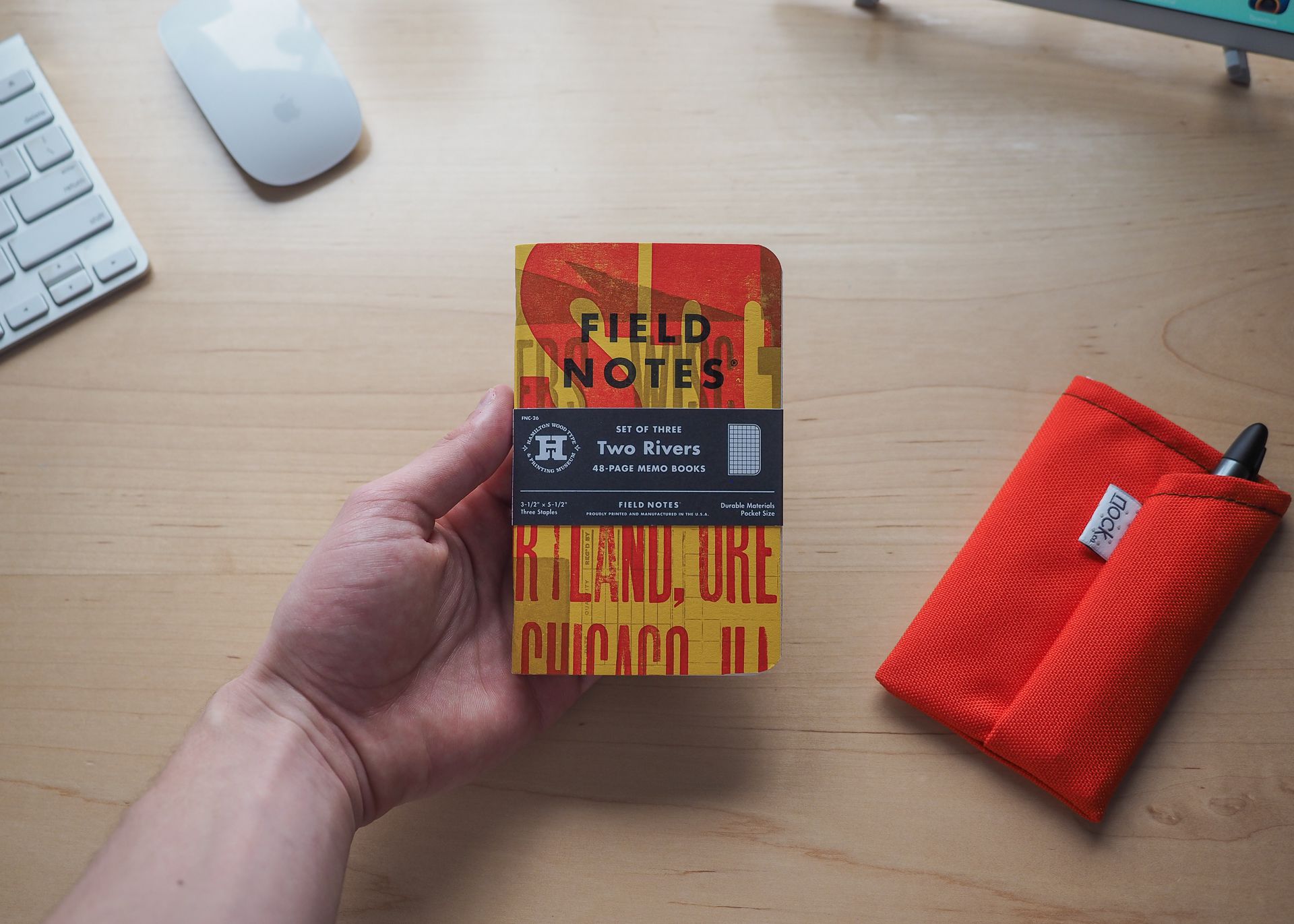
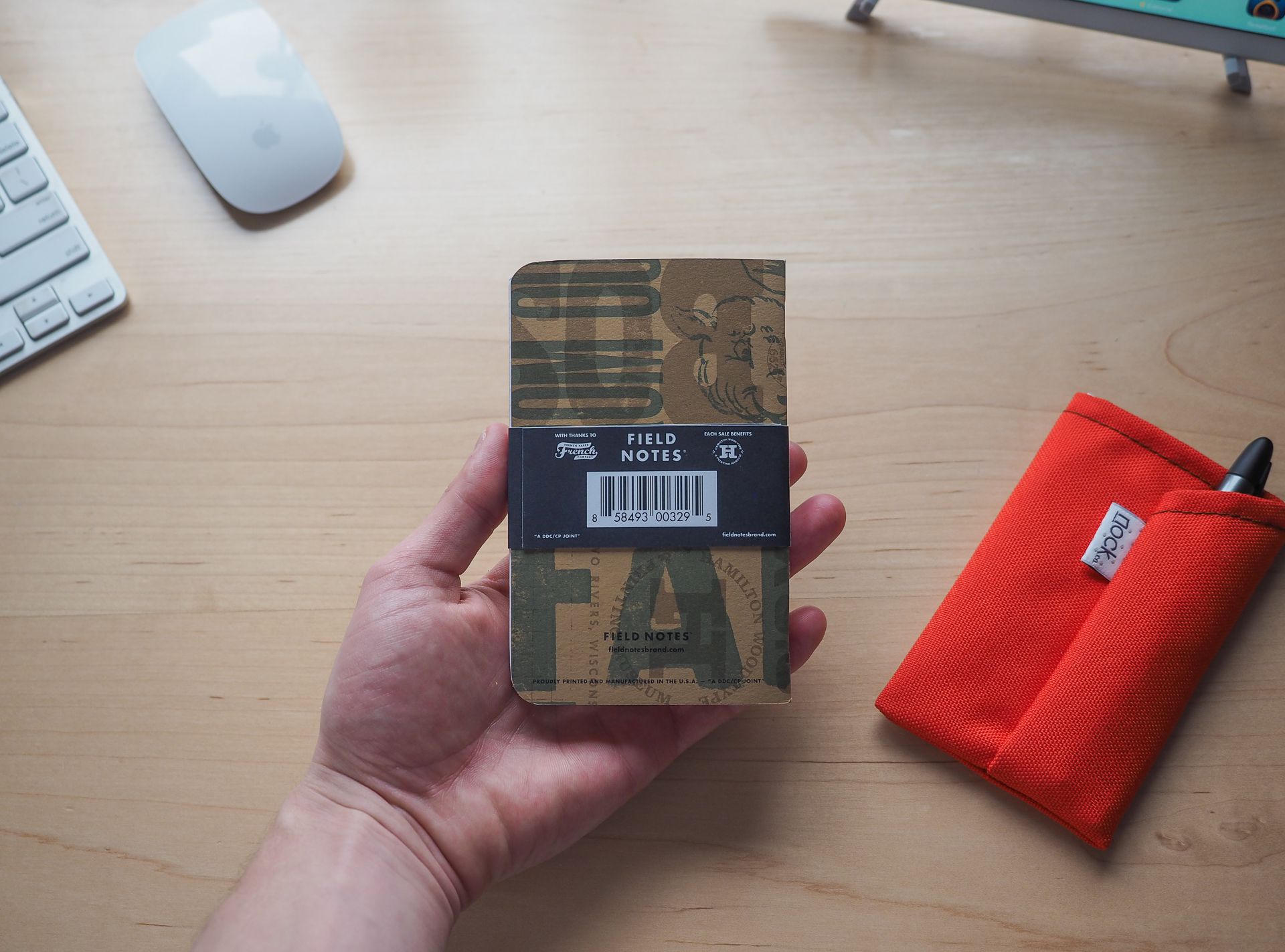
Two Rivers is Field Notes Brand’s 26th COLORS edition. The books were printed by the Hamilton Wood Type & Printing Museum in Two Rivers, Wisconsin with some old printers and some excellent handiwork.
Each sale of the Two Rivers edition results in a $2 donation to the Hamilton Wood Type & Printing Museum to keep their operations moving forward. There’s nothing cooler than supporting a good cause when purchasing something so unique.

Field Notes Brand selected four different cover colours. Three of the colours (Lemon Drop, Sno Cone, and True White) are the heavier 100#C weight, while the Packing Brown Wrap books are the generic 80#C weight.

The artsy cover designs were created by Aaron Draplin, Bryan Bedell, and Matthew Jorgensen using many of the classic wood ornaments from the Printing Museum. These designs are plastered to each cover at slightly different angles and locations, meaning each book is slightly different from the rest. Like Shelterwood in Spring 2014, there’s no way to collect them all.
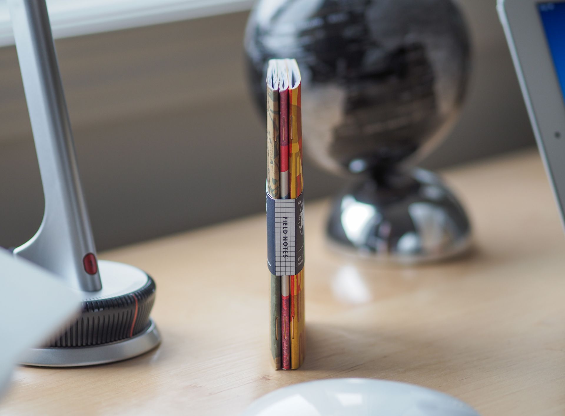
Each book is held together by three standard copper staples.
Based on materials so far, Two Rivers is par for the course.
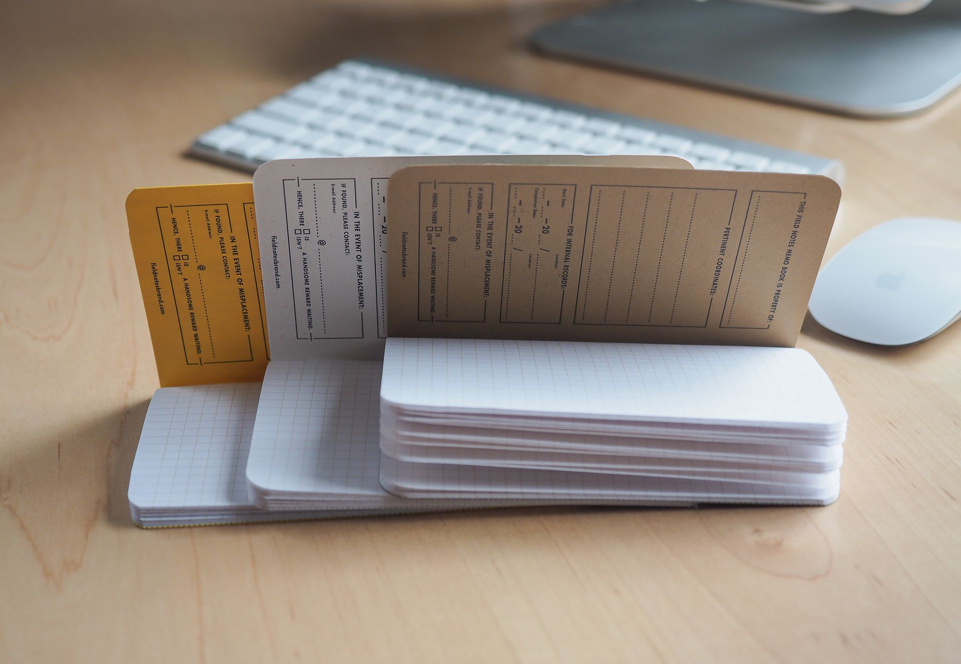
Inside is not much different. The inside covers reflect the original colour of the cover paper, meaning inside documentation won’t have any caveats.
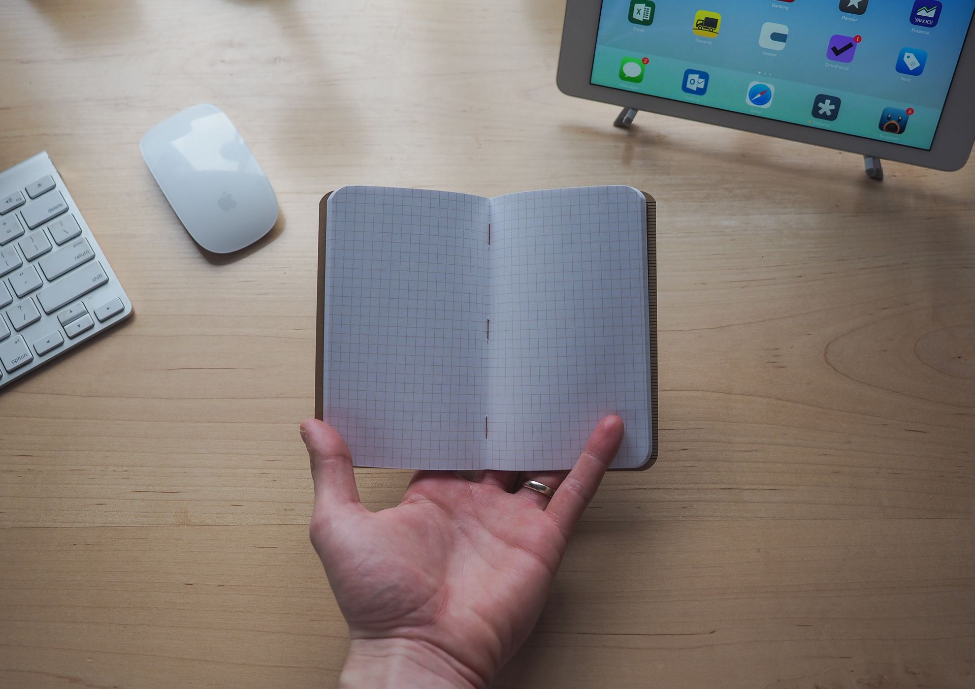
Even more normal is Two Rivers’ innard paper. The innard paper is (again) the same old 50#T Bright White Finch paper which (as always) is great for pencils and ballpoints but relatively poor for handling fountain pens. I really am dying for a Field Notes that can handle my Vanishing Point.
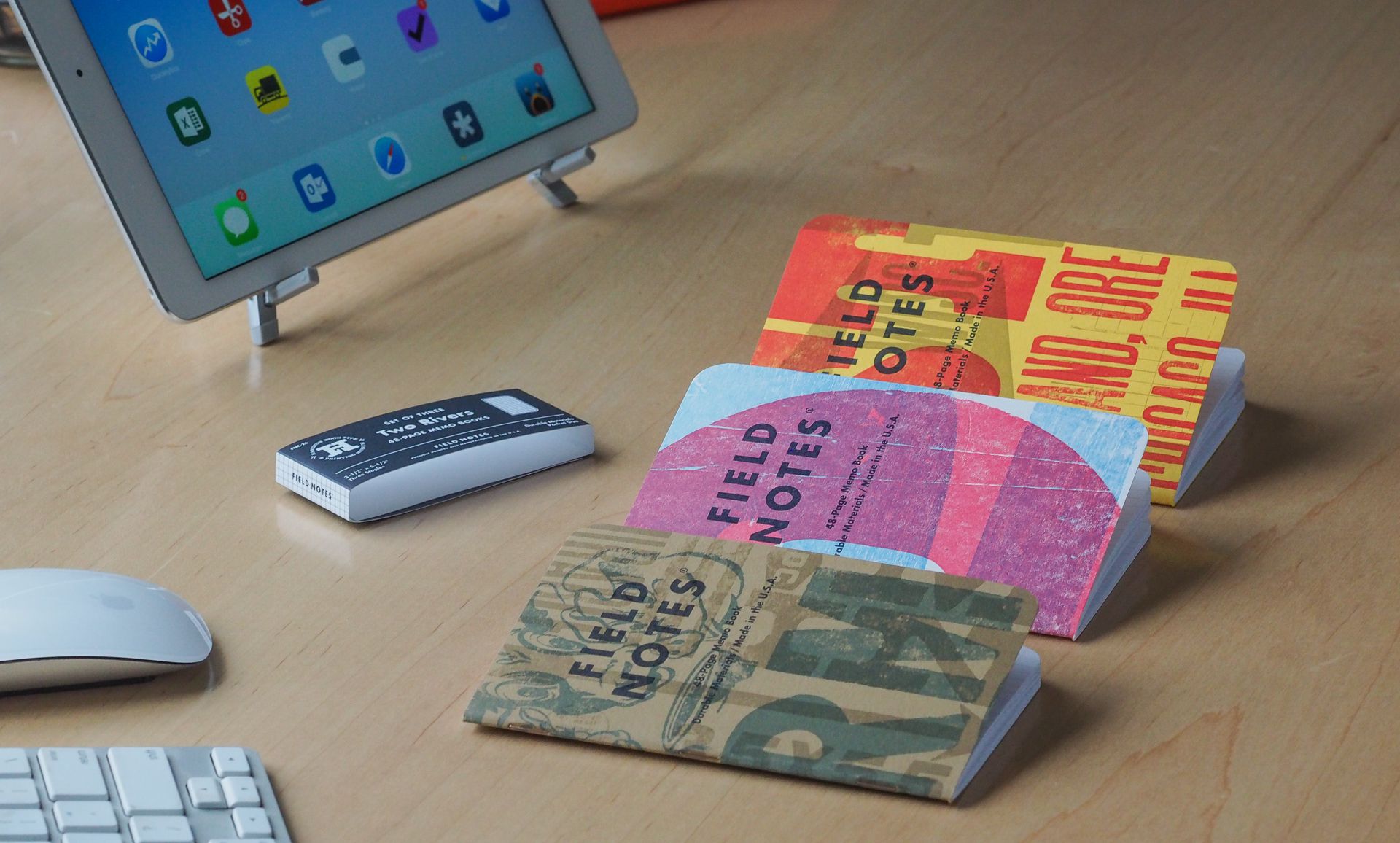
Do I sound bored yet? Do I sound let down? Because, for the most part, I was let down. Despite Two Rivers’ unique colours and the immense amount of work put into the wood type printing, I was disappointed with the presence of the same old materials and the now ubiquitous Field Notes aesthetic.
But there are two fairly simple reasons why Two Rivers has become one of my most prized editions. One is a reminder, while the other is purely vain.
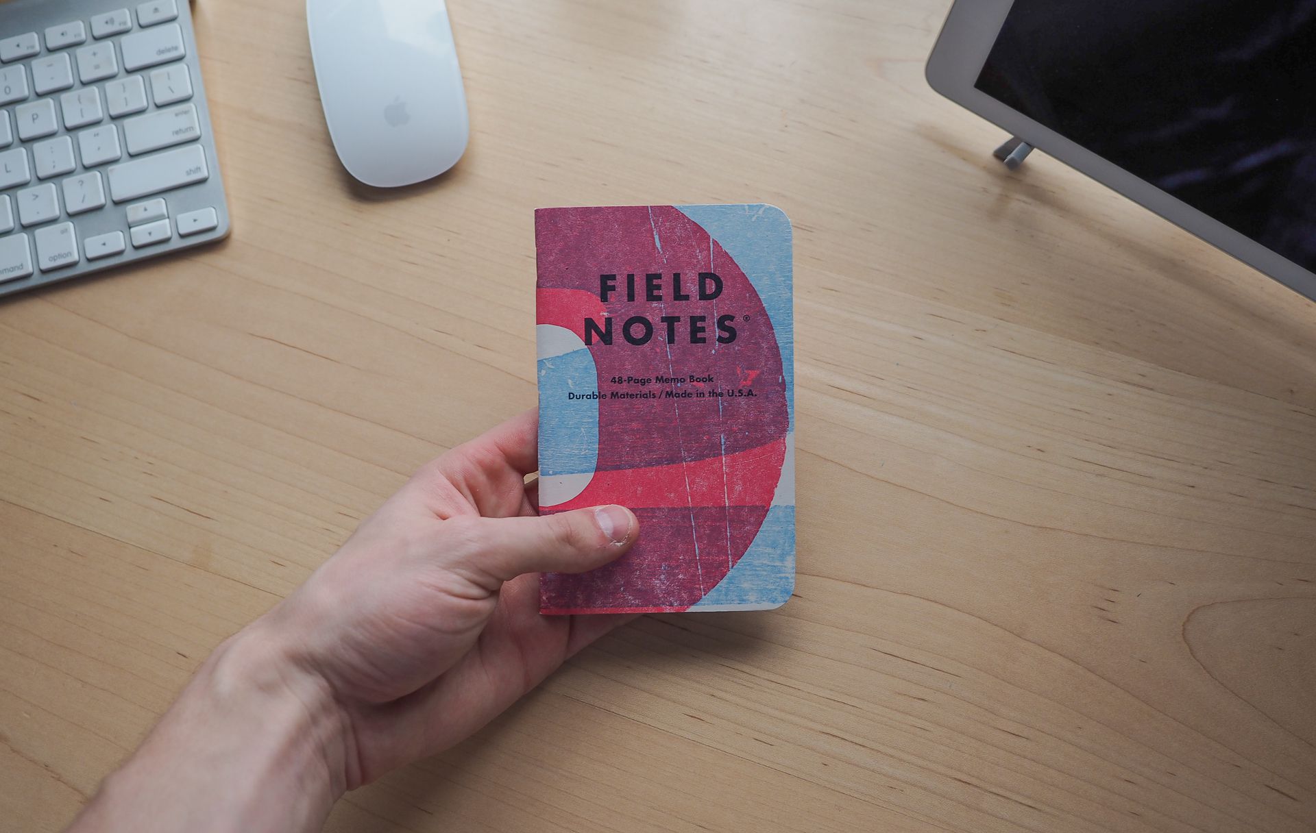
The latter of those reasons is this book — this book helped kick off my infatuation with Two Rivers. I have never seen such an incredible assortment of colour and character in a Field Notes book. I love the way the gigantic “O” graces the right edge of the front cover and how the “Field Notes” type nicely fits into the magenta stripe.
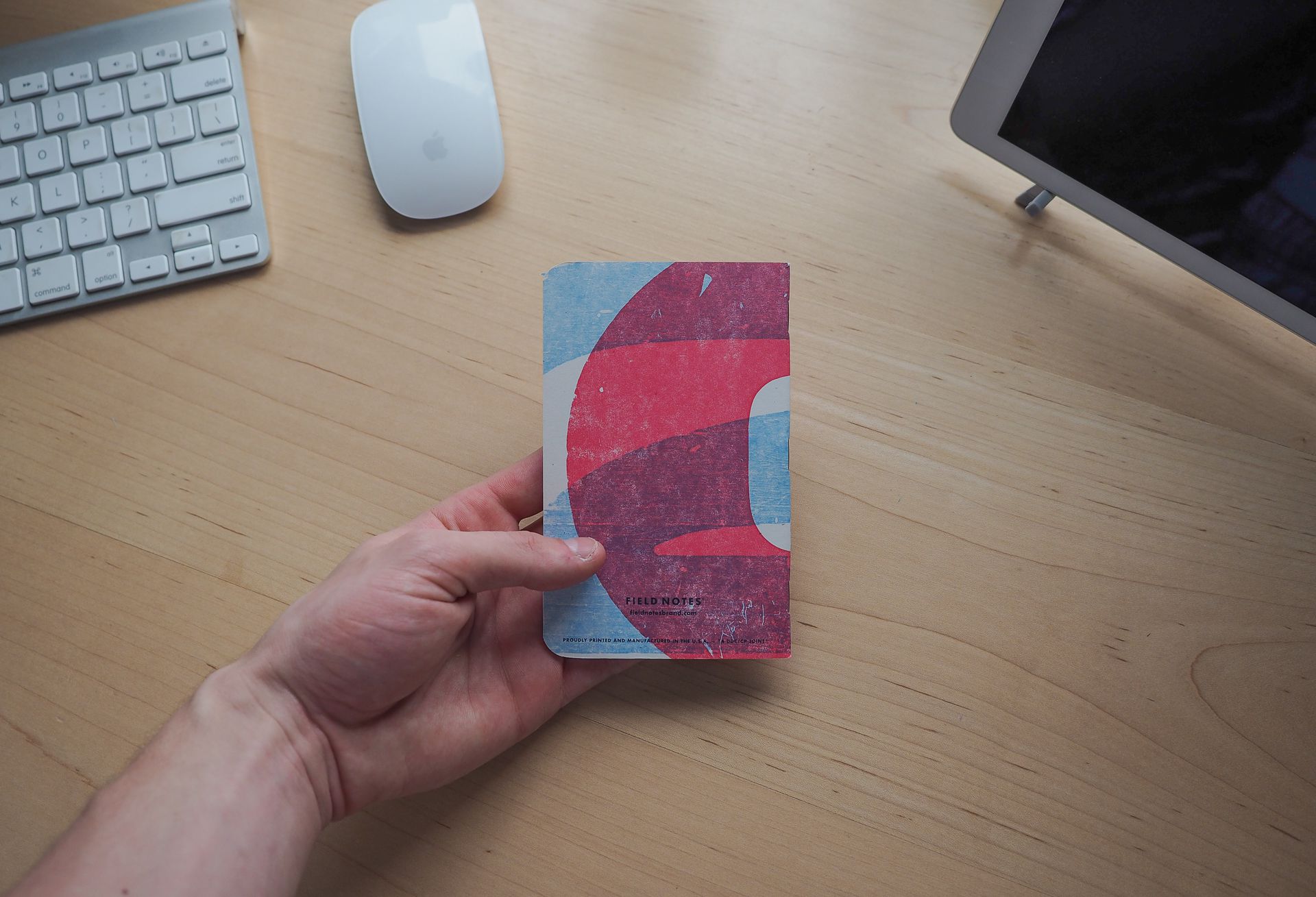
I’m also in love with the grungy, splotchy, and chippy application of colour. The grungy lines remind me of those old time photographs which extinguish ethereal scenes and which help to expose real life. And further, the combination of sky-to-baby-blue combined with a a fairly bold magenta just tickles my fancy.
I couldn’t be more drawn to the external aesthetic of this Two Rivers book.

Better yet, the inside is exactly the kind of book I’ve always wanted. Despite the standard innard paper, the paper is lined with a Double Knee Duck Canvas grid that disappears when a pen is applied.
More importantly, the inside covers are the thicker 100#C stock and they are white. Yes, they are the ideal inside cover for entering documentation and indexation records. And, to my plain eye, the black-on-white type is the way type was meant to be printed.
This single book is perfect. It’s my favourite individual book in my entire collection. I opened this Two Rivers three-pack with the intention of writing in them and using them for the reason they were created. After finding this book, that most certainly won’t be happening.

Fortunately, my love for Two Rivers doesn’t end there. This is where the reminder comes in.
Field Notes Brand, as a whole, has made it very clear that rounded corners are just another part of the entire, well thought out design. These rounded corners even have a dedicated specification in the back of every Field Notes memo book:
Corners preciously rounded to a 3/8” (9.5mm) radius with a Challenge SCM double round-corner machine.
Those 3/8” corners and the Field Notes Brand design are one in the same.
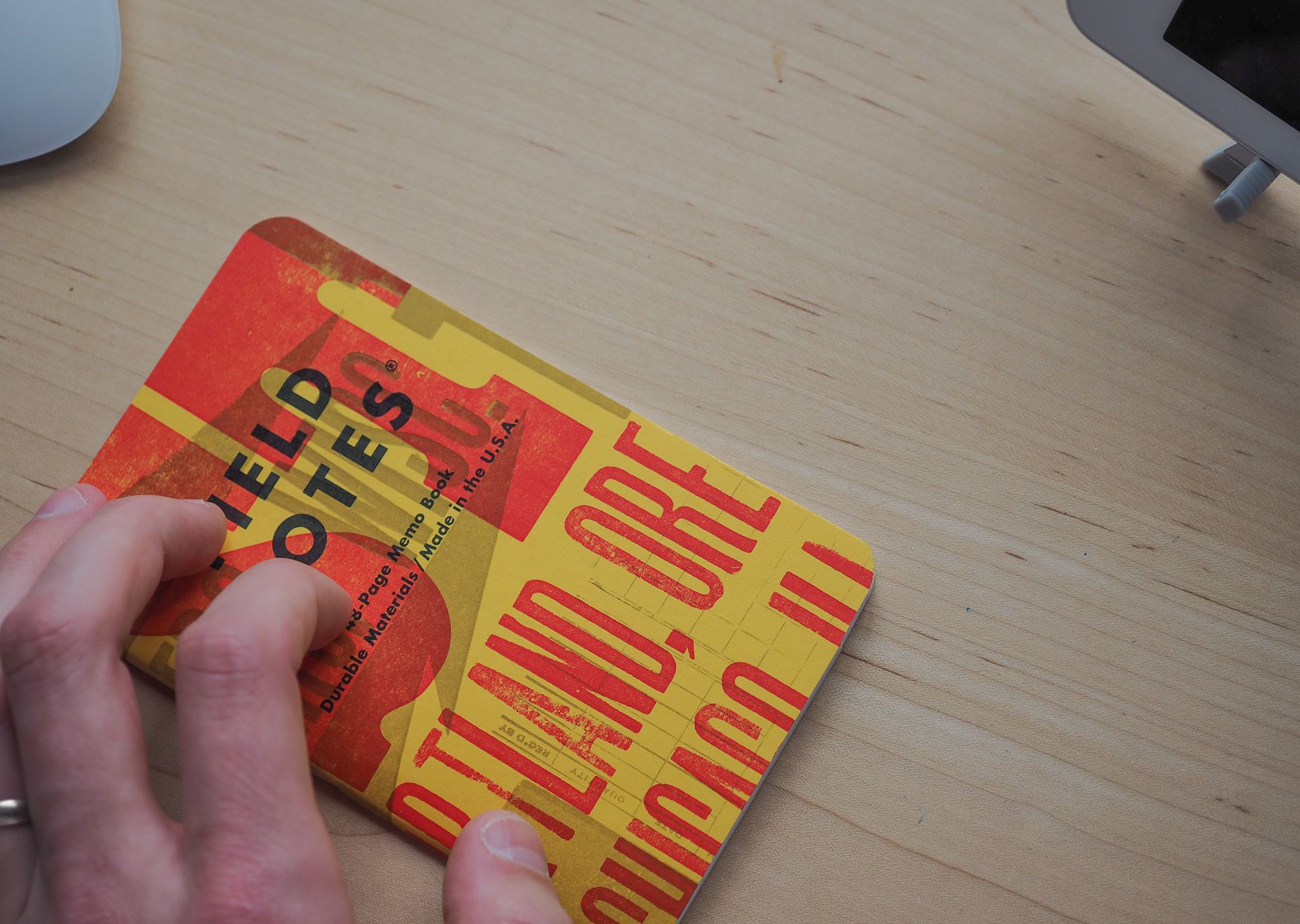
So imagine my glee when I pulled out this mule.1 There’s no doubt about it: the yellow book’s corner was botched, bruised, and battered in the cutting process. Not only is it not a 3/8” radius, there are even frayed fibres of paper freely hanging from the cover’s edge. This corner has made this Two Rivers book my second favourite individual book.
These mistakes are so human, so natural. They are representative of a process completed not by a machine, but by a human being. With their own bare hands. With their own eyes and their own measurement tools. Lasers, CNC machines, and quality control were all cast aside for this beautiful corner to make it into my hands.
And I absolutely love it.
This corner is what makes a Field Notes a Field Notes. It’s why the books are beloved across the globe. They are handy books which are meant to be used and abused, and which develop character as they are filled with good information. Yet, unfortunately for everyone else, my book has more character right out of the package because of this mistake.

I didn’t know if I would actually review Two Rivers when the edition was originally announced. The books lack any materialistic uniqueness I look forward to when a new COLORS edition comes out. While the designs are unique, the papers are standard stock which we’ve seen since the very beginning.
But what Field Notes Brand and the Hamilton Wood Type & Printing Museum proved to me when I opened my three-pack was something far more beautiful than I could have ever asked for. I received a pack of humanity for my Spring 2015 edition. I have a mule book which will never leave my collection, and I have a perfectly coordinated book which stands alone as the most aesthetically pleasing Field Notes I have ever seen.
I would have never guessed these would be my feelings when the books were introduced. But, like they did countless times over the past year, Field Notes Brand found a way to strike that nostalgic, grungy, care-free bone in my body, and they found a way to do it in the most humanistic way possible.
Two Rivers is one of the coolest editions yet, especially if you’re lucky enough to stumble upon a mule.
My boss is a heavy numismatist. “Mule” has become a normal word around the office. ↩