Lots has been said about Unexposed’s raison d’être. I’ve needed a few weeks to digest the 24th Colors edition and figure out where it truly stands in Field Notes Brand’s Colors history.

I think the edition itself is unique, trendy and piles of fun.
But I feel disappointed when I look at my incomplete collection. I can’t review the entire edition as I still don’t have every colour. This really bugs me — so much so that this may be my least favourite edition yet.
Unfair? Yes, perhaps. But staring at my incomplete collection and incomplete review isn’t made up for in a perfect Colors release.
I’m going to make a genuine effort to keep my thoughts on the colours, materials, and impressions of Unexposed separate from Unexposed’s backstory. It’s the least I can do to give this review some justice.
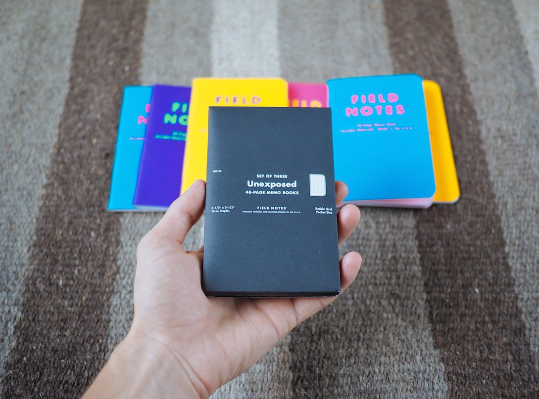
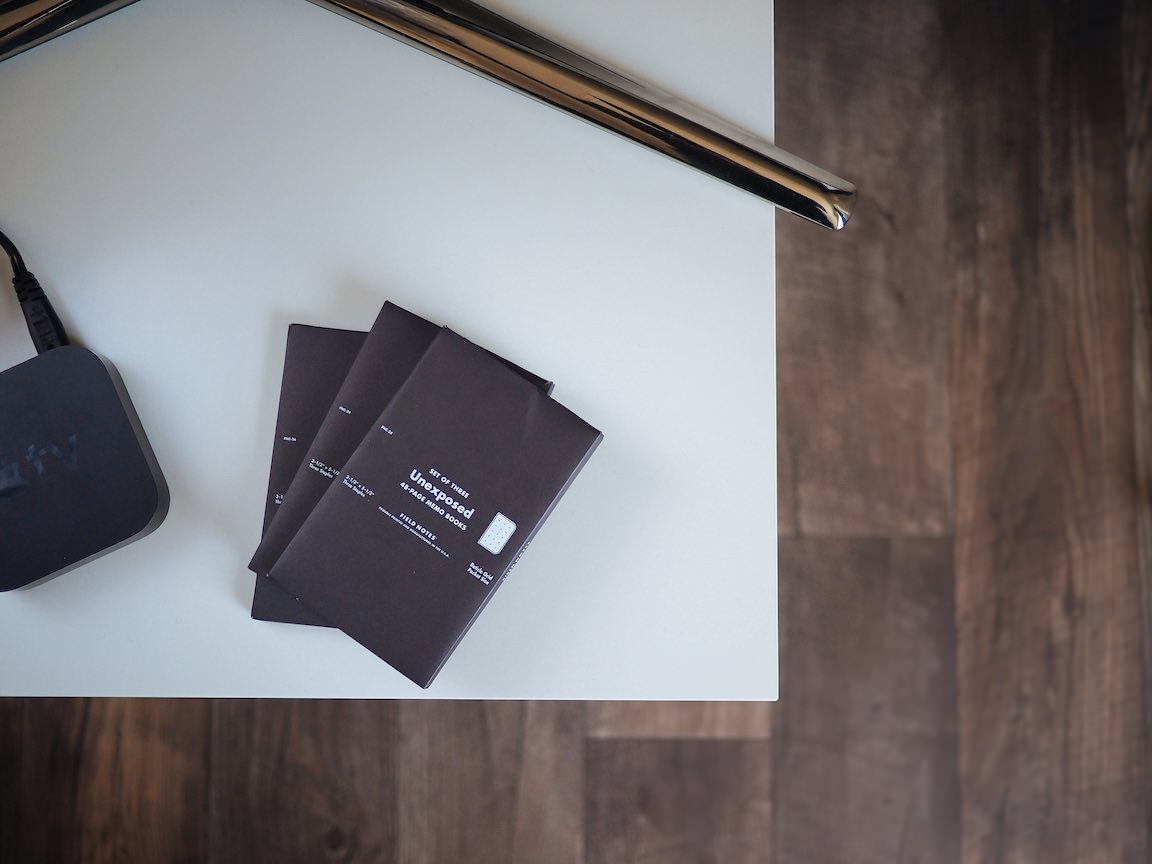
To keep Unexposed’s contents a secret, Field Notes Brand hid the 24th Colors Edition’s striking colours behind a blacked-out envelope. Field Notes Brand successfully kept these colours under wraps until the new three-packs landed on front porches everywhere. I was impressed with their achievement.

Opening the blacked-out envelope felt much like pulling sticks of gum out of a chewing gum package. The books slide out neatly and, if you aren’t prepared for the explosion of colour, you’ll be in for an overwhelming treat.
Sight nor touch struck my first impressions of the 24th edition though. Instead, I was blown away by Unexposed’s smell. Slipping the books out of the sleeve hit both my eyes and nose like a fresh coat of paint. Aside from the psychedelic colours, this is Unexposed’s most unique characteristic.
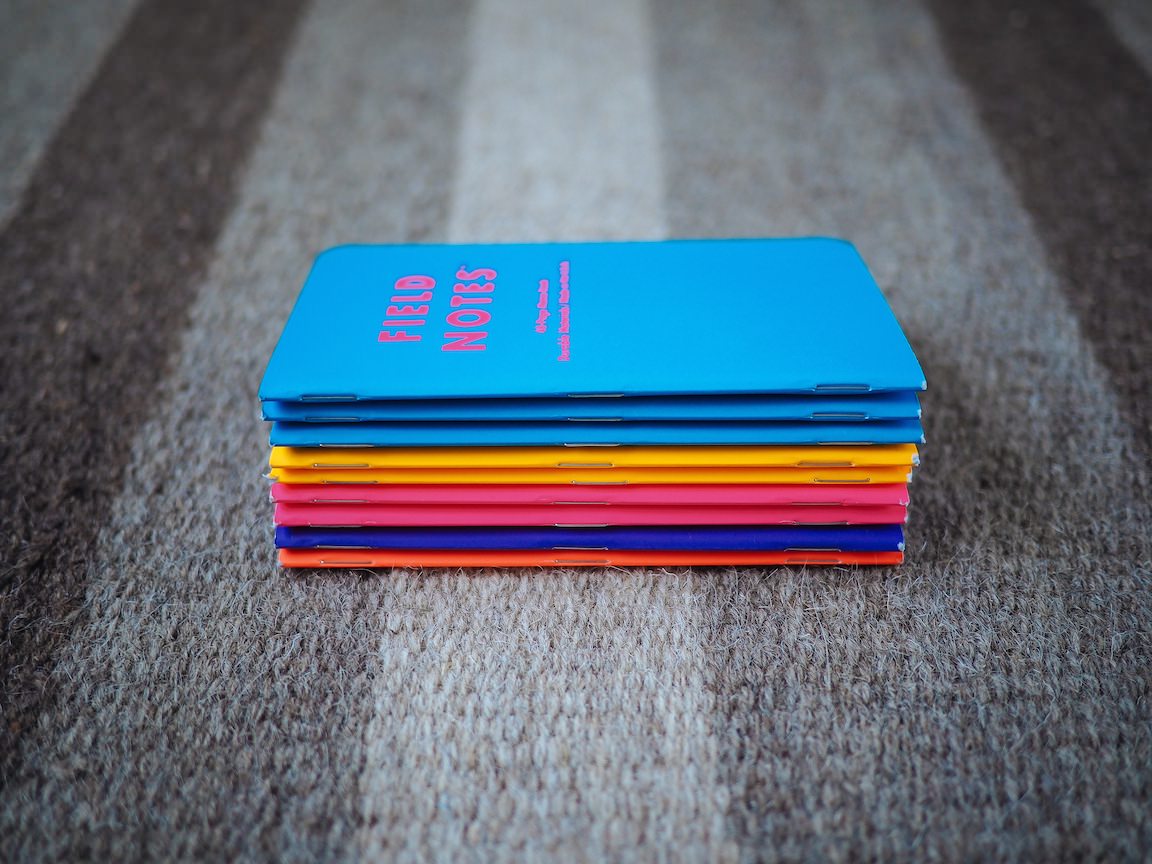
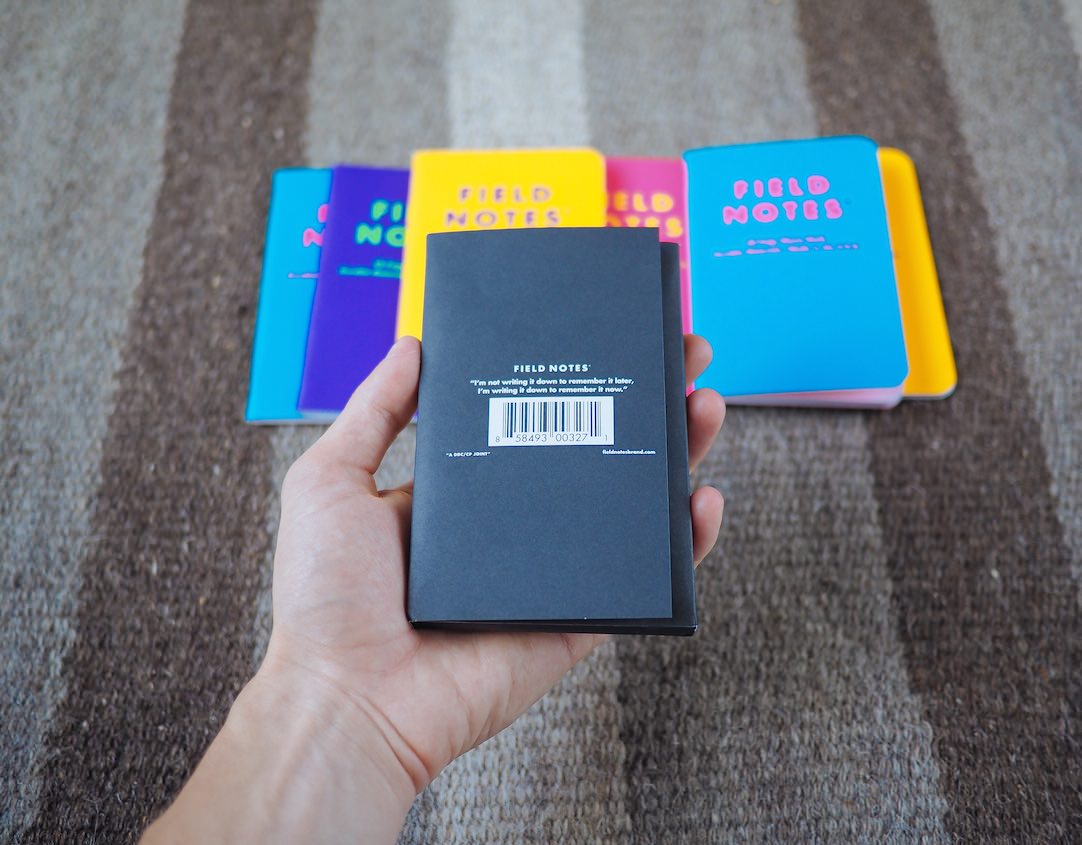
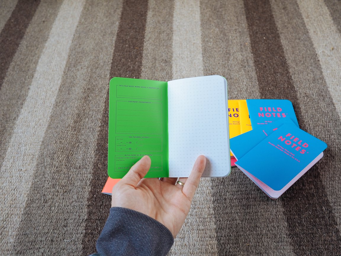
Unexposed is bound like every other Field Notes book before it. Three silver staples line the spine of the memo books. Nothing much more to say than that.
The covers are made of a Sappi McCoy #100C Silk White stock and have been applied with fluorescent inks that may knock your socks off. The application of the colours afterwards means Unexposed’s white cover stock will show through on ripped spines and worn books. I originally hated the white stock with applied inks, but I’ve come around on the effect it has while wearing.
Best of all, these inks have been finished with a soft-touch coating, making them feel more like the Drink Local edition from a year ago. I’m finishing up a Stout Drink Local book and the soft touch coating is my favourite part of slipping the book in and out of my pocket. I’ve noticed the softer Unexposed covers collect dust more than any prior book. I feel this helps make the books look more grungy and beat up, but it’s something to note if you’re interested in keeping your books pristine. Either way, I’m a big fan of this design choice.

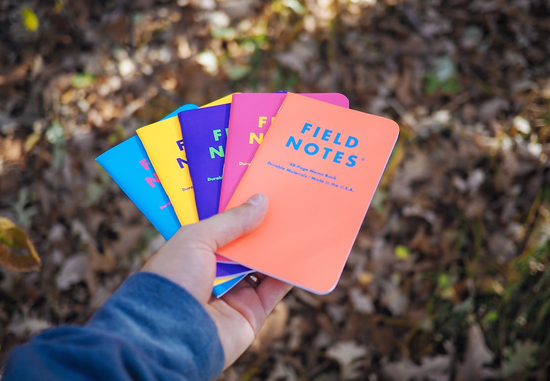
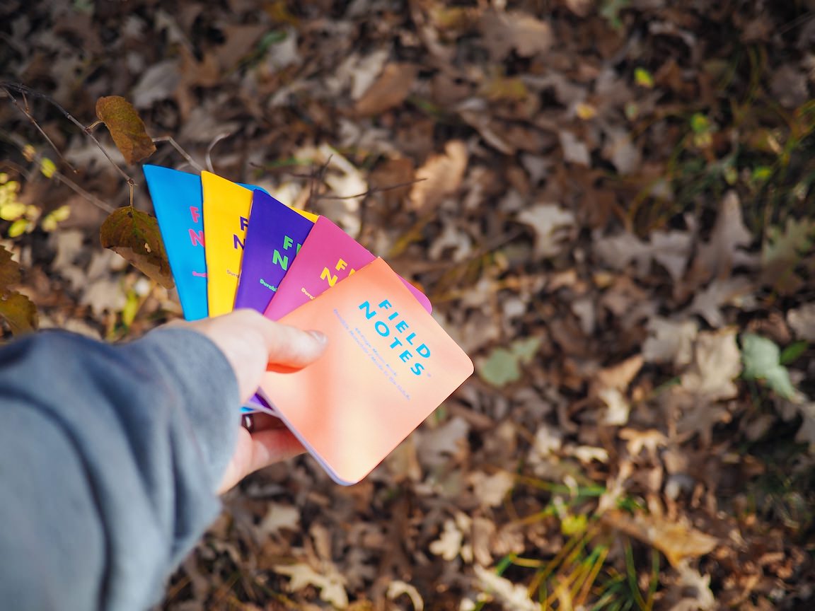
Unexposed comes in six different colours, but I’m only able to show off five of those colours today. Field Notes Brand did such a good job concealing the neon colours that even they themselves didn’t know which colours would be put into each three-pack. This added to the surprise factor of Unexposed; you could never guarantee which three colours you’d pull out of the envelope.

As a result though, I have five of six colours. I have yet to get my hands on the green book.[1] Perhaps I can trade for it down the line. For now, the most green you’ll see today is the inside of the purple Unexposed book.
The blue version is a brighter blue with a very hot pink inside cover. The blue and pink clash so drastically that it made photographing these books more difficult than any book before. If you can look at the blue and pink clashing for longer than five seconds without your brain going haywire, you’re doing better than me.


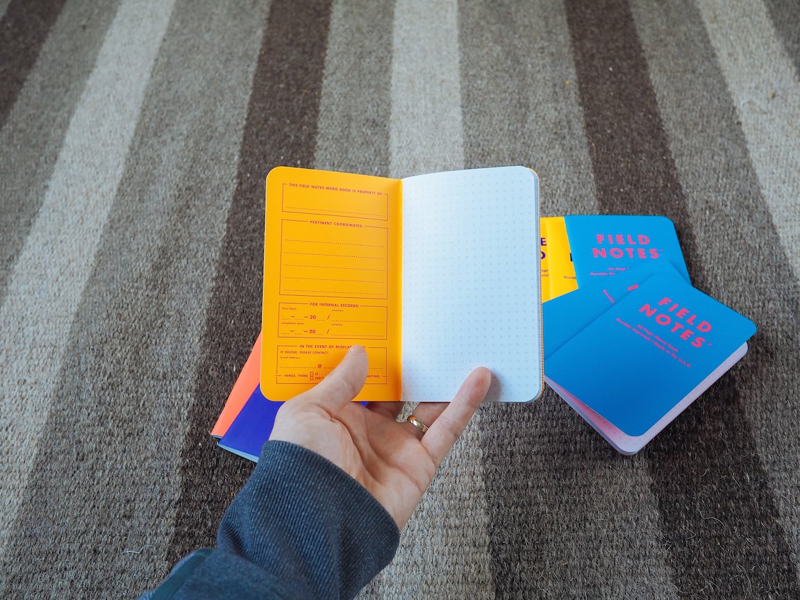
The yellow and purple version reminds me of the classic Los Angeles Kings jerseys from the late 60s and early 70s. Reading the inside back cover facts and Practical Applications is a breeze, but the dark purple makes inside front cover documentation more difficult than it needs to be. No single edition yet measures up to Day Game’s inside covers for storage documentation.
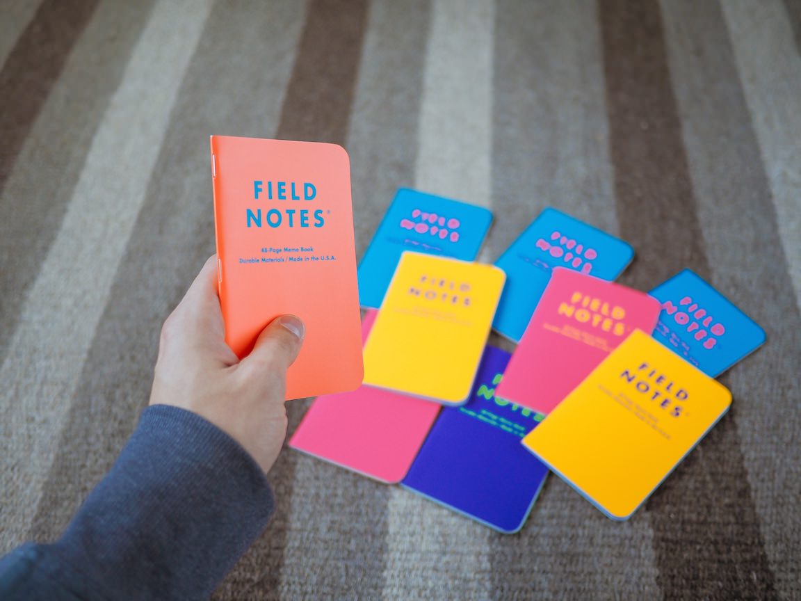

I really like the look of the orange/blue Unexposed edition. The orange isn’t as striking as Expedition and is more reminiscent of a peach than of an orange.
Mind you, reading the inside cover writing is a lesson in how not to print an inside cover. The orange lettering on a blue backdrop is very hard on the eyes. This combination actually makes my brain go crazier than the blue/hot pink fiasco.
I still appreciate the peach/blue combo though. The entire edition would feel off-kilter if the peach/blue wasn’t present.

Hot pink/yellow is my favourite of the six Unexposed colours.[2] In fact, if Field Notes Brand had released an entire edition of pink/yellow, it would rank right near the top of my all-time favourite Field Notes Colors editions. The yellow lettering plastered to the front matches the hot pink spectacularly. The inside cover documentation is easy to read and light enough to properly write on. And, best of all, it’s a crazier colour than any edition prior.
I’ve never been a hot pink kind of guy, but this colour really floats my boat. Luckily, I have two hot pink books — I’ll actually allow myself to write in one of these sometime down the road.
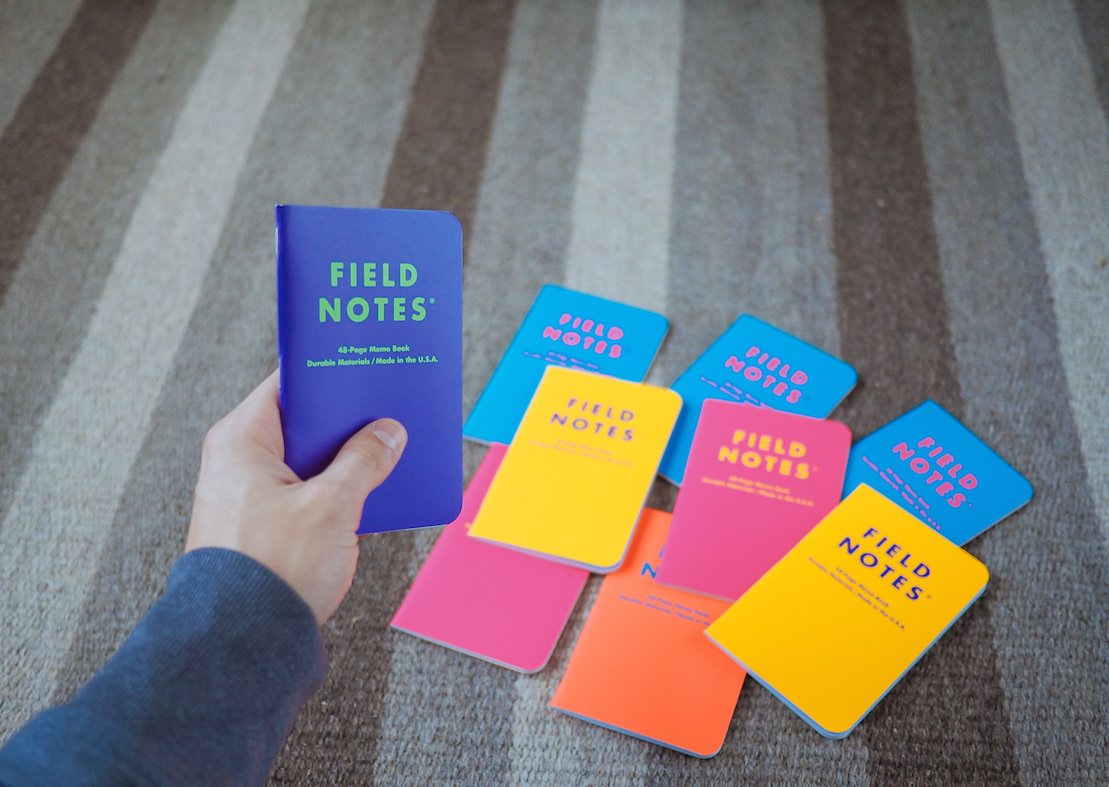
Lastly, the purple/green combo is my least favourite of the five books I possess. The purple is a deep purple and the green is a lively green. I can’t help but see Barney the Dinosaur when reaching for the purple/green combo.
Children’s superheros aside, I feel purple/green is the least inspired colour combination of this fall’s Colors edition. There’s nothing that pops or shouts out for purple/green and I’m let down as a result.

Each of the six colours are packed with standard Field Notes #50T Bright White Finch paper. As always, fountain pens won’t be the ideal writing utensil for Unexposed. Classic ballpoints — like my new F-701 — work like a dream though.
The reticle grid, originally introduced in Night Sky back in Summer 2013, makes a comeback in Unexposed. As I said in my Night Sky review, the reticle grid isn’t my grid of choice as I find it distracting. To each their own.
Ok! How did I do? Was I able to keep my opinions on Unexposed’s backstory away from the actual colours and materials? I think I did alright.
But now I want to complain a bit.

Ever since I stumbled upon this analog addiction back in February, I’ve been the most dedicated die-hard Field Notes customer I could be. I purchased a subscription. I purchased two or three extra packs at each release. I’ve spent money (too much money) on past editions that are nearly impossible to find.
So much has been said about the spontaneity of the Unexposed edition. I understand that collecting anything costs a considerable amount of money. If you want every edition ever created of any collectible item, it’s going to hit your pocketbook hard.
Further, I agree that Unexposed is a nice little reminder that these are memo books and not coins or stamps or Beanie Babies. These books are meant to be used and abused, not collected and stored safely away in a locked box in your closet.
But that’s not reality. In reality, people (myself included) want to collect these books. In reality, people value these books abnormally. In reality, people get angry when they can’t collect the entire edition.
My reaction when I opened my fourth green-free pack says it all. I was mad. I even swore. I felt cheated when I spent nearly $60 on these memo books and I wasn’t able to see each colour. All I truly wanted to do was photograph them for my blog.
Alrighty. I’m done. Moving onward.

All my complaining aside, Unexposed is actually a pretty great edition. Some of the colours clash and make for a mind-numbing brain craze, but that doesn’t hinder their unique splash of funk and spunk. I would love to see a few of these colours in their own Colors edition instead of one gigantic edition. Luckily, I’ve got a few extra blues, pinks, and yellows to try my hand at writing in them on a daily basis.
With Unexposed’s backstory behind me, I can’t wait to see what Field Notes Brand has up their sleeve for their 25th Colors release. I’m sure Unexposed will fall into the shadows once Winter 2014 hits in a month or two.
If you’d like to check out the green/red book, head over to EdJelley.com. If I had to make a quick assessment, I would say that green wouldn’t rank near the top of my favourite colours and that the inside cover documentation is far too difficult on the eyes. In some weird way, I’m kind of glad green/red is the book I’m missing from Unexposed’s 2014 edition. ↩
Yes, even though I haven’t seen the green book. Pink/yellow is that good. ↩