There are three types of notebooks indexed in my bookshelf: on-the-go memo books, desk books and classroom books.
I carry a Field Notes book in my back pocket wherever I go. Inside of the book, I practice my cursive writing skills and jot down any thoughts I have throughout the day. In essence, my Field Notes memo books have become a running journal that spans across many smaller books.
Using the same size memo book for jotting notes when at my desk doesn’t yield the same feeling of delight for me. The 3.5” x 5.5” size feels obtrusively small when stuff is spread out across a large desk. Despite my growing Field Notes collection, I have yet to use these books when working at my computer.
Arts and Sciences finally fills this void.
Field Notes Brand has ventured — quite unexpectedly — away from their backbone medium. Arts and Sciences ushers in a new format and size, a new ruling (and lack thereof), a new pack size and page capacity, and a new set of small details that only a die-hard would value. It’s so different from past COLORS editions that Field Notes Brand markets Arts and Sciences as a “Note Book” instead of the classic “memo book”.
Arts and Sciences is new by every definition of the word. Yet, Arts and Sciences is a “traditional” theme, hearkening back to historical scientific discoveries and historical artistic paradigms; all the “new” had to be combatted with a strike of “old” and nostalgia. And, like another well-known company, Field Notes Brand has managed to make Arts and Sciences feel normal for anyone familiar with their smaller offerings. Despite the plethora of new, Arts and Sciences is a Field Notes book through and through.
Arts and Sciences

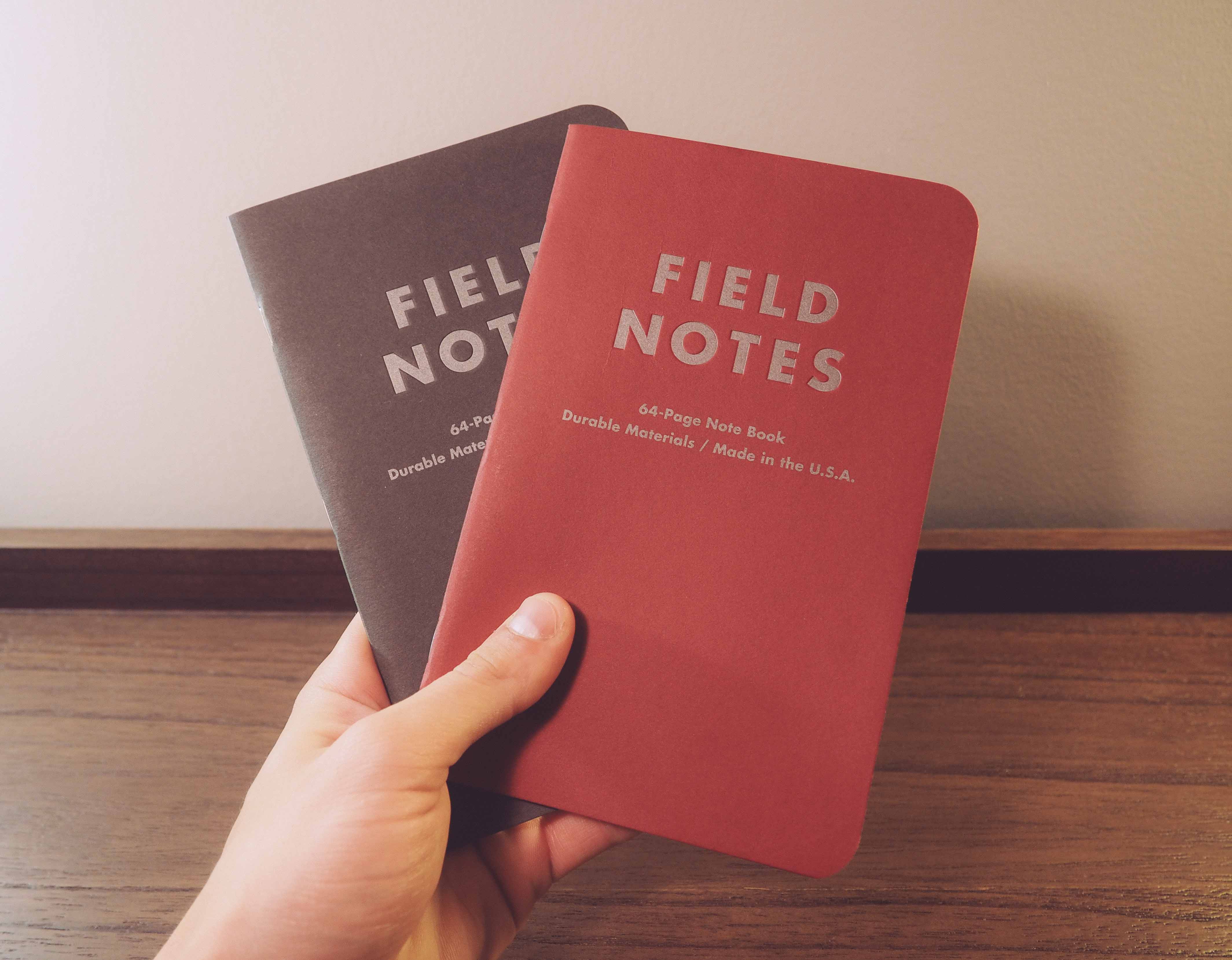
Arts and Sciences is Field Notes Brand’s 23rd COLORS edition for Summer 2014. The edition comes in a two-pack instead of a three pack. The Arts side of the coin represents all things loved by artists and creatives, while Sciences is dedicated to the cold hard facts of the empirical world.
Field Notes Brand went above and beyond for the 23rd COLORS edition by creating seven (7!) short videos linking artistic fervour with scientific discovery. I definitely recommend checking them out.
Outer Covers

Field Notes Arts and Sciences covers are made of a sturdy Mohawk Loop 110#C stock — so sturdy, in fact, that I find my covers don’t properly close. This 110 lb. Mohawk Loop is a coloured paper, rather than past cover stock which is often white with colour applied in the printing process.
These sturdy covers measure 7 1/2” high by 4 3/4” wide. These measurements are as arbitrary as they come and don’t appear to equal any industry-standard paper sizes.
Field Notes Brand’s marketing photos don’t do Arts and Sciences any justice. When I opened my package and pulled out the two-pack, my initial reaction was “Woah, they’re huge.” I had seen the press release material but was still blown away by the increased stature.
Standard Field Notes memo book corners are famously rounded to a precise 3/8”. Many — me included — argue that this precise corner adds character to the book. Arts and Sciences ditches the 3/8” corner in favour of a 1/2” round corner, however, which contributes further to Arts and Sciences newness. I feel the 3/8” corner would look silly on such a large notebook, but the scaled up 1/2” corners don’t match the scaled up size of the notebook in general, lending a new character to Arts and Sciences. A small change, but a change none the less.
Arts and Sciences maintains the standard three staple binding. They are spaced differently than traditional books and can certainly be chalked up to the larger format.
Field Notes Brand’s COLORS editions have been traditionally defined by the actual colour of each release. Arts and Sciences is no exception. Akin to Drink Local or Day Game, Arts and Sciences have a perfect colour scheme. The “Chili” Arts book hearkens back to academic luxury of yesteryear, providing an unsurpassed air of nostalgia. The “Urban Grey” Sciences book may not be as reminiscent as “Chili”, but the mechanical grey makes a lot of sense in the general theme. I find the “Urban Grey” to be my favourite Field Notes colour yet and I desperately hope to see the colour duplicated in a standalone product line.

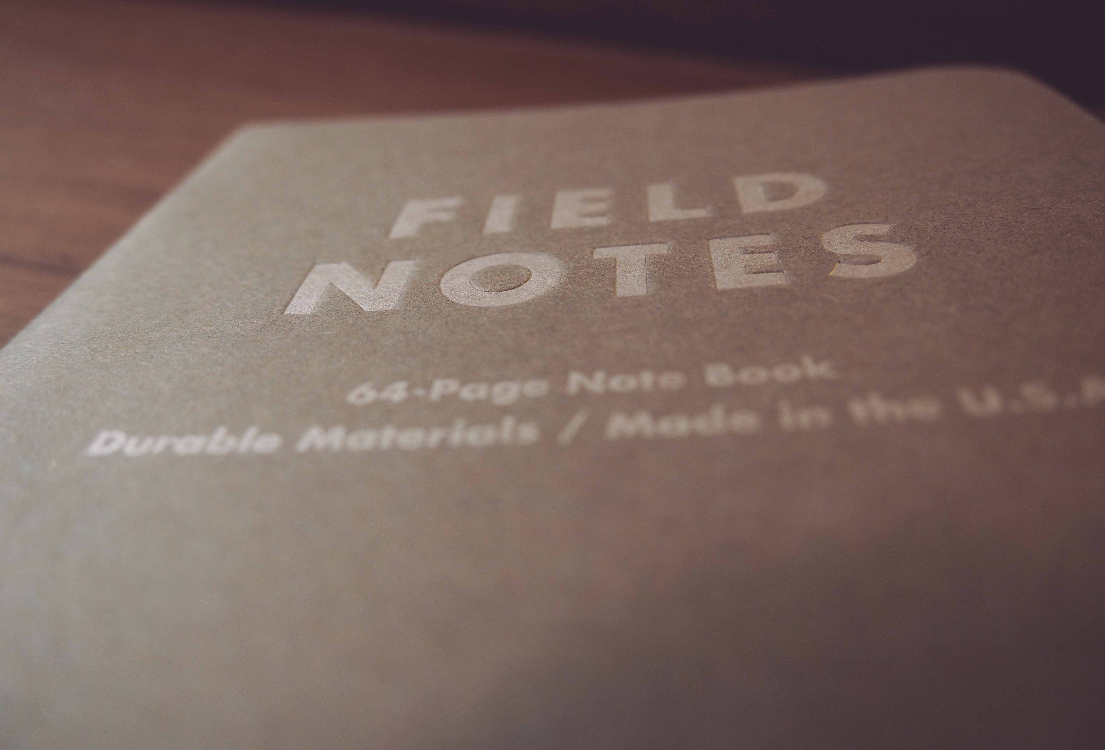
The last major features of Arts and Sciences outer covers are the elegant title and brand debossing. The larger Field Notes title has been neatly pressed into the front cover, creating a depth that adds a nice touch to the overall design.
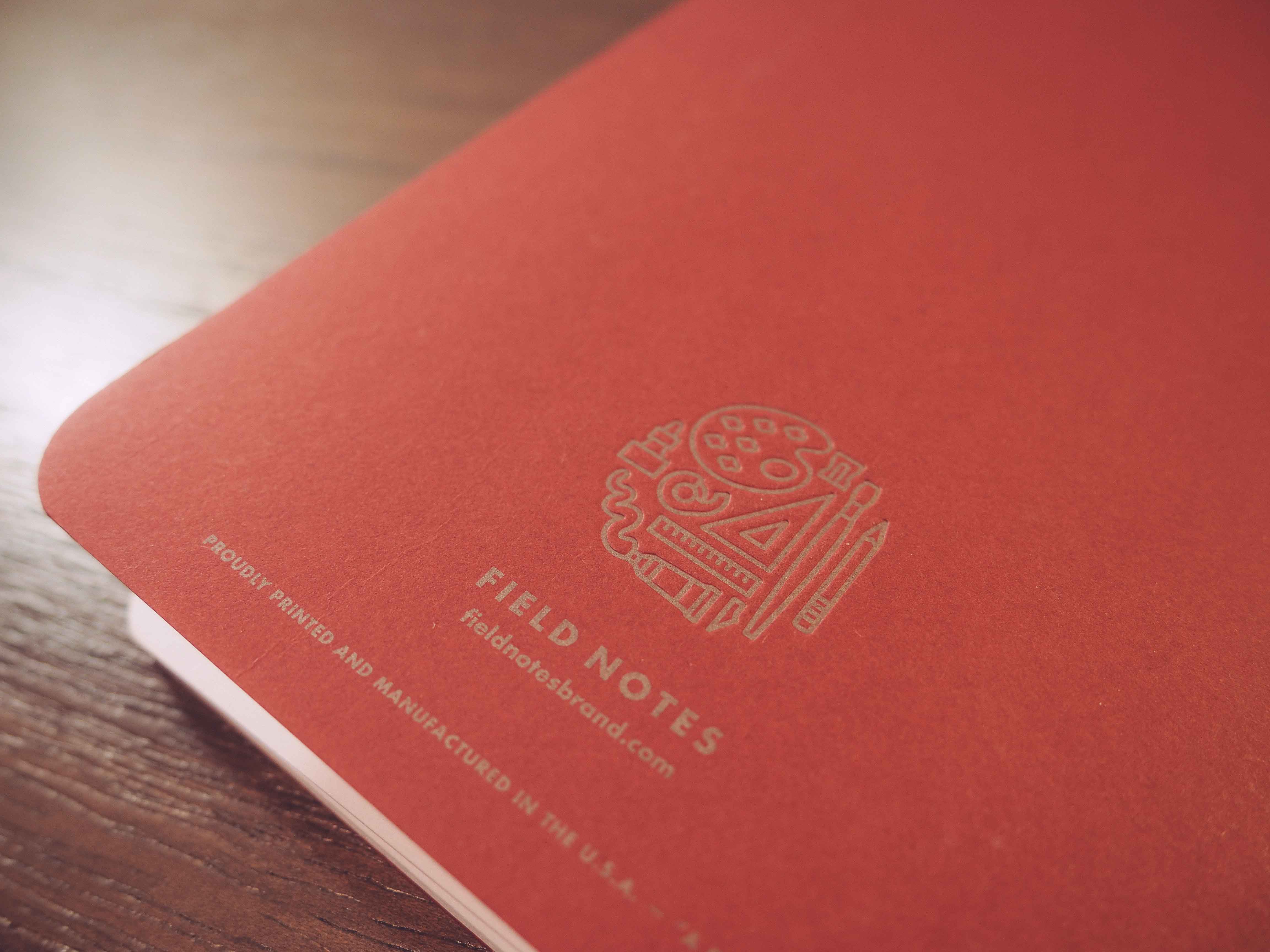
The back cover brandings are truly a sight to behold. Stamped into the back covers are two unique brandings that beautifully sum up the Arts and Sciences theme. The Science branding incorporates elements of a chromosome, a beaker, astronomical symbols and the ever-popular microscope. The Arts branding is fashioned with a paint palette, brushes, pencils, rulers and glue. These small symbols are cleverly wrapped in a circular brand that will stand the test of time.
Inside Covers
Despite the incredible level of unique design applied to the Arts and Sciences brandings, an even more extensive level of design is evident in the inside covers.
The front inside covers maintain the Chili and Urban Grey colouring, which inhibits the visibility of inside documentation. I am neither here nor there on this characteristic; I like having a white inside cover for proper documentation, yet I prefer the uniform colour. This eliminates my right to an inside cover opinion.

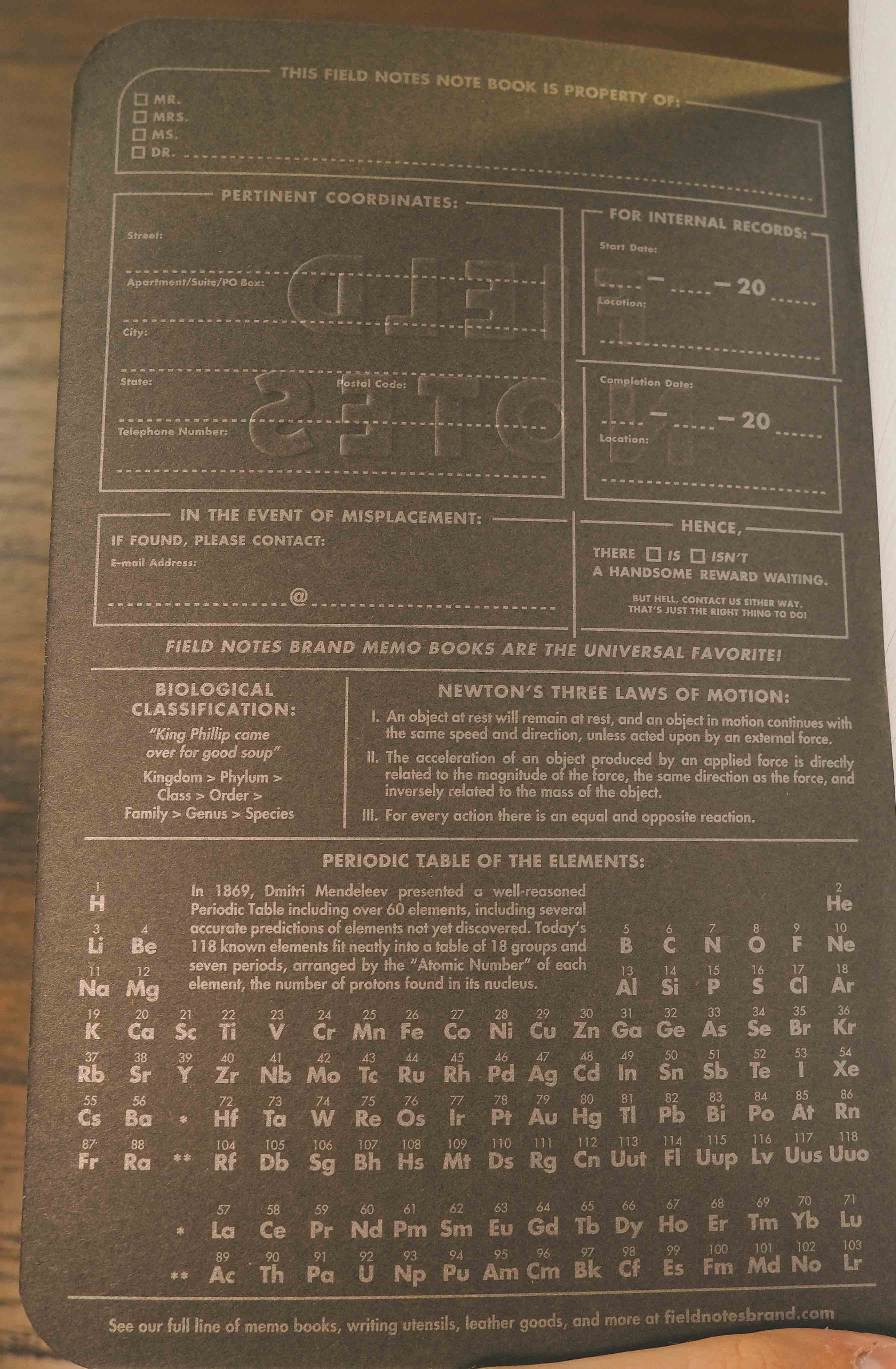
New tidbits of documentation have been added to the “This Field Notes Book is Property of” and “Pertinent Coordinates” sections.1 I like the additions of these documentation guidelines; I never truly understood what “Pertinent Coordinates” meant until it was expressly outlined in Arts and Sciences.
All inside text is written in an “Antique Silver” soy-based ink. The ink shines nicely in different angles of light, especially in the Sciences book. I love the application of the Antique Silver ink on the outside debossed logos and brandings, but I find the ink to require an extra amount of focus for reading on the inside.

And reading you will be doing, because there are a ton of interesting facts strewn about inside both books. The Arts book packs in an extremely handy “Proofreading Marks” section, which I will undoubtedly use when proofreading my wife’s and sister’s essays in the future. Field Notes Brand incorporated a Periodic Table of the Elements in the Sciences book which will forever garner utility in a science lab. They even switched up the Imperial and Metric rulers between the books.2

I wager the amount of research time poured into the inside covers of both books equals the amount of design time applied in changing the format of the books. So much character is thrown around inside Arts and Sciences and the inside covers are truly magnificent.
Innards

The multitude of unique features in the outside covers extends ever so slightly to Arts and Sciences innards. For the most part, I think Field Notes Brand stuck to their guns. The “Bright White” 50 lb. Finch paper is pretty standard for Field Notes books at this point in time. This time around, I actually notice the thinness of 50 lb. paper. The larger sheet yields a flimsier feel than Kraft books and I find myself wanting the buttery-smooth 70 lb. paper in Shelterwood and America the Beautiful.
Field Notes Brand switched up the rulings and introduced an entirely new graph in the Sciences book. Sciences innards have been printed with an Engineer’s Grid, which have 1/10”, 1/2” and 1” line measurements. This is an appropriate ruling for the Sciences book and I’m sure some people will find this ruling extremely helpful. Its usefulness is entirely lost on me, though. I constantly find myself losing track of which lines I’m supposed to carry on to when finishing a line and my scribbles end up angled and even messier than necessary.

The Arts book has been printed with the 1/4” linear ruling which I have so desperately hated. Luckily, the larger format of Arts and Sciences makes 1/4” seem like a more natural size for writing. I’m left wondering if the smaller Field Notes memo books are too small for a 1/4” ruling rather than the 1/4” ruling being too big in general. The larger size makes this 1/4” ruling enjoyable and — I can’t believe I’m saying this — I like the 1/4” ruling in Arts.
Potentially my favourite innard characteristic is the “Academy Gray” printing. Every single ruling is noticeable and offers a proper guideline while writing, but the colour seems to naturally disappear into the background when going about your work. The double-barrelled title ruling in Arts is absolutely magnificent. I love to geek out over the smallest details and the Academy Gray ruling is, bar none, my favourite ruling colour to date.
Another neat change is the addition of blank pages. Every left-hand page has been stripped free of any ruling, leaving a bright white canvas for creative scribbling and doodling. The blank page fits nicely within the Arts and Sciences theme and is especially handy when inspiration hits at your desk. Like the engineer’s grid though, the blank page utility is useless for me and I find myself wanting rulings on every page. I will certainly find a use for the blank pages, but if Field Notes Brand decides to make this a standalone product, I hope for 1/4” ruling or a dot grid throughout.

Last, and certainly not least, is the increased number of pages in Arts and Sciences. The standard 48-page memo books have been cast aside for the summer and a new 64-page “Note Book” has taken its place. I began my on-the-go note taking in a 64-page Moleskine Cahier and the smaller capacity of Field Notes books was the biggest pill I had to swallow when I switched over. The larger Arts and Sciences books would feel anorexic with only 48 pages, so I believe the 16 page increase was a natural progression. Still, notebooks this size could use even more pages to reach their potential as a desk book.3
Verdict

Having noted all the changes from traditional Field Notes memo books, I believe it’s important to remember the most apparent change: size.
Field Notes Arts and Sciences books can’t and shouldn’t be compared to the traditional memo book because Arts and Sciences aren’t memo books. I would argue they aren’t even notebooks. A memo book is the most mobile form of written books, while notebooks have been designed for the classroom or the boardroom. I believe Arts and Sciences targets an entirely different writing context: your desk.
I often find my small memo books to be too small for notes I need to take while sitting at my computer. These memo books are also certainly too small for taking notes while in class. Moreover, full-fledged notebooks (like the Moleskine Extra-Large Cahier ) are too big to station beside your laptop and are much too big for mobile note taking. The Arts and Sciences format fits perfectly in between these two sizes.

I will never use Arts and Sciences as a mobile note taker. Instead, I will carry an Arts and Sciences book in my bag or leave it behind at my office desk. I’ve already noticed myself reaching for the bigger Arts book when jotting down ideas for this review. It’s just the perfect size for my desk.
This ushers in my one and only worry about Arts and Sciences. The Summer 2014 edition marks a foray into a new writing context and, as a result, it marks a foray into new workflows. My Arts and Sciences books will most certainly not hold the same types of information as my Field Notes memo books. Therefore, I know I will want an endless supply of “Note Books” of this size.
I truly hope Arts and Sciences is more than just a COLORS edition to the Field Notes Brand team. The new format offers immense promise as a new product line (just like Winter 2012’s Expedition Edition) and I can’t help but yearn for a standard book of this size.
In the meantime, I guess I’ll have to buy up as many packs of Arts and Sciences as possible. The 64-page capacity may slow down my consumption of the books, but I most certainly won’t stop using these books. If a standalone product line is released as a result of Arts and Sciences, the Summer 2014 COLORS edition will stand out as one of the most important COLORS releases ever.
This is my favourite edition yet. And I’ll buy Arts and Sciences until it becomes its own product line — or until they're sold out.

There’s also an edgy addition to the “Hence, There is..” section. Like always, character. ↩
A slight shot, perhaps, at the American insistence on Imperial measurements? ↩
I think it makes business sense to limit the page increase to 16 pages. The less pages in a book, the more product customers end up buying. I’m sure sales of the 64-page Arts and Sciences edition will be hindered by this page increase (whether it be measurable or not) and I don’t see Field Notes Brand making it the standard capacity going forward. Disappointing, but inevitable. ↩