Sometimes interviews don’t age well. Or they do age well — it looks like my predictions (which was hardly a prediction after all the rumours and leaks) basically all came true. Here’s me just a month ago:
How would your ideal setup look and function?…
My ideal setup would be a 13-inch MacBook Pro that is capable of running two 27-inch displays. There’s an Intel-based 13-inch MacBook Pro capable of this right now, but I’m hesitant to double-down on an Intel-based Mac given the inevitable Apple M-chip future. I’d like a laptop so I could work from home in the evenings during tax season rather than beaming in via Screens from my home office M1 MacBook Air.
Ask, and it shall be given. Or at least mostly.
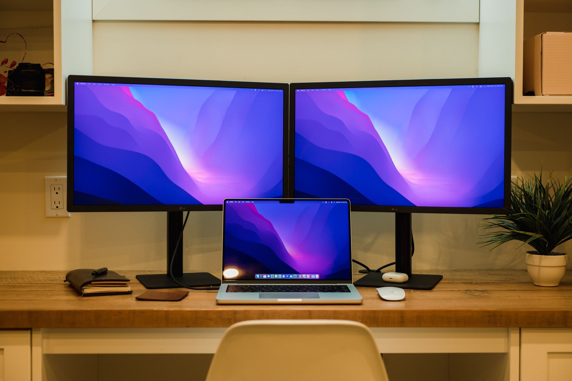
I’ve spoken about it a few times already: I’ve upgraded to the 14-inch M1 Pro MacBook Pro. Was I running into performance issues with the 2019 27-inch iMac? Not even maybe. Am I starting to fall into the bleeding-edge-upgrade-always camp? Maybe. A guy can have a hobby right?
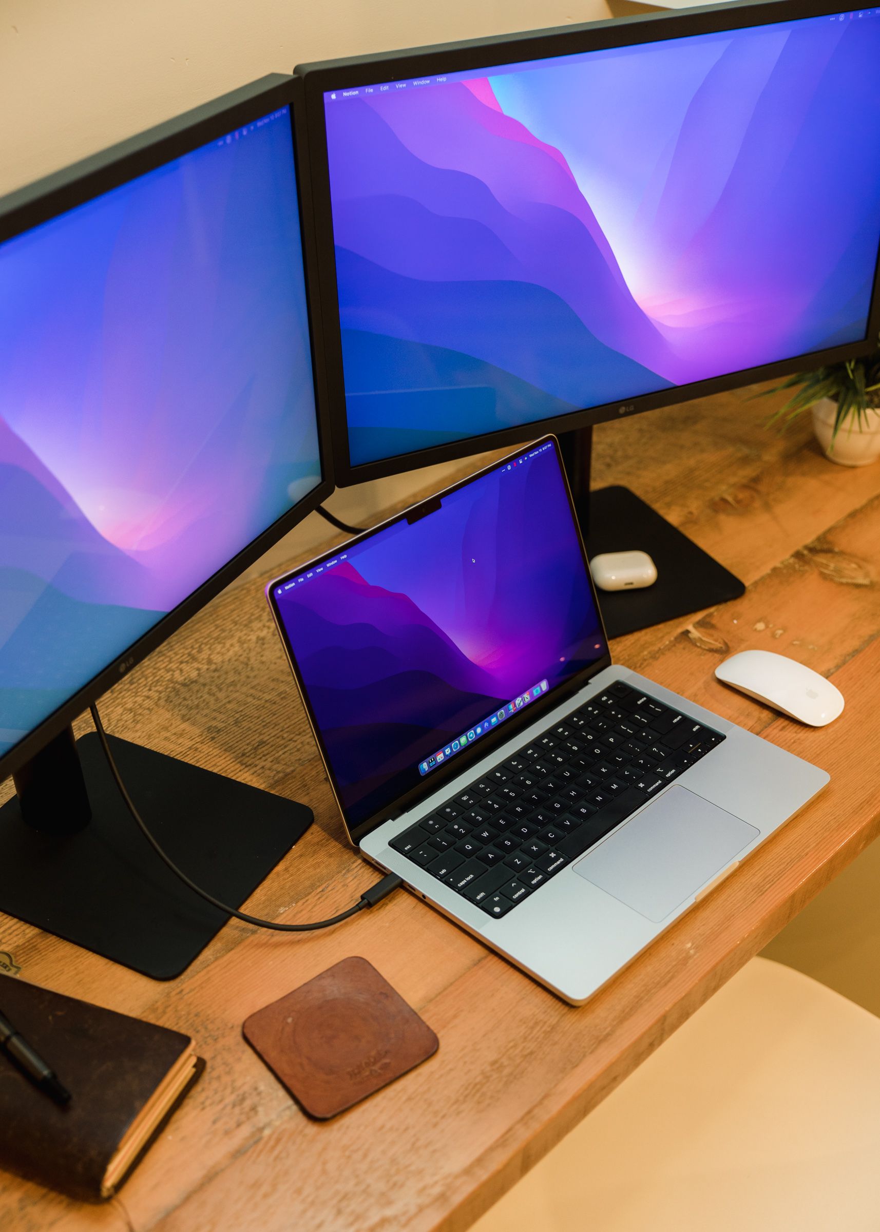
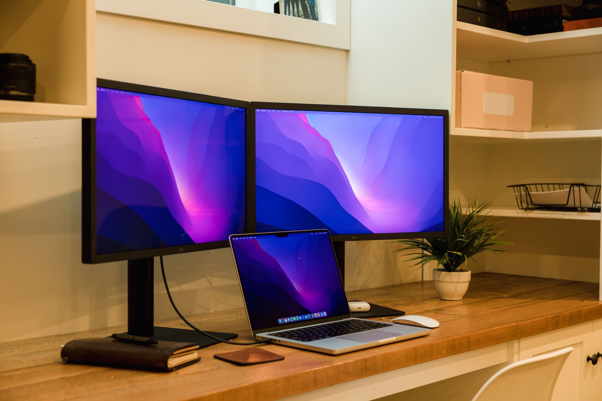
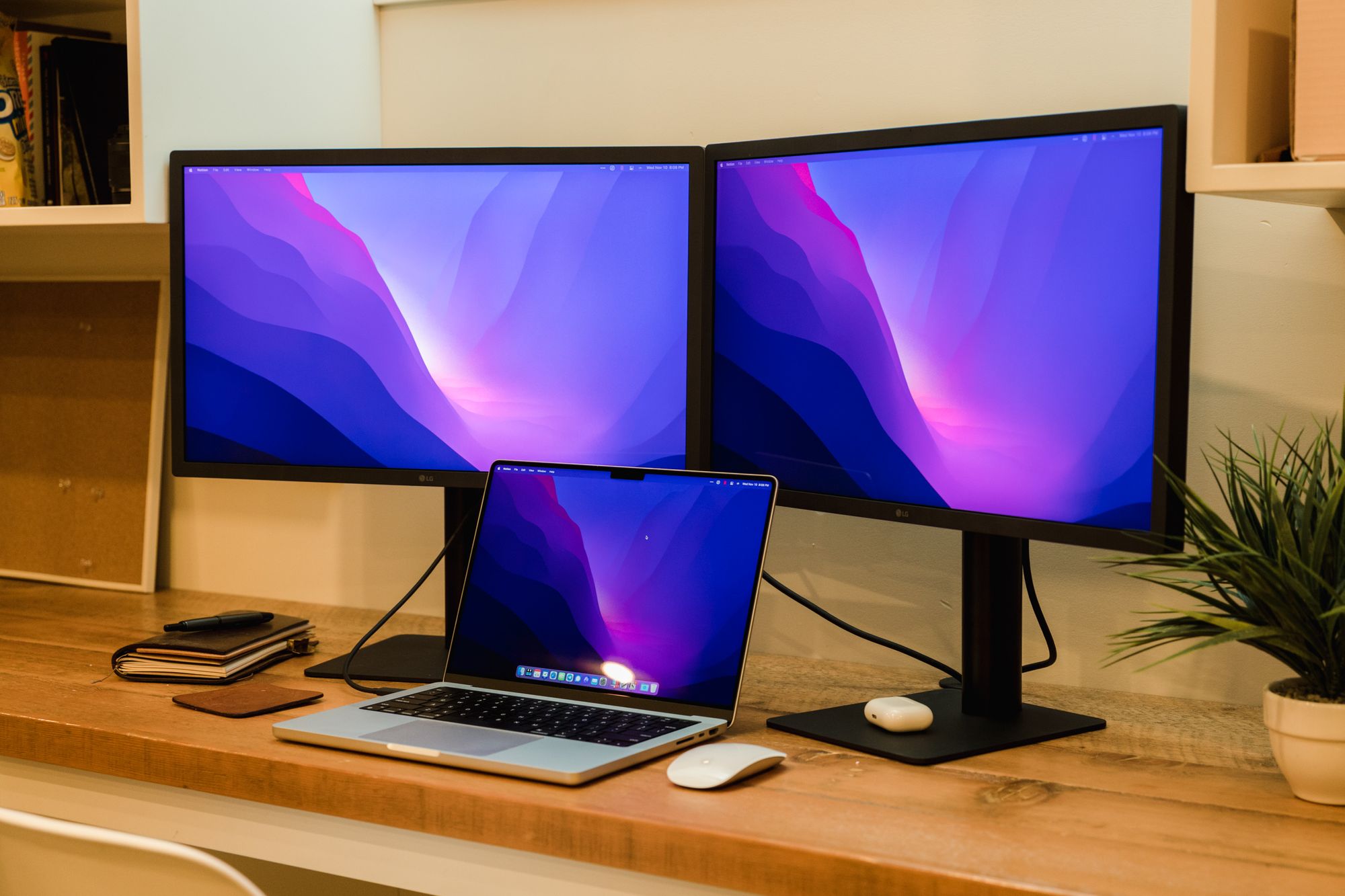
Instead of a 13-inch MacBook Pro, I was given a 14-inch MacBook Pro. I gained an inch here, but opted to size down from my dual 27-inch display dream.
Instead, I opted for two 24-inch LG UltraFine Displays.
The displays arrived earlier this week and I’ve had a chance to put them through the paces of a work-from-home work day.
So far, I’m happy. I’m not blown away. I’m even disappointed in some ways. But overall, I think this is a big upgrade over my previous setup. This setup will transition to the office after isolation ends, so this work-from-home setup is temporary. Even if that makes me sad, it’s been fun working at this station from home.
I’ve heard about quality control issues with LG UltraFine Displays in the past, and these displays are not exempt. One display has what I believe is a completely dead pixel. It’s almost like someone took a needle and jammed it into the display. The displays also don’t seem to adjust to the right height — the display on the right can adjust about a quarter-inch higher than the display on the left.
Height adjustment doesn’t bother me, though. I won’t be extending these to full-height, so I will be able to ignore the issue.
And the small pinhole dead pixel? I’m still pondering how to handle this. I’ve spent a few days working on the display and forgot to write about it until almost publishing this piece. If I look for it, I can find it instantly. And it’s right in the middle of the display to boot. But I’m not sure if it’s worth the hassle of the return.
I’ll likely delve further another day, but three things:
- I went with the 24-inch UltraFines for two specific reasons: price and I/O. The 24-inch displays have better I/O than the 27-inch UltraFine and work with the iPad Pro. Given our 2016-2021 dongle reality, I have plenty of USB-C dongles at my disposal for plugging accessories into these displays. For this reason, they seemed like a better fit.
- I’m impressed with the “efficiency” of these displays. By “efficient”, I mean the amount of content that can be shown on the display at once. When used in a dual setup like this, there’s enough room for multiple spreadsheets and PDFs to get the job done without flipping between windows, and there’s not enough room to have to crane your neck from one shoulder to the other. I don’t find my eyes zooming around looking for anything. There’s just the right amount of material on the display at any given time. This is a truly magnificent size of display.
- The UltraFine Display speakers are not better than the built-in speakers in the 14-inch MacBook Pro. The speakers may be louder, but to my ear, they are not better. The MacBook Pro speakers present a fuller, wider ranging sound. As such, I have been listening to music through the MacBook Pro’s speakers rather than through the display’s speakers.
I am very excited to see how this setup evolves over the years. With a MacBook Pro, I can bring my work home with me in the evening and put in an hour or two in the later evening (my most productive time of the day) without having to return to the office. With the dual 24-inch displays, I have more screen real estate than ever before. And with an incredible display and great keyboard in the MacBook Pro, I may find myself returning more often to the Mac for my writing and photography pursuits.