I was chatting with a friend recently about my three favourite Apple products of, say, the last five years. “Three” is an arbitrary number and “five years” is an arbitrary length, but you have to cut things off somewhere.
Defining “favourite” is also a chore. “Favourite” can mean “let’s me get the most work done”. It can also mean “brings me the most joy”. It can be “my favourite design” or “My favourite Apple device to show off”.
For me, “favourite” means “brings me the most joy” or “giddiness” — which Apple devices make me want to rush home and use them at the end of a long day of work? Which devices have me wanting to reach for them over and over just because they are so much fun to use?
To an extent, my “favourite” does mean “allows me to get a crapload of work done each day” as well. I can’t be entirely whimsical.
Here are my three favourite and giddy-worthy Apple products of the last five years.
M1 Pro MacBook Pro
Let’s quickly get the work-first device out of the way.
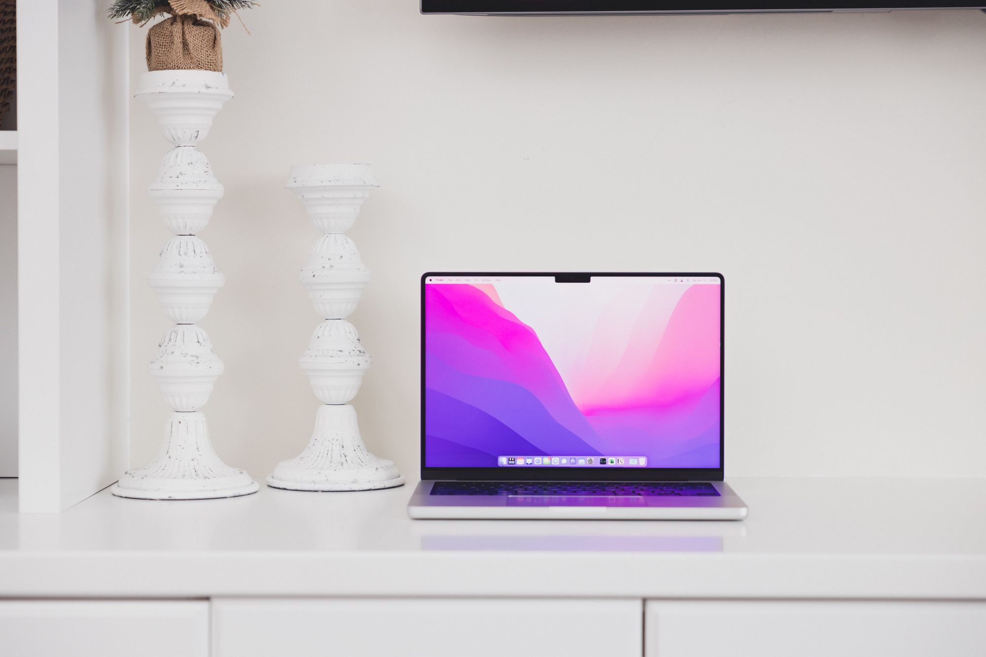
The M1 Pro MacBook Pro may be the most impactful device I’ve ever used in my life. It’s surely been career-changing. I can do everything from this one device each working day. It never used to be this way.
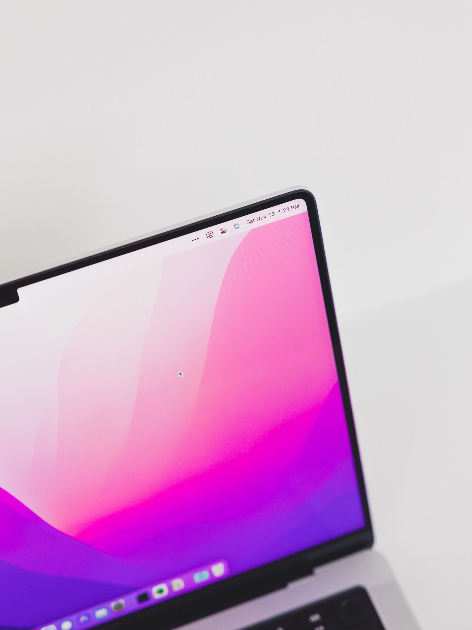
I’ll tread carefully, but I also think I’m blazing a new trail. At least to an extent. I don’t think there are too many accountants out there who use Windows-specific software on a Mac each day, all day. I use Windows and macOS perfectly interchangeably, and there are very few files you can throw at me that I can’t volley right back to you. I’m incredibly proud of the workflow I’ve built to use a Mac in my enterprise/business-first career and I hope it can continue to blaze new paths for me in the future.
AirPods Max

I’m far from the correct person to be raving about the AirPods Max. I have no business owning a pair, nor do my ears have any capability to understand how good the Max truly are.
But I don’t care.

When folks ask me in the office why I use such big headphones, I tell them I use them for two reasons:
- They are a huge sign to anyone passing by that I’m in the zone and I’m working. Basically, it’s a huge sign on my head that says “Do not disturb!”
- They have an incredible Transparency Mode, which enables great music listening combined with an amplification of the ambient sound around you, ensuring you never miss a beat in the office or coffee shop.
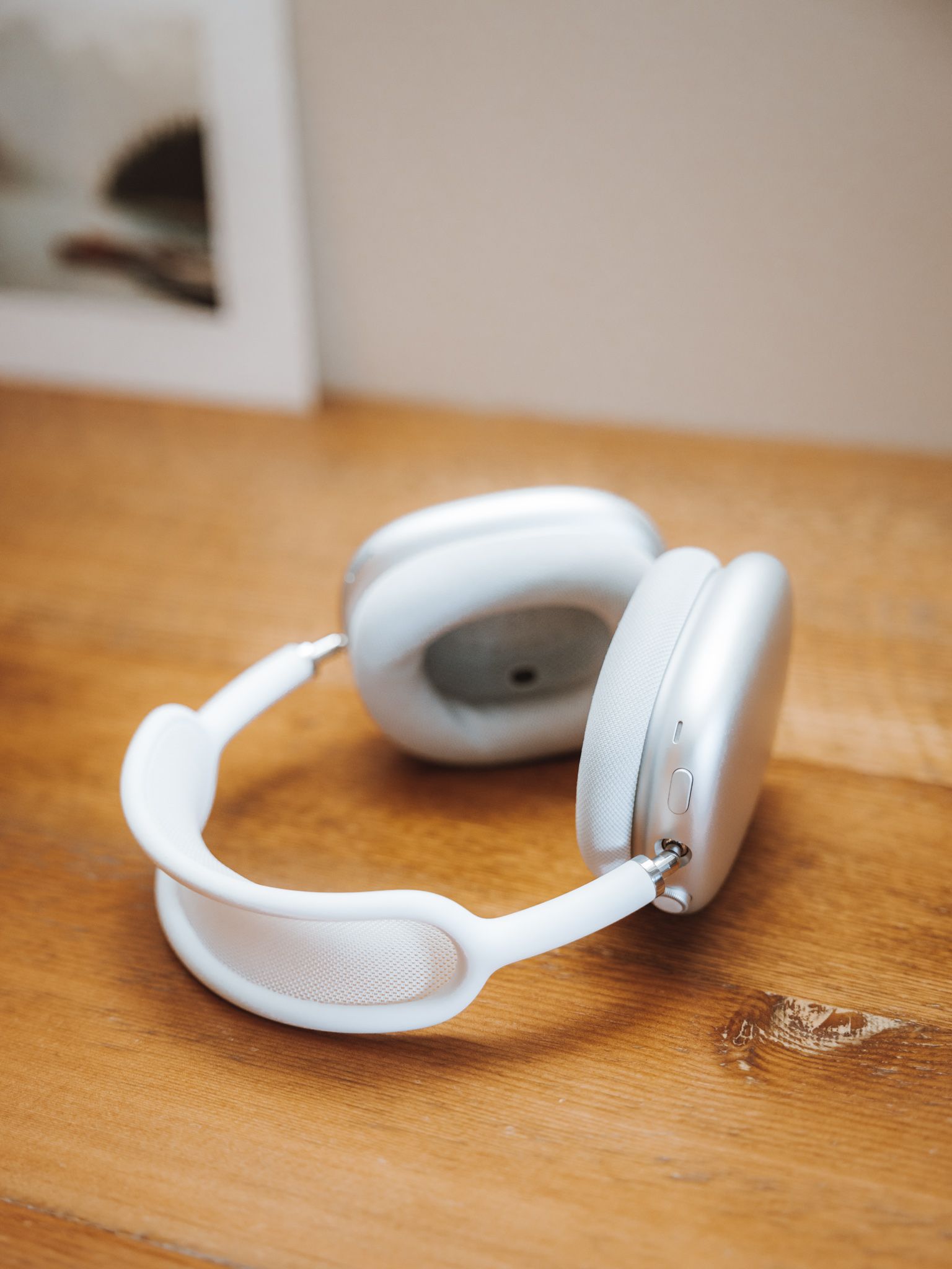
So basically, the AirPods Max tell other people I’m busy and don’t want to be disturbed, but they have a listening function that enables me to stay in tune with what’s going on around me.
Needless to say, I love wearing the AirPods Max.
Studio Display
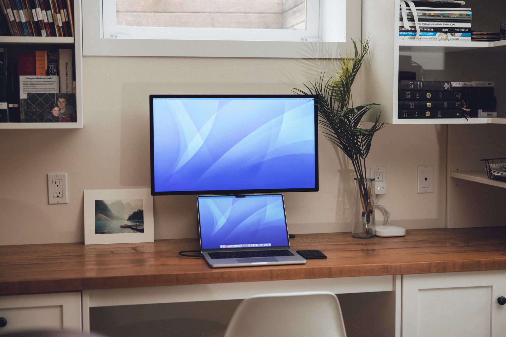
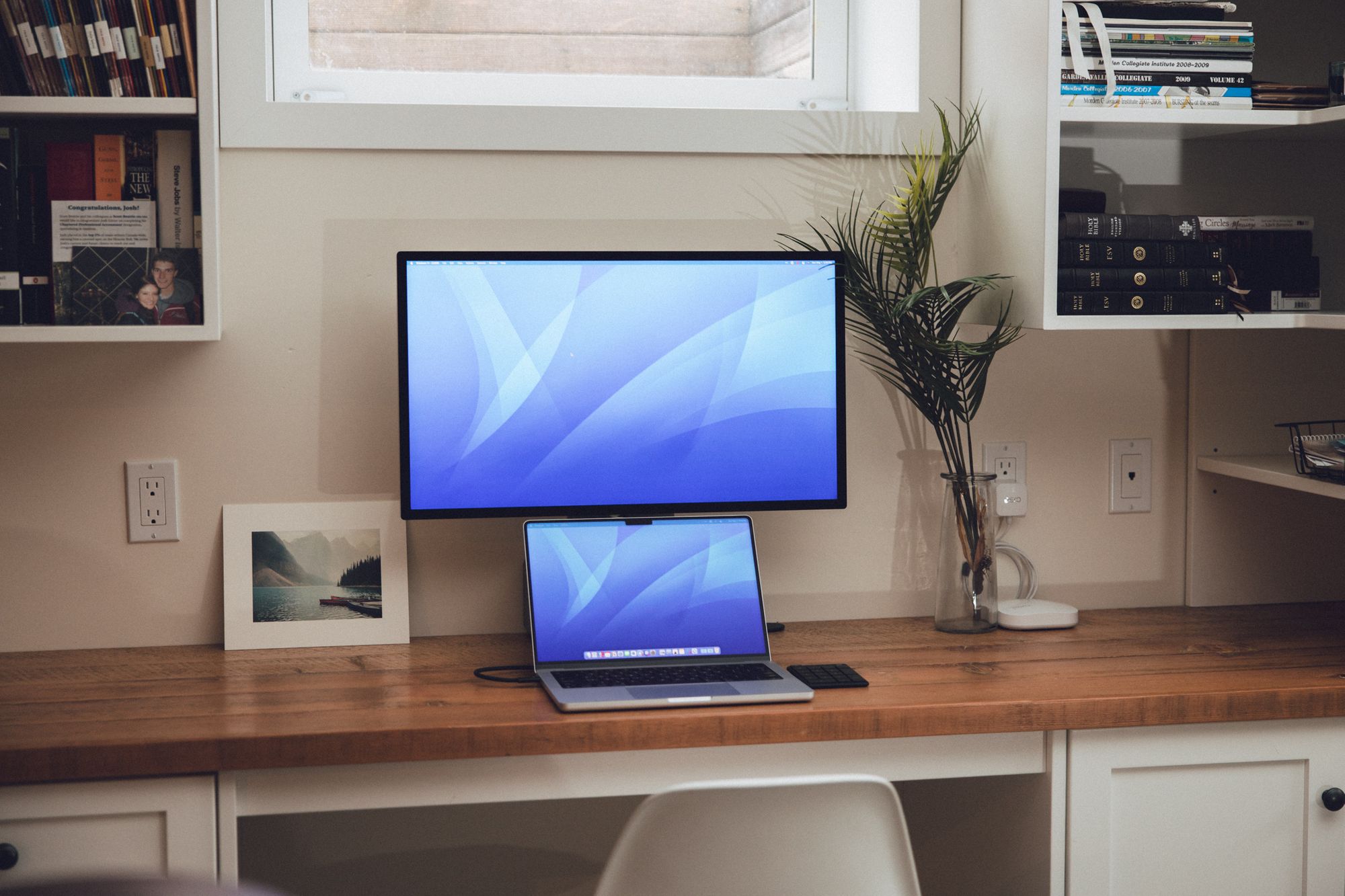
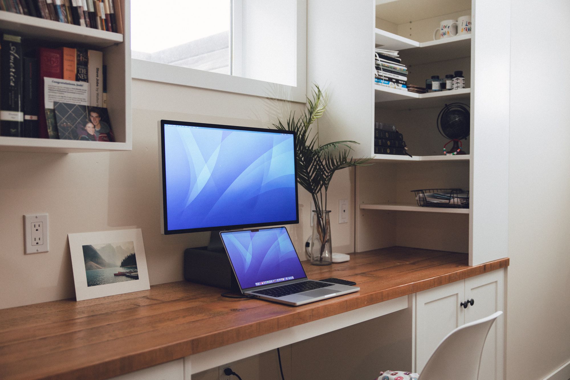
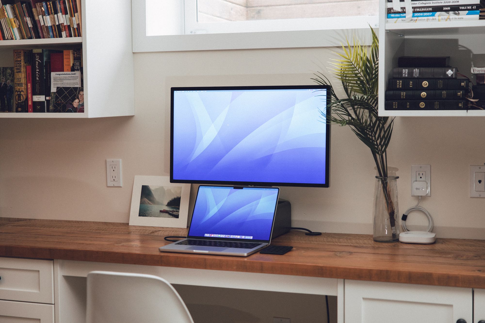
This may be the fastest any Apple device has made it into my top three. But I’m in love with this Studio Display.
It’s expensive.
It’s also an amazing product. I have the nano texture version, which makes it easy to shoot photos of. It’s also very easy on the eyes — I swear the ever-so-slightly fuzzier nano texture version takes off some blaring eye strain by the end of the day. I swear!
Everything else is Apple like. The Studio Display starts up right away with an M1 Pro MacBook Pro. The display has amazing speakers. It has an amazing design. And it has a pretty good panel — one you won’t hear me complaining about any time soon.

My Studio Display is my home display and I use two 24-inch LG UltraFines at the office. I always come home at the end of the day and opt to work from home for the last hour or so — just so I can use the Studio Display.
Special Mention: iPad Magic Keyboard

The iPad Magic Keyboard came out of left field unlike any Apple product I can remember. Nobody really expected it. Nobody saw the point-and-click interface fully built out in iPadOS. Nobody knew anything about the Magic Keyboard’s design.
Despite the incredible secret keeping, Apple was able to nail the iPad Magic Keyboard experience. The keyboard itself has an incredible feel, with very few laptop keyboards feeling as precise and comfortable. The trackpad is small on the 11-inch model, but completely changes how iPadOS can be used. Even the extra USB-C charging port enables the iPad to reach a new level.
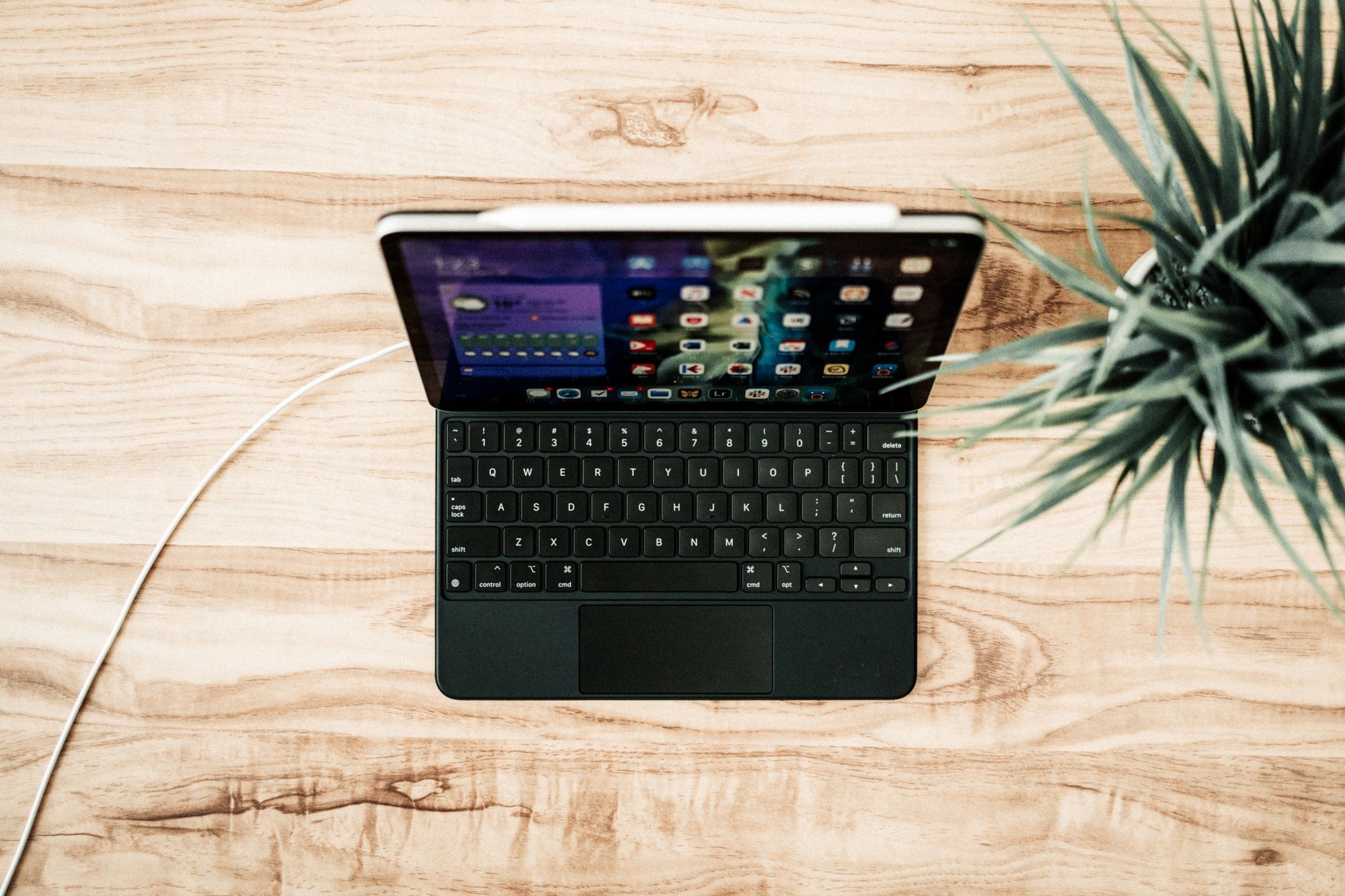
At this current place and time, the three above mentioned Apple devices are more important to me than the iPad Magic Keyboard. But the Magic Keyboard was probably the first Apple accessory in years to tempt me away from a laptop computer. I looked for ways to get everything done on an iPad. I did all my writing on the iPad (I still do a ton of writing on my iPad, thanks to the Magic Keyboard) and I was looking for ways to extend the display to those LG UltraFines I mentioned earlier.
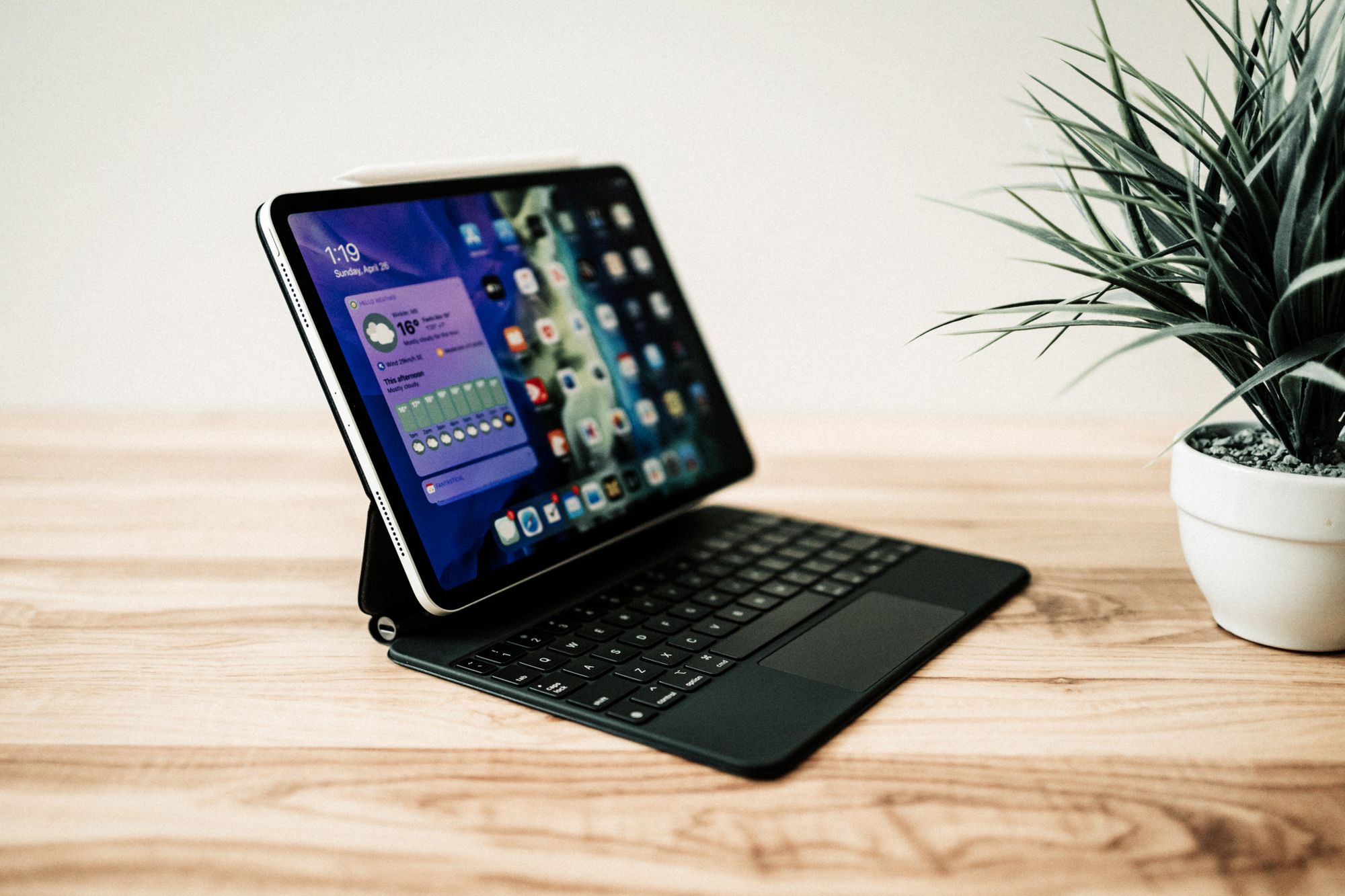
The iPhone 5 was the iPhone that kickstarted my love affair with Apple devices. The iPad Pro sort of did the same, but it wasn’t until the iPad Magic Keyboard debuted that I finally found a niche in my life perfectly fit by the iPad.
I really hope the next iPad iteration still maintains support for this impressive Magic Keyboard accessory.
