There is only so much an app designer can do when it comes to licenses. Fonts, symbols, terms… — I speak with little knowledge of the issue, but it’s clear there are times when an app maker is forced left or right with little to no control over the outcome.
Matter for iPhone and iPad is one of the prettiest apps on the planet. The folks making the latest read-it-later tool truly understand what it takes to make a delightful reading app. For the longest time, I was saving everything to Matter to read, simply because it was so beautiful to look at.
There are many design decisions the Matter team have made to make the app so beautiful. One of those outside their control realm was Bookerly, Amazon’s exclusive font which has little to no licensing terms available for use. Great design decisions combined with the world’s best reading font made for a $10/month subscription I joyfully signed up for. Matter was truly the most beautiful reading app ever made.
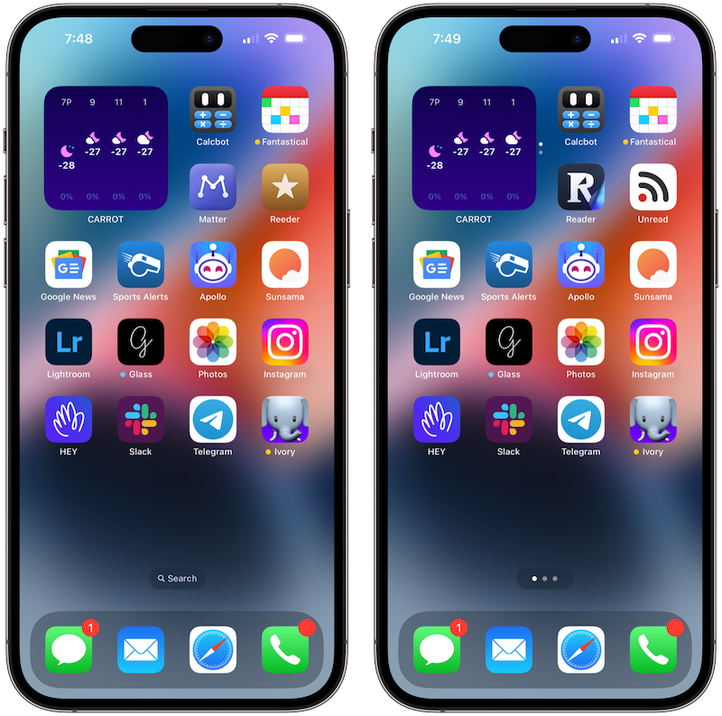
But the Matter team had to move away from Bookerly in the latest update. Alongside the Bookerly removal came a slew of new fonts —some which are nice enough — and a few new theme packages to better suit a variety of tastes. The new Matter app icon options are equally or more impressive; I especially love the latest purple/plum app icon.
This single font change though has me at a crossroads. I have to turn right or turn left, given the $10/month subscription fee. I’m not ready to fully turn my back on Matter already, but this one font change has me downloading Readwise’s Reader once more and moving all my read-it-later material to Matter’s competitor.
Again, there’s nothing the Matter team can do about this. I get it.
I just wish the app hadn’t come this far with a font they weren’t really allowed to use. And frankly, with a font that became so core to the app’s identity.
For that, I’m (at least currently) exploring other options.