Everything changes when a little one arrives.
I had to purchase something that marked such an occasion. And why waste an opportunity like this by buying something off the local bookshelf?
No, I had to go a bit deeper on this one.
There’s only one Bible blog you need to follow, and that’s J. Mark Bertrand’s Bible Design Blog. Bertrand’s been reviewing Bible designs for years, both with awesome photography and literary prose. In my research phase, I think I had 10 or 11 of Bertrand’s reviews saved in my Instapaper queue.
There are dozens of Bibles, publishers, and options to choose from when you go down this rabbit hole. Black-letter or red-letter Bibles? Single-column or dual-column? Reader’s Bible or reference Bible? Goatskin leather or calfskin leather? And, of course, which translation?
One of the first Bibles to ever catch my eye was the Crossway ESV Heirloom Legacy. I think I saw a link to Bertrand’s review of the 2014 model pop up in my Twitter feed once. The leather looked gorgeous. The single-column layout fascinated me. The type looked easily readable and consumable. And it didn’t take a trained eye to know this Bible could last a few lifetimes if properly cared for. If not for the price, I’d have purchased one that day.
Crossway updated their Heirloom Legacy line in 2017 with the introduction of a “third generation” Heirloom Legacy. This Bible fixes the sturdy hinge found in the 2014 Heirloom Legacy and introduced three new colours (sold exclusively by EvangelicalBible.com in blue, green, and purple; I’m going to buy Jaclyn the green one as soon as I can).

To mark the occasion of my daughter’s arrival, I purchased two Crossway ESV Heirloom Legacy Bibles — one for myself in black goatskin leather, and one for Emryn, as a birthday gift, in purple goatskin leather.


If all books were produced with such care and attention to detail, there’d be no such thing as buying a second copy. You’d only need one copy of a book for the rest of your life.
And for the rest of your child’s life.
Design and Materials
There’s so much to talk about here, so I hope I do it justice.
Goatskin Leather
This is my first goatskin leather Bible. It doesn’t take long to stare at the rest of your bookshelf and imagine how beautiful every other book would be if they were lined in goatskin leather.

Goatskin leather has a particular pattern and texture to it. It’s more grainy than calfskin or synthetic leather and has a more unique character to it.
When someone said “leather”, I used to imagine the sturdiness and durability of cowhide leather. But goatskin leather is on the other end of the spectrum — it’s far softer, more pliable, and substantially more flexible. I wouldn’t want a goatskin leather briefcase. But I also don’t want a cowhide leather Bible. Goatskin, in this context, is simply perfect.

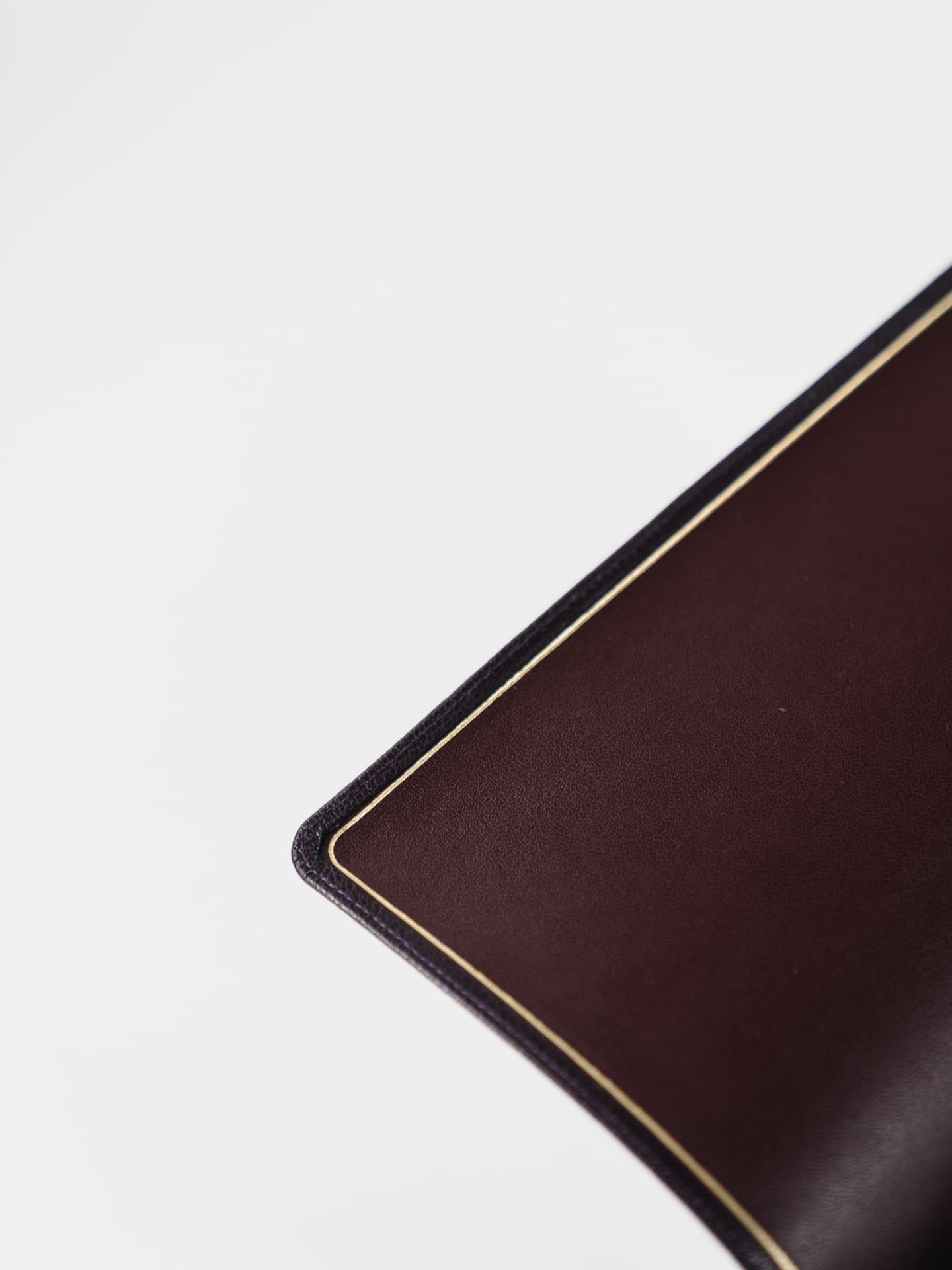
The inside cover is lined in calfskin leather, to provide a little more sturdiness and durability to the relatively flimsy book. A look at the inside stitching where calfskin meets goatskin only serves to improve your impression of lifetime quality. I’m not sure you could rip the cover, even if you tried.

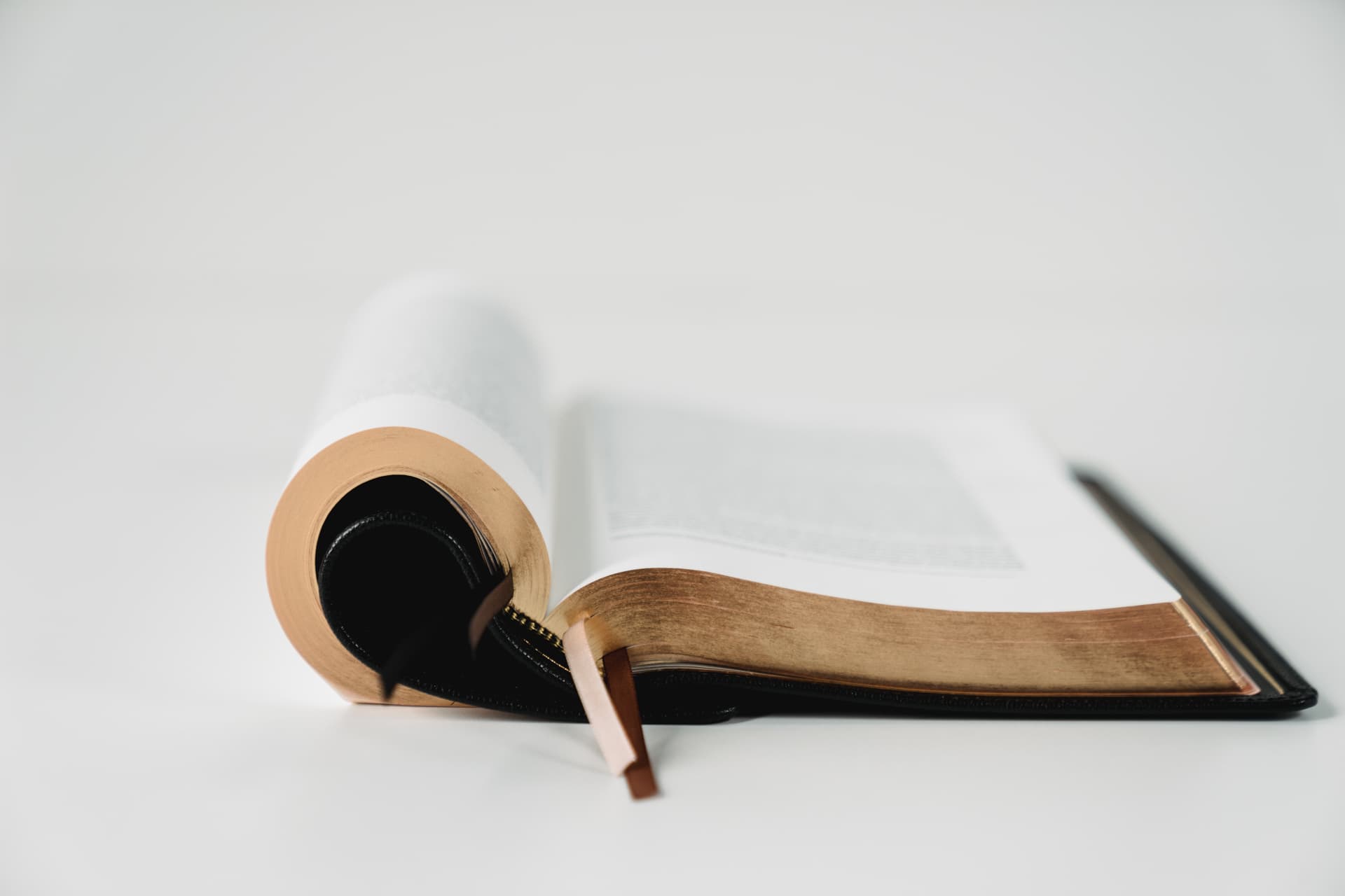
Over time, the goatskin leather cover begins to flow over the edge of the paper block inside. This is called the “yap”, or the amount of leather that flows over and around the book block. The Heirloom Legacy comes with a standard 9mm yap, while R.L. Allan’s Bibles are known for taking the yap quite a bit further.

What a look. I’ve had this Bible for just over a month now and it already looks weathered and used.

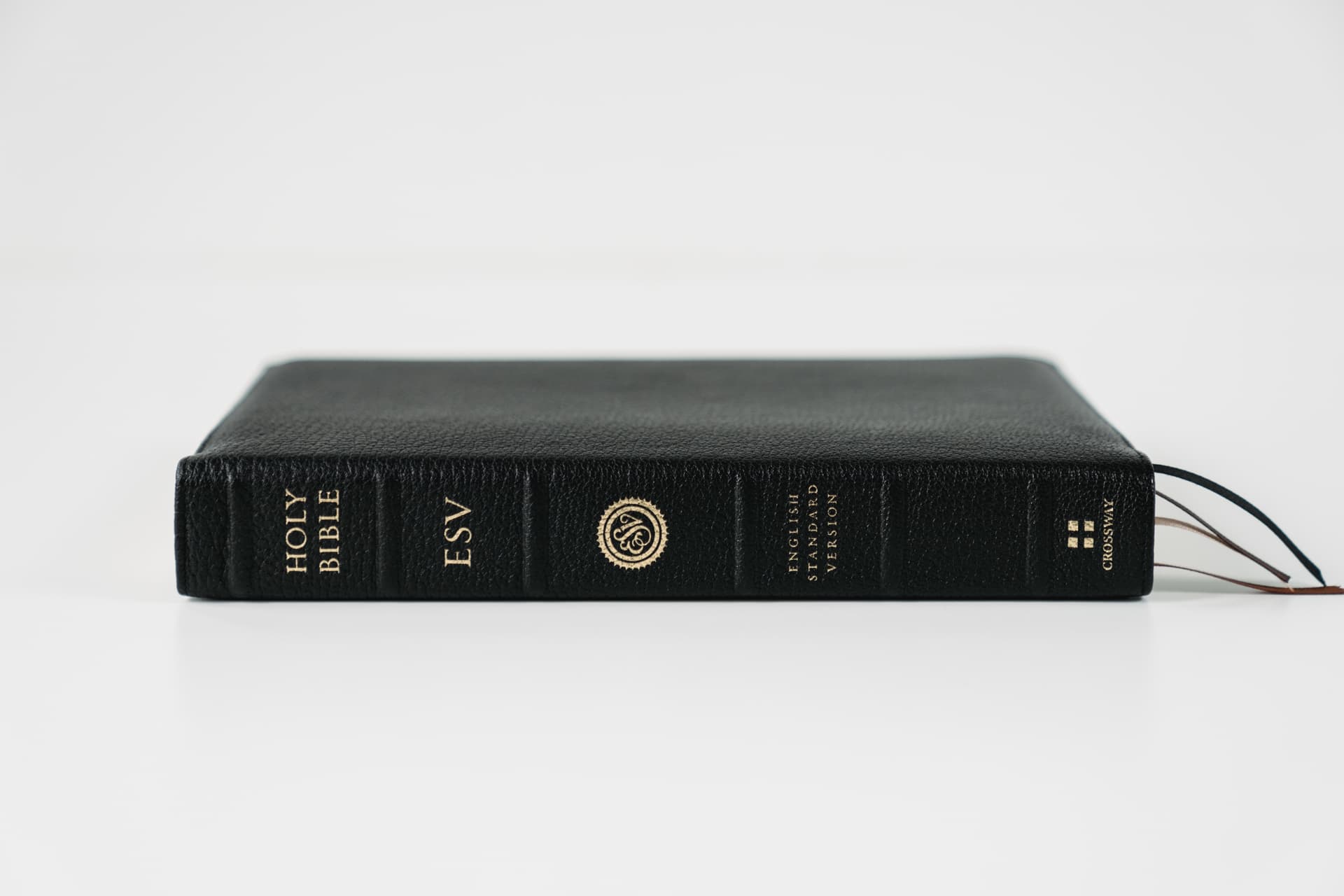
To my pleasure, there’s no adornments, embossing, logos, or words printed on the front or back cover of the Heirloom Legacy. It is, quite simply, blank. The only printing or gildings you’ll find are on the Legacy’s spine. I’m one for understated Bibles with no extra frills or designs added, so this design choice is right up my alley.
Size
No matter the format or design choices made in designing a Bible, there are compromises. If you aim for more portability, the size of the Bible has to shrink, all but forcing Bible designers to use thinner paper and smaller fonts. If you want a concordance or a more readable font, the Bible has to get larger and thicker — and, therefore, less portable.

Plus, if you go with a single-column format with large margins, you’re opting to use more paper for fewer words — thereby making the book block that much larger.
It’s a game of compromises.
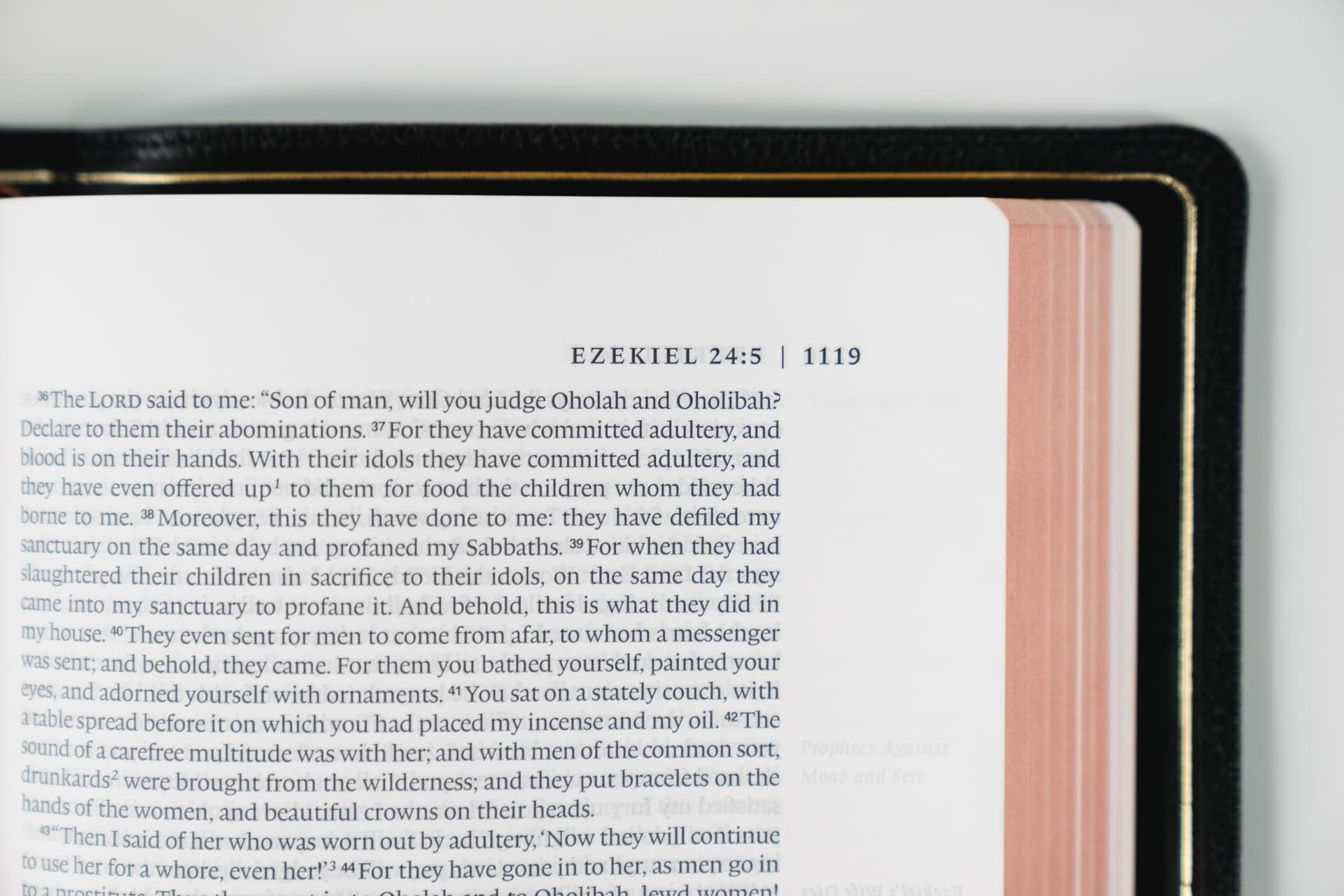
So it’s no surprise the Heirloom Legacy comes in on the larger size. The 9 pt. font and 28 GSM paper work to ensure the single-column format and large margins don’t bulge beyond a reasonable grasp.

And grasping this Bible can be hard to do. It’s easy enough to allow the Bible to flow down and away from your hands if you hold it by the spine, but this makes it difficult to read when you’re away from a flat surface.

Instead, these Bibles are designed to fold the front or back cover around, giving your hand something to grip onto when reading. I’ve been hesitant to fold these covers, if only to avoid testing the durability of the paper. However, in my tests, the cover and paper returned to their natural state immediately upon unfolding.
The compromise list is pretty long, but Crossway has made a number of great decisions to ensure the Heirloom Legacy’s readability is held to the highest standard. Considering the choices made, the Heirloom Legacy is a great size for a Bible on your desk at home, and isn’t too large to be taken to church either.
Spine
Although you’re not supposed to judge a book by its cover, it’s not usually the cover that offers a first impression. Whether you find a book on a shelf or in a stack of other books, it’s the spine that catches your eye at the beginning.
Case in point: J. Mark Bertrand’s photo below.

Which spine catches your eye first?
To me, the two Crossway Heirloom Legacy Bibles at the top of the photo catch my eye. The raised hubs on the spine give the Bible such a classic and sophisticated feeling. It just begs to be held.

However, I’m not a fan of Crossway’s branding here. We’re told this is an English Standard Version Bible three times, by way of the “ESV”, the ESV stamping, and a spelled out “English Standard Version”. This is overkill and, quite frankly, I don’t want marketing anywhere in my Bible.
Binding and Hinge
Based on my research, there are very few Bible binding experts on the planet. The Heirloom Legacy is bound and printed by Jongbloed in the Netherlands, who is also responsible for printing the widely-loved Schuyler Quentel series. Jongbloed’s bindings are world-renowned and a quick glimpse of the Heirloom Legacy’s binding explains why.
Out-of-the-box, the Heirloom Legacy lays flat, right from Genesis 1 through to the glossary at the back. No matter which page you flip to, the Legacy’s binding looks as though it was specifically bound for the page.

Further, the Heirloom Legacy’s binding opens far enough to allow for comfortable reading right into the gutter of the book. With such a thick block of paper, it’d be easy for the book block to flow upwards, away from the binding, and then flow down towards the edge of the cover, thereby hiding some bits of text on the inside of the page. However, Jongbloed’s binding and hinge allow for all text to be easily legible, no matter which book of the Bible you’re reading.
Paper
Paper! It’s the one thing I feel like I know something about when diving into the design of a Bible. It’s very rare for Bibles to utilize thicker GSM paper — not only would be the book become unbearably thick, it would be increasingly heavy and more difficult to carry with you.
As a result, “Bible paper” (I’ve referred to Hobonichi Techo Tomoe River paper as “Bible Paper” in the past) is usually only 28 GSM to 36 GSM in thickness. Schuyler prints its full-size Quentel series on 36 GSM paper, but has to make other compromises to ensure their Bibles don’t become too thick. At 28 GSM, the Heirloom Legacy’s paper does yield some show-through on the opposite side of the page, but Crossway has used a few other techniques to limit the impact show-through may have on your reading.

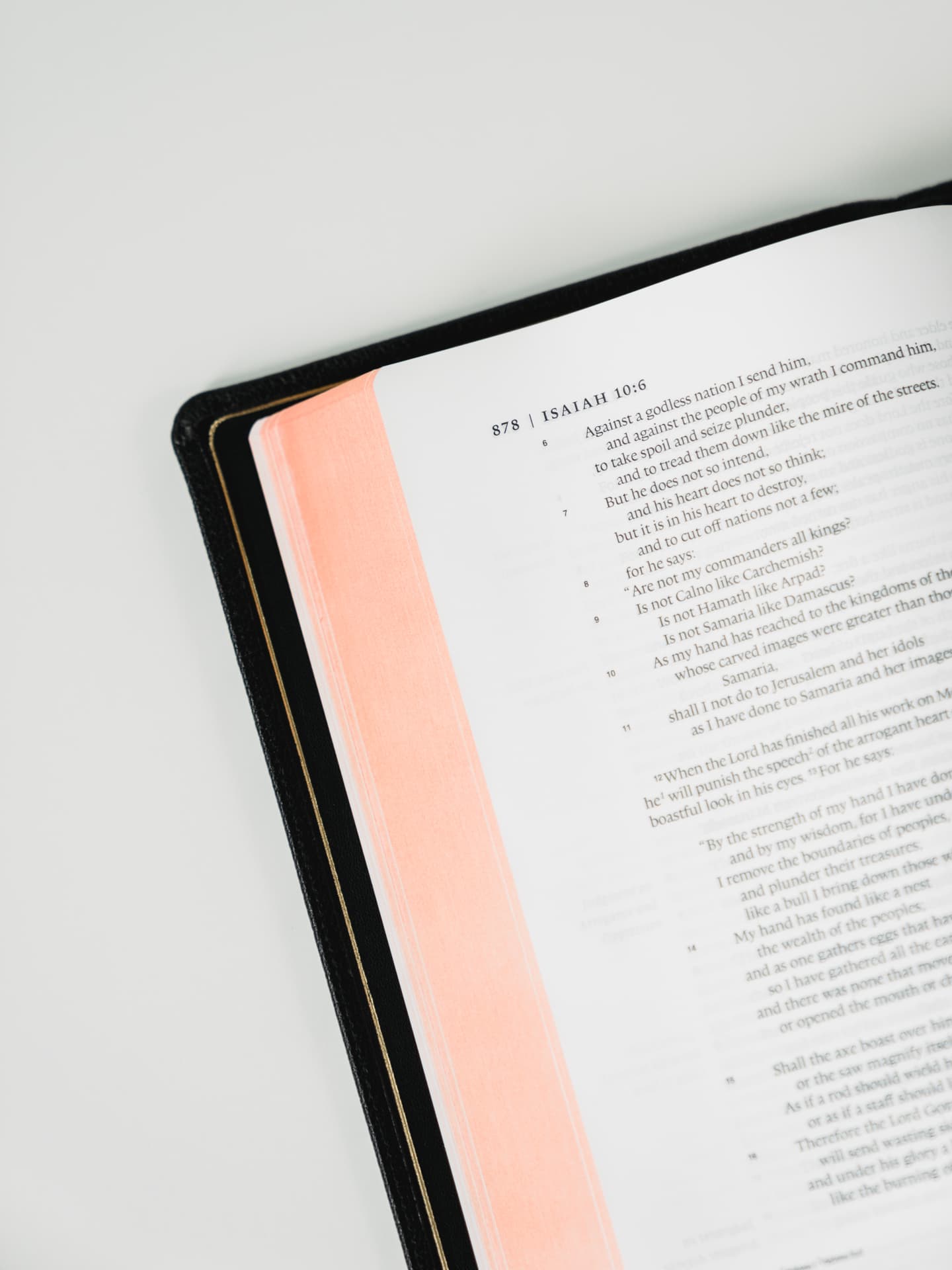
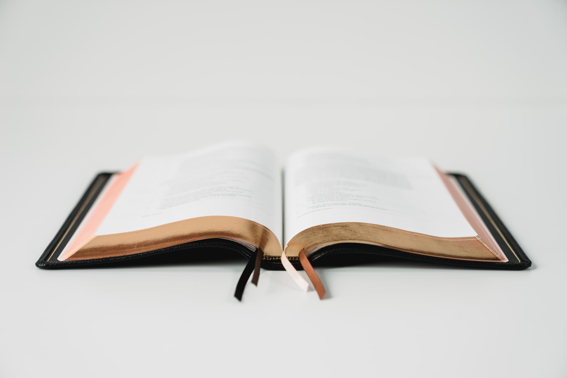
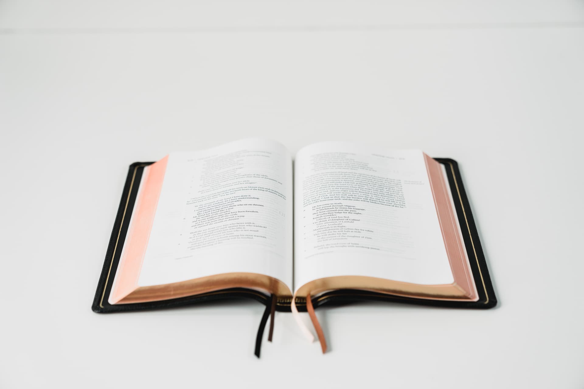
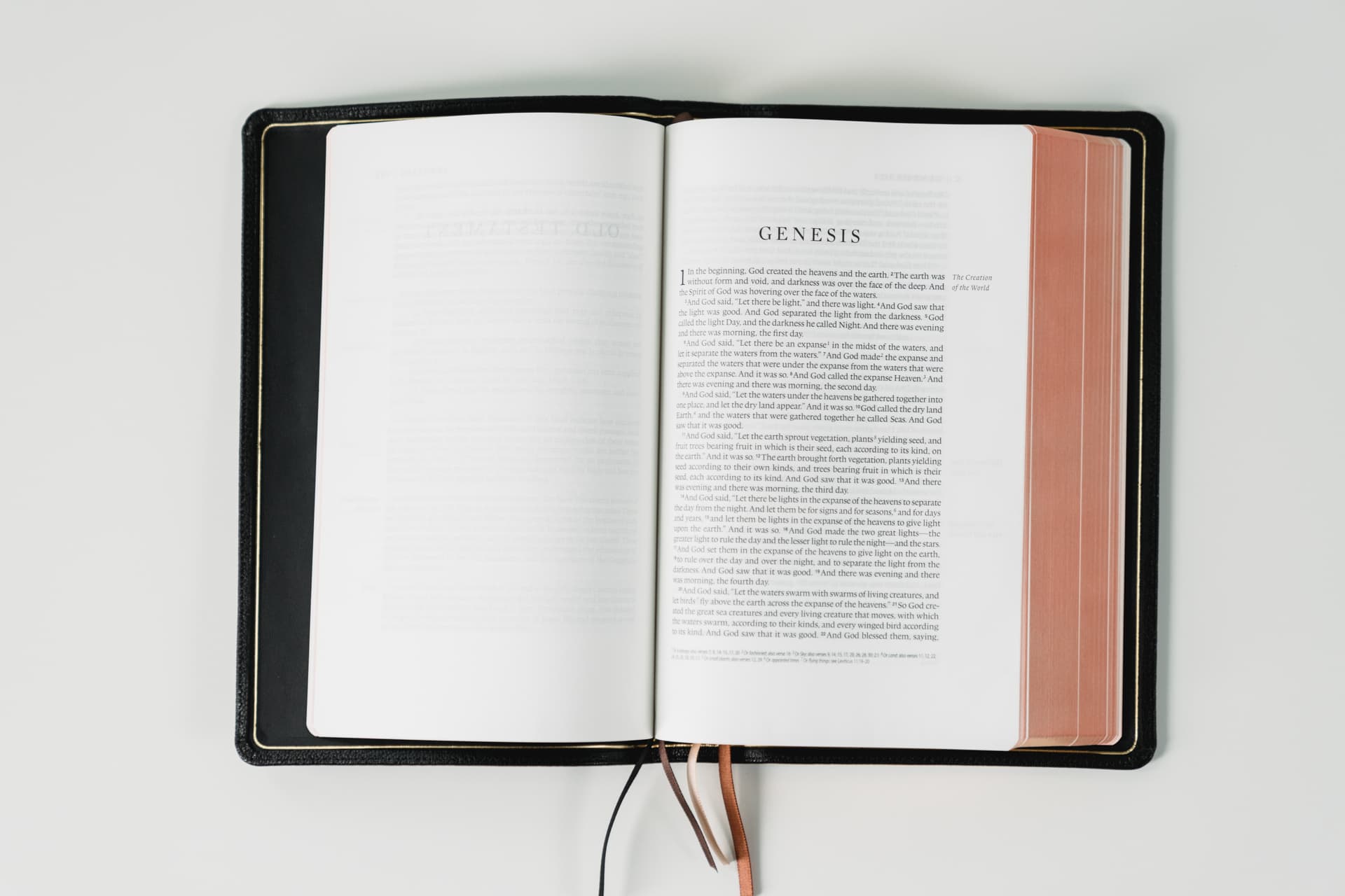
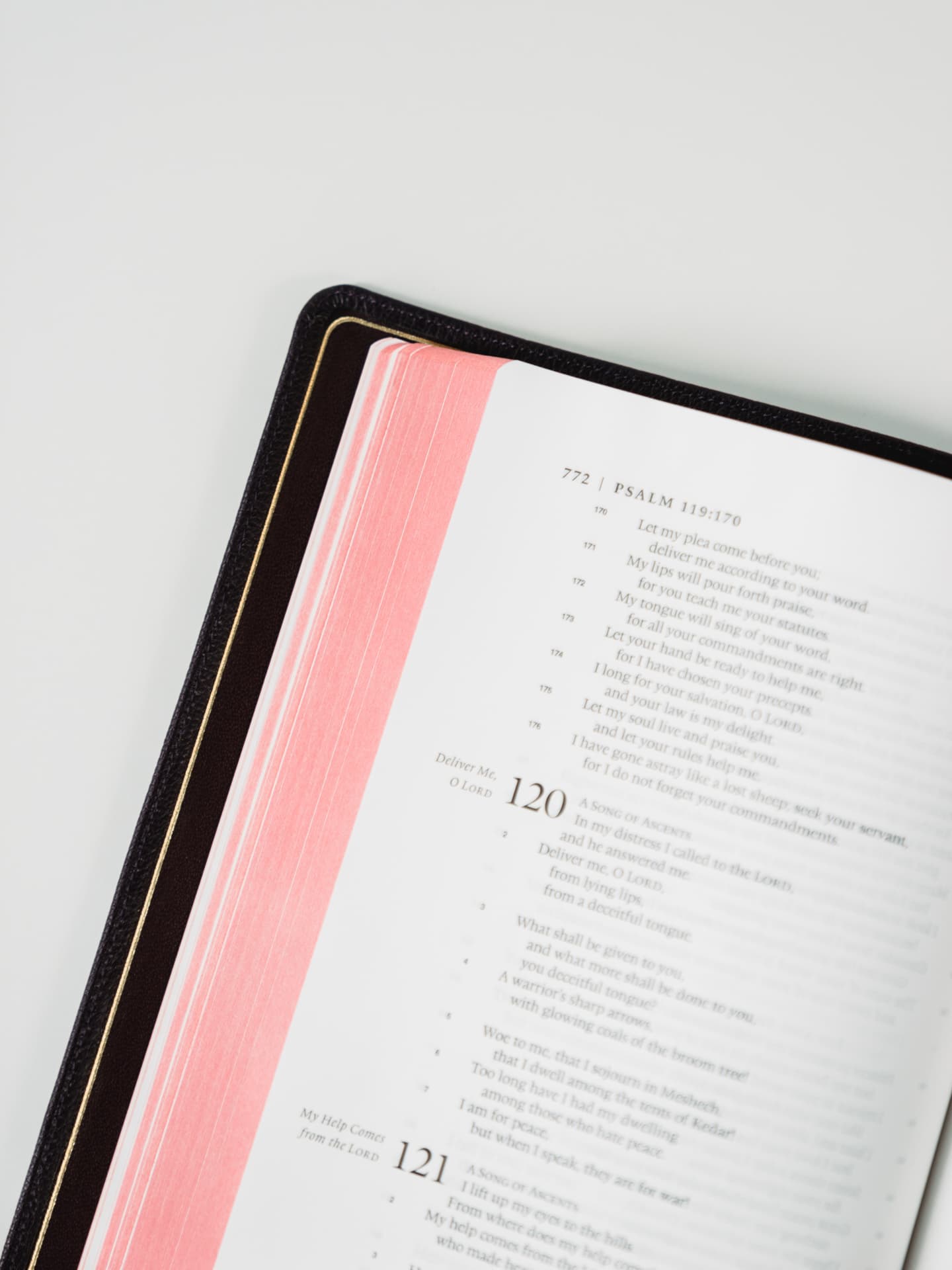
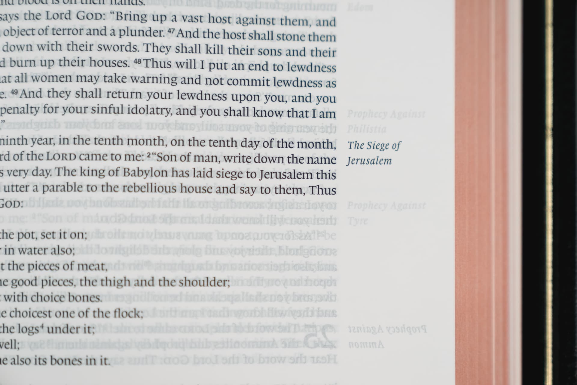
Bibles almost always include wonderful edge gilding, and the Heirloom Legacy is no different. The black goatskin version comes with a standard art gilding, a salmon colour of sorts under gold.

Emryn’s purple goatskin Bible has a red under gold gilding, while the green and navy blue goatskin Legacy Bibles come with a red under gold and blue under gold gilding, respectively. All gildings look magnificent and I love how they pull some sort of optical illusion as you open the Bible and skim through the pages.
The most important feature of the Heirloom Legacy’s paper, though, is its off-white colouring. I didn’t originally notice the difference in colour until I compared the glossary pages to the printed map pages at the back of the book. When compared side-by-side, the difference is striking. The off-white colour provides more ease on the eyes when reading under all sorts of light, be it direct sunlight or soft incandescent light from your nightstand lamp.
It’s a decision like this that proves much thought was given to the Heirloom Legacy’s reading experience.
Ribbons
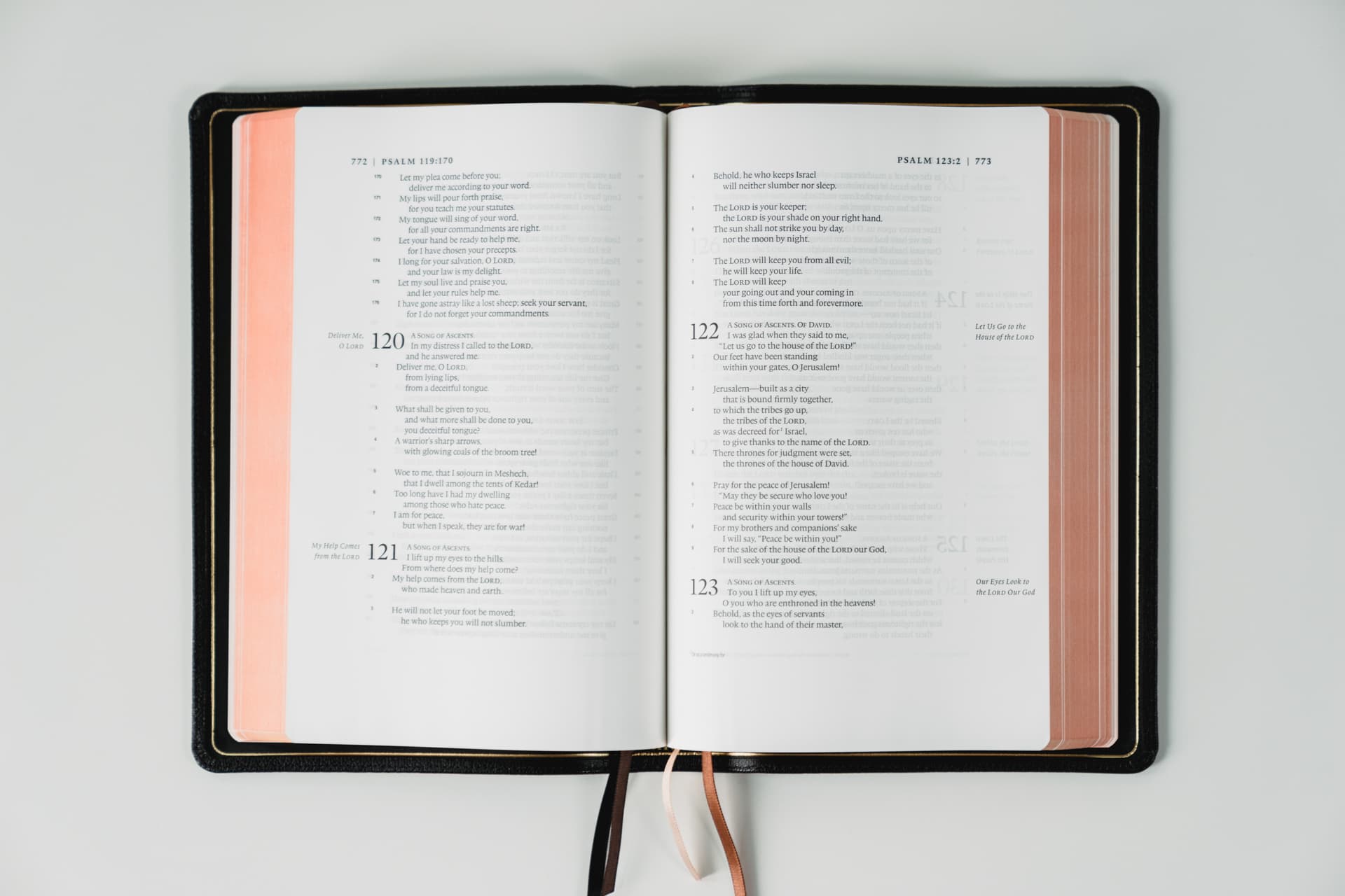
The standard Heirloom Legacy (black and brown goatskin) ship with four different ribbons to keep track of your reading locations.

The exclusive colours — purple, blue, and green goatskin — from EvangelicalBible.com only come with three ribbons, oddly enough. The purple goatskin Legacy comes with three slightly varied purple ribbons, while the black goatskin Legacy comes with four varied brown ribbons.
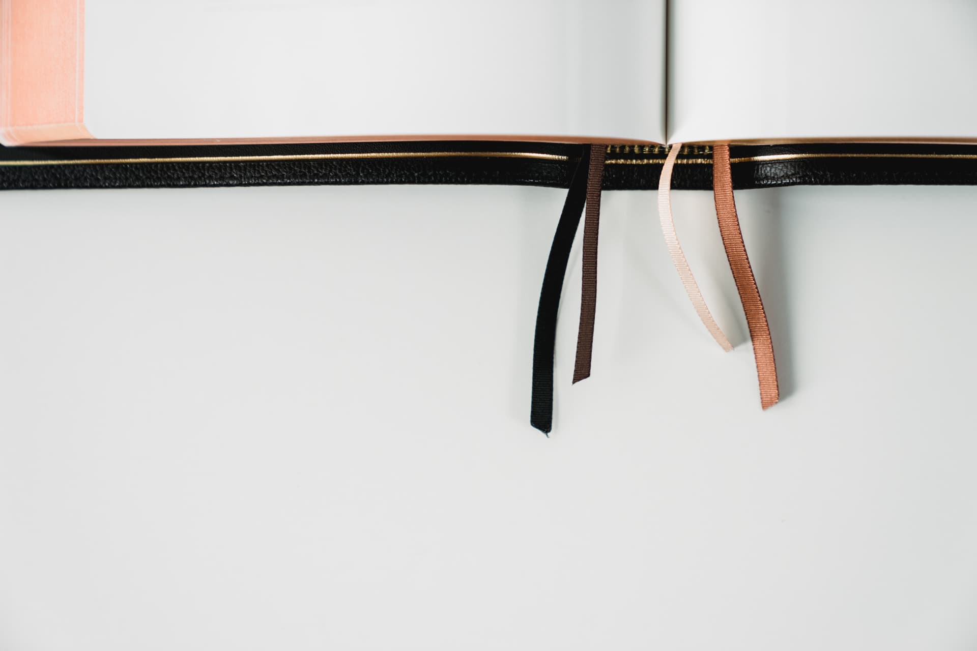
Four ribbons sounds like quite a lot, but I’ve already found a need to use all four at once. I keep one at the beginning in the Table of Contents, one where I’m currently reading in my own personal schedule, one where we’re reading at church, and one at the glossary in the back. If I had a fifth ribbon, I’d likely use it. The fact the exclusive colour offerings only have three ribbons is far from a deal-breaker, but it is a bummer.

The ribbons themselves aren’t made of the highest quality material — surprising, considering the rest of the package. They’re substantially thinner than I’d like.
When pulling on one slightly to get to a marked page, I’ve often felt like I’m about to rip the ribbon right out of the binding. I’ve read somewhere you can remove the default ribbons and stitch in your own if you’d like, but you do void the lifetime warranty by doing so.
The sum of all the material parts is a book design worthy of a lifetime of readership. Barring water damage or explicit intention to rip a page, the Heirloom Legacy’s physical materials feel like they’ll last a lifetime. I expect to purchase more Bibles over the years, as there are far too many beautiful Bibles I’d like to get my hands on. However, if this were the only Bible in my collection for my entire life, I could all but guarantee this Bible would be passed down to my children and grandchildren 50 to 60 years from now.
Printing
The wide range of material options available in the Bible design world can be applied to the printing formats used in the industry. Dual-column and single-column layouts are used. There are black-letter only formats, with others printing the words of Christ in red. Still others have wide margins and references printed on the bottom of each page or in a third middle column on each page.
The options are breathtaking. But, when you’re looking for the perfect Bible, the many options become stressful.
Like many other questions, your specific printing format of choice will boil down to your goals. And the Heirloom Legacy has a range of features perfect for those looking for a comfortable reading experience above all else.
Font, Font Sizes, and Layout
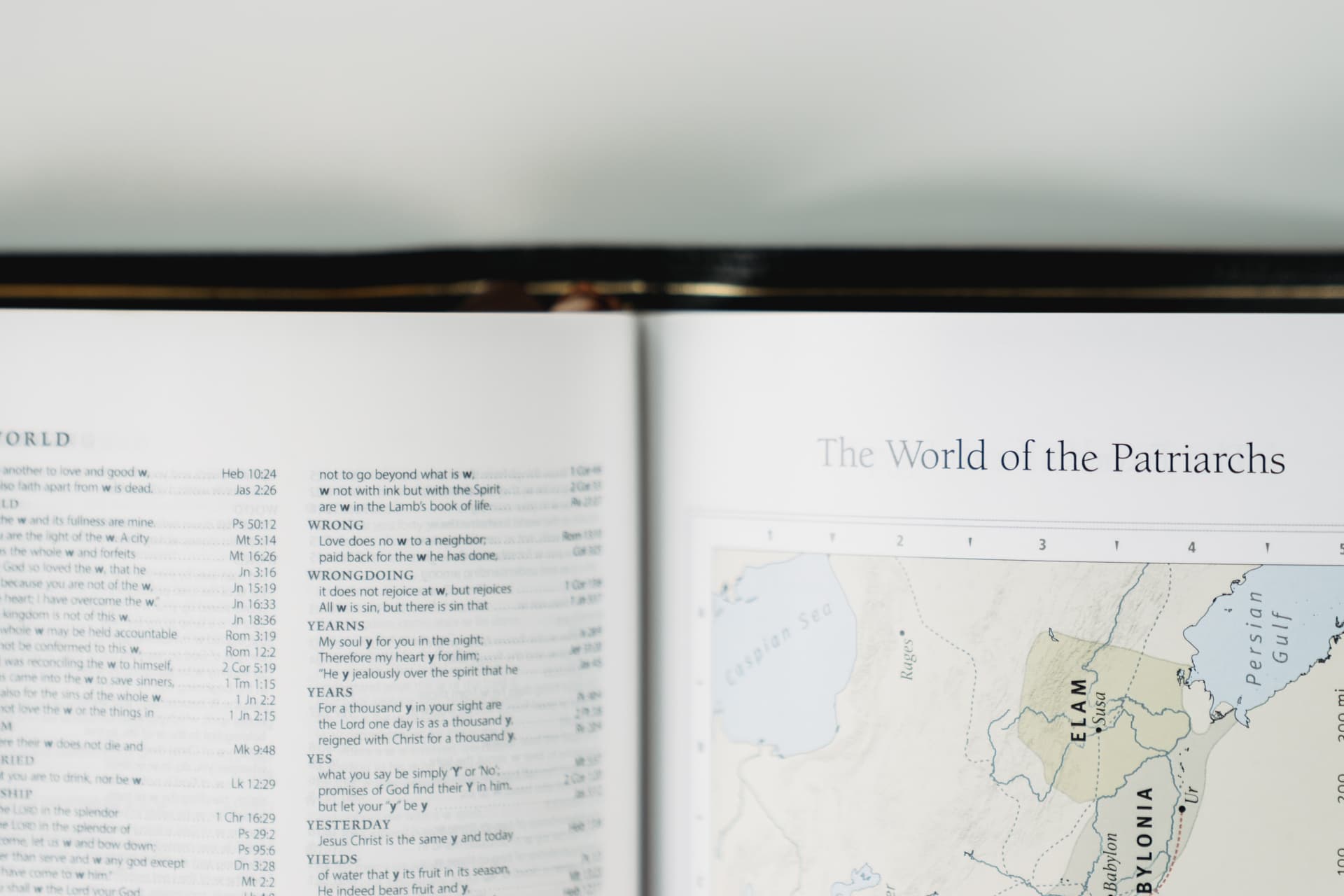
The Heirloom Legacy utilizes a single-column, paragraph-based format, making actual reading one of the most comfortable experiences I’ve come across. In this format, words, sentences, and paragraphs more properly flow from one idea to the next, which helps improve comprehension as well.
I also think the single-column format looks super cool. Not only is it easier to consume and comprehend, but the beauty and eloquence of some of the passages — particularly in the Psalms and Proverbs – come to life in this format. Just holding the book out in the palm of your hand, absorbing the words in a single-column — it brings out a whole new side to an otherwise common book.
There’s a lot of thought put into this single-column format. This bit from the Crossway blog gives more of a background on the format:
The inviting reading experience of the Single Column Legacy Bible was inspired primarily by Robert Bringhurst’s typesetting philosophy in The Elements of Typographic Style. The page layout is based on the Renaissance ideal of a perfect page, which means that there is a measured and precise layout of the text and margins–what Renaissance thinkers considered to be perfect proportions.
An ideal reader’s edition incorporates this philosophy by prioritizing the Bible text and allowing it to be the dominant feature on the page. In order to accomplish this, we chose a single-column format and opted not to include cross-references, introductions, or other special features. We also placed the subject headings in the margin instead of in-line with the text, freeing the reader to engage the biblical text with fewer interruptions.
It’s hard not to fall in love with the Legacy’s format selection.
Crossway opted to use a 9 pt. font size for the Heirloom Legacy. While I don’t think the 9 pt. font is too small, the larger 11 pt. font size found in the popular Schuyler Quentel line would certainly be more comfortable. There’s always a concern of a Bible becoming too thick and too heavy with larger font sizes and a single-column format, so I understand why this particular decision was made. As a whole, the 9 pt. font is comfortable enough, but not perfect.
The Heirloom Legacy’s typesetting is as incredible as its single-column layout. The font is a Lexicon No. 1, size 9-point with ~10.5-point leading and the serif is neither over the top nor understated. My favourite parts are the small capitals used for the word “LORD”, while the thinner capital letters used in the table of contents come in at a close second. The typeface selection here is simply superb.
Line-Matching
The Heirloom Legacy is now printed on a 28 GSM paper,1 making show-through a potential problem for the biggest of nitpickers. However, Crossway has used a line-matching printing technique to alleviate show-through and provide a better reading experience.
There is near perfect whitespace in between lines, eliminating unwanted preceding page serif text obscuring your view. It’s a neat trick to make do with the 28 GSM paper.
Black-Letter Typesetting
As it has been pointed out by other Bible bloggers, red-letter Bibles are not as old as some people think, making them a relatively new phenomenon in the Bible design world. I grew up under the impression that black-letter Bibles were the only way to go, making the difficulty in finding a black-letter-only Bible somewhat of a surprise.
Of course, red-letter text is used in many Bibles to signify the words of Christ. This quickly highlights Christ’s passages and parables and brings them to the forefront in the gospels. However, it also implies that His words are more important than the rest of the Bible — something which I would argue is true, but which I’m willing to bet He Himself would argue against.
The issue with red-letter Bibles isn’t so much the added importance to red lettering, but rather the poorly printed red ink. Too often, red letters appear pinkish, or deeply crimson, or (worst of all) orange-y. It’s difficult to nail a red lettering. So while these premium Bible makers are more likely than others to ensure ink is properly chosen and applied, black-letter Bibles eliminate any possibility of a mismatched red ink.
Warranty
Crossway’s belief in its Heirloom Legacy line is matched with a lifetime guarantee.
Any non-normal wear and tear on the Bible’s leather and book block are covered by Crossway. If your Bible is used to the extent recommended, these types of lifetime guarantees ensure you will use the same Bible for your whole life and beyond.
Wrap-up
I feel a bit fraudulent, reviewing a Bible and all. “Reviewing” hopefully comes across differently when it’s more a look at the book’s design, materials, and binding process.
It doesn’t take a faithful person to see the thought and care poured into the creation of this Bible. The goatskin leather and other premium materials garner that high price tag expectation of perfection, but there is no corner cut or shortcut taken in the making of this book. The goatskin leather has its own character and lifelong durability. The page gilding shimmers different colours in different light. The font and format make for one of the best reading experiences I’ve come across — one other book publishers should research and implement.
Of course, there’s no sense lusting after a Bible when the material inside the book is what matters. You don’t have to break the bank for the message inside to take root in your life.

Yet, there’s something special about owning a Bible with such high quality. If there was ever a way for the words inside to make a tangible appearance, it would be through the precision and care found in the making of the Heirloom Legacy.
This Bible is an heirloom. The Bible is a legacy.
It kind of fits, if you ask me.
You can find both the black and the purple goatskin Crossway ESV Single Column Heirloom Legacy on EvangelicalBible.com. You can also find the black and brown goatskin models on Amazon.
The first generation Heirloom Legacy was printed on a 36 GSM paper, making it an instant classic amongst Bible design enthusiasts. The move to 28 GSM paper was a disappointment for many. ↩