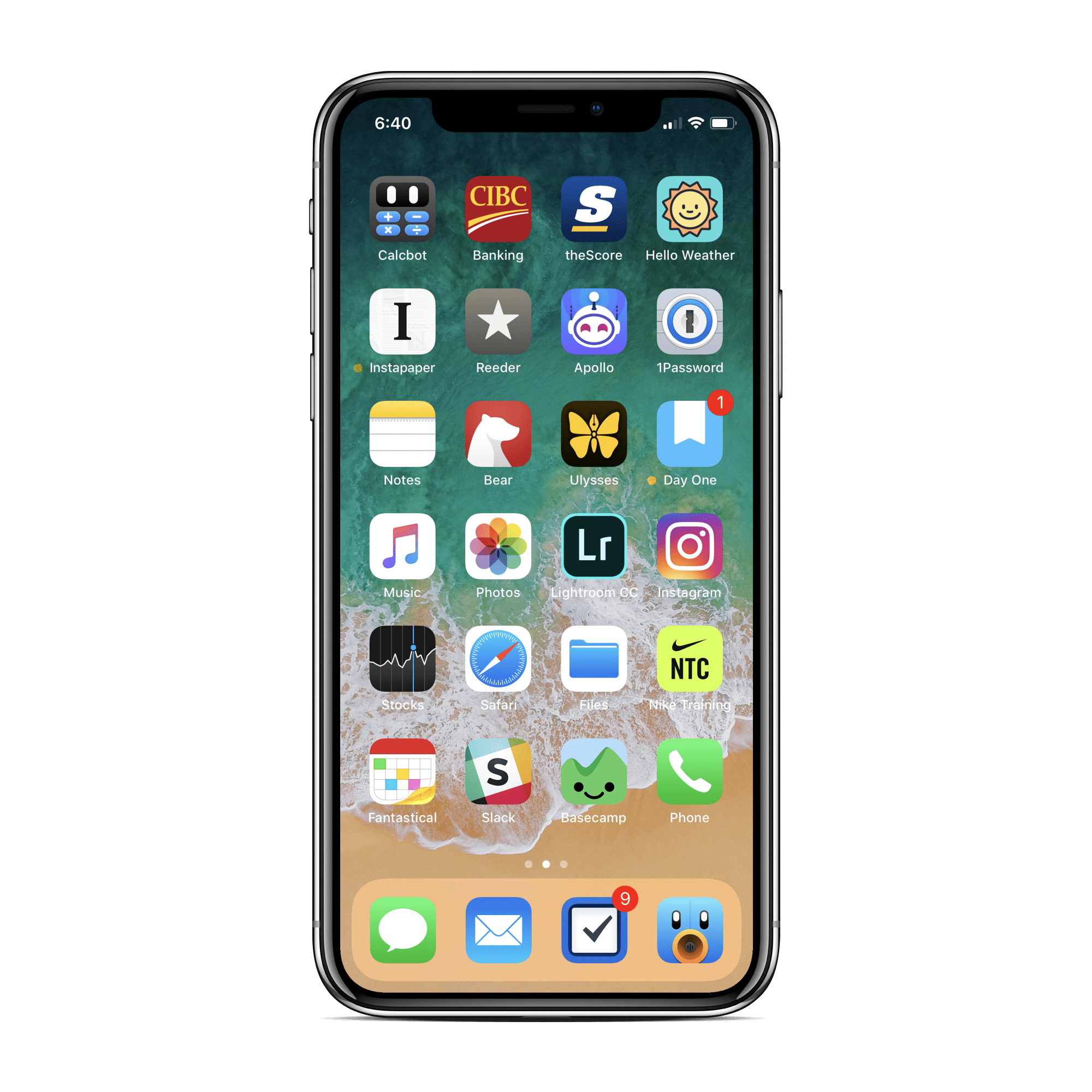
Michael Rockwell’s Home Screens page caught my attention today, if only because it rekindles my old fascination with everyone else’s home screens. Shawn’s has helped re-spark this as well.
I’m a sucker for home screens — the weekly1 Sweet Setup interviews tickled my curiosity just enough to enable further exploring for new apps and workflows for iPhone and iPad. Between The Sweet Setup and MacStories, there are plenty of home screens and workflows for everyone.
I used to post these fairly often back in the day, the latest being October 2015. Here’s my latest home screen:

I’m still developing my full thoughts on the iPhone X, but there’s a lot to be impressed with. I can’t imagine an iPhone feeling better in hand than the X’s combination of glass and stainless steel. The X is a work of art, as is the X’s variation of iOS 11’s typographic theme.
If I have one nitpick, it’s the remarkably bad colour shifting when viewed at non-straight-on angles. For 2017 2018, it seems really bad. I’m also not a fan of the smaller keyboard (the reason I started with 8 Plus a few months ago).
Otherwise, it’s my favourite iPhone yet. So much fun to use.
“Formerly” weekly, actually. We’re working on getting the series going again. ↩