I’ve spent the entire evening inside — it’s that time of year. The time of year where the snow has left and the dead, brown, dry earth eagerly awaits warmth, rain, and some sunlight.
Life, right now, is a bit drab.
It’s times like these that require a reminder about the beauty looming on the horizon. A few photos and some encouraging thoughts help push the calendar forward, be it toward an incoming goal or just the promise of leisure.
For me, Cereal is that little reminder.

I talk about Cereal a lot here. The editing crew has the most seamless sense of taste, design, and style I’ve ever come across. The photography in every guide book and in every volume is perfectly placed within a well-defined scope. The same for any highlighted locations, products, and styles.
But up until Volume 11, I never cared for the words. They were a bit ethereal, utopian. The volumes, as a whole, are well-intentioned and blissful, so this criticism is far from fair. The words and thoughts, though, never struck me as purposeful. Again, well-intentioned. But not necessarily impactful.

I get it now, though. I’m not sure what it took. Maybe it was reading every word. Maybe it was a historic look at the Shinkansen. Or the seemingly divine study of St. Kitts.
Now, when I view Cereal, I read it too.


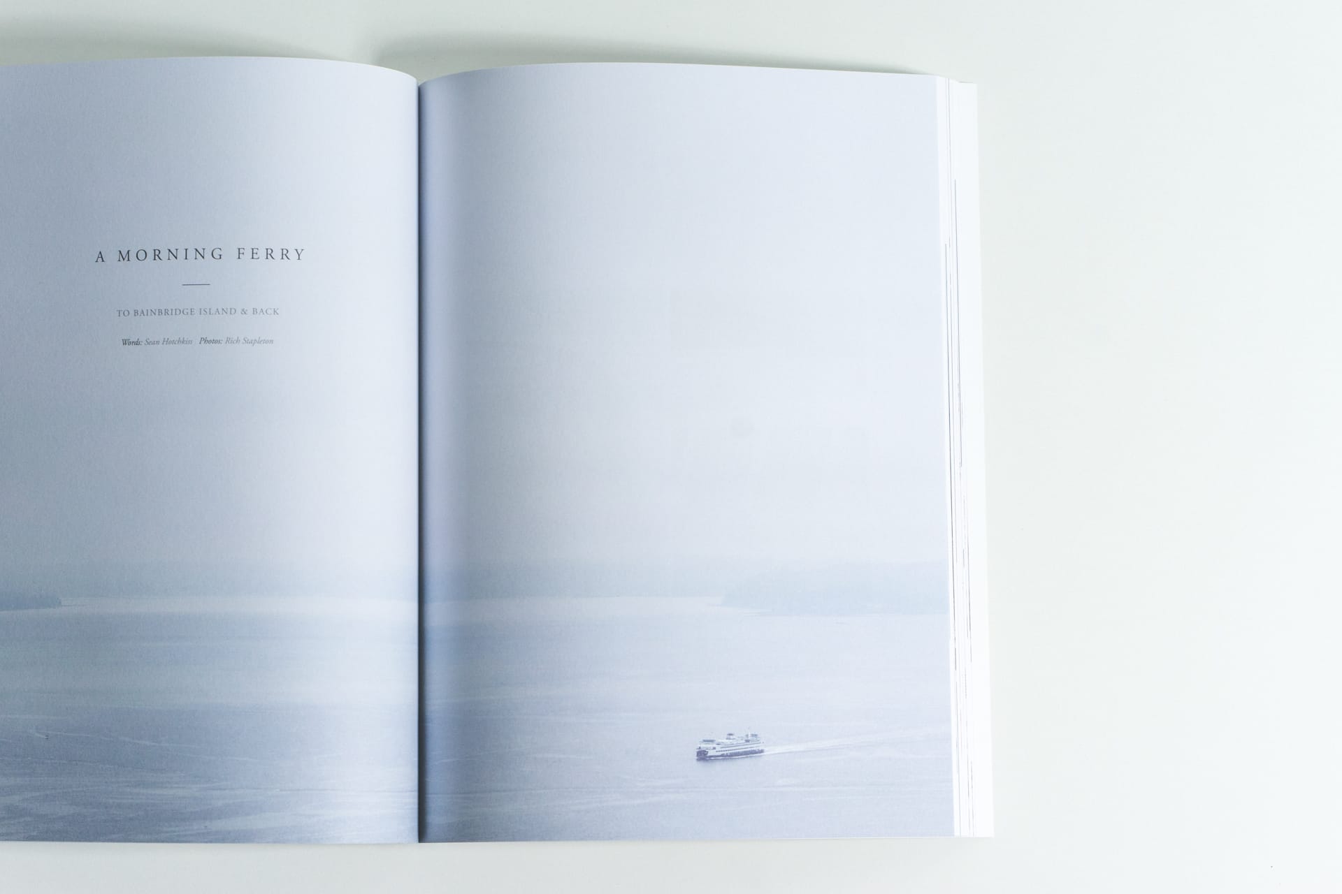
Volume 11 is a stunning collection of imagery, insight, and recollection. Cereal’s Spring 2016 edition takes a fairly in-depth look at Tokyo and its inhabitants. From the aforementioned Shinkansen to a magical interview of Muji’s art director, the section on Tokyo is some of the best creative work I’ve seen from any publication, anywhere.
Little in Volume 11 could possibly measure up to the masterful Yosemite photo essay in Volume 10, but the illustrations in “Another World” take Cereal’s ethos to a whole new level. How the editorial crew thought of this section and the method in which the watercolour illustrations are delivered is a testament to the publication’s brilliance.
Seattle, Vienna, and Fogo Island are also explored, but to a lesser extent than Tokyo. All are well-photographed and tactfully written, but the highlight of this publication is Tokyo.
Volume 11’s “Curated” section also comes on the heels of my favourite “Curated” list from Volume 10. Timepieces outweigh shoes in my mind. That hasn’t changed with Volume 11.
Lastly, I want to heap some praise on Cereal’s choice of advertisements in its latest edition.
Me? I hate ads. They’re always tacky ploys for my attention, unwilling to let go of profit to stay within the confines of the publication itself. That little ad above? It’s a weakness, I will admit.
But Cereal is different.
Take Serif TV as an example. Samsung sells the largest variety of flatscreen televisions, yet its creative Serif TV graces Cereal’s pages. It’s a tactful ad, perfectly targeted at the ultra-discerning (and, perhaps, the ultra-wealthy). It takes a special set of tastes to put your product in a publication like this, and somehow the multitude of ads don’t distract from the message.1 I researched at least five different companies who put their ads in Volume 11, and one of those companies is on the tippy-top of my wishlist.
This is how you advertise.

Perhaps my love affair with Cereal is a bit irrational. All of my inspiration comes from these pages these days, though. I aim to emulate the work of Cereal’s contributing photographers, and I hope their stylish words play a part in how I write these days.
I think Cereal’s effect on my creative life should be announced, though. It’s been profound, for the good and the bad. The good in finding style and purpose in my photography and written work, and the bad in wanting only the very, very, very best products and experience. My pocketbook doesn’t like Cereal.
A publication like this deserves to be saved for a Sunday afternoon scotch and cigar. Alongside the mossy taste of a proper scotch and the sweet aroma of the cigar, Cereal finds a way to delight the other three senses.2 Volume 11 is my favourite piece of work from the Cereal crew and I’m eagerly awaiting their September edition.
Well, OK, maybe one advertisement distracts from the book as a whole. Although the Hermès ad and photograph on the back cover is beautiful, it’s overdone. It causes the UPC barcode to be moved to the spine instead of on the backside, where it’s been on other publications. Cereal Magazine is a business, I get it. But I think its readership and advertising base has become large enough to charge more for internal ads — or to make the book one or two pages longer — for the sake of keeping its vision clean and pure. ↩
Yes, the way the pages feel in your fingers is incredible and I love the sound of a thick paper book being flipped from front cover to back cover. ↩