There must not be much demand for developers to adopt the iPhone 6 Plus’ new landscape options. Three months after the release of the new iPhones , only 8 of the 23 apps on my homescreen have been optimized for the 6 Plus’ landscape orientation. Of those 8 apps, 4 of them are stock iOS apps. While I understand there are development tradeoffs to be made to implement the 6 Plus’ landscape screen, I really hope to see landscape optimization become more mainstream in the future.
I’m more surprised than I am concerned. I’m not a developer, so there may be development quirks that I don’t understand which inhibit the adoption of the 6 Plus’ unique landscape features. Or maybe developers have experimented with these landscape options and they just don’t fit their apps appropriately.
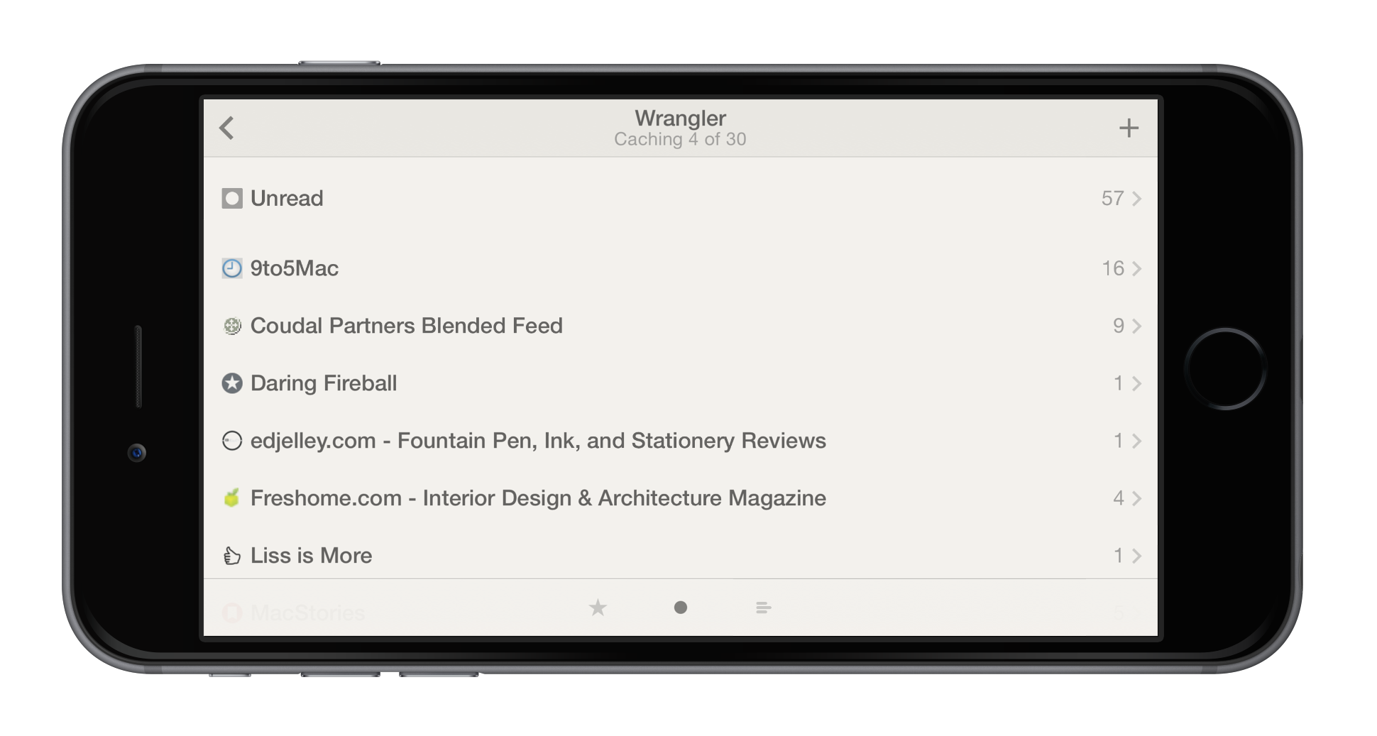
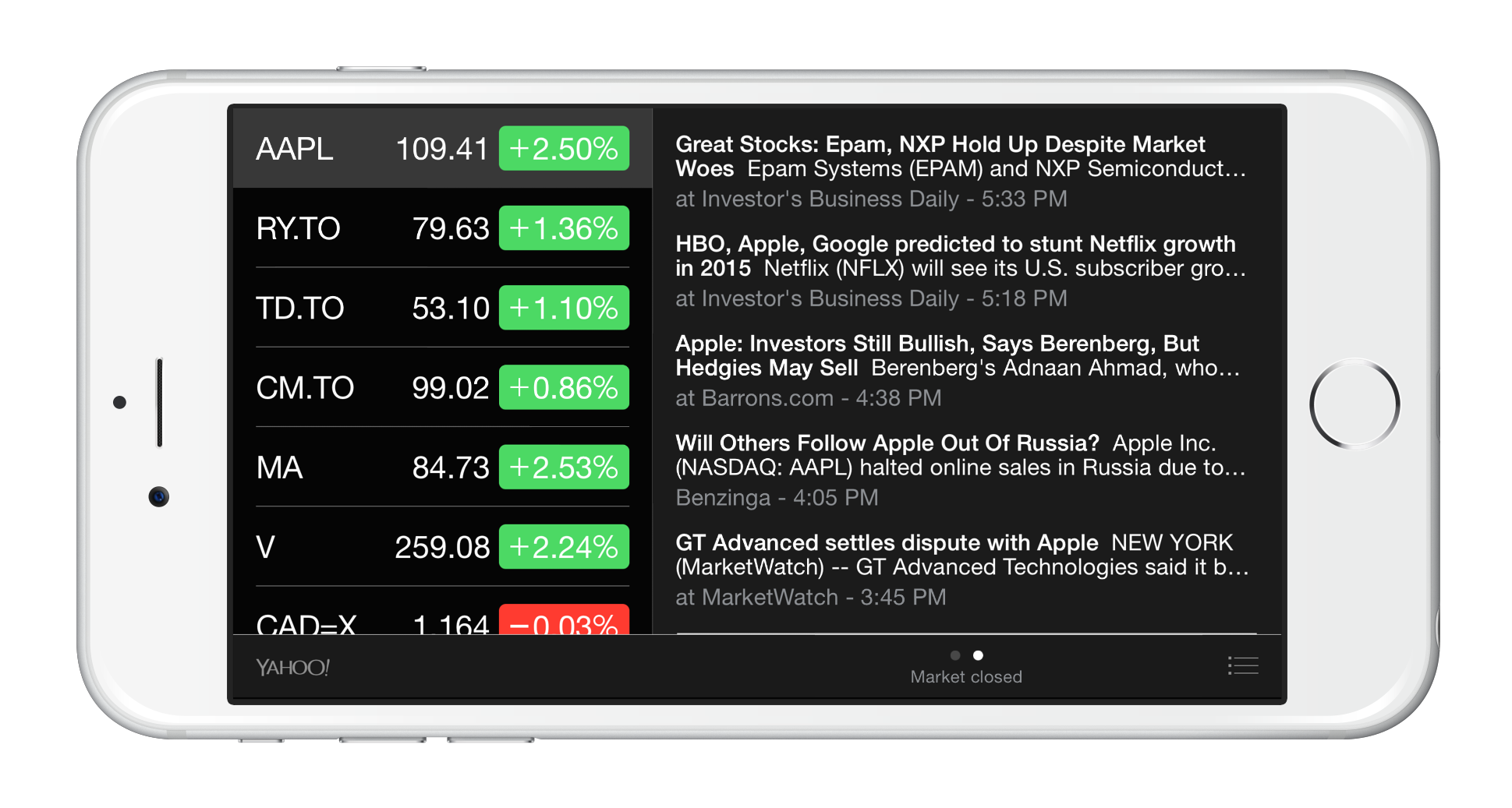
Either way, I’m surprised this screenshot is allowed to live:
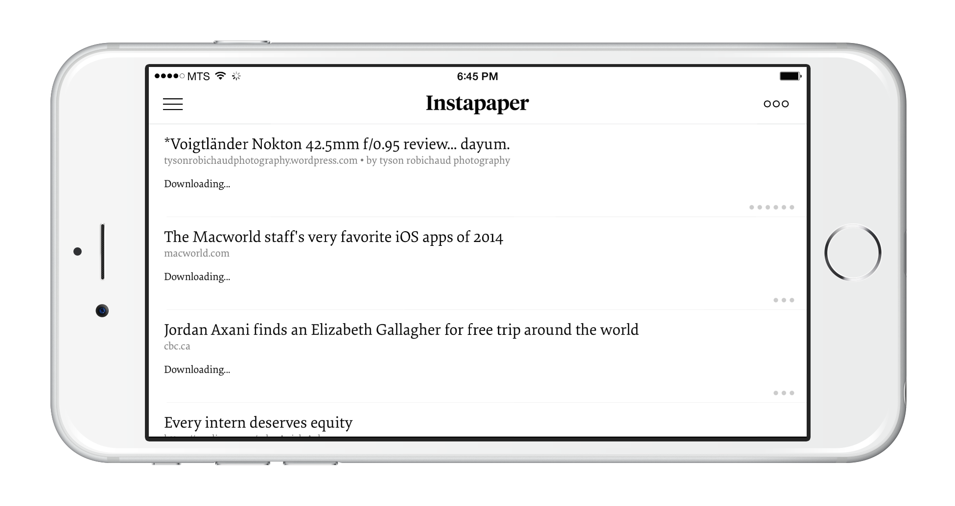
Or this screenshot:
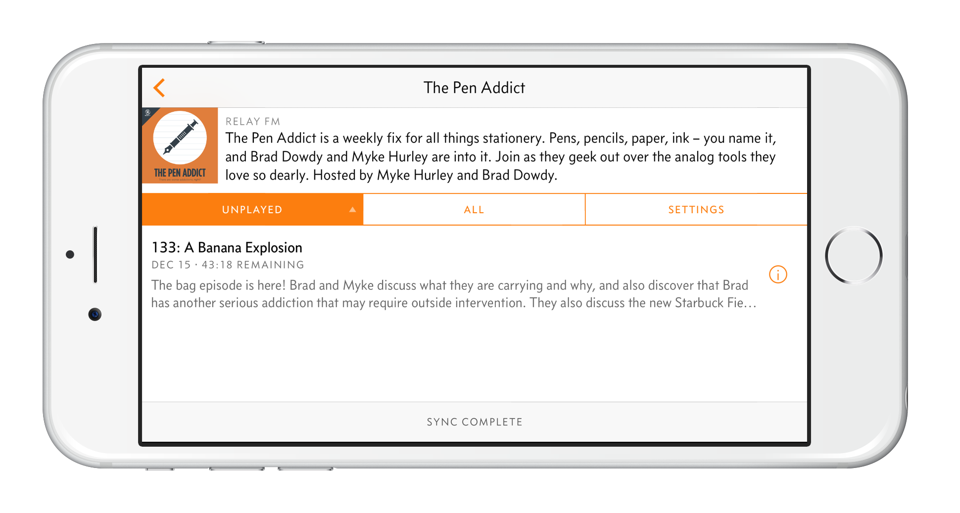
Or even this screenshot:
I may find myself in a very small subset of users who enjoys using the 6 Plus in landscape. Due to the size of the phone, I find the 6 Plus to be quite top-heavy in portrait, especially if I’m trying to use the phone while laying flat on my back.
To combat the 6 Plus’ size, I like switching to landscape and using both thumbs to navigate lists on the left and content on the right. In fact, this has become my default orientation for quickly processing email and iMessages, or for skimming through Pinboarded articles and stock market news.
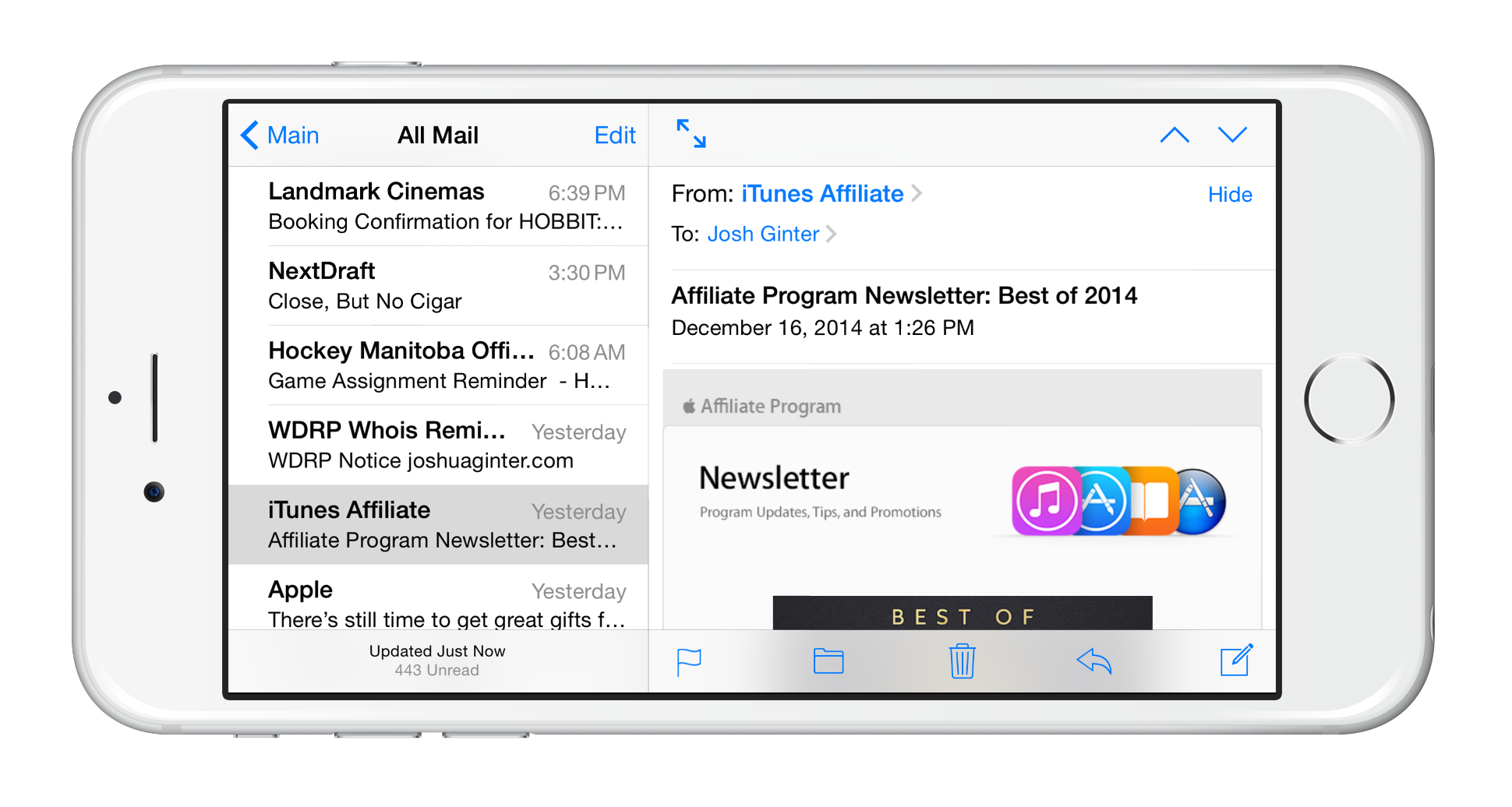
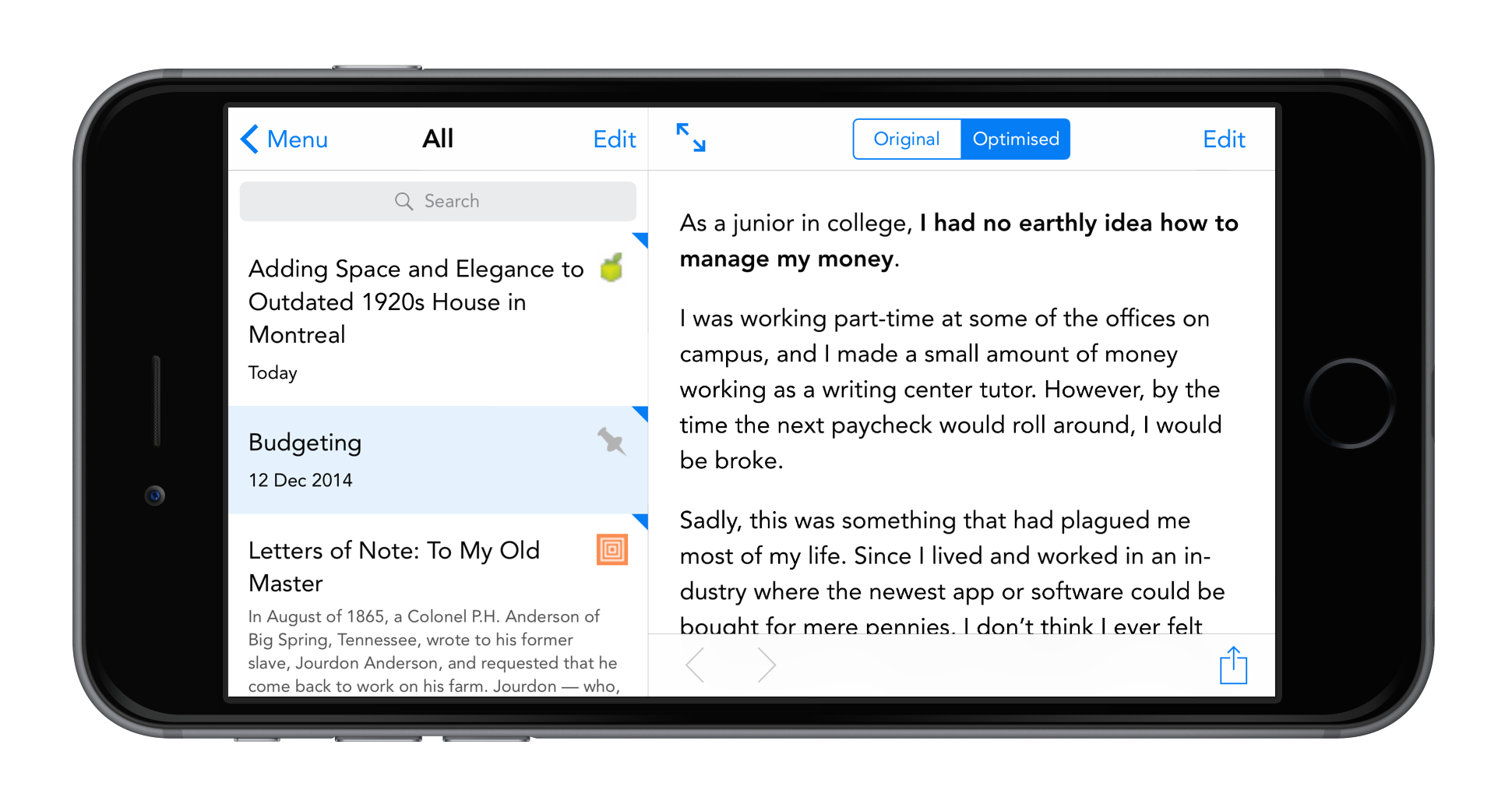
By navigating with my left thumb and scrolling through the content with my right thumb, I can limit the number of screen transitions iOS goes through to navigate to the next view. For example, Apple’s Mail app provides you with a list of emails in portrait mode and then transitions to a full screen view of the email when you tap the email in the list. In landscap, however, the screen transition disappears and the email loads immediately on the right side of the screen. While less content can be displayed in a list format, getting through that content is less tiresome because less is going on on-screen.
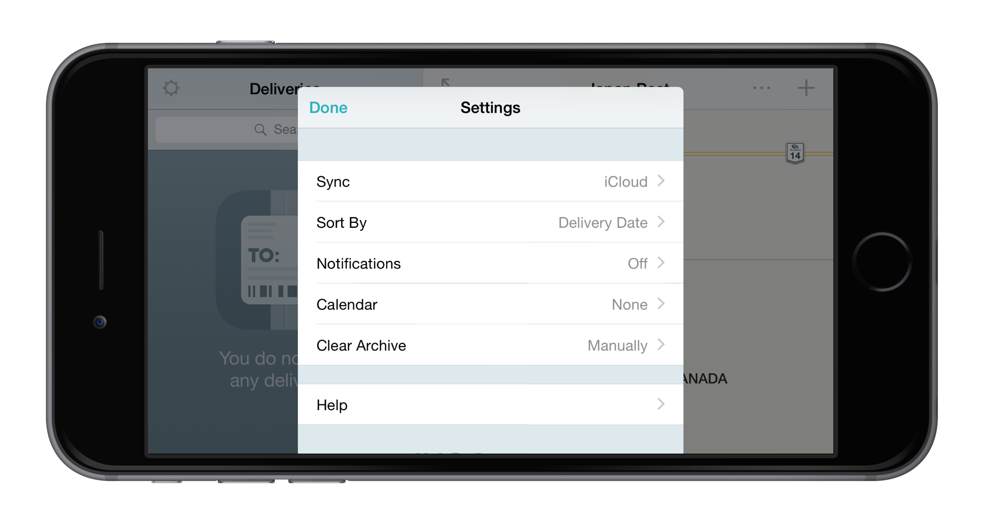
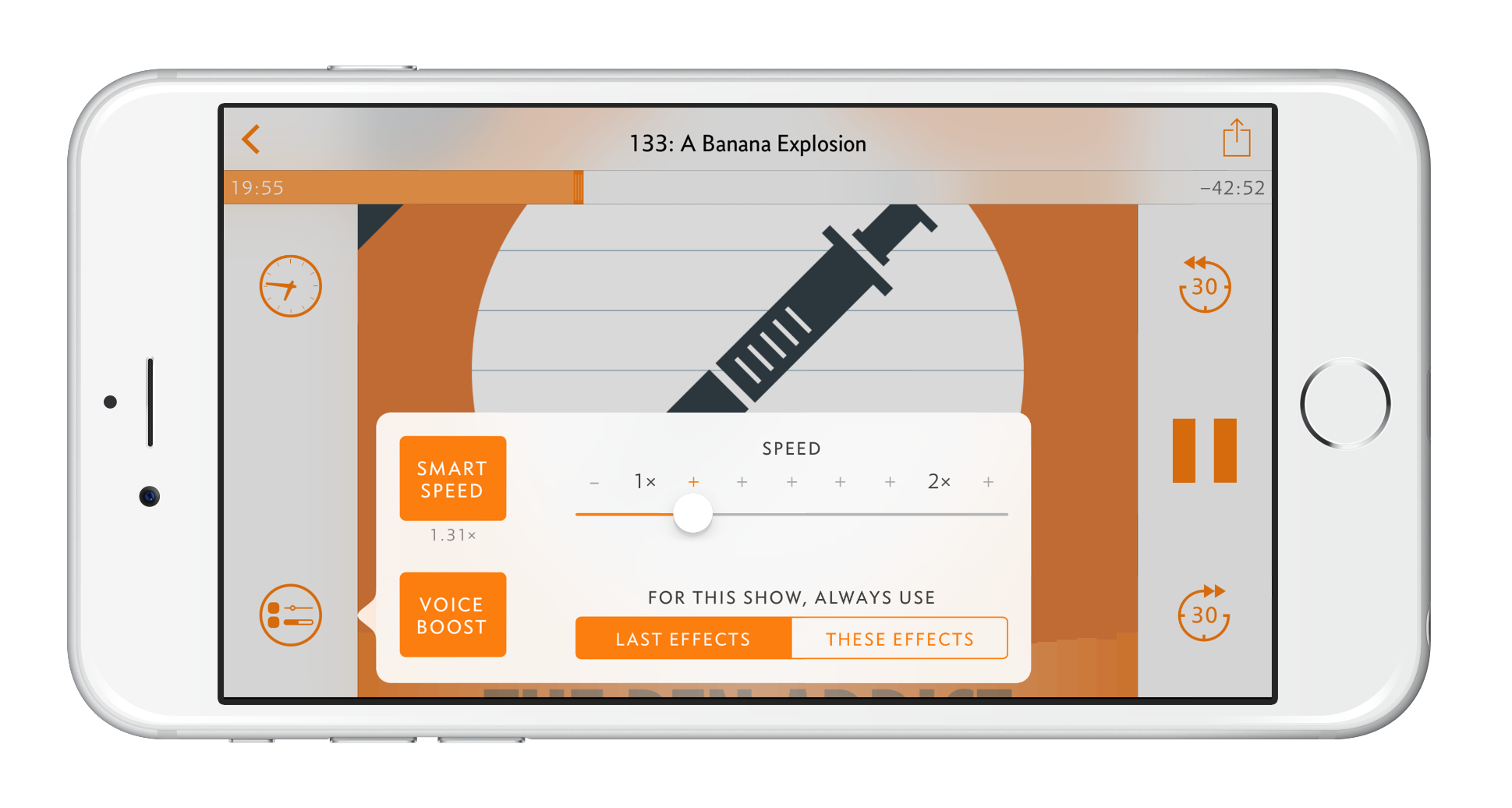
I also like how some apps have adopted pop up bubbles for adjusting settings and options. Deliveries and Overcast1 both make use of these pop up bubbles to change playback options or to change settings. A full screen view of settings would be a waste of screen space in these instances and I’m glad to see some adoption of these landscape features.
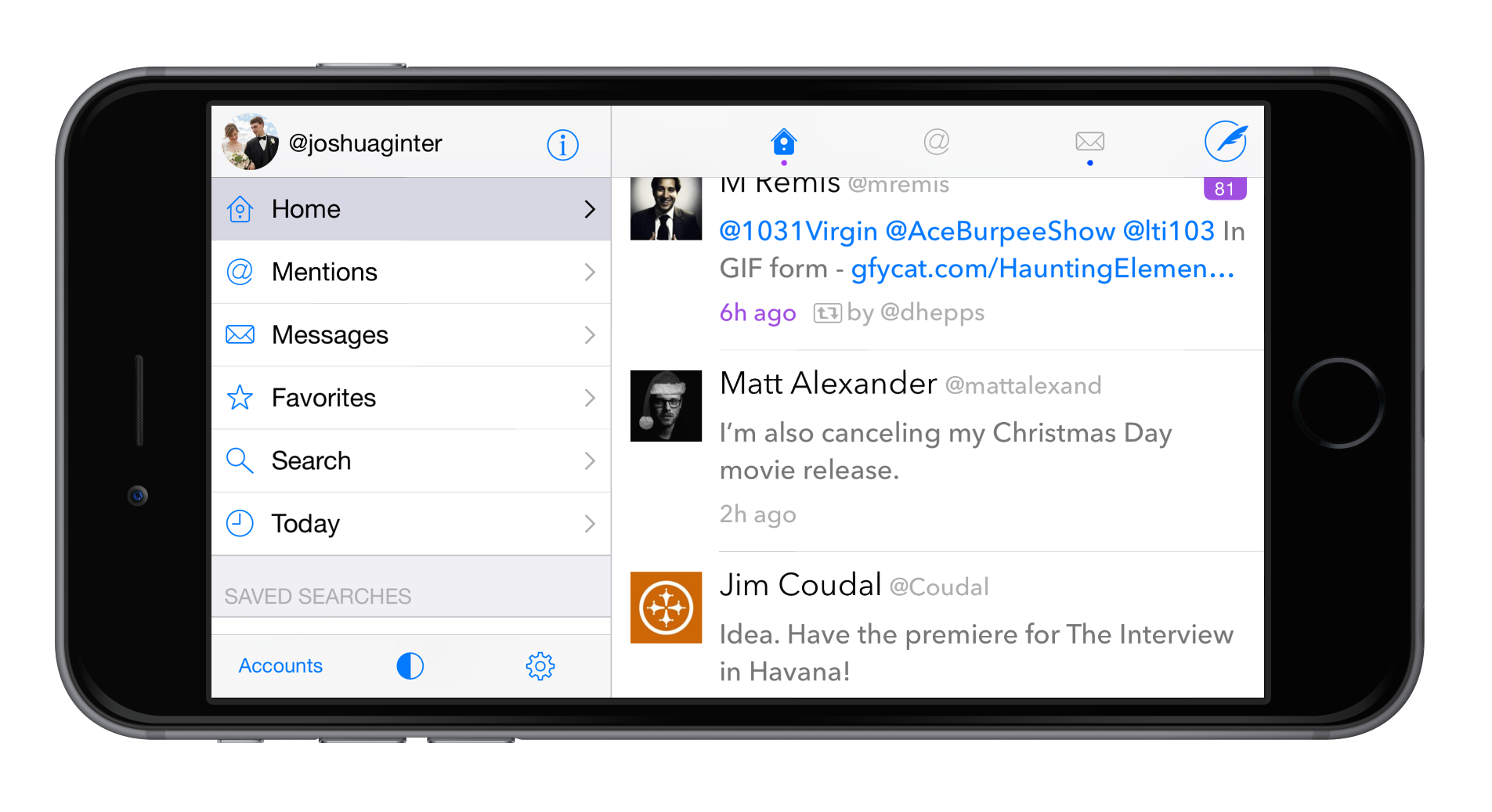
Some apps have jumped aboard the landscape optimization and I applaud them for their efforts. I am a very big Tweetbot fan on both the iPhone and iPad, but I have Twitterific installed on the iPhone because of its landscape options. When browsing Twitter in bed, I much prefer Twitterific’s landscape split-screen view over Tweetbot’s portrait waterfall view. I find it more comfortable to hold my iPhone in landscape while laying down, so I’ve made app choices that accomodate how I use my iPhone.
I’m sure much thought has been put into deciding if Tweetbot is best served with a landscape view. While I’m not an expert, you can definitely put me in the crowd who wants to see Tapbots adopt the new landscape features.
Apple hasn’t helped the iPhone 6 Plus’ landscape screen with iOS 8’s landscape keyboard. As everyone knows, the keyboard is terrible. But I can’t see the landscape keyboard being enough of a deterrent to keep developers away from landscape support in general.
I have really tried to stress here that I don’t understand enough about application development to know whether these landscape options are the correct features to adopt. I have no doubt that developers weigh the pros and cons of development, investment of time, and balancing of other new features when they consider a landscape view. Maybe developers have pushed landscape support off to the side for the time being to catch up with other iOS 8 features. Either way, I’d love to see more landscape modes created for my favourite apps.
There’s no doubt there is a world of interface development on the iPhone 6 Plus that has just hardly been tapped into at this point. I hope developers find landscape support to be a worthwhile investment in the foreseeable future.
And if they forgot about this feature, well, consider this a friendly reminder.
Overcast’s main landscape list views give the impression the entire app isn’t optimized for the 6 Plus’ landscape screen. However, Overcast’s playback screen is second to none for optimization. I love how Overcast’s use of buttons on the far left and far right of the landscape screen allow your thumbs to comfortably navigate the entire view. There shouldn’t be any thumb cramping when listening to your favourite podcasts. ↩