For quite some time, Reeder was the go-to iOS app for reading RSS feeds. Reeder excelled with Google Reader compatibility and Silvio Rizzi’s app gained immense traction in the iPhone’s early days. Because of its strong foothold back then, I can’t seem to let go of it now.
When Google Reader was cut out of Google’s plans, Reeder went into a stunned reactionary period. Rizzi’s meticulous development work caused Reeder to sunset in favour of apps like Unread or Mr. Reader. Reeder’s incredibly slow development forced users elsewhere, and the resulting debate between RSS apps of choice has never been bigger.
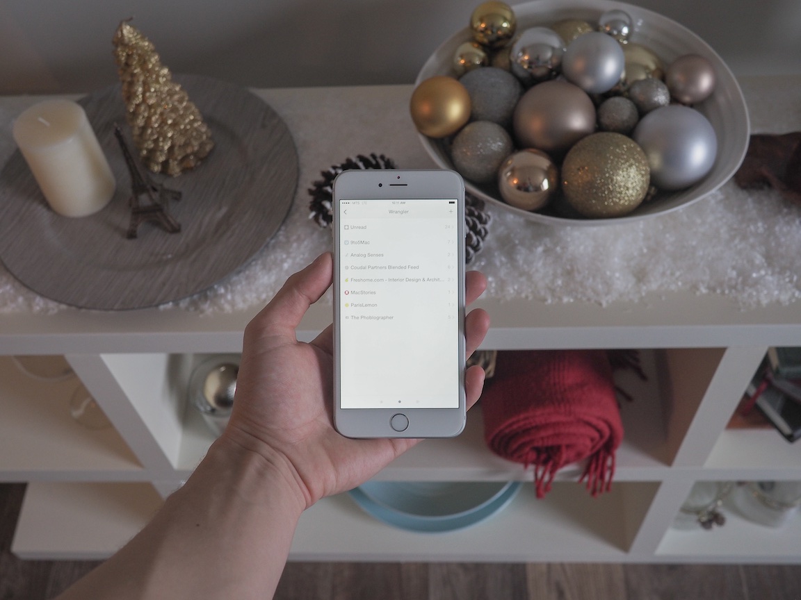
However, through thick and thin, Reeder has been there for me. I fell in love with Reeder due to my initial use of Google Reader and I’ve had a difficult time switching to any other app for my RSS needs. I now use Feed Wrangler to manage my RSS subscriptions and I couldn’t be happier with Reeder’s speedy interface.
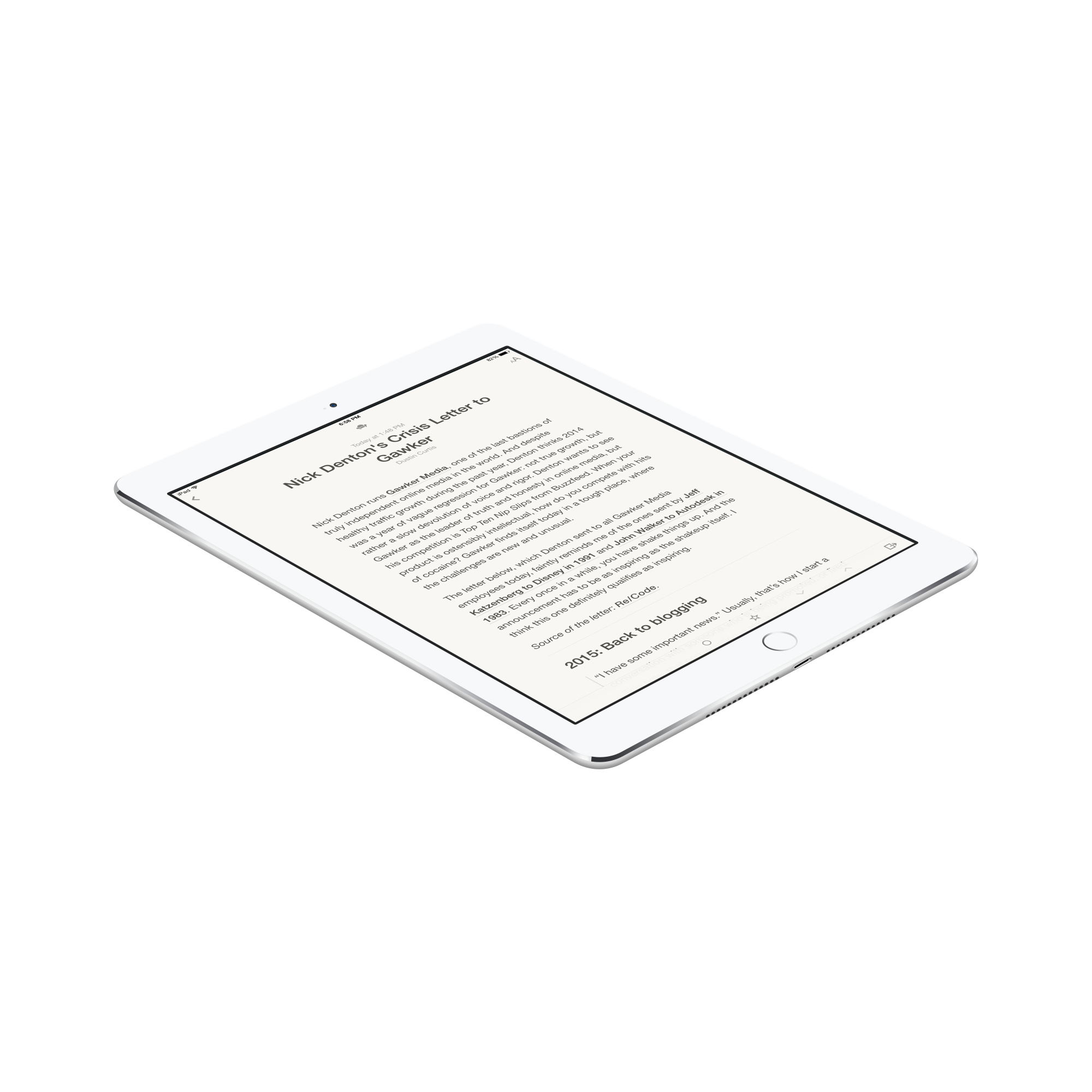
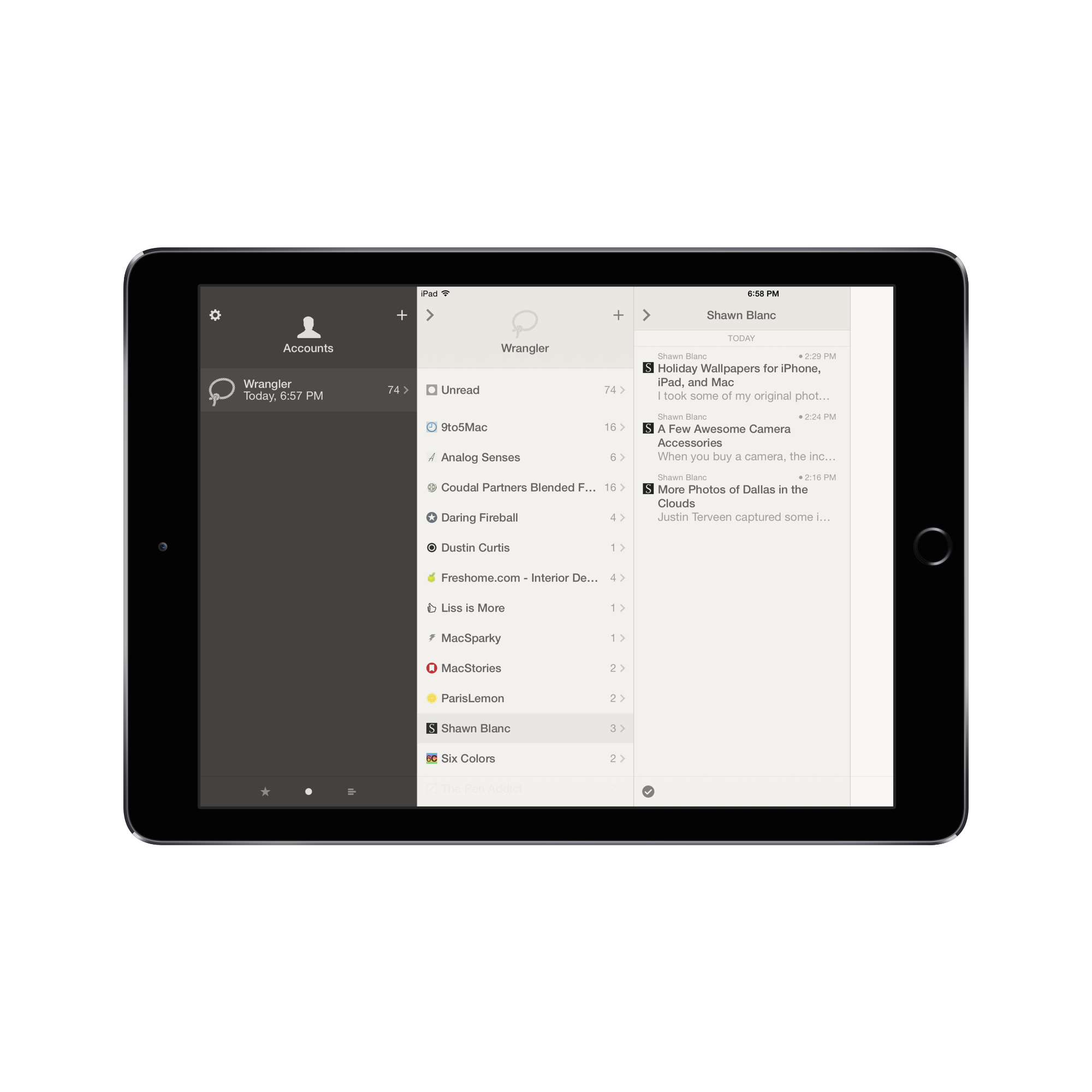
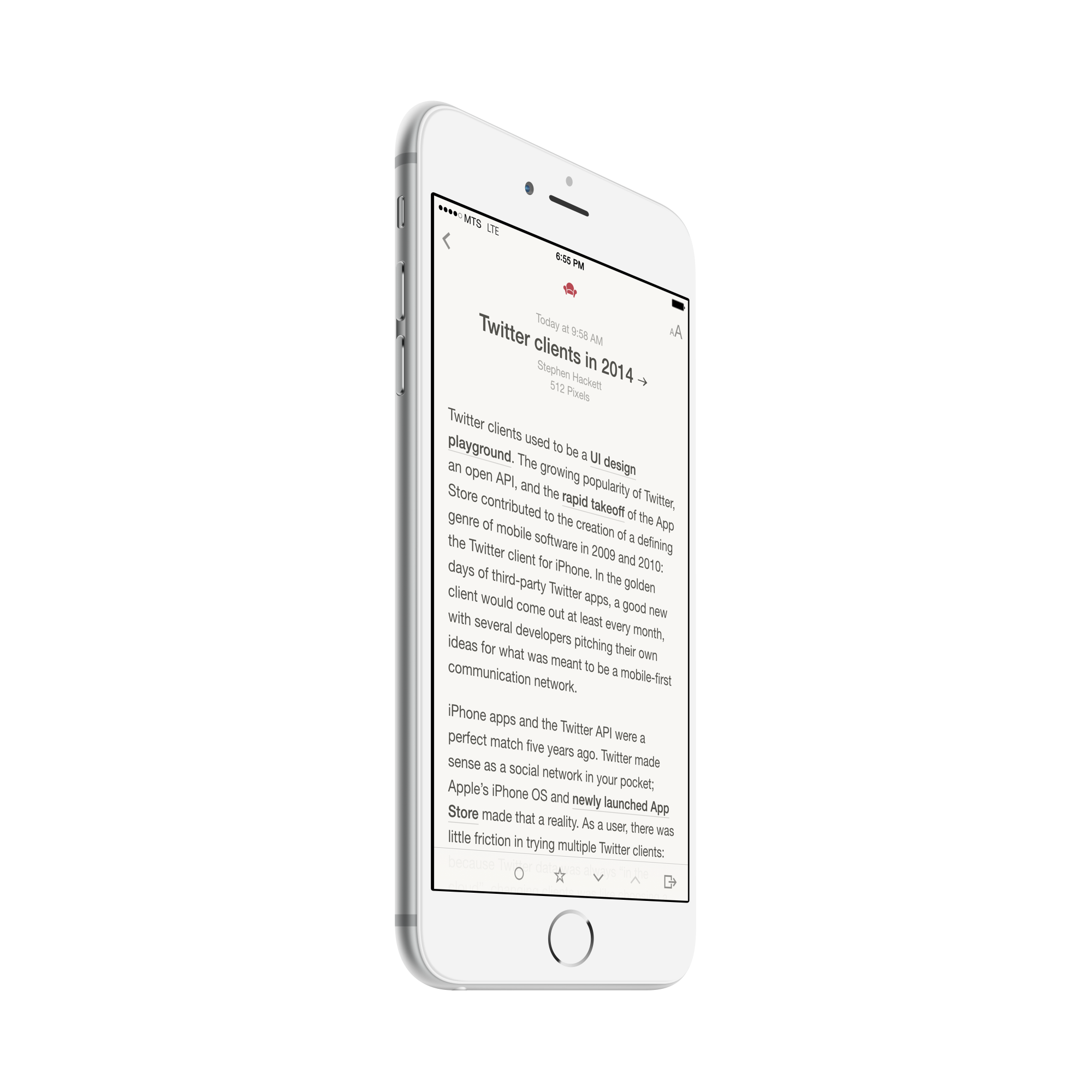
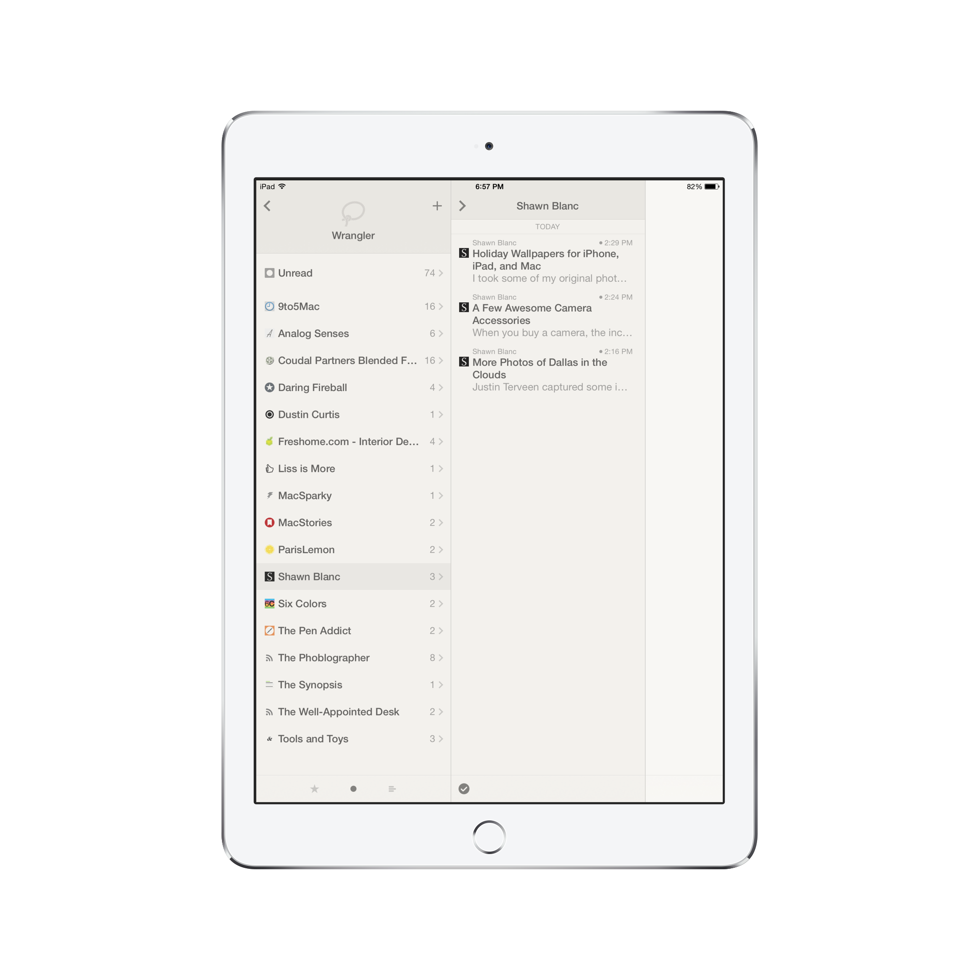
Reeder has a very minimal design and makes heavy use of Helvetica type. Buttons to navigate between different lists line the bottom of list views, while buttons to mark articles as starred or unread line the bottom of reading views.

Reeder for both the iPhone and iPad comes with four different themes for your viewing pleasure. You can find these themes in any reading view.
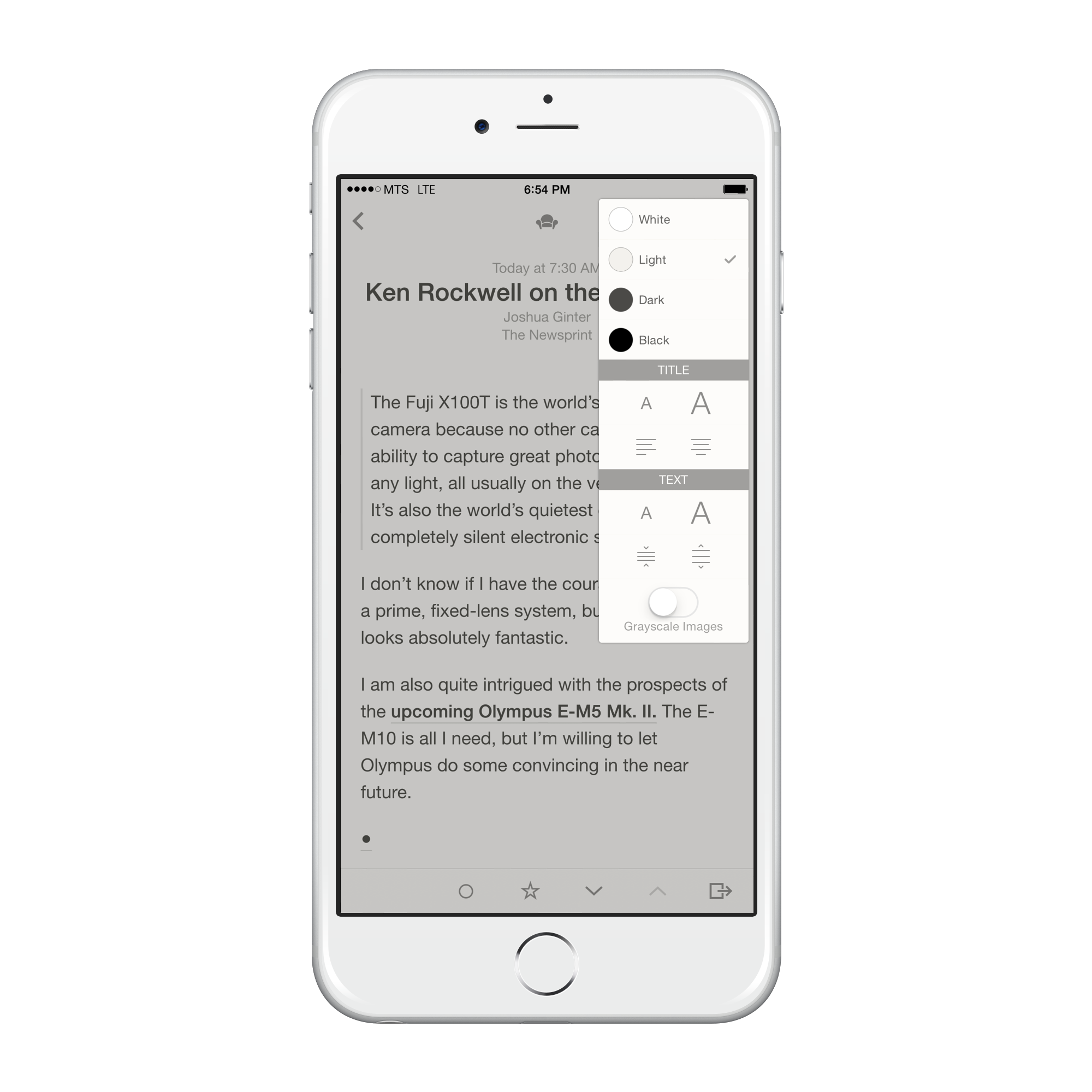
I prefer the default Light theme as it isn’t too bright when I’m in a low light situation and it’s easy on the eyes everywhere else. The classic earthy-grey Dark theme is also quite pleasant, if you prefer such things.


Reeder makes extensive use of list views to manage your subscriptions, unread articles, starred articles, and accounts. These lists are simply navigated by sloppy swiping from left to right. On the big iPhone 6 Plus, this sloppy swiping navigation is extremely important for a healthy navigation experience. If I had to reach across the screen to navigate backwards, my thumb would cramp up instantly.
These article lists have a cool swiping feature that allows you to quickly curate your feeds. I have my options set so I can swipe right to mark the article read and I swipe left to send the article straight to Instapaper. Swiping to curate lists is the single factor for my love of Reeder — if Reeder didn’t possess this ability, I would jump aboard the Unread boat in a heartbeat.

On the same note, if Reeder’s only job were to read my RSS feeds, I would also switch to an app like Unread. Reeder’s actual reading experience isn’t all that great, as the standard Helvetica font isn’t particularly inspiring. Moreover, the entire reading view lacks that sort of pizazz that many users have come to expect thanks to Unread.

I do like the extra wide images in Reeder’s reading view though. Colours and images pop beautifully.
The few customizable options that are available make the reading experience decent enough for me to be happy. I’ll put up with reading experience so long as I can have Reeder’s great menu system.

When reading an article, Silvio Rizzi has put a unique share sheet in the bottom right corner of the screen. This share sheet can be customized in the settings and allows you to share your articles to a multitude of services. I have my menus set up with the options I use most often. For the few times I use a sharing option that isn’t in my list, Reeder still maintains the ability to access iOS 8’s system-wide sharesheet under “More…”. I really appreciate the ability to have a quick sharesheet of my most used services but still being able to access that awesome iOS 8 sharesheet without hesitation. Like the rest of Reeder, I get the best of both worlds.
Reeder also has a Readability option. I don’t use Readability all that often, but it’s a great way to quickly jump to a linked post’s actual content and maintain the simple, stripped down reading experience we’ve come to love. Readability is also noticeably faster than Reeder’s browser and, although the page view doesn’t load for the author of the content, I like the way Readability maintains design uniformity when reading.

Speaking of that in-app browser, Reeder allows you to swipe right to left to bring up the actual webpage of the current article. I can’t stand Reeder’s in-app browser. I find it slow, clunky, and relatively optionless compared to other RSS in-app browsers. If at all possible, I prefer to swipe to my sharesheet and open the article in Safari so I can take advantage of Safari’s tabbed browsing and zippy speeds.
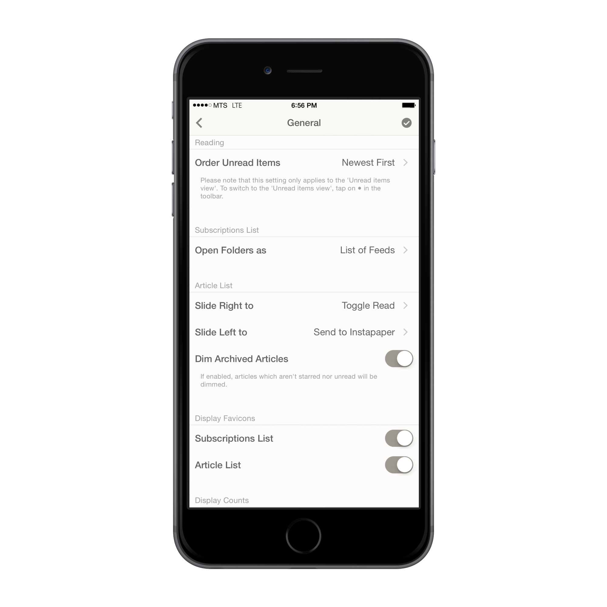

Reeder’s settings menus are just that: settings. There are options for customizing your sharesheet, setting up your RSS accounts, and choosing what your menu swipes do. These menus maintain the design aesthetic found throughout the rest of the app and I have little to no complaints regarding this aspect of Reeder.
Despite my relative unexcitement for characteristics like Reeder’s in-app browser and general reading view, I’m still drawn to Reeder for my RSS needs.
It all boils down to speed. Reeder’s ability to swipe articles straight to Instapaper in the unread list, or to swipe articles as read, makes curating my RSS feeds less of a chore everyday.

While Unread may be more elegant and conducive for reading, and while Mr. Reader may be more powerful, I find Reeder to be a happy medium between the two. Reeder looks pretty great — especially with the default Light theme — and its unique sharesheet customization makes it easier to get interesting content to a multitude of other platforms.
If you’re new to RSS, I recommend Reeder as a great starting app to determine how you use RSS. From there, other apps may be more appropriate.
For me, Reeder it is. And Reeder it always will be.