There really is only one option for digital journaling these days. Day One is not only the best journaling app, it’s one of the best apps on the iOS App Store period.
I’ve talked a lot about Day One in the past. I incorporate my analog journal into Day One and I really like Day One’s awesome Publish feature. However, despite talking about it so much, I’ve never given Day One itself a true review.
You’ve undoubtedly read a thousand reviews of Day One by now. I’d like to think I have something new to add to the conversation, but I’m sure I don’t. Day One is one of those few apps that can be used however you like — although “journaling” may be at its core, the app is so much more than “Dear Diary” each day.
Like so many other people, Day One rests at the pinnacle of my iPhone and iPad. It’s one of the first apps I put on my devices and it will be an insta-buy when 2.0 is released in the future.
More so than any other app, Day One is me. It houses many of my deepest thoughts and feelings and it keeps all of that information secure and private. I don’t know if the app could fulfill its purpose any better.
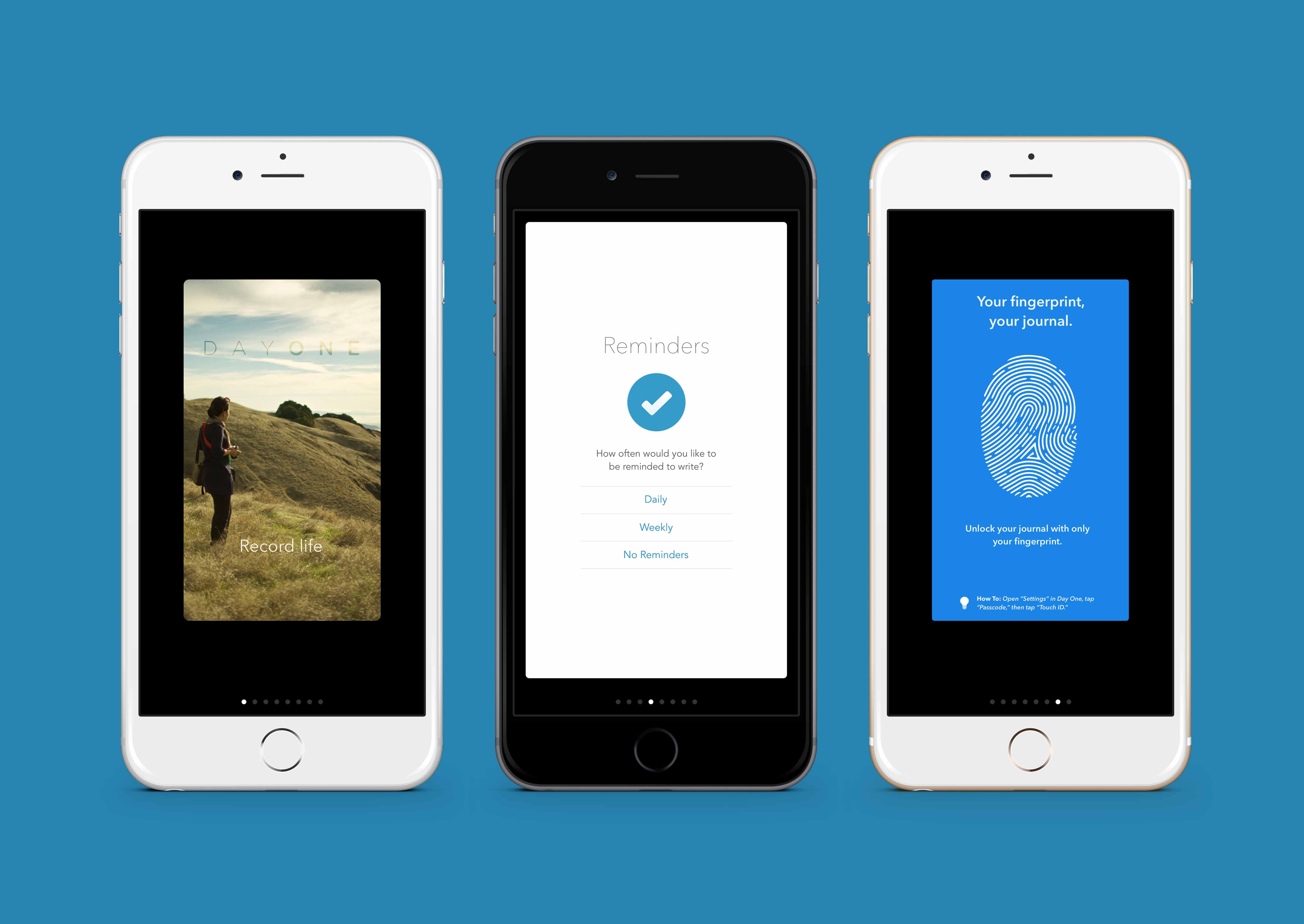
After opening the app for the first time, Day One welcomes you with some sweet welcome screens. The neat sound effects and subtle animations make these welcome screens a joy to wander through. They’re so good, in fact, that there’s an option in the settings menu to replay them.
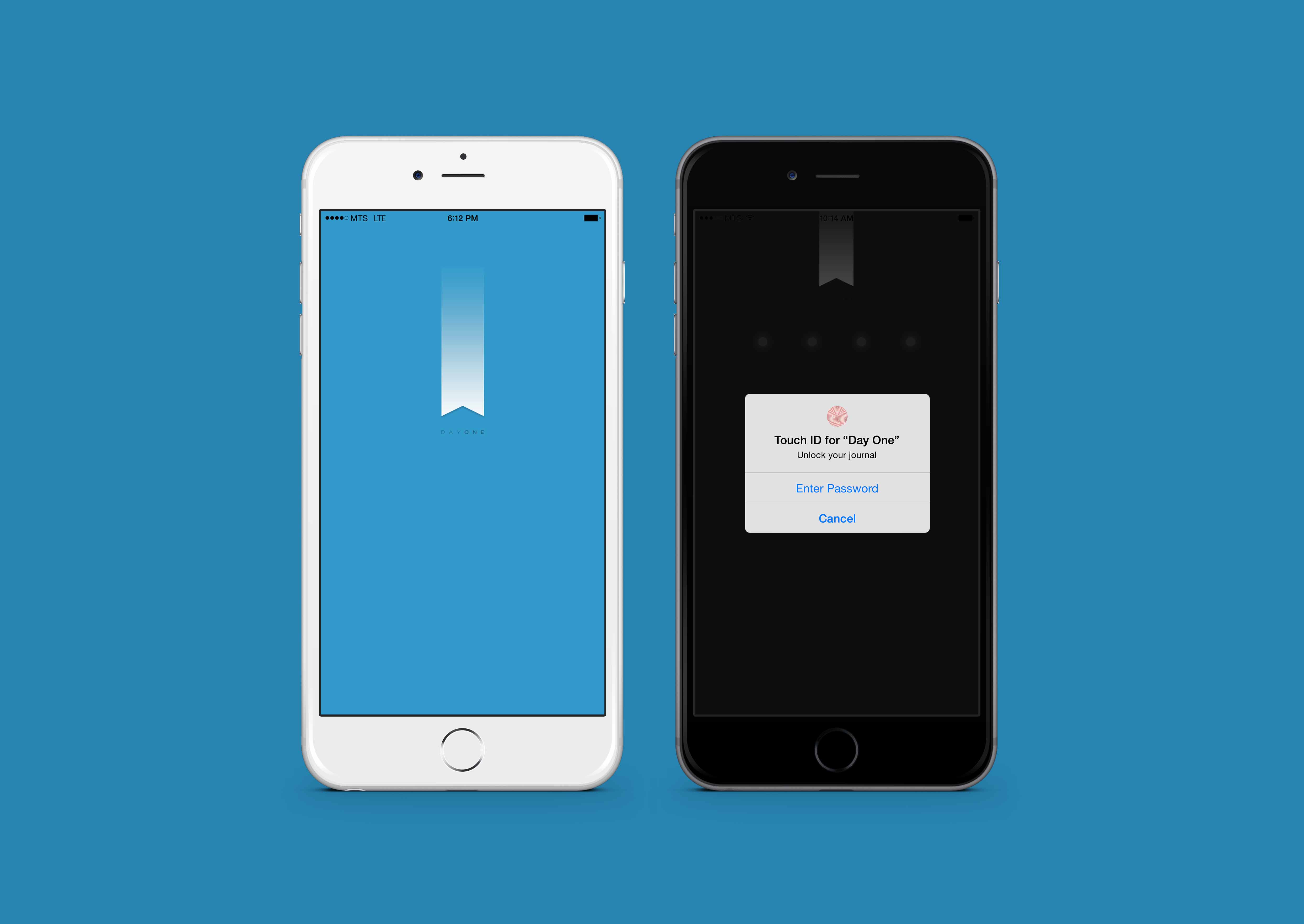
Day One’s startup screen and Touch ID implementation are top notch. Although it seems hard to mess up Touch ID’s usefulness, Day One certainly doesn’t disappoint with the new iOS 8 feature.
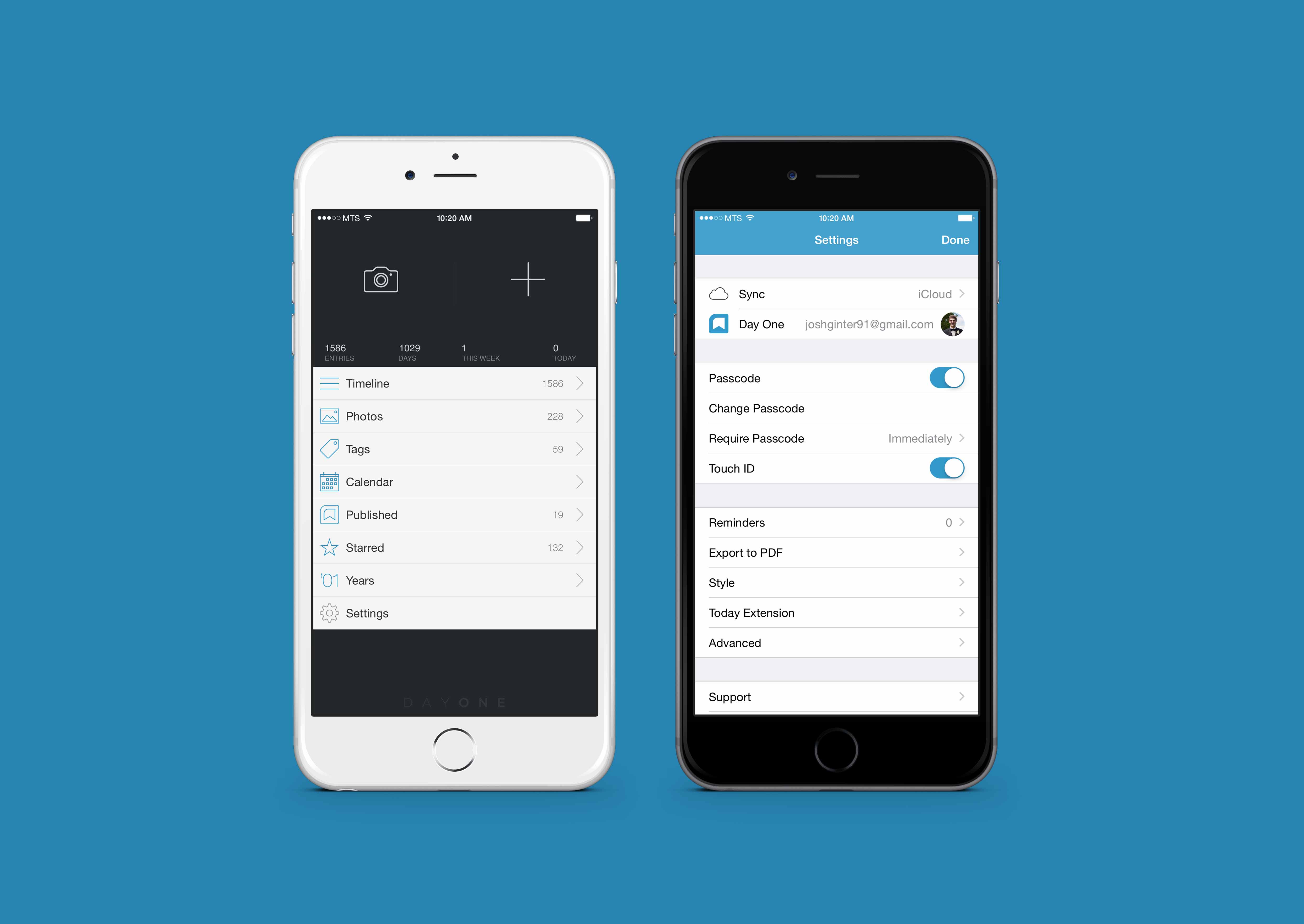
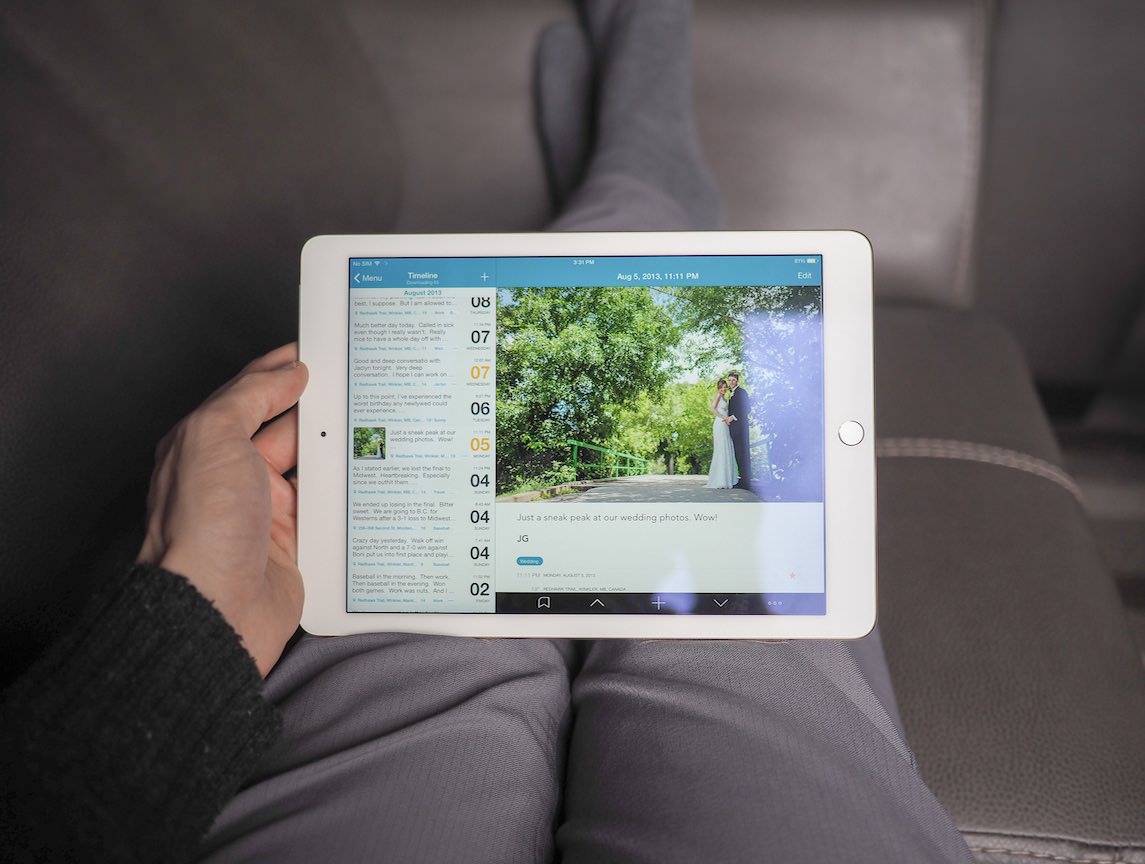
After getting through the locked gates, Day One’s menus are easy to navigate and easy on the eyes.
The main menu has hardly changed since the very first iterations of the app. I remember launching the first major update (don’t ask me for the date) and being impressed with the large buttons to create new text and photo entries. While the menus make navigation a breeze, Day One makes it clear from the onset that journaling is more important than reading your diary.
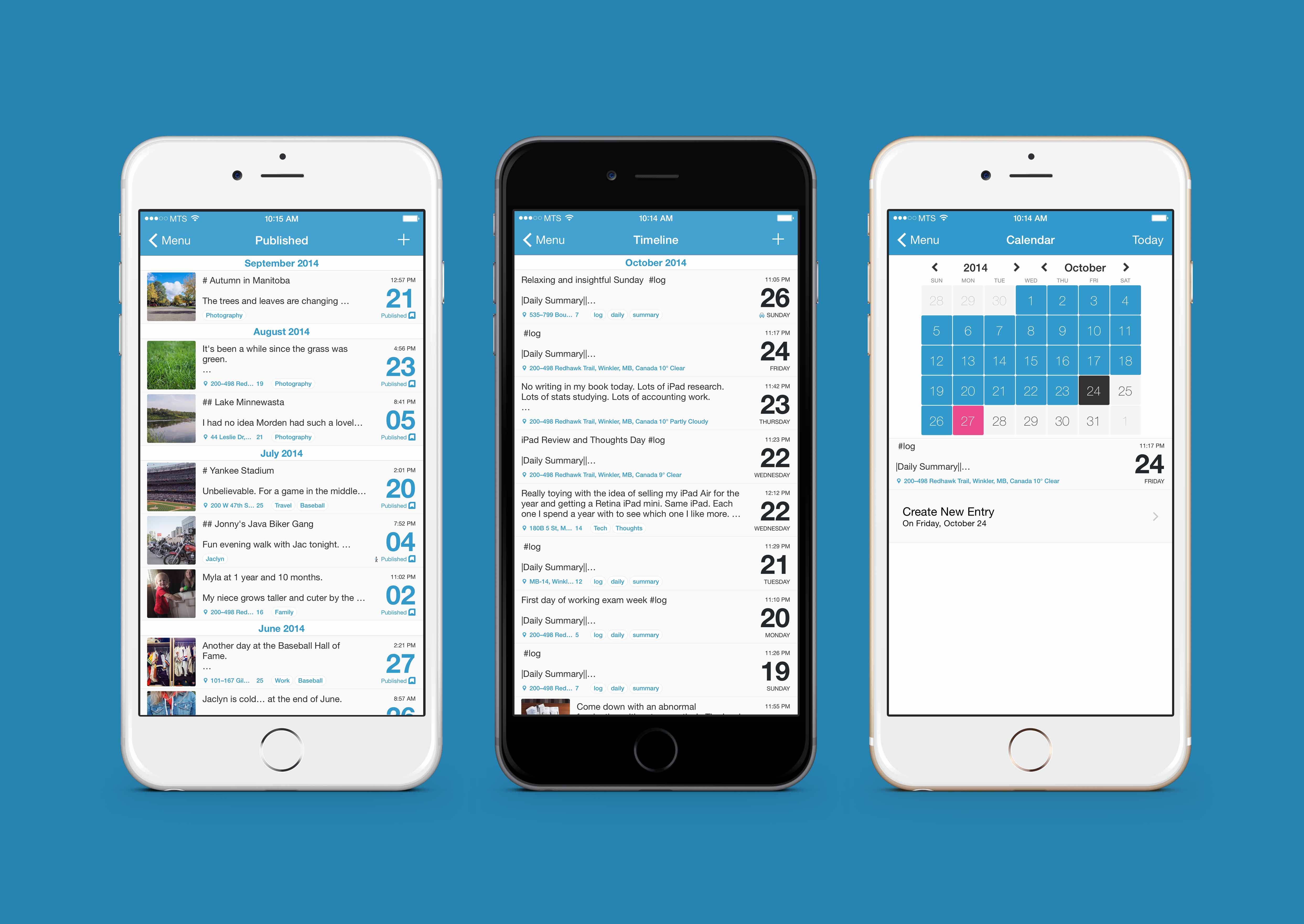
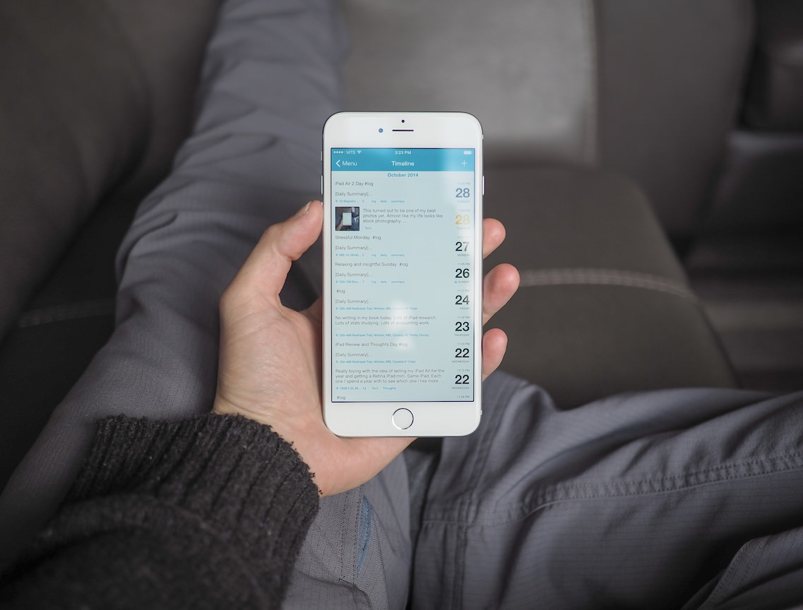
Menus on the iPhone app are stellar. The calendar view is extra useful for navigating back into past years entries. Every now and then I’ll find myself wandering through a rabbit hole in the calendar view and my wife will catch me with a tear in my eye. Rare, but it happens.
Paul Mayne and the Day One team have also incorporated a neat Publish feature into the main menu. Publish allows you to take a private journal entry and share it via a beautiful, semi-private webpage. Publish generates a unique URL for your published entries and the URL can be shared via social networks (Tumblr is my personal favourite), emails or messages. I’ve found Publish extremely useful for showing off my favourite photographs or sharing my latest locations. Fortunately, Publish has its own menu and managing your shared entries is a breeze.
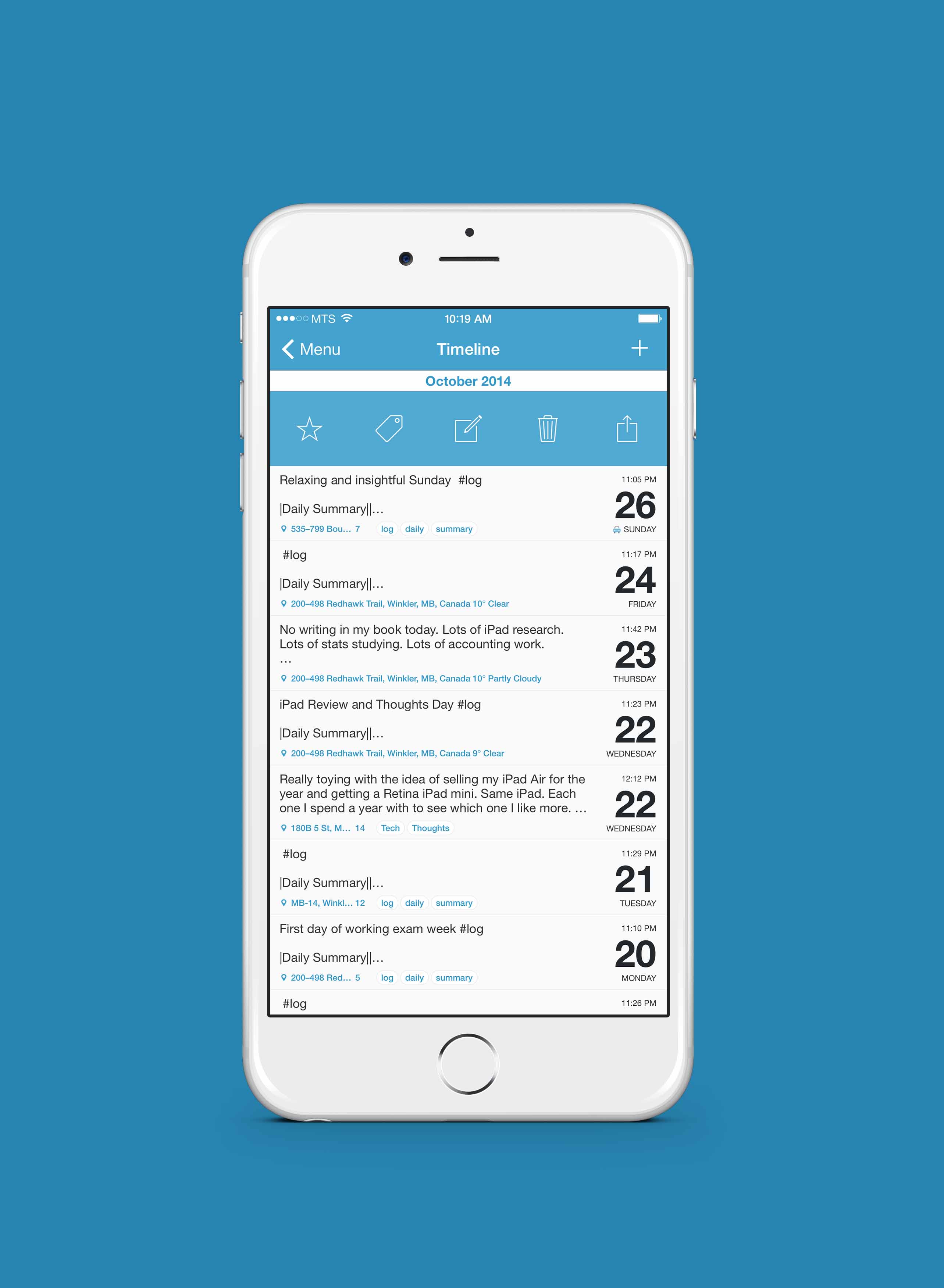
Despite the usefulness of these menus, they aren’t without fault. As of today, Day One’s menus preview unaltered Markdown text, meaning any markup you’ve done in your entries isn’t immediately noticeable. I have no doubt this will be fixed in the future, but it marks the single hiccup I can find in Day One’s visual appearance.
Like many other apps, you can act on an entry right within the menu. Quick, plain and simple.
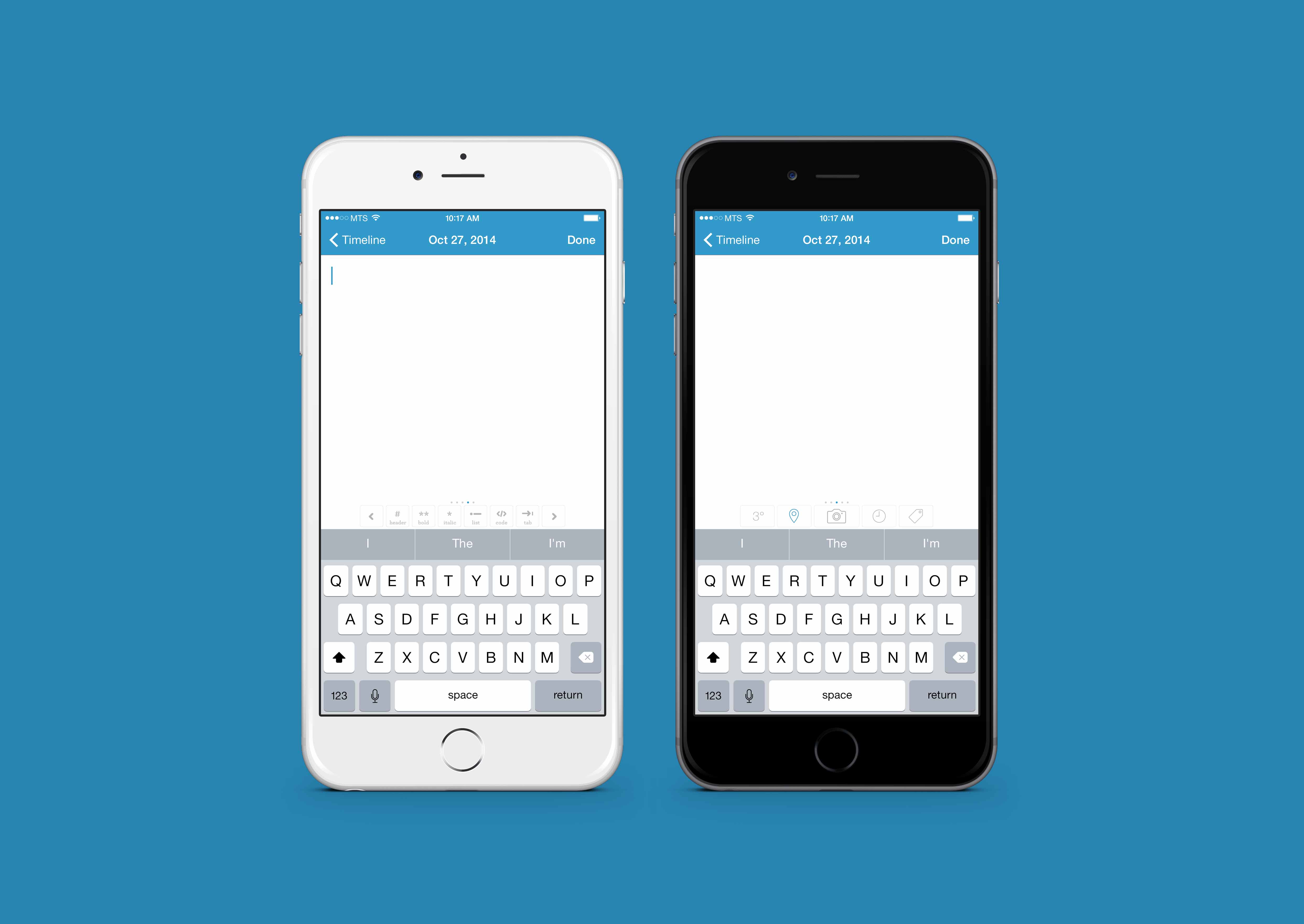

Most important is Day One’s writing experience. Little gets in the way when jotting your thoughts into Day One’s archives. A quiet toolbar that lets you quickly input Markdown markup or to quickly tag and star your entries lays above the keyboard. Tap on a quick tool, hear the unique sound and write onward. Without a doubt, Day One’s aesthetic extends into its writing mode.
Swiping all the way to the right of that toolbar shows an option to go full-screen. I love Day One in full screen mode. Full screen writing in Day One leaves nothing to distract from your thoughts and feelings.
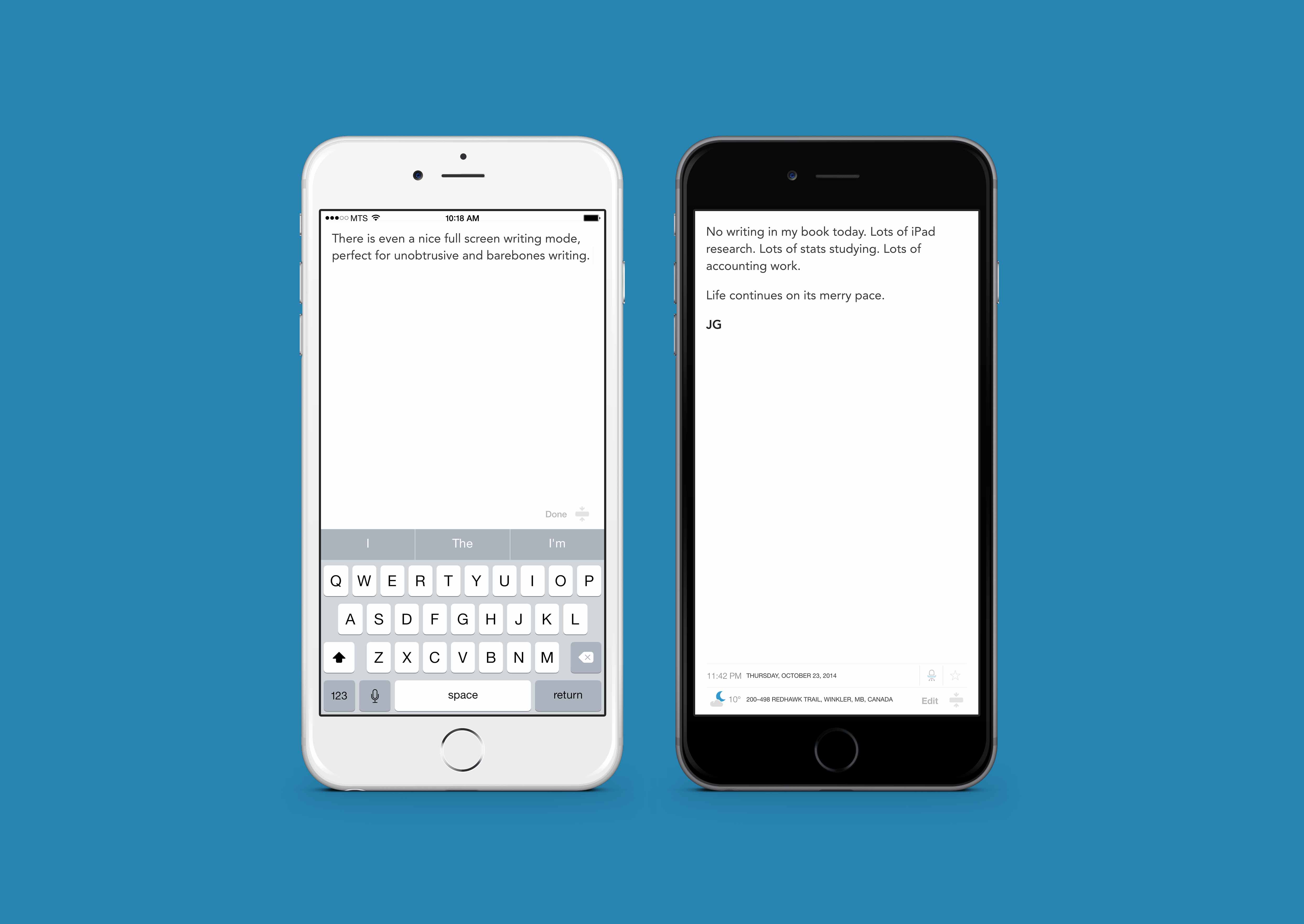
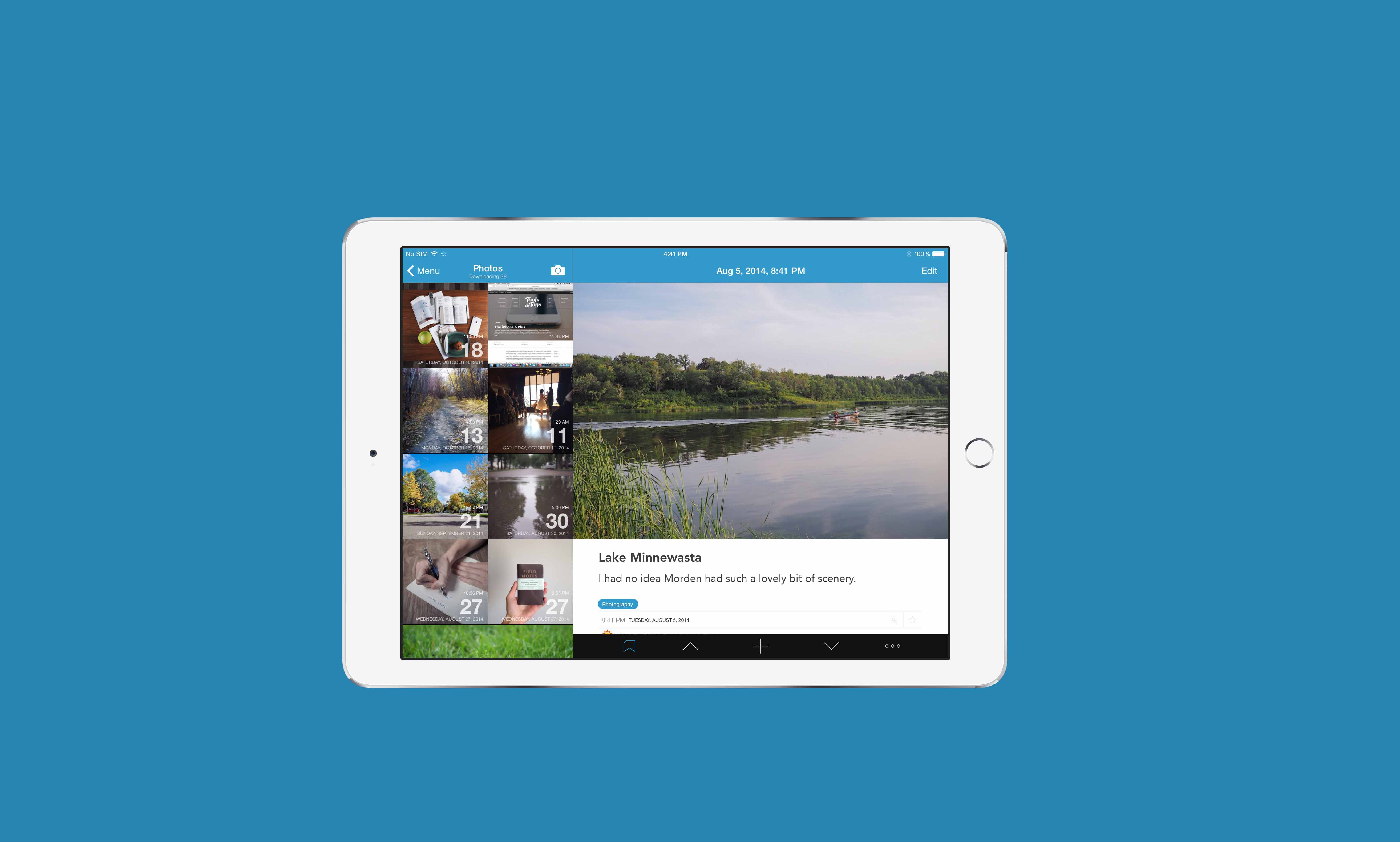
Better yet, scrolling through your entries in full screen mode is a treat. Meta data added to your entries (like your step count, the day’s weather, your location at the time of your entry) all line the bottom of the full screen view while your writing fills the white space above.
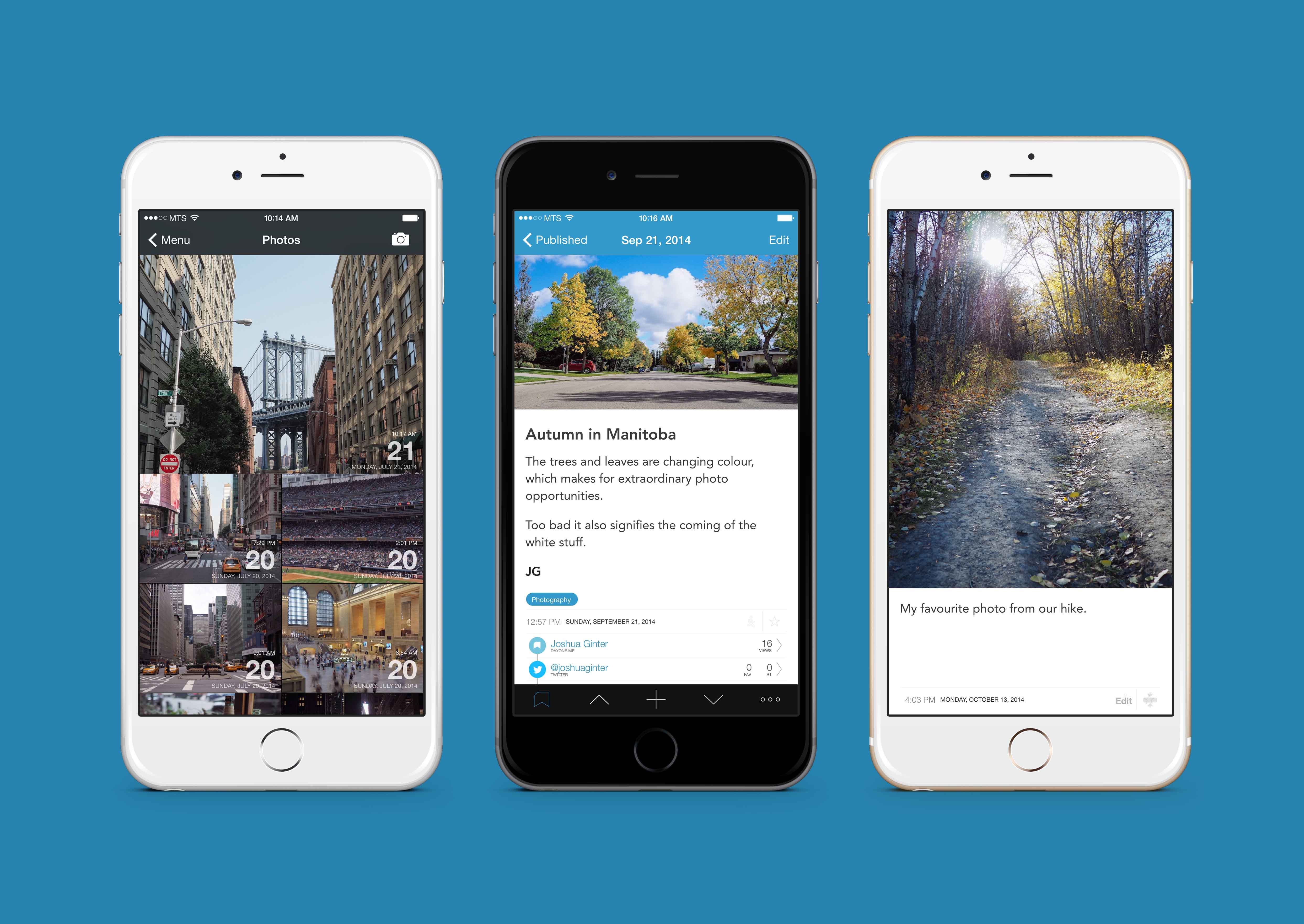
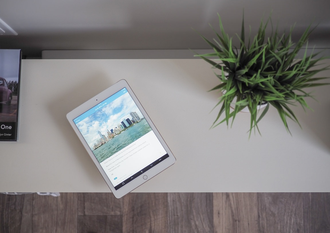
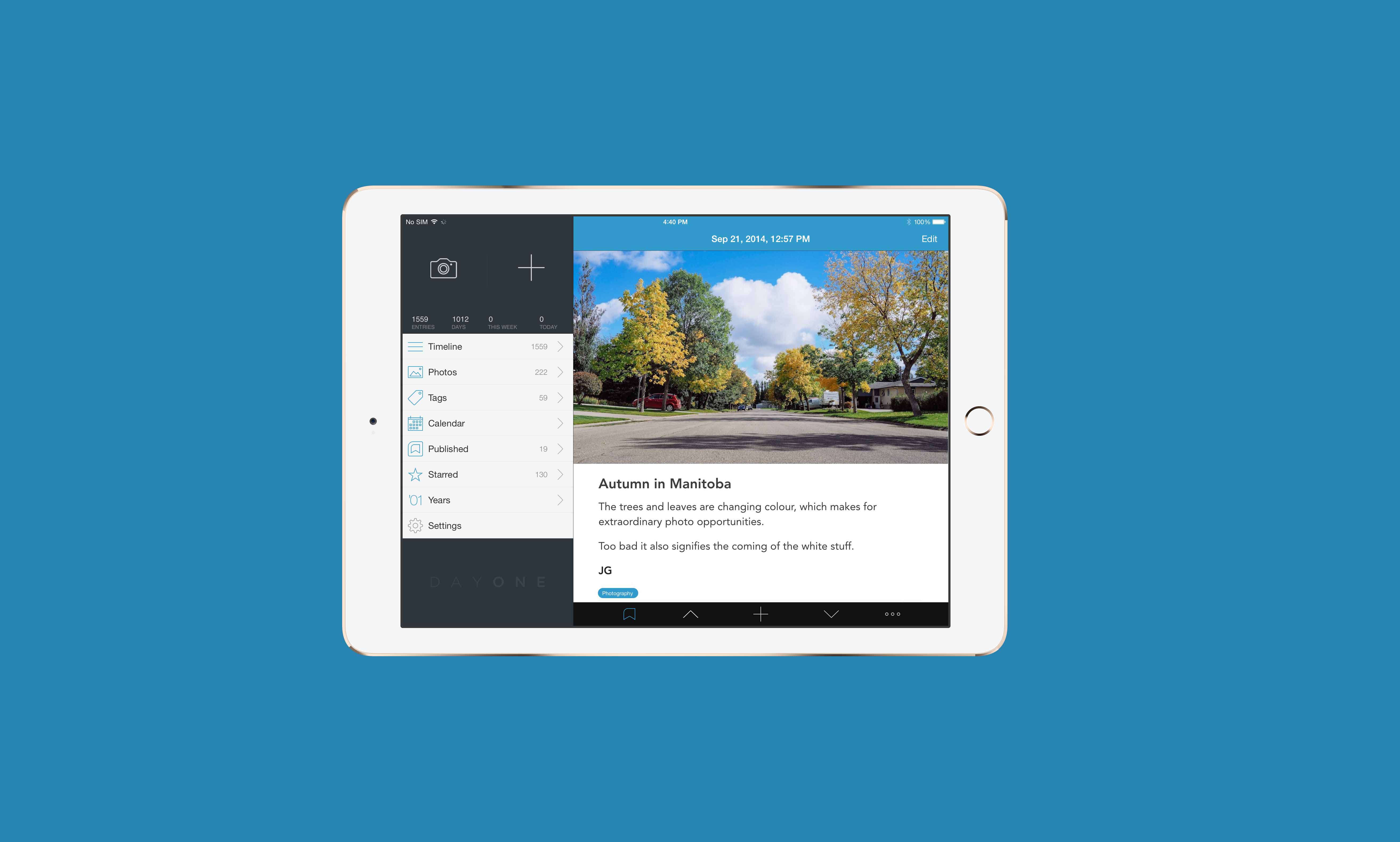
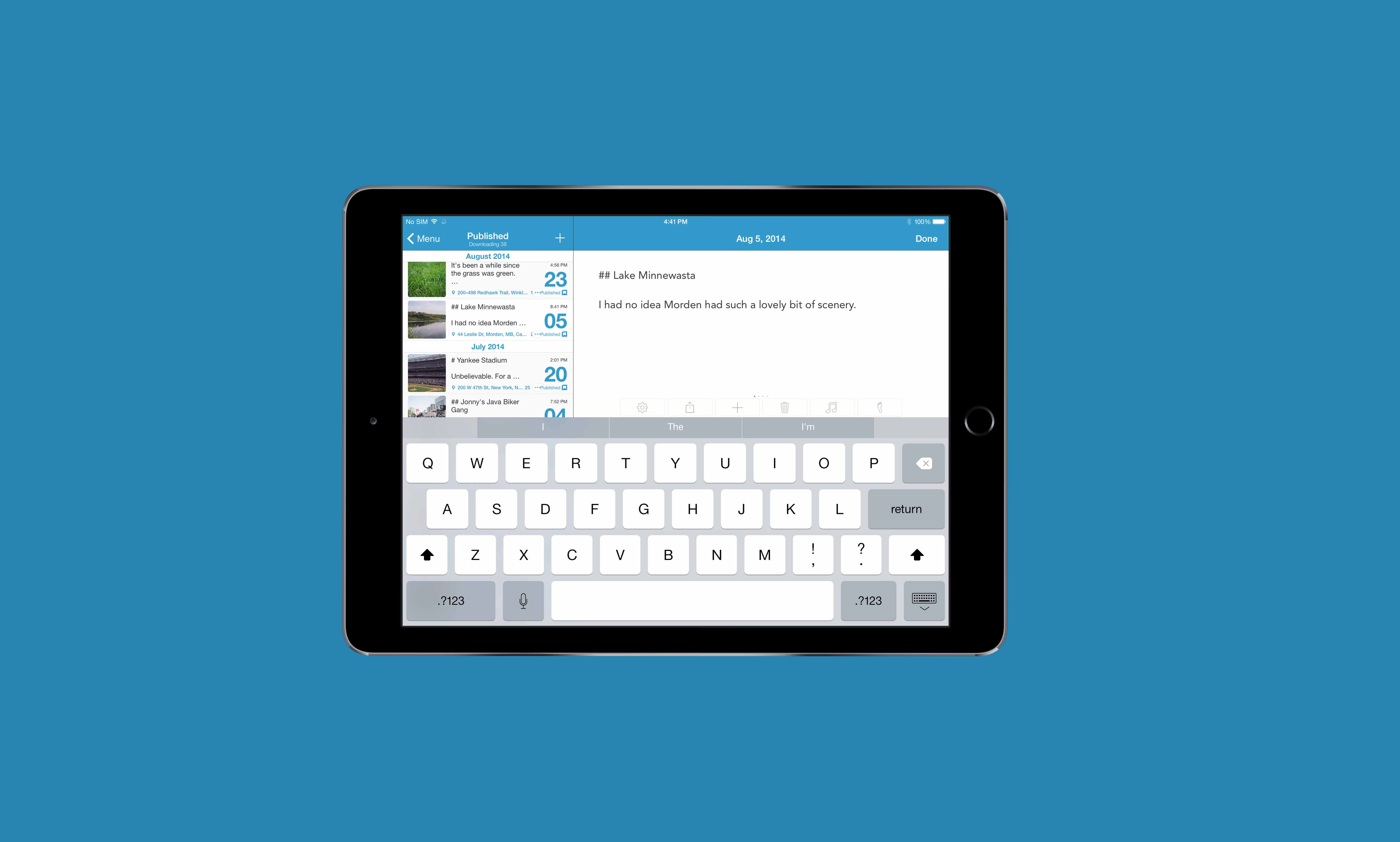
Without a doubt, the best way to experience that full screen mode is with your photographs. I’d venture to say Day One is meant for photographs. Slowly, Day One has become a photo book of all my favourite shots.

Viewing these photos is jawdropping on the iPad and iPhone 6 Plus. The photos menu outlines all the entries in your journal which have an image attached. Any starred photo entries are automagically made larger in this menu, making the photo menu look like a quick collage of your artwork.
I can’t stress how much I love these photo features. With Day One’s iOS 8 extension, I can add a photo from virtually anywhere there is a sharesheet. Send the photo to Day One, add a small caption and bang, I’ve got a thousand words (or more) packed into my journal. It’s one thing to create text entries for your future self, but it’s an entirely different thing to create photos tagged with locations and weather all with the press of a button. Only a journal of the future would do something like this.
Like any half-decent review, there needs to be a complaint or suggestion. I would do anything to have multiple photos in an entry. While focusing on one photo per entry forces you to choose your journaled photos carefully, sometimes a single photo isn’t enough. I would love to string together four or five photos from the Yankee game this past summer all in one entry.
And better yet, I would love to have the option of inputing short videos as well. Although this would mess around with the PDF feature, video has a way of capturing the best moments of our lives unlike any other medium.
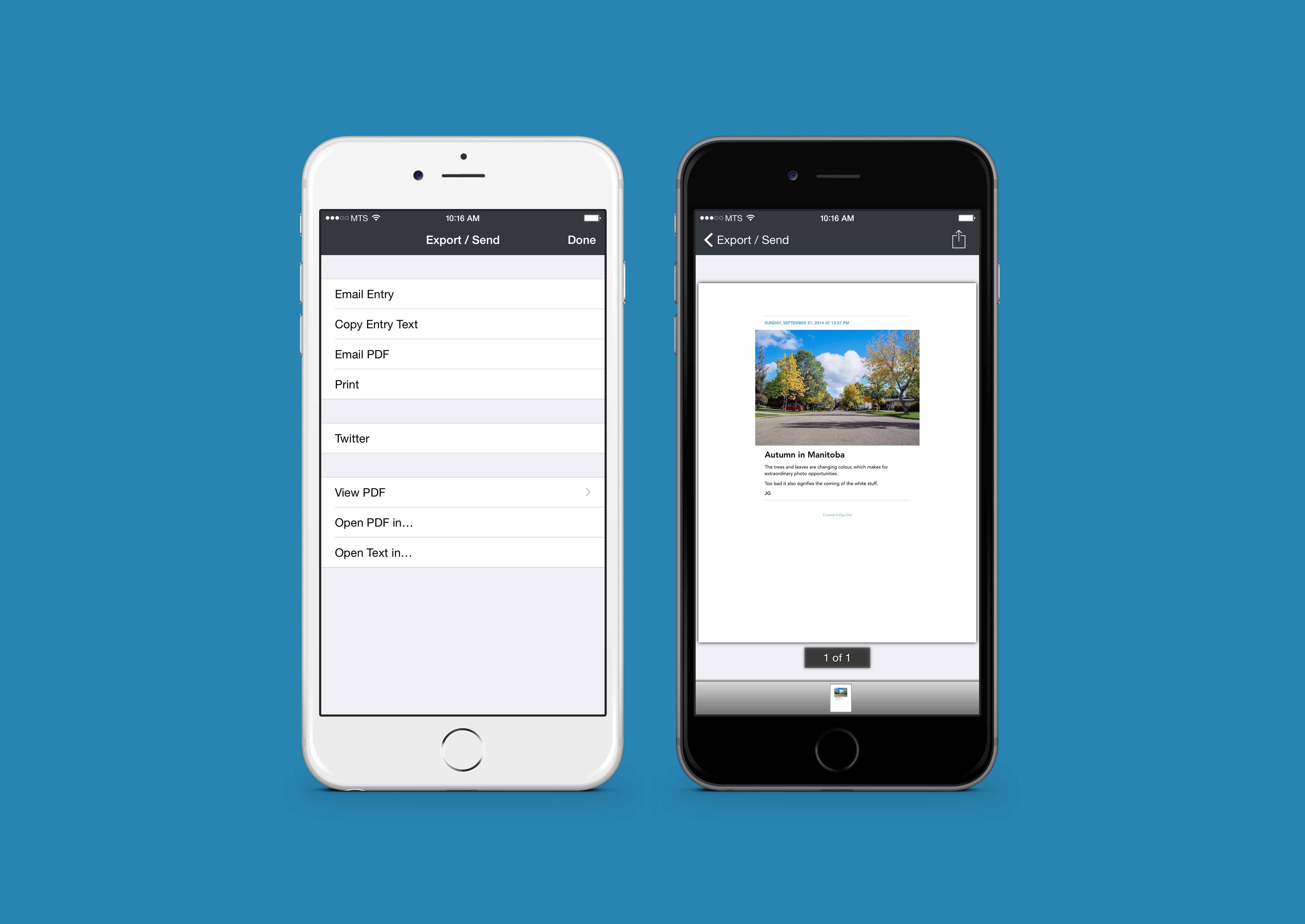
Speaking of that PDF feature, Day One can quickly generate a PDF of all your entries — or entries of the tag of your choosing — into one gigantic PDF file. The PDF comes formatted with your Markdown markup and accentuates your photographs in a blog-like format.
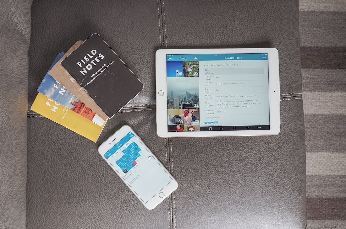
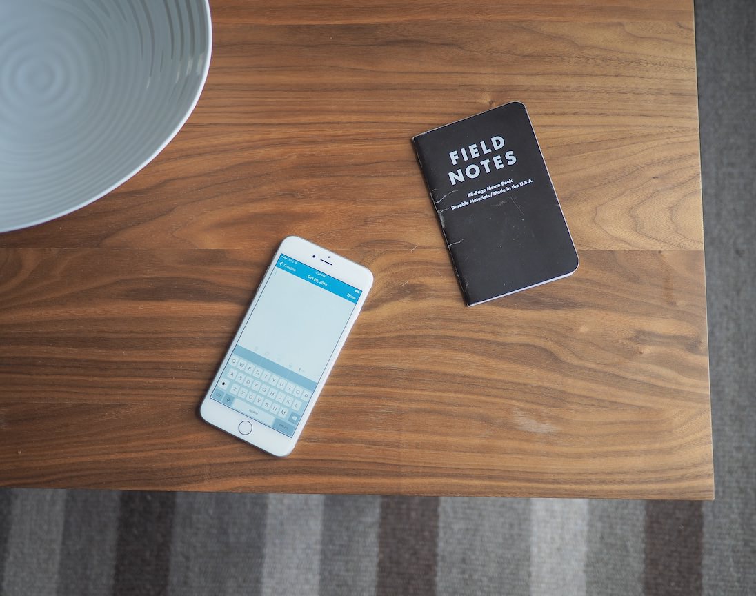
I journal many of my thoughts and feelings in my written Field Notes books and I make a daily summary entry in my Day One at the end of the day. This daily summary entry is a summary of the events of the day, what I worked on, and which pages to reference in my Field Notes books if I want to cross-reference.
In the long run, I want to print my Day One into a spiral bound book and have it accompany all my scribbled Field Notes books. Not only can I print that spiral bound book, that book will come formatted as well. I can’t wait to print my first five-year Day One journal.
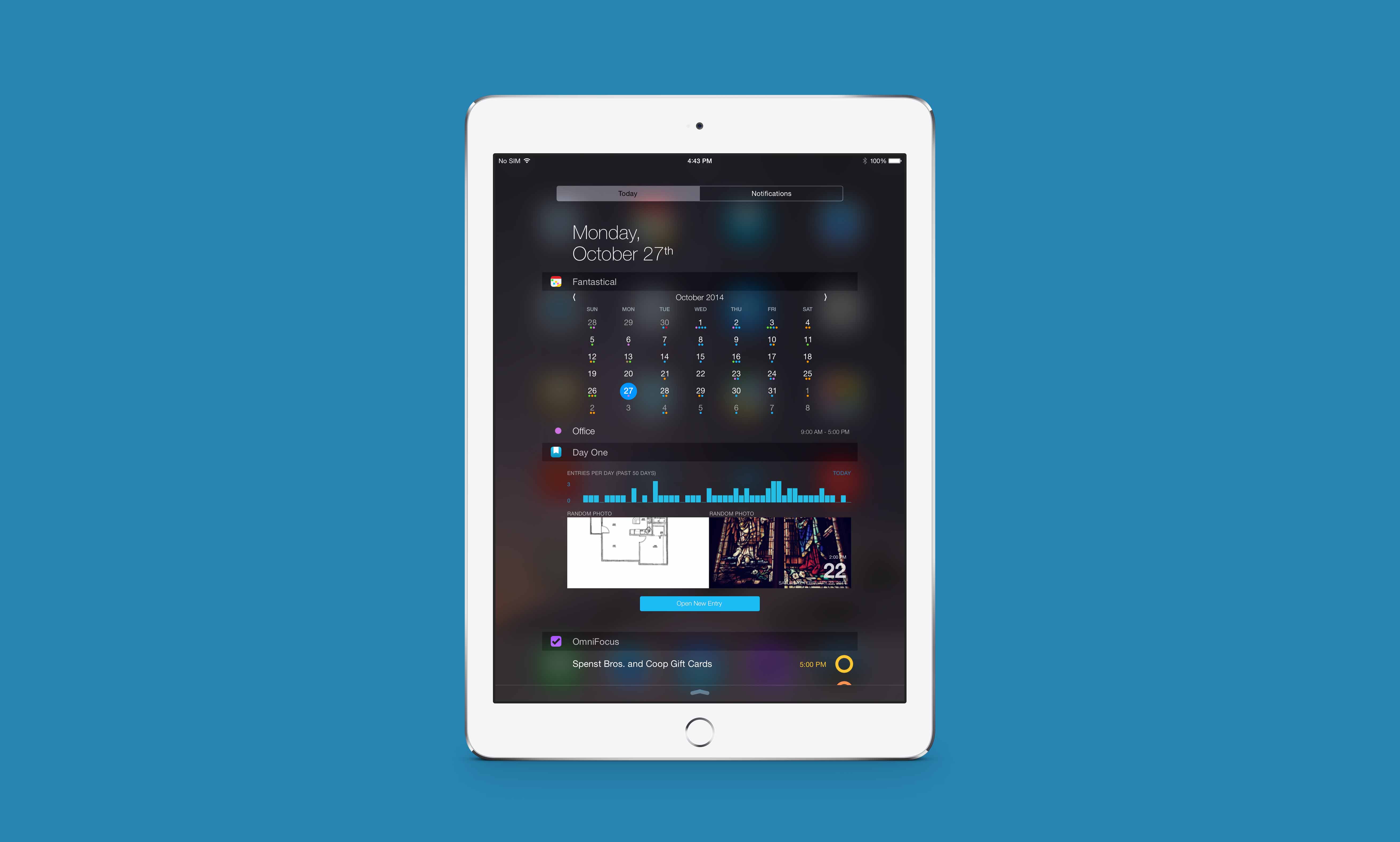
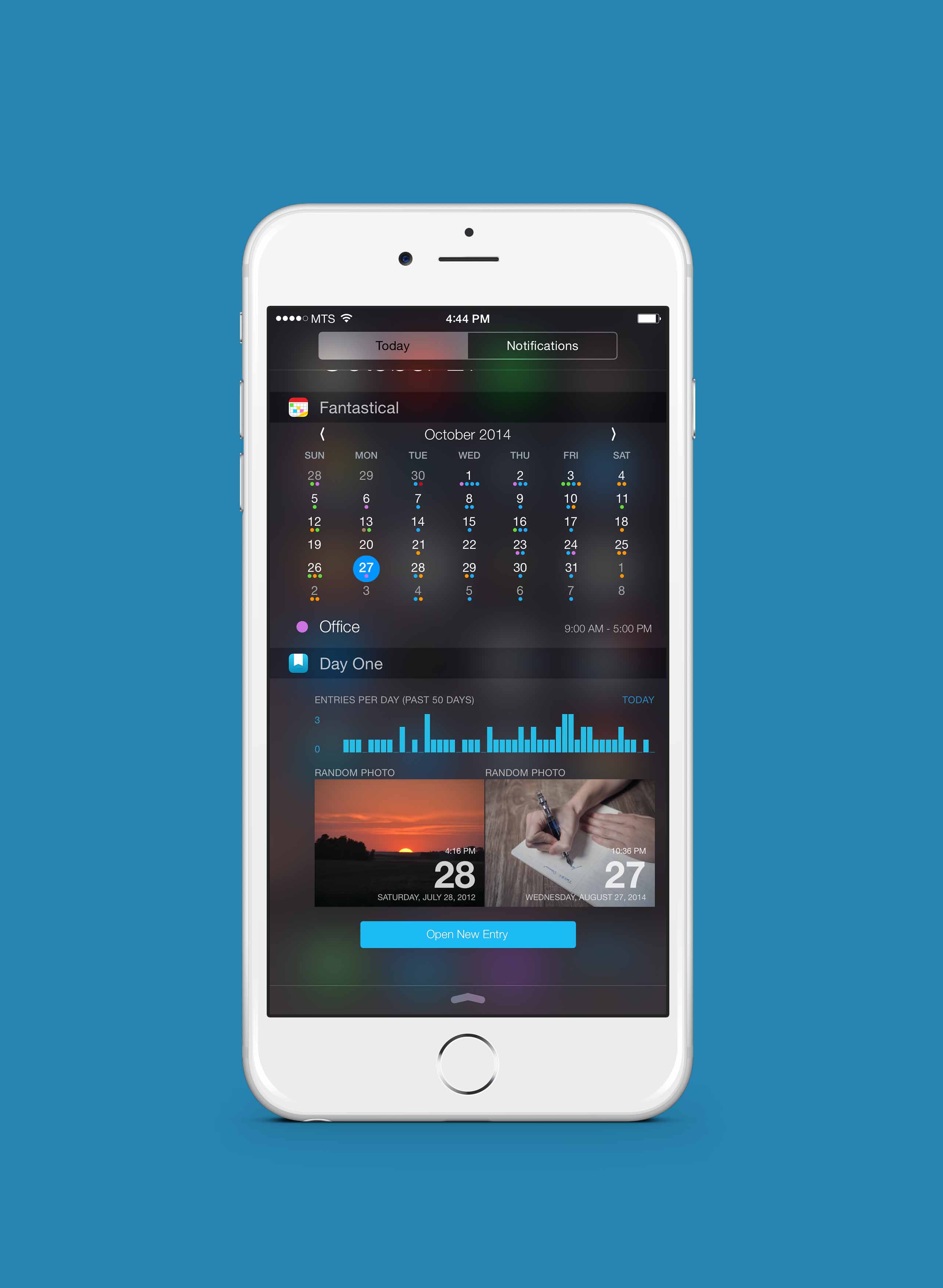
Most recently, Day One incorporated a Today widget which showcases random entries from the past and your daily entry statistics. I don’t personally use the Today widget, but I think it’s one of the prettier widgets available on the App Store. There’s also a quick entry button in there as well in the off chance you need to jot down something immediately.
It’s hard to do such a personal app justice in such a short review. There are a thousand ways to use Day One and I’ve only grazed the surface of Day One’s use cases and design elements.
Not only that, Day One is one of the most widely used apps on the paid App Store. Many, many people will have an opinion of Day One and I can’t possibly summarize those feelings here.
What I can say is that Day One is the only app on my iPhone and iPad that has the ability to make me cry. I recently revisited the entries I wrote in the weeks prior to buying an engagement ring. Better yet, I have an entry that is tagged with the exact location of where I asked Jaclyn to marry me.
These are the moments that make us who we are. These are the thoughts and feelings I want to pass on to my children and grand children after I die. These entries are my legacy.
I dare any app to try besting the impact Day One has had on my life. Needless to say, it’s a long shot.