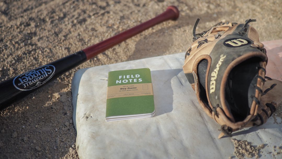
I am a Canadian through and through. I was born in Canada. I grew up in Canada. I didn’t leave the country for the first time until I was 18 years old.
That doesn’t mean I’ve ever been good at Canada’s national sport though. I played some hockey when I was younger and I officiate hockey now, but hockey has never captured my heart.
Since forever, I’ve been a baseball player.
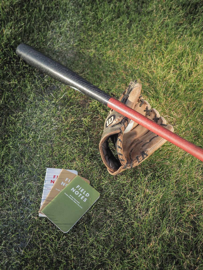
At times, baseball is a chess match — opponents of equal skill do battle through psychological skirmishes and strategic placement. At other times, baseball is a game of speed, raw power and focus. Even the best players only succeed 1/3 of the time. Baseball is a gentleman’s game that prizes statistics above all else.
Field Notes Brand dedicating their 15th edition to the American pastime was sensible and inevitable. Baseball is as American a sport can be, and Field Notes… well, they’re also as American any memo book can be. They’re a perfect match.
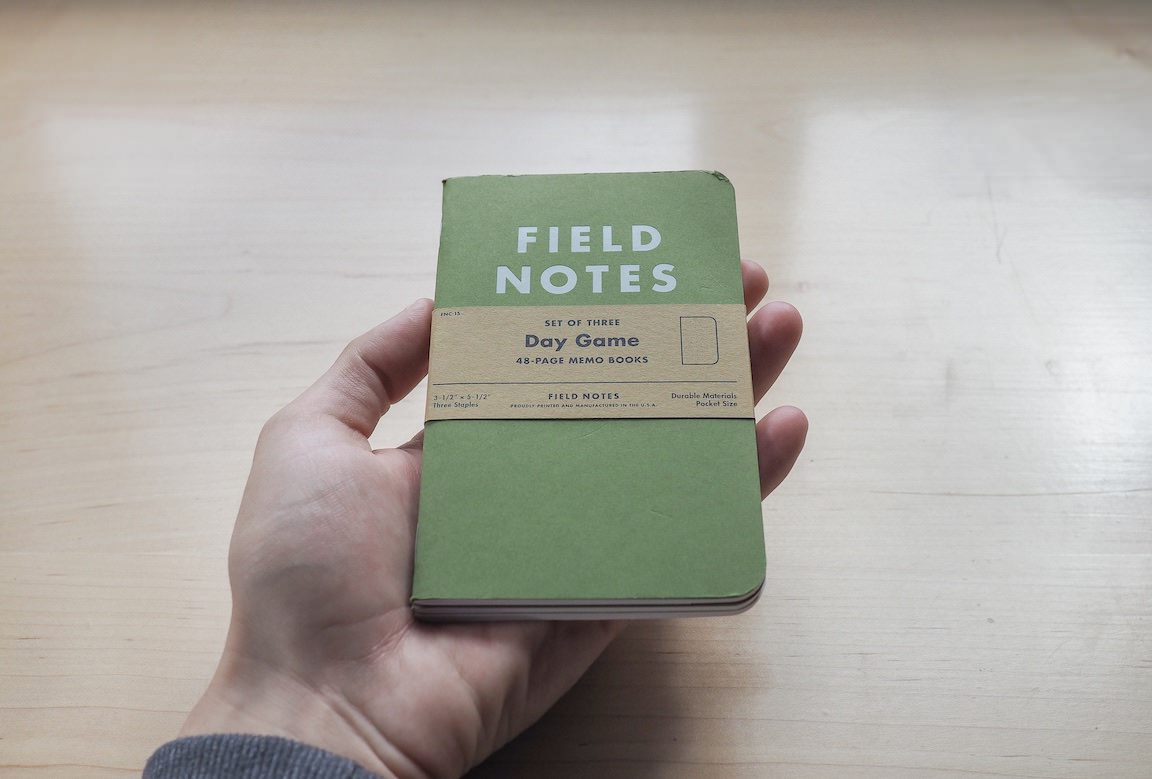
Summer 2012’s Field Notes Colors Day Game edition comes in three colours unique to the game of baseball: Outfield Green (Jellybean Green), Infield Brown (Packing Brown Wrap) and Hardball White (Recycled White). Quite clearly, each colour showcases a major element of the game, although my parents were unable to determine that the white and red book showcases a brand new ball.


The front and back covers of the green and brown books are stamped with white Futura lettering while the pearly white book is stamped with a striking red (baseball stitching) lettering. The little homeplate on the back cover is a perfect finishing touch.
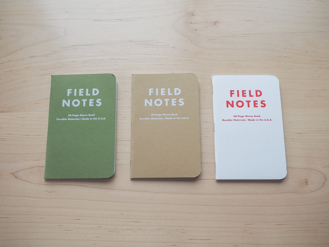
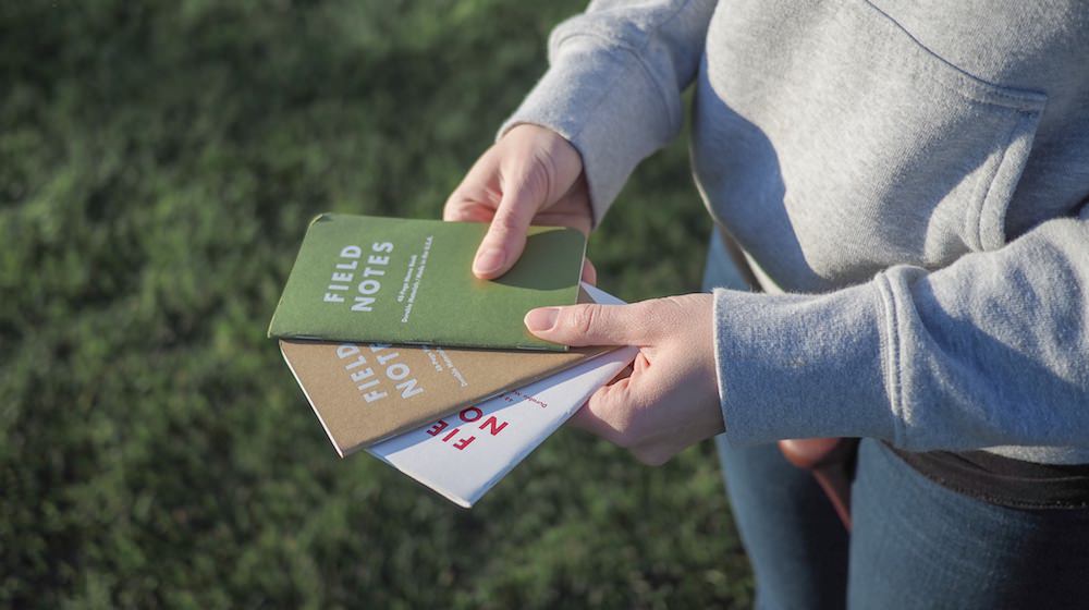
Interestingly, the covers are not uniform across the board. All three colours are made of coloured paper instead of printed white paper, but only the Outfield Green and Hardball White covers are sturdy 100#T covers.
In contrast, the Infield Brown is the same cover stock found in Field Notes Brands’ generic kraft versions. The brown covers are 80#T stock and are noticeably thinner than the 100#T covers. The thinner cover paper will provide the marvelous wearing we have come to love with Field Notes books, but I’m sure the brown Day Game book would be the first to tear in your back pocket.
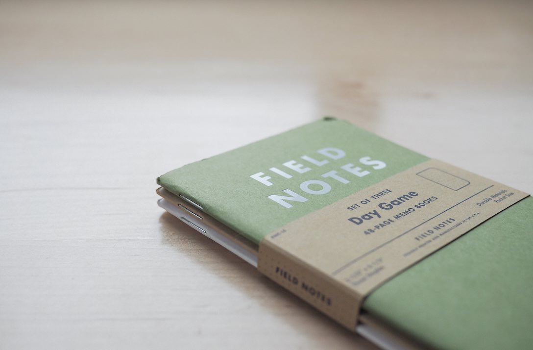
Like most older Colors editions, Day Game sports the three traditional silver staples. No surprises here.
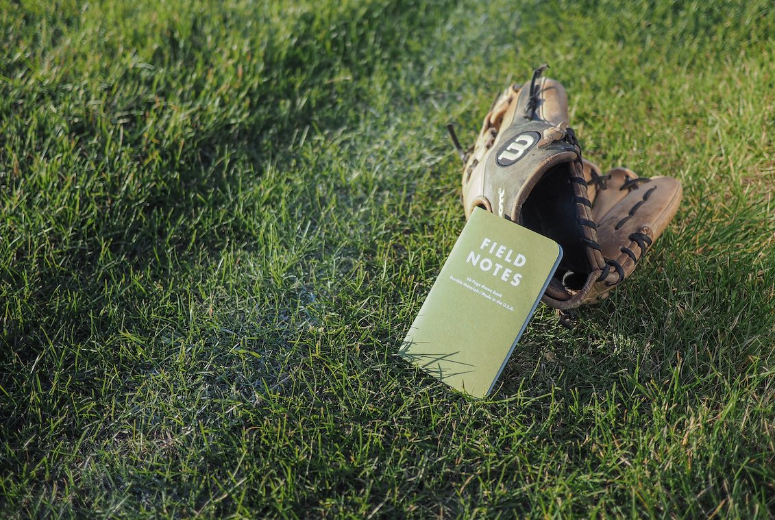
Day Game’s three unique colours are the moral of the story though, and I’m completely enamoured with the Outfield Green colour. The green is soft, like dried grass from late afternoon to early evening. There is no mistaking this skeuomorphic colour and it only makes me want the heralded Grass Stain Green edition that much more.
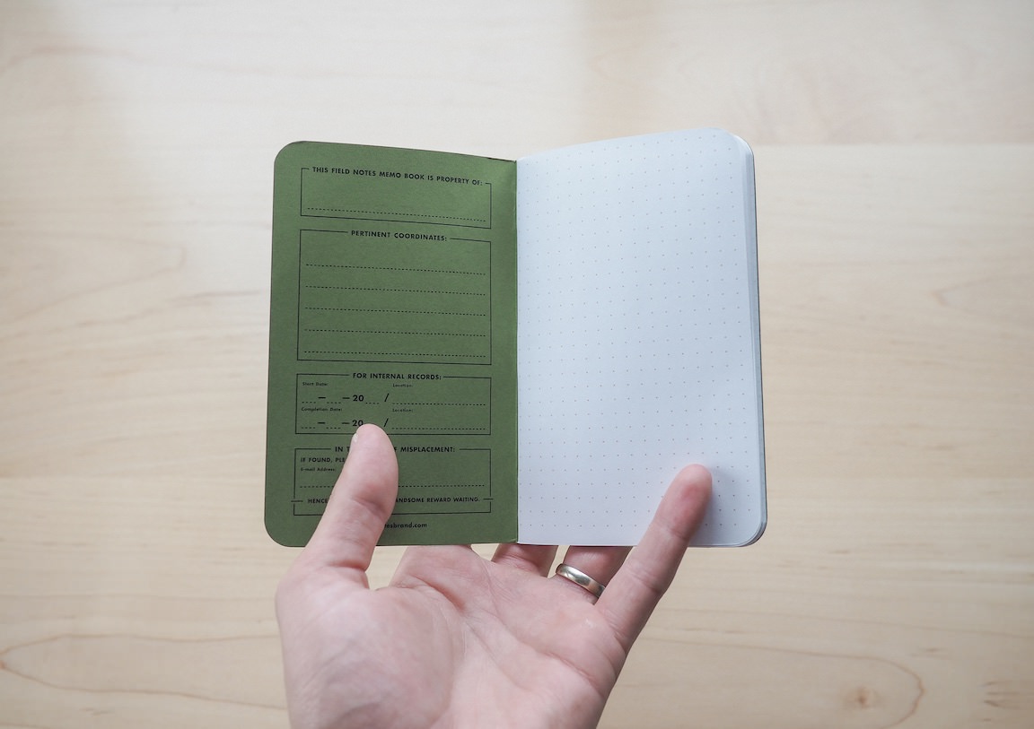
The inside covers throughout Day Game are top notch for documentation purposes. Of the three colours, Outfield Green drew the short end of the stick (bat??). The green is dark enough that black inside documentation is slightly harder to read and decipher than the white and brown colours. I would be happier if white printing was used instead.
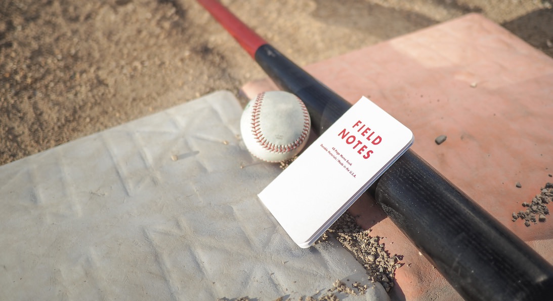
The most striking of all Field Notes Colors to date is the Hardball White version. The white is brilliantly white and the red is striking and bold. Even photographing Hardball White was difficult as the white covers were blinding in standard light. I hope this is the last time these books come out to play — I want to keep that white as white as possible.
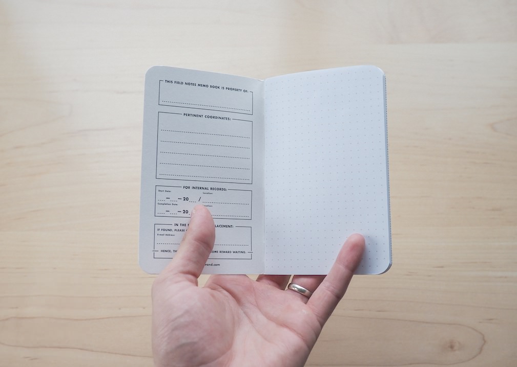
Inside, Hardball White is a five-tool-player. The inside covers are white with black documentation, allowing for perfect readability and writeability. Understandably, it isn’t possible for every version to sport this colour scheme inside, but it is easily my favourite inside cover template to date.

In the middle stands the Infield Brown book, which is disappointingly not much more than a standard kraft book with white lettering. The inside documentation is printed the same as kraft versions as well. Although the white outside lettering lends Infield Brown a unique step up from standard kraft books, I can’t help but feel cheated.

All three books are stuffed full with 50#T Bright White paper and a Double Knee Duck Canvas light brown dot grid. Day Game was the first Colors edition to sport the now-famous dot grid. I’ve jumped from grids to dot grids to rulings enough to feel that dot grids lie somewhere above rulings and slightly below standard grids. I’m sure the introduction of the dot grid in the summer of 2012 was exciting nonetheless and the dot grid gives Day Game a unique edge in the originality category.
The 50#T innard paper is the standard Field Notes innard paper and will handle ballpoints, rollerballs and pencils with ease. Fountain pens, as per the norm, aren’t ideal for use in Day Game. I would stick with extra-fine nibs if you insist on using fountain pens in your Day Game books.

The nice part about taking a look at older Field Notes Colors editions is being able to see how the old editions transformed the newest editions we see today. We just saw the return of the reticle grid in the Unexposed edition, which was first introduced in Night Sky in summer of 2013. The dot grid, meanwhile, has been used in Pitch Black and Expedition since it was introduced in Day Game in 2012. I love seeing how successful products shape the future of companies; Day Game clearly had a long term effect on Field Notes Brands’ future.
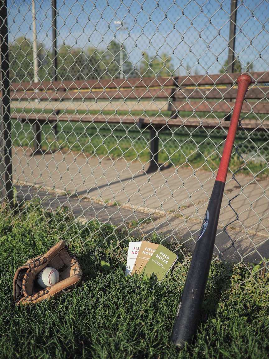
My baseball past probably sways my opinion in favour of 2012’s Day Game edition, but I expect Field Notes aficionados would tend to agree more often than not. Day Game is a very traditional Colors edition and this classical aura makes it one of the truest editions I’ve reviewed.
If Day Game was still available (I paid $60 for this pack on eBay), I would throw it right to the top of my list of favourite editions. In fact, it would take the top spot if not for another older edition I have yet to review.
Day Game strikes a chord in the deepest part of who I am and I couldn’t be more excited to have Day Game in my collection. There are small hiccups along the way, but nothing negative can overcome the colours found on a Sunday afternoon at the ballpark.