
Update: This post has been updated with new photography as the original photos did not migrate over from the past website version. Only photography has been updated — all written content remains the same.
As brand recognition grows, each product release takes on the pros and cons of popularity. For each product Apple releases, for example, pundits take to the Internet to lambaste each design decision. In the meantime, fanboys shout their praise. Although this may be overly represented by Apple, companies with any brand equity will experience some form of praise and scrutiny.
Field Notes Brand certainly falls into this category. As the months go by and as Colors editions are released, Field Notes Brand will find an increasing amount of polarized opinions.
The reason I say “will” is because Field Notes Brand doesn’t appear to be wholly at this point yet — there isn’t a large group of Field Notes Brand haters. Sure, people may swear by Moleskine’s Pocket Cahier. But they don’t take to the Internet to hate on Field Notes books.
As a result, it’s hard to find a negative review of any Field Notes Colors release. I’ve found a podcast that spoke negatively about a Colors release. I’ve even found widespread unhappiness with Balsam Fir. But other than that, each Field Notes Colors release has been fairly well accepted and fairly well loved.
And for good reason too. Field Notes memo books offer the best combination of form, utility and quality. The agricultural nostalgia only improves that combination.
But what happens when your product is too well made? What happens to the useability of a product when its design is immensely beautiful?
For some people, perfected design equates to optimization. For me, perfected design needs to be admired, treasured and protected.
That’s Shelterwood’s problem.
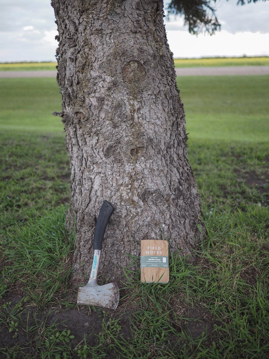
Shelterwood
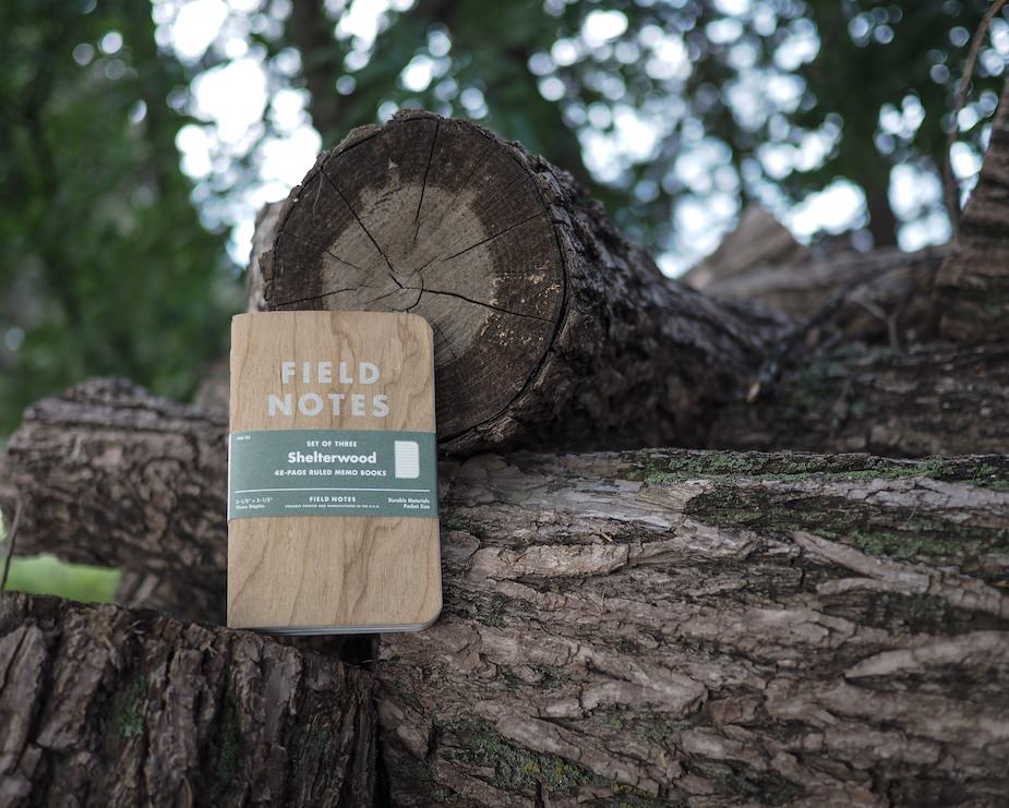
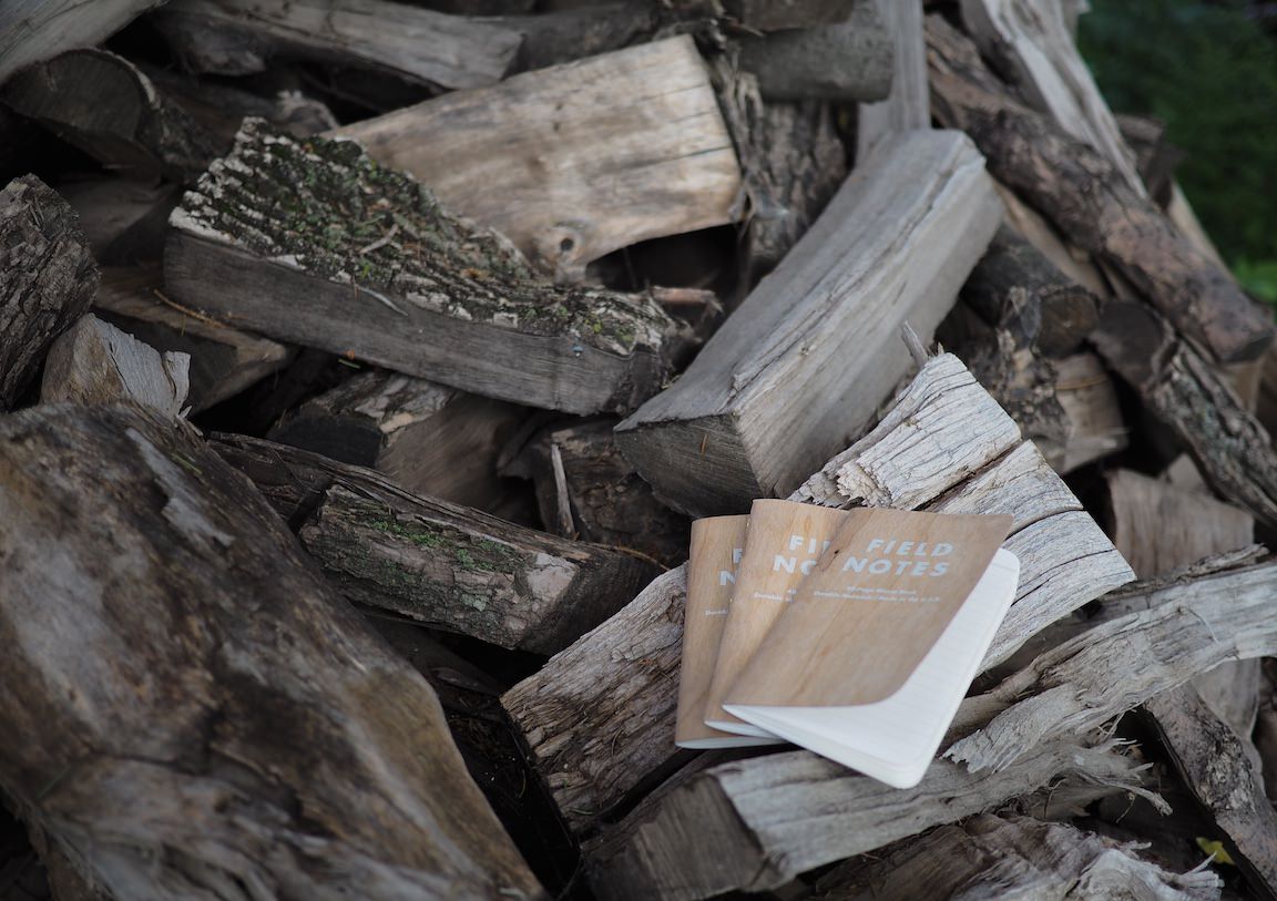
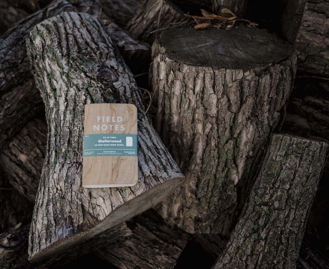
Field Notes Brand went way above and way beyond any Colors release with Shelterwood. The 22nd Colors edition covers are made of sheered American Cherry veneer that is adhered to a standard kraft stock. All 75,000 covers are completely unique — all grains are one of a kind and add to the incredible personality of this release.
Shelterwood’s Cherry veneer feels unsanded to the touch, lending an old fashioned feel to the notebooks. This rough feel should wear away over time.
The famous Futura-based Field Notes logo is printed on the veneer in a “Ghost Flower” ink that doesn’t rub or scrape off. As Brad Dowdy states in his Pen Addict podcast, there appears to be an impressive level of technology in the printing of the Field Notes logo.
If you look closely, you can see where the veneer and stock kraft cover paper are glued together. The kraft cover paper is glued to the inside, meaning the inside covers are easy to write on. The kraft cover paper also helps the wood veneer from chipping or breaking. This adhesive combination creates the most durable cover I have seen to date and I wouldn’t hesitate at all when throwing this book in my back pocket.

The inside cover documentation is printed in “Twilight Sage” ink which looks more like a deep grey than a green. The documentation is easy to read and fits perfectly with the light green ruling on the innard paper. Again, as I’ve said in the past, I greatly value inside covers that can be written on. My Pitch Black books have documentation written in pencil because my pens don’t show properly. I can foresee that pencil rubbing away over time. Luckily, there shouldn’t be problems like this for Shelterwood.
To add to the incredible level of personality imbued by the cherry wood veneer, the smell of a woodworking shop awaits when you open the packaging. Is there a better way to flex some nostalgic marketing whimsy than by implanting an old fashioned woodworking smell? I don’t think so.
Now, if the outside covers were enough to impress you, don’t look at the innard paper. Actually, don’t touch the innard paper. It’s buttery smooth.
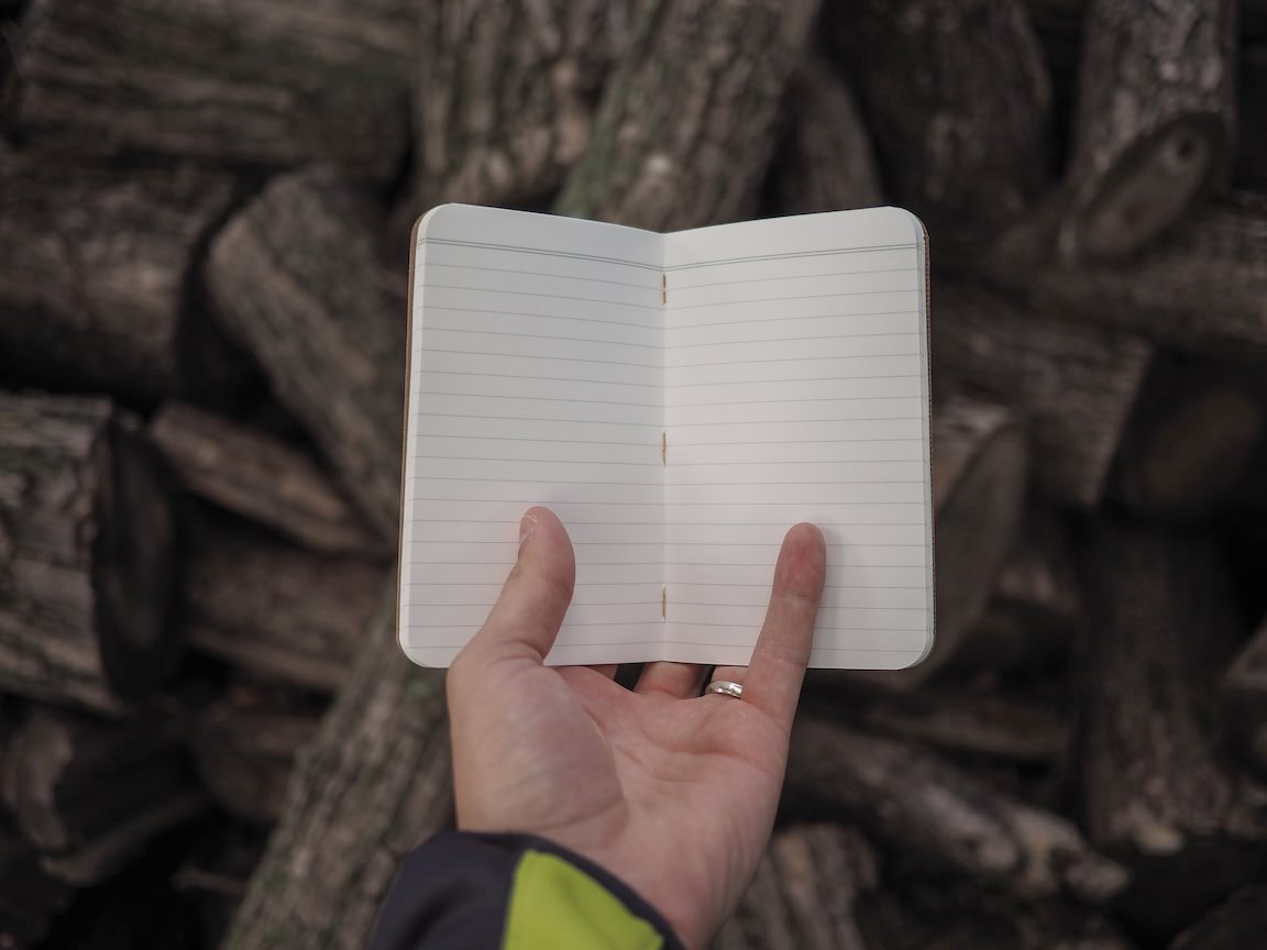
Shelterwood innards are different than the standard kraft versions and are reflective of the paper used in the America the Beautiful edition. The paper is a Finch Paper Fine 70#T “Soft White” as opposed to the 50#T found in the kraft books. The paper is noticeably heavier and noticeably smoother. The heavier stock fits right in with the wood persona and feels fantastic to boot. I’m left wishing this paper was used in every other edition.
Shelterwood is a ruled edition. The rulings are printed in a light green “Maidenhair” soy-based Toyo ink and, again, fit right in with the Shelterwood aura. The rulings are printed on 1/4“ lines as opposed to the 3/16” graphs and dot grids found in kraft versions. If you want to get a better indication of Shelterwood’s innards, head over to Ed Jelley’s awesome review. He takes a look at how different pens write on the paper (I don’t have enough pens lying around to justify having an opinion) and he has some beautiful photography to drool over.
Back to those ruled lines — I actually noticed the greater ruling height immediately after flipping through Shelterwood’s pages for the first time. I’ve always felt grids were ugly in comparison to rulings. Realistically however, graph (and dot) grids are far more functional than ruled paper. Rulings hearken back to my looseleaf-burdened elementary school days. Yet, I’ve just always preferred ruled paper.
That isn’t to say that I love Shelterwood’s ruling, however. The larger line height means I will get less writing on a page. I adhere very closely to the lines when writing[1] and the 3/16" graph line height gives more horizontal lines per page. If Shelterwood was my only choice, I would hammer through books at a faster clip than I already do.[2] Line height is surprisingly important to me.
I’d also like to add to the specification part of this review that the bellyband is the best bellyband ever. The sage green complements the promotional images perfectly and they have a thick and unique feel. I also noticed that the bellybands have been made to hold a thicker edition; between the thicker innard paper and the thicker covers, a standard bellyband (I tested the Pitch Black bellyband) doesn’t come close to holding three Shelterwood books.
It’s more than just thicker paper and thicker covers, though: Shelterwoods have an inherent need to open when laid on a desk. They don’t sit flat at all. It’s a unique characteristic of the edition that is neither a pro or a con, but adds to the necessary design considerations for Field Notes Brand.
Verdict
Now all this nostalgic wood grain and thicker stock paper leads to one ultimate question: Will I use Shelterwood? So far, I have avoided writing in all my Colors editions. I want to keep them pristine for the future. It’s a weird obsession I guess.
But if someone pointed a gun at my head and told me to write in one of my Colors books, I would never choose Shelterwood to be the candidate.
Shelterwood is easily the most beautiful edition Field Notes Brand has ever released. Its beauty reminds me of the Herman Miller Eames Lounge Chair. More often than not, you buy a product like the Eames to admire the beauty of its incredible design. There’s no reason to not sit on an Eames. You just choose not to. You may sit on it from time to time, but the very fact that you have an Eames chair is why you bought it to begin with.
That’s Shelterwood. It’ll be the most beautiful edition in your Colors collection and you’ll even show it off to your family members.[3] But I just don’t see this being the first choice for the general user. Subscription holders will write in one pack and move on to the kraft version afterwards. I foresee many subscription holders keeping a pack of Shelterwood unopened in the back of their archival boxes.
Like the Eames Lounge Chair, Shelterwood is a testament to design and branding. It is quite simply the most beautiful memo book on the market. It’s even made of the highest quality innard paper ever used by Field Notes Brand. And its one-of-a-kind personality is infectious.
But also like the Eames Lounge Chair, Shelterwood may end up in a design museum marketed to onlookers and awestruck analog note-takers. Some people will use the books. But I bet most will be proud just because they can say they have a memo book made of actual wood.
Turns out I have three three-packs because I thought I would want to write in these for the foreseeable future. I was wrong. I’ll throw the extras on top of my shelf for safekeeping and maybe trade them in the future. Or I’ll donate them to the Museum of Modern Art. At least that’ll give me the chance to visit New York again.
And, generally speaking, I only write in my books. You’ll find very, very few drawings or graphs that utilize a Y-Axis. ↩
Generally, I finish a book every three weeks. I use a minimum of two pages per day and I usually use three to four pages per day. ↩
In turn, they’ll think you’re a nut for actually caring about memo books. Someone please convince my wife that I’m normal. ↩