I have written about analog note-taking for a long, long time. Not as long as some other colleagues in the arena, nor as prolific and consistent. But I got my start in this whole writing thing back in 2014 when I reviewed the Hellbrand Leatherworks Field Notes Cover for Tools & Toys.
Analog and I have an on-again, off-again relationship style. When I put analog notes away, it’s always a “me thing”, and when analog notes return, it’s usually a “I didn’t know how good I had it” sort of thing. That cycle has repeated itself every year from 2014.
That cycle is responsible for a plethora of notebooks, memo books, leather covers, leather notebook systems, and more scattered throughout my desk and shelves. I eventually gave up the Field Notes COLORS/Special Edition subscriptions, settled on a Plotter notebook system, and jump in and out of that occasionally whenever inspiration sparks.
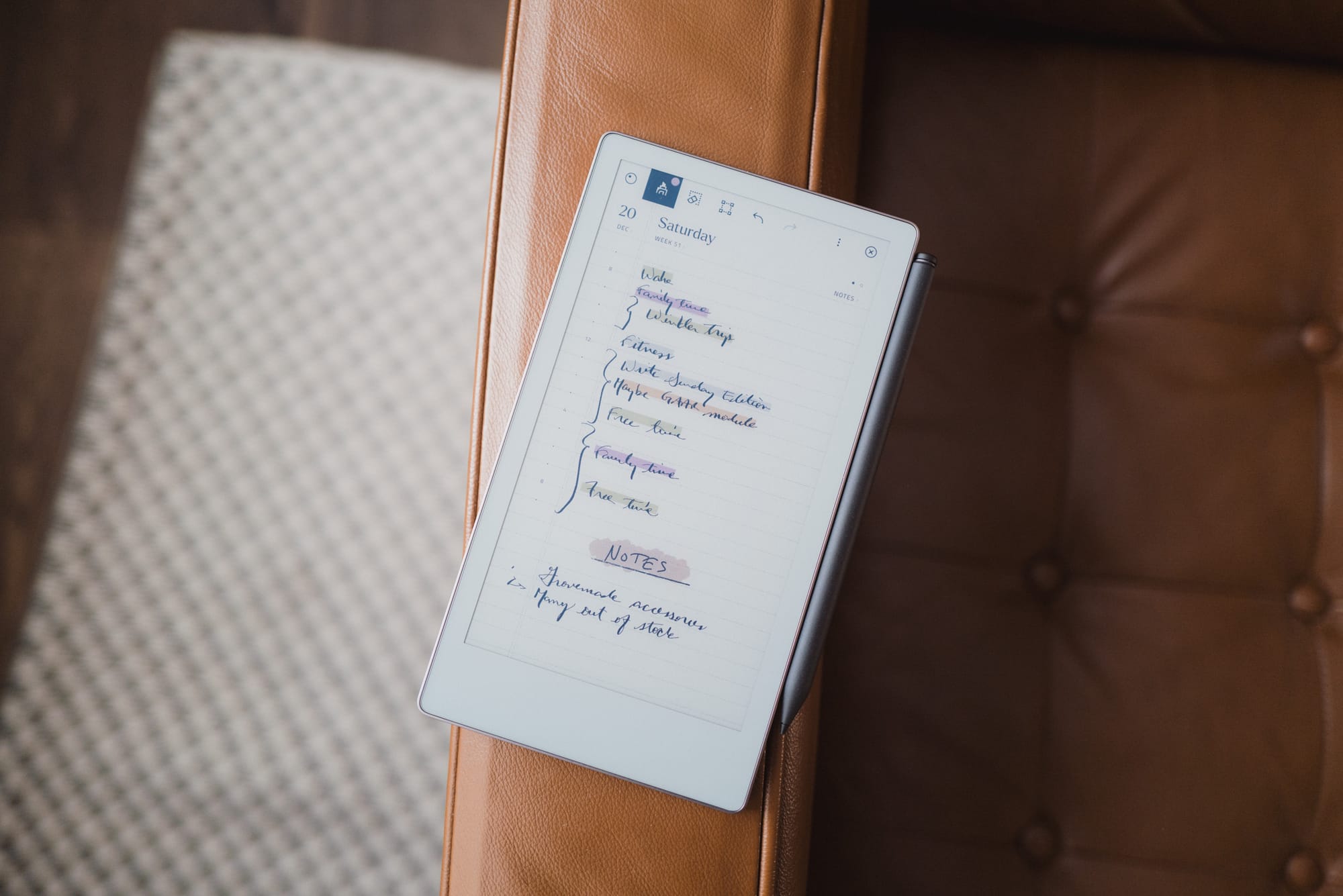
I have reason to suspect, however, that this cycle is going to change once and for all. And it’s all thanks to the reMarkable Paper Pro Move.
You see, I have long, long, long been attempting to find the perfect balance between the benefits of digital note-taking (search, speed, and various content types like images, URLs, and more), and handwritten note-taking (memory improvement, focus and attention improvements, and an overall approachability when taking notes with other people in the room). Most recently, I have effectively settled into taking digital notes only. I’ve planned my days on my Mac, do my reading on my iPad, cut my handwritten notes down to a minimum and ensure every note is scanned, and more.
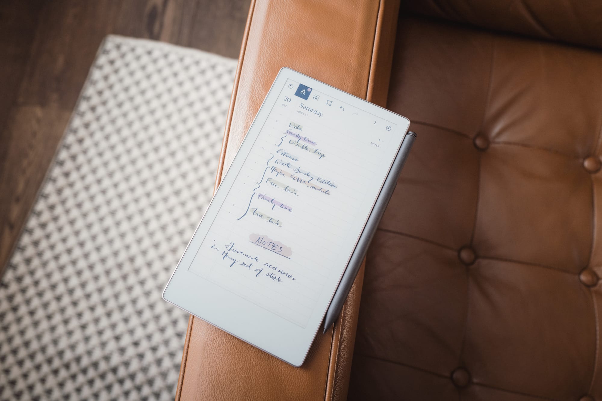
The reMarkable Paper Pro Move appears to be an answer — maybe the answer — to that dreaded mid-zone between analog and digital note-taking. reMarkable’s impressively fast sync speeds ensures I have my handwritten notes on my Mac or iPad instantly, and ensures I can mark up PDFs and ePubs in a focused-first environment. The Move is easily pulled out in a meeting, easily taken on the go, and easily thrown in a bag. It’s the most well-thought-out device to traverse the chasm between digital and analog.
For a steep, steep price.
Let’s dive into the reMarkable Paper Pro Move and why your focus is going to thank your pocketbook for the purchase.
Design and Materials
I’ve had the fortunate experience to compare the Paper Pro Move directly to its larger brother, the reMarkable Paper Pro. Their physical designs and material choices are largely the same, though the larger option has a sturdier, more classy fit and finish. Though the Paper Pro Move feels somewhat cheaper overall, reMarkable has done a good job applying a high level of polish to an e-ink paper tablet.
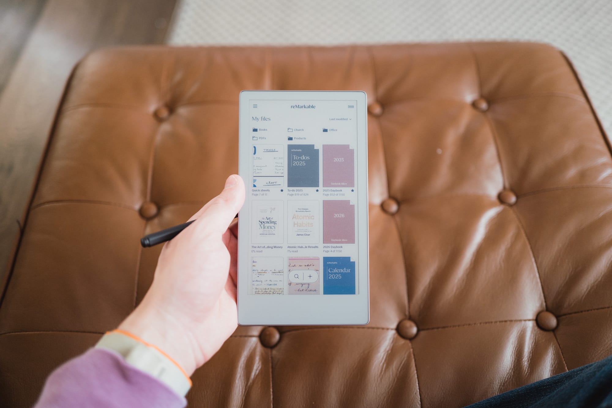
The Paper Pro Move measures 7.7-inches by 4.24-inches and weighs just over half a pound. Surprisingly, the Move is slightly thicker than the larger Paper Pro — 0.26-inches for the Move and 0.20-inches for the Pro — which was likely done to tout better battery life.
The Move’s size is wonderfully portable, though it’s too big for certain things. You can easily throw it into a back pants pocket for notes while on a job site, and you can tightly jam it into the inside breast pocket of a sport jacket. Inside that breast pocket, it’s very tight — I’ve had to fiddle with it to get it to slide into the pocket — and it certainly produces a noticeable flat profile that works against the overall shape-styling of a sport jacket. I had hoped it would fit better inside a sport jacket pocket, to be honest.
I also find the size to be too big to hold in my left hand and take legible notes on the go. For my smaller hands, it’s difficult to claw the device and hold the device with enough firmness to push against my right hand when writing. This makes for borderline illegible writing. I feel a smaller device would have felt too small for most people, however, and a bigger device wouldn’t fit inside back pockets or sport jacket pockets. So by and large, I think the reMarkable team did a great job picking this size of device.
The Move’s outer frame is an anodized aluminum with gentle grooves milled all around. We’ve long become accustomed to aluminum devices thanks to Apple and iPhones, so I’m more of a “smooth aluminum” kind of guy, but the grooved edges provide extra tactility for whipping out the Move on the go.
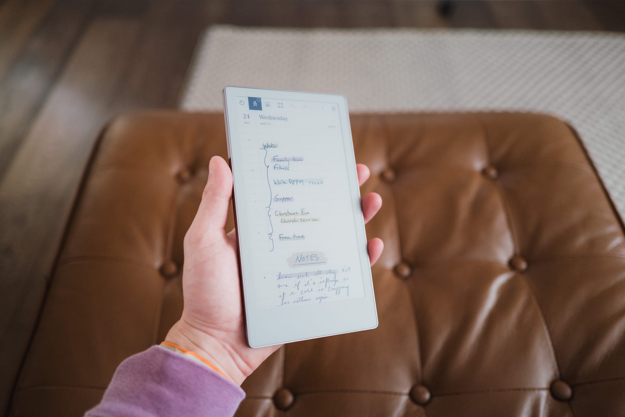
The Move’s front panel is a textured glass. I’m unsure on the durability of the glass — I wouldn’t test it like I would an iPhone. It feels softer than that. E-Ink text seems to be right below the top layer of textured glass, making for a crisp viewing experience.
The back is a soft plastic. It almost feels like paper or cardboard. Compared to the larger Paper Pro, the Move’s cardboard-like back is the flimsiest and most crude decision reMarkable made for this device. I’m sure this backing helps keep the Move feeling lighter and improving portability, but it feels poor, sounds hollow, and instills next to no confidence when you hold it. Frankly, the Move’s backing material had me convinced I was going to return the Move after I unboxed the device — this backing provided the worst first impression of any device I’ve ever purchased, ever.
Three other quick notes:
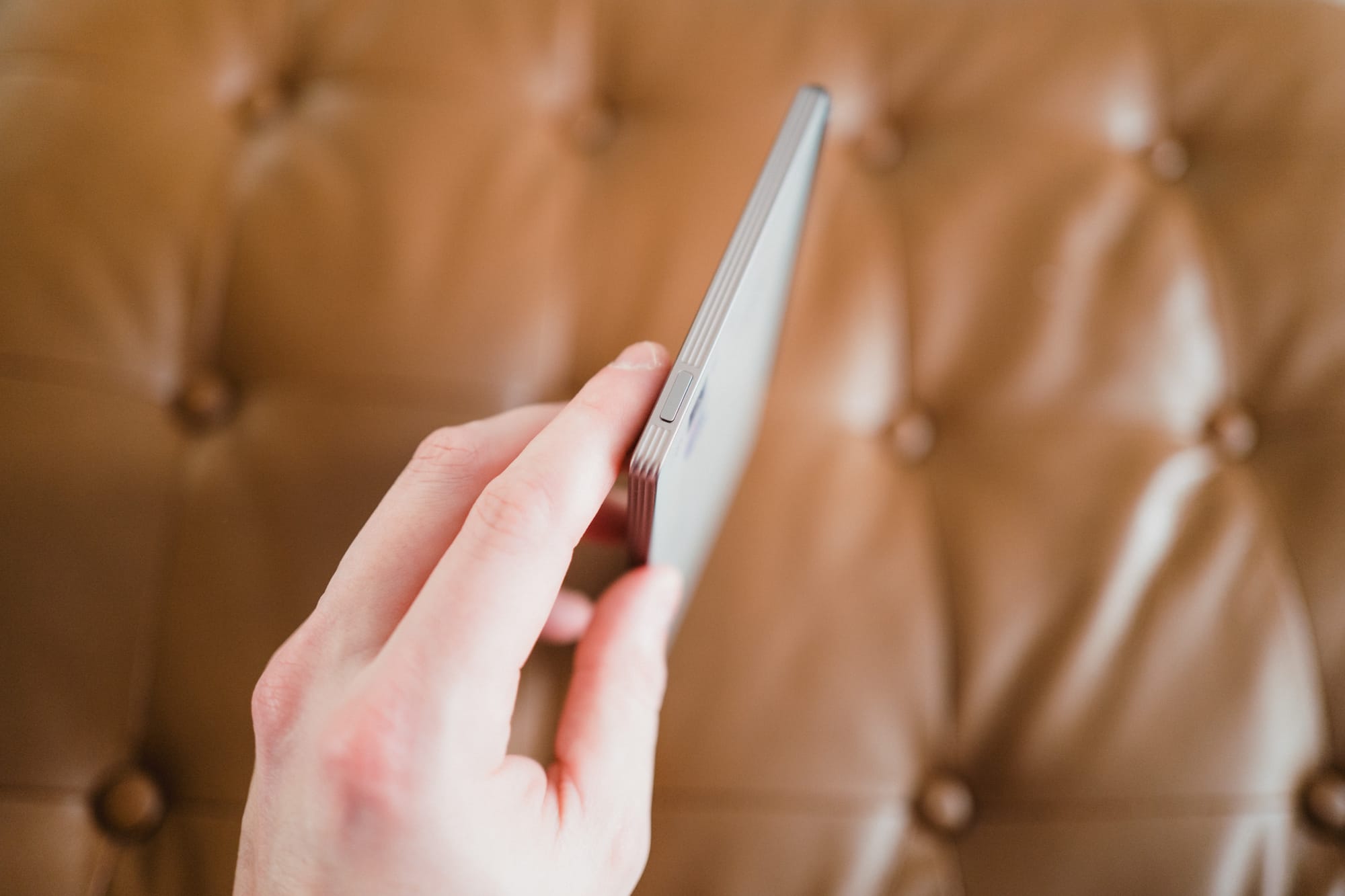

- There is one USB-C port on the Move’s bottom-left side. This device charges remarkably quick.
- The Move’s power switch is on the top edge, left side of the device. This is exactly opposite of an iPad, making for an interesting muscle memory experience.
- The Move has four corner flat rubber feet on the back side, ensuring you put the device onto any desk or table without worrying about the back rubbing against the surface. The rubber feet also keep the device in place when you’re writing. These four feet are probably my favourite physical feature of the device.
Overall, the Paper Pro Move feels pretty good in hand. The front textured glass is great to the touch and to the feel with the Marker Plus (more below), the grooved aluminum edges have a certain classy look to them, and the rubber feet on the back are an excellent utilitarian decision. I’d do anything for a better backside material, though. Especially considering the high-quality aluminum back on the larger Paper Pro.
Color E-Ink and Writing Experience
This is my first experience with e-ink, period. So cut me some slack. If you want expert advice on e-ink, check out Chalid Raqami’s awesome YouTube channel.
E-ink is likely to be a foreign concept for many digital-first people. E-ink is actually physical — it’s technology using millions of tiny black, white, and coloured capsules and particles that move with electric charges to create images. At first, it seems old-fashioned. After some more extensive usage, your brain starts to understand the benefits of e-ink: far superior battery life, easier on the eyes, better in direct sunlight. There are many good reasons to have at least one e-ink device in your tool stack.
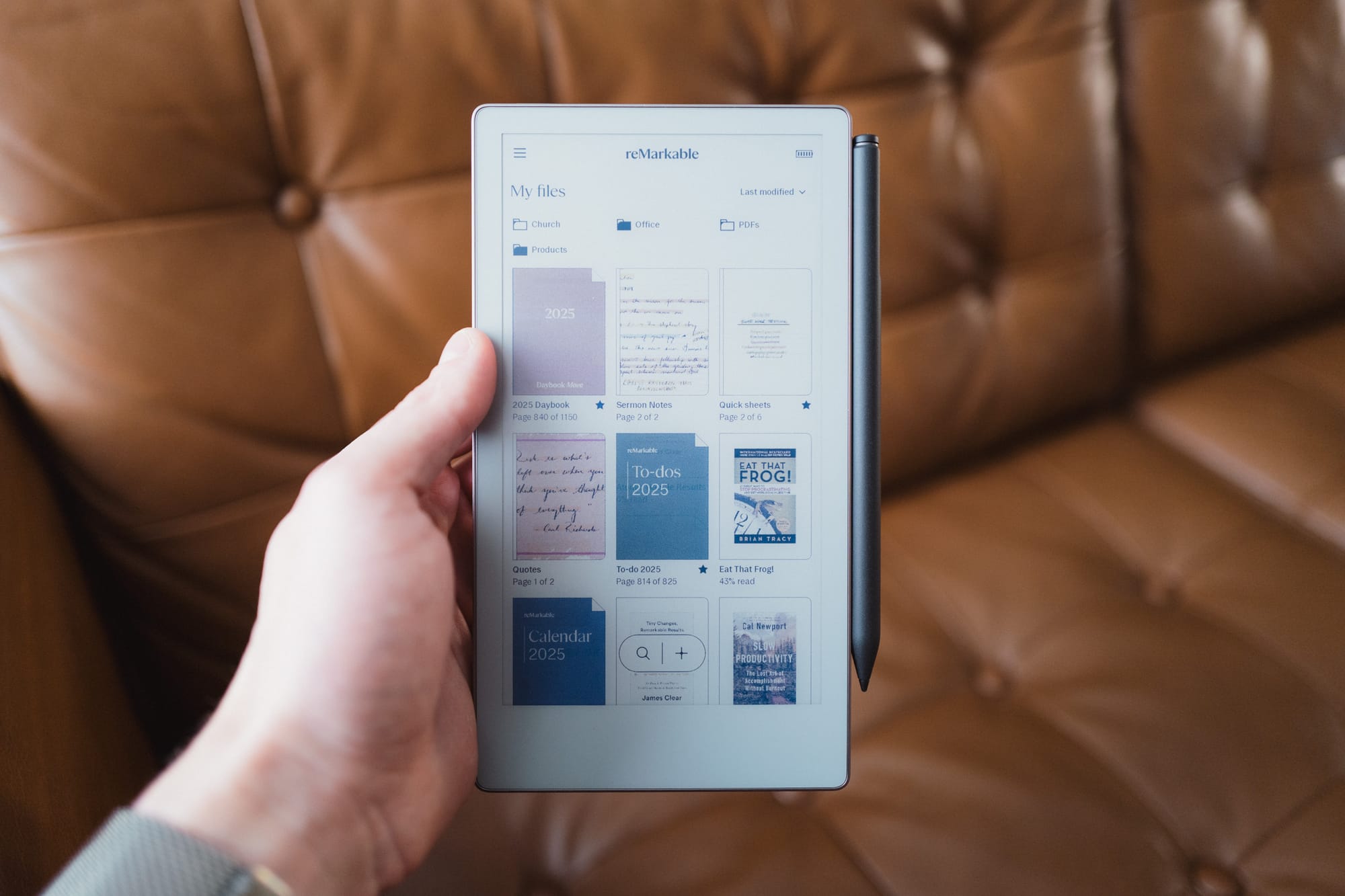
Now, colour e-ink has something of a questionable track record so far. By introducing coloured particles to the e-ink technology, displays take on ghosting consequences, slower refresh rates, and drain power far faster than standard black and white e-ink displays.
Here’s the benefit of never having experienced a black-and-white only e-ink display: I have nothing to compare to. The Paper Pro Move is my first ever e-ink device, so it is the standard setter.
And the standard, to my eyes, is fantastic.
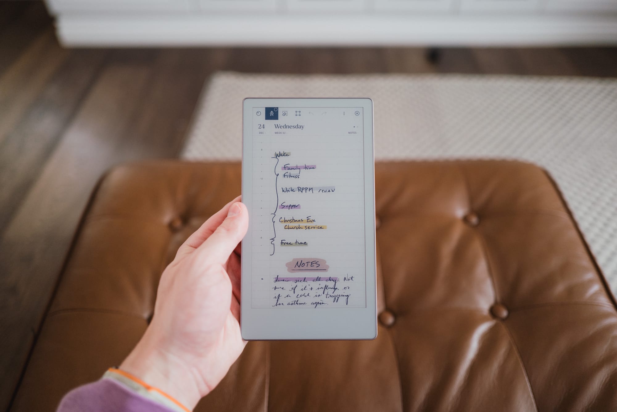
I love the way the muted colours display on the Move’s e-ink display. Coloured highlighters and coloured shaders provide this painterly-like feel when you mark up your notes. Colored pens feel far more like coloured pens in real life, where the colour doesn’t jolt your eyes off the page. Everything about the Move’s e-ink implementation — colour, refresh rates, and more — is wonderfully comfortable to me.
There are issues of ghosting here, to be sure. If you’re taking notes in landscape orientation, you’ll find you’re constantly scrolling your page up or down. When doing so, you’ll quickly find the ink scrolls upwards and leaves some “residue” behind. You’ll see a yellow-ish tint in the background of your text block as you scroll, and until the screen refreshes, your text will appear a bit fuzzier than normal. No fretting, though — the Move refreshes quickly and painlessly, bringing to life your coloured notes and sharpening your writing.
I find myself constantly wanting to use colour when writing out notes. I tend to use the shader tool to colour a background behind note headers, or I’ll use the big marker tip to create major line dividers with a shader background over top the line. Not only that, but I’ve even taken a screenshot of app icons on my iPad, uploaded the PNG to the reMarkable, redrawn and coloured an icon as a new layer overtop the actual PNG, and then copied that drawn icon to a specific sheet filled with other app icons. From there, I can easily copy that drawn app icon to build out my notes elsewhere in my reMarkable.
Writing Experience
Again, my naivety with e-ink paper tablets is going to show its ugly face here. My experience extends to the Apple Pencil and the iPad Pro. That’s it. Pencil on sheer glass. I’ve never liked the experience whatsoever — hence why I resorted to typing out my notes across the board.
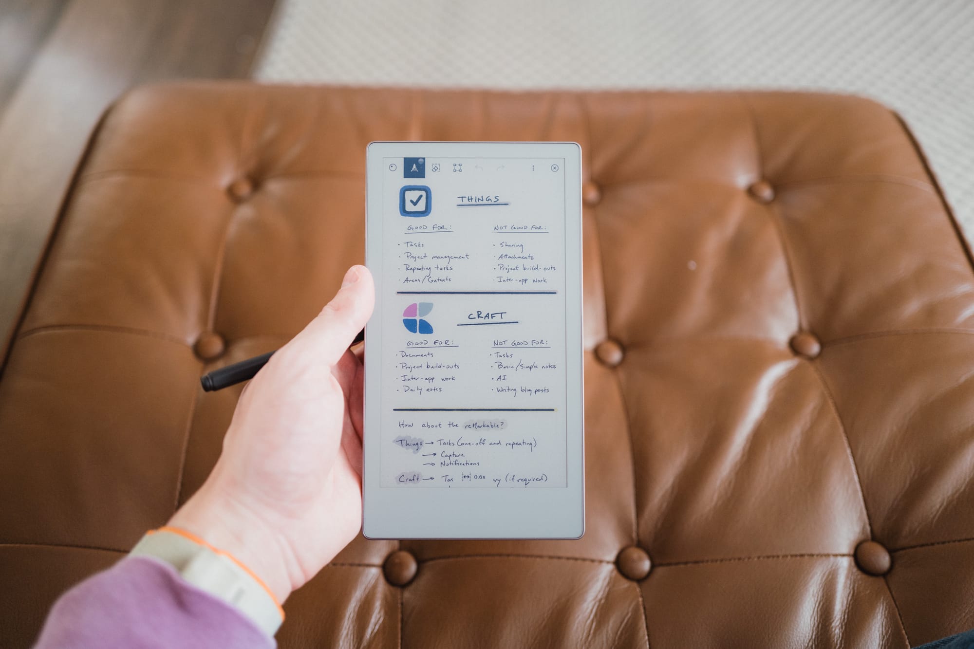
But the reMarkable changes the game for me. The very first time I stroked out my signature on the Paper Pro Move, my brain instantly switched into paper mode. There’s that tangible friction you just don’t get with a smooth piece of iPad glass. There’s the gentle pencil-like scratching sound of the Marker Plus on the textured screen. There’s the tap, tap, tapping of your pen if you’re a printer (rather than lengthier brush strokes in cursive writing). It’s very reminiscent of the paper notebooks and an HB#2 pencil we all grew up with in school, without the smell of pencil shavings or lead.
The Paper Pro Move is far more portrait-shaped than a larger A4-sized notebook, much like a reporter’s notebook. As such, you’re likely going to end up writing in portrait orientation more often than not. This works, by and large, but you should get used to your hand resting off the tablet. On the larger Paper Pro, you can rest your hand directly on the tablet and write endlessly, exactly like a piece of paper.

Flip it to the side, and you can write in landscape orientation on the Move as well. If you write notes in this orientation, the Move will adjust the view when you rotate back to portrait orientation to keep all your written text in the field of view. I quite like the way it renders your writing smaller when viewed in portrait orientation. Because of this, I tend to write a good chunk of my more-fleshed-out notes (which should be read as notes outside my daily planner) in landscape orientation. I’ve just had to get used to scrolling up and down the page more often when working in landscape mode.
My understanding is the writing experience with the Marker Plus and the Paper Pro Move is not as strong as, say, the Supernote. The Marker Plus is a capacitive pen, which tends to have more technology inside it than an EMR pen, which is the kind of pen many other e-ink tablets use. As you’ll find, reMarkable opts to take its own path (both in proprietary tools and software choices) where competitors don’t. This has both pros and cons, to be sure.
The Marker Plus’s pen tips do wear down over time. Depending on the consistency of your writing style and how you hold the Marker Plus, you may find you burn through the pen tips a little faster than you might expect. A quick search suggests a reMarkable pen tip lasts three to seven weeks, which means heavy users will burn through these things like candy. Find yourself a reMarkable pen pal so you can share pen tips.
I’d propose the Paper Pro Move’s writing experience is ever so slightly poorer than the larger Paper Pro. The larger Paper Pro is made of better materials and is heftier, providing a sturdier piece of glass to write on. If you only have a Move of your own, you won’t be able to compare and you won’t notice a thing. If you have both, I’d bet you’ll prefer to do more of your writing on the larger Paper Pro, as the glass doesn’t bend quite as much as and the heft of the device provides more tangible feedback when writing.
The writing experience, in unison with the Paper Pro Move’s distraction-free environment, provided one of those “Aha!” technology moments I don’t tend to experience much anymore. The immediacy at which everything clicked shone the light on why so many people prefer a paper tablet like the reMarkable over the glass display on an iPad. Perhaps the nano texture iPad glass would improve its writing game, but I don’t think anything is going to come close to this writing experience except maybe a direct reMarkable competitor.
Software and the reMarkable App
Now, we’re bridging gaps and chasms between the digital and analog world here. The reMarkable Paper Pro Move is far from an analog-only device. There is some pretty sophisticated software built into this device, and it works — cough, cough — remarkably well.
Where a device like the Supernote may have a superior writing experience and provide more flexible software in some cases, the reMarkable’s sync speed and ability to quickly offload notes from the device is where this device really shines. A friend watched me sync a PDF to the reMarkable from my iPhone in under three seconds and said, “Yeah, with my Boox, that workflow would have taken about five minutes.” For professionals or a corporate environment for which this device is designed, reMarkable’s app and sync speed set the device apart.
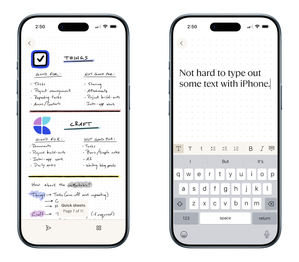
Everything is handled inside the reMarkable app. On the Mac, you can drag and drop PDFs and ePubs right into the app, which will likely sync by the time you look down, pickup your reMarkable tablet, and navigate to the home screen. Same for templates — if you click “Add to reMarkable” on the reMarkable Methods page, the template will be available on your tablet in seconds.
The same goes for written notes and edits you make to PDFs. Write out your notes or make an annotation in a PDF, navigate out of the document back to your home screen, and jump to your computer. You’ll see your edits are available and ready to go. As you’ll see below, emailing out your notes to an app like Craft generally syncs your notes within three or four seconds. This speed is truly spectacular and is the core game-changer for professionals who want to use this over a paper notebook at the conference room table.
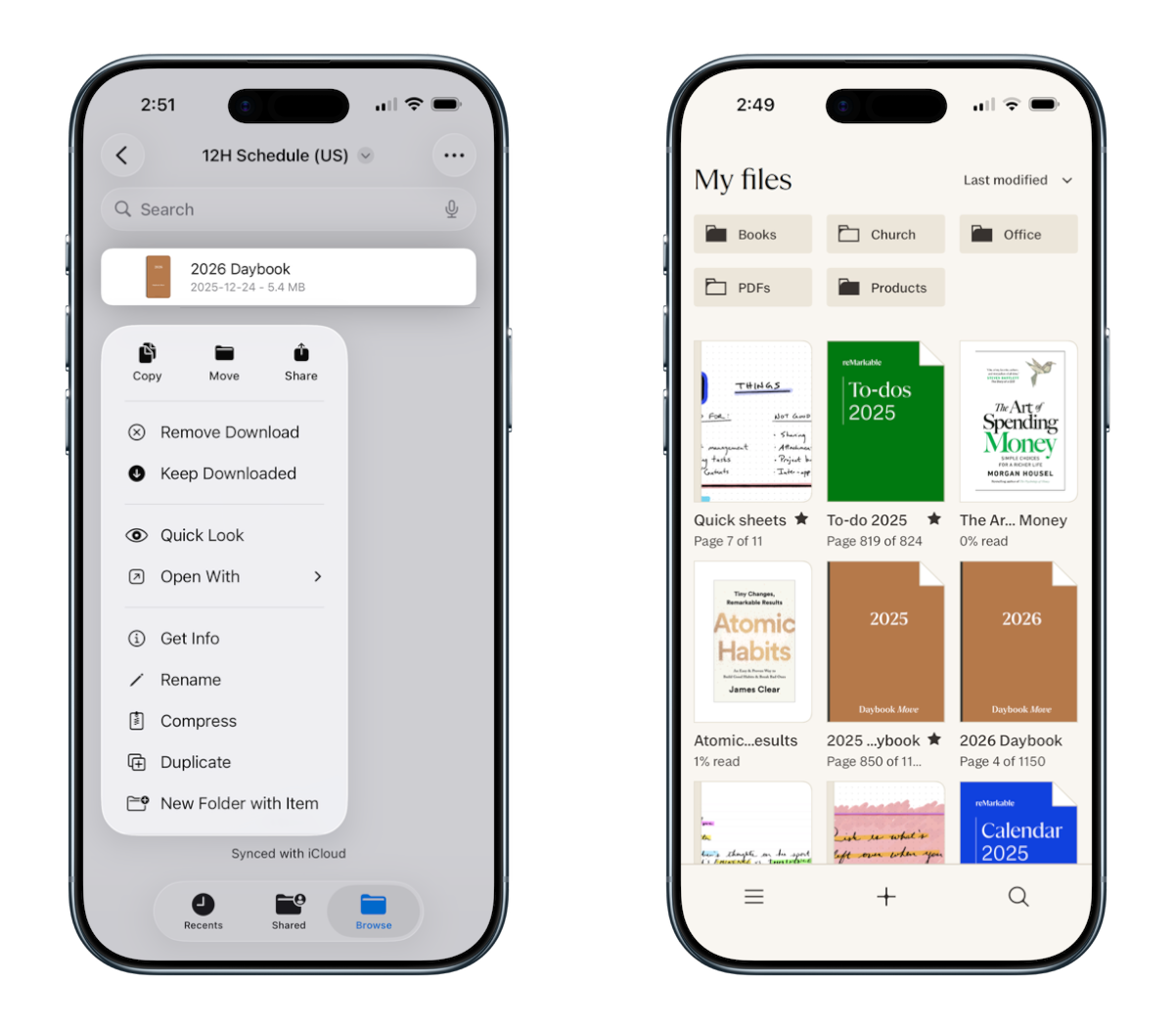
There are a number of other great features inside the app, with one particular caution throughout:
- You can convert your handwritten notes to typed text inside the iPhone/iPad/Mac apps, just like you can do on the reMarkable itself. You can also add typed text to a note from any of those three apps, which allows you to make some wonderfully formatted notes.
- Aside from making handwritten notes, you can effectively do anything inside the iPhone/iPad/Mac apps that you can do inside the reMarkable itself. You can also drag and drop PDFs, ePubs, and other documents right into the reMarkable.
- That’s the caution: If you’re working inside the reMarkable app on your iPad, you cannot mark up your notes with the Apple Pencil.
The incredible sync speed between the app and the reMarkable itself, combined with the flexibility of having all your handwritten notes immediately available on your Mac to export elsewhere, makes the entire software experience a top feature. Finally, it’s the software speed that sold a friend on the reMarkable, even after he had already committed to a Boox tablet.
Google Drive, Dropbox, and OneDrive Integration
On top of sync speed, you can also directly sync your entire Google Drive, Dropbox, and OneDrive storage accounts to your reMarkable, making every single file you own available to you at all times. In theory, this builds an impressive layer of file-accessibility to your workflow.
In practice, though, I’ve found the Google Drive integration to be pretty slow, especially in relation to the rest of the sync speed from the reMarkable app on the desktop to the reMarkable itself. If you’re going to use Google Drive/Dropbox/OneDrive to sync files to your reMarkable, I recommend having one high-level folder where you keep reMarkable-specific documents, and then having that folder in a quickly accessible spot in your drive. We have our entire client folder saved in Drive, and it takes a few minutes to load all the folders on the reMarkable tablet.
Secondly, you can only navigate to the file in Google Drive/Dropbox/OneDrive and import the file directly to your reMarkable files. You can’t work directly on the file from the reMarkable. This will create duplicates all over the place and may run in the face of some collaborative features offered by a service like Google Drive.
In all, though, it’s good to have this integration readily available on the reMarkable Paper Pro Move. If you need to find a PDF in a pinch, you can do so. I’d just recommend finding a faster way to import PDFs and other Word documents into your reMarkable through the app.
Sharing Documents and Slack Integration
There are a few other neat software integrations in the reMarkable Paper Pro Move, but the two that stood out to me were the Slack integration and the ability to send documents directly from your reMarkable Paper Pro Move.
Slack Integration: We no longer use Slack, so this feature is lost on me. However, for those who find themselves inside that software, you can send documents very simply from your reMarkable paper tablet to Slack for sharing beyond.
Email sharing: My more-often used sharing feature is the ability to send a specific page of a document or a larger document itself to someone directly via email on the reMarkable Paper Pro Move. The email composition window isn’t your standard email composition window (messages are pretty challenging to type out on this tablet), but you can do it. How I use this feature: I send my notes directly from the reMarkable tablet to Craft for adding to daily notes or other things I’m working on. I also send highlights on PDFs and ePubs I’m reading through from the reMarkable Paper Pro Move directly to Readwise. I suspect this will be the most popular reason to use the email sharing features inside the reMarkable Paper Pro Move.
You cannot receive any email on the reMarkable. At least, not so far that I can tell.
reMarkable’s digital experience — the software and the digital features baked around the core note-taking experience — is what quickly blends the grey zone between analog and digital. I can see why this area is the most difficult to balance. Once you have nailed the writing experience, you have to choose which features analog note-takers want for their notes and which ones push the reMarkable Paper Pro Move increasingly into the “do-it-all”, iPad-like category.
For now, I’m pleased with the decisions the reMarkable team has made. I’m curious how far they are willing to push it in the future, though.
Reading Experience
If you’re buying a reMarkable Paper Pro Move, you’re likely not buying it for the sake of it being an e-reader. The Move’s e-reader features are more like a cherry on top of the cake rather than a core feature, but it’s a feature I find myself using a ton.
Now, again, my lack of e-ink experience is going to show here — I’ve never used an e-reader and I have no clue how those devices look and feel for hammering through books. So I have to lean on other folks' thoughts and reviews to provide a better sense of whether the Paper Pro Move holds its own as an e-reader.
In short, my understanding is that the e-reading experience is poor on the Paper Pro Move. I’m very, thrilled with it myself. But apparently it’s poor overall. (Which means I am sure I’d love something that’s more of a dedicated e-reader.)
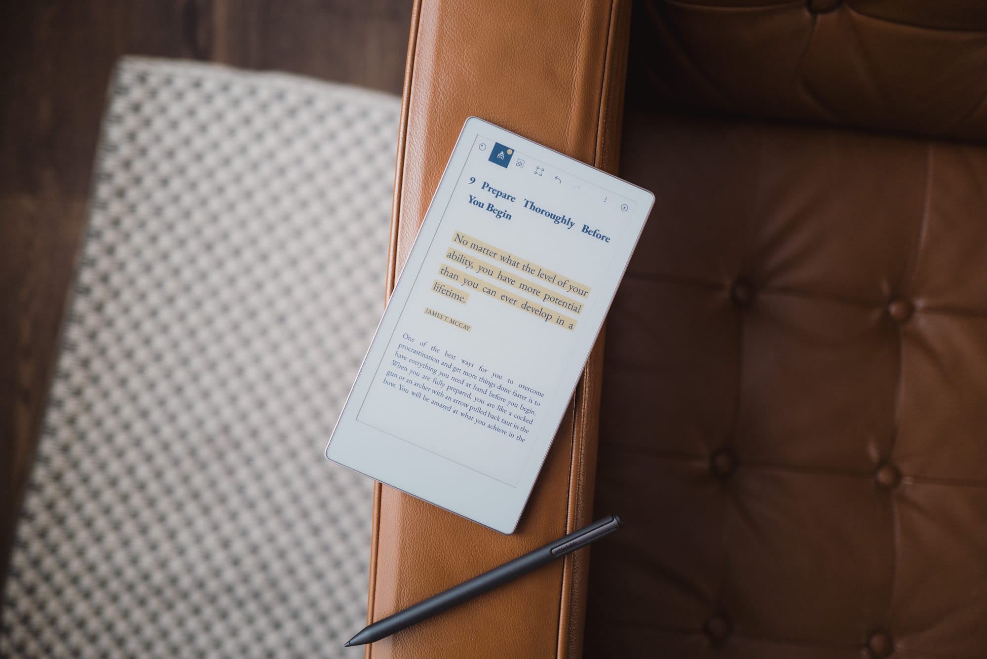
The Paper Pro Move offers a number of ePub features, such as the ability to increase and decrease font size, choose from four different fonts, jump between chapters in a dedicated Table Of Contents view, and more. It also does a great job sticking highlights to lined text, ensuring you can squiggle highlights all over your ePub and then share those highlights later.
However, the single biggest issue with highlights I’ve encountered is how reMarkable treats highlights in a PDF or an ePub. In short, reMarkable simply adds colour to a layer behind the text. For a PDF, this is not an actual highlight annotation. Therefore, when you share a highlighted PDF from your reMarkable to Readwise, you’re going to get an error stating there are no highlights in your document. Readwise parses the document for actual annotated highlights, not colour behind text. Therefore, if highlights are your thing, you’re either going to have to re-highlight your book or PDF in an app like PDF Expert, or you'll have to do your reading in a different app or on a different device altogether. I discovered this after reading my first full book on the Paper Pro Move and, needless to say, I was quite disappointed.
If you want to take handwritten notes in an ePub, you can do so by adding in a page to the ePub itself. Your written notes will then form part of that ePub file. This is slightly different from how Amazon appears to handle written notes in their Scribe models, wherein a note can actually stay in-line with the written text. Still, though, I love the ability to take a few random notes here and there when I’m reading.
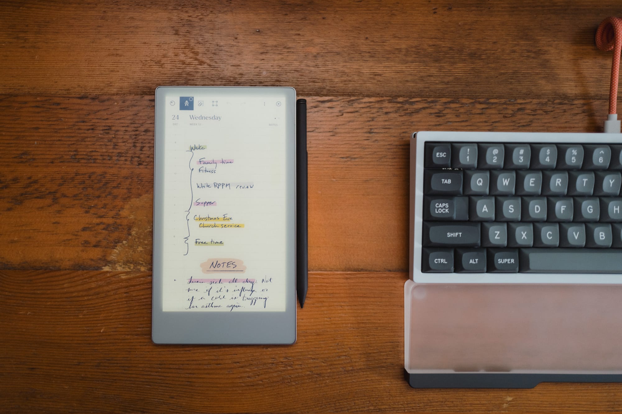
The Paper Pro Move does come with a backlight. It’s a bit blue, if you ask me, and if you will likely be using the backlight if you’re reading at night. I’ve become used to the blue backlight, but I do prefer reading with the backlight off.
I’ve found the e-reading experience to be just good enough to absolutely fall in love with the feature on my Paper Pro Move. This device is the perfect size for reading books, capturing highlights, and taking notes. It may not have a number of other e-reader specific features, but for me right now, it’s an outstanding experience.
Notes on the Leather Book Folio
I could continue on about a number of other reMarkable Paper Pro Move features, but I’d like to spill some ink on the Leather Book Folio itself. Physically and metaphorically. Overall, it’s a pretty disappointing case.

Now, first the positives:
- The Leather Book Folio is leather, so it will wear nicely over time. My colleague has one of the woven cases, and I can’t stand woven cases — they pick up all kinds of grime and dirt. My Leather Book Folio is perfectly clean after a few weeks of use.
- The Book Folio’s magnets are as impressive as the magnets built into the device itself. It’s flat out difficult to remove the device from the case thanks to the strong magnets. On the flip side, everything is held by magnets, meaning it’s still pretty easy to remove the device from the case.
- The pen holder on the side of the case has a nice indented area on the backside of the case to allow you to fold it over flat. This provides a flat writing surface, even if you’re writing with the case on the Paper Pro Move. This is a great feature if you find yourself rarely wanting to remove the case when writing.
Where the Leather Book Folio falls completely on its face is the price. This is a good case, in general. But for the price, it needs to deliver a fair bit more to get my vote. At $200 CAD, this is one of the most expensive leather products I own. It’s up there in Plotter territory. And it is so far from Plotter quality, it’s not even funny.
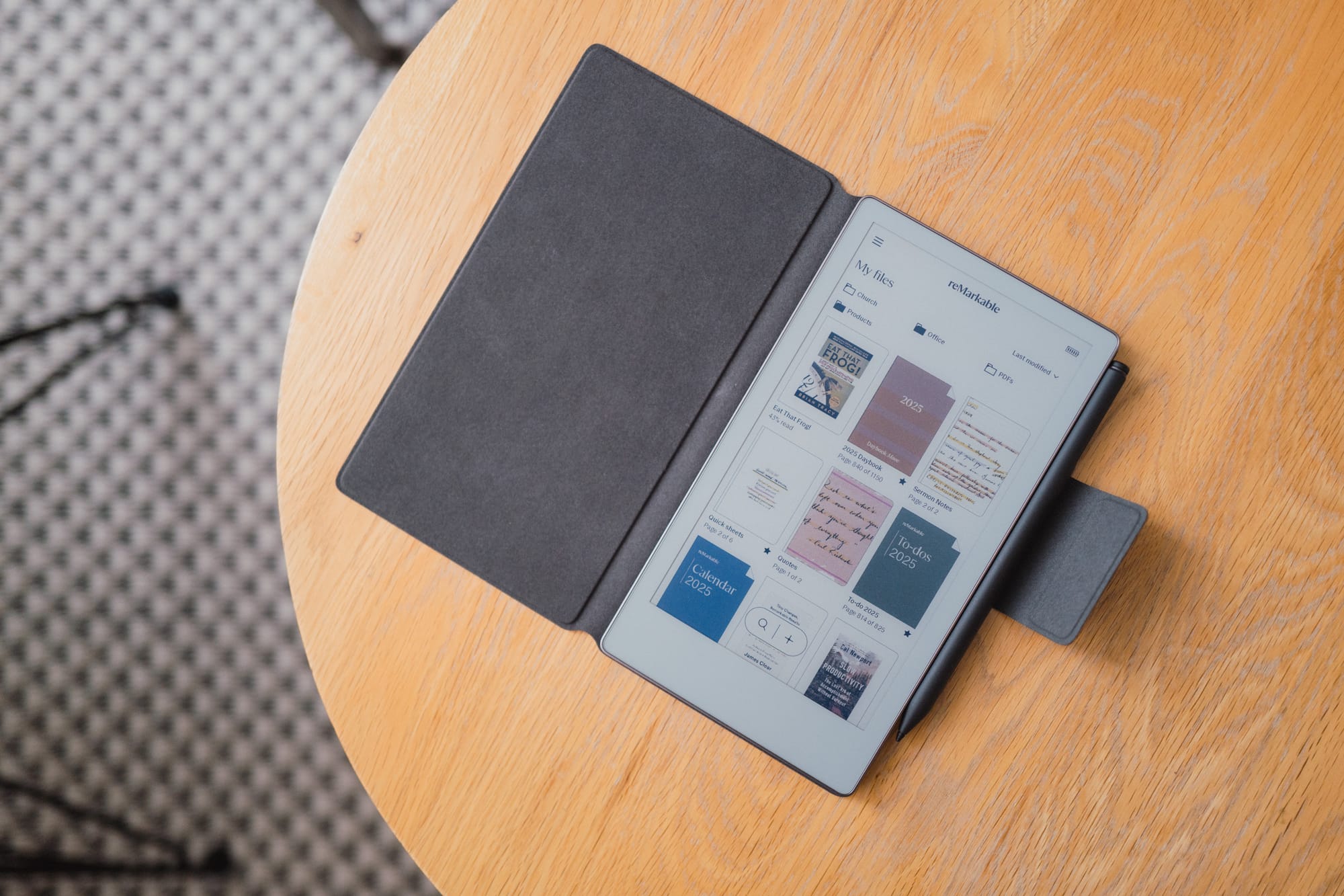
I think I’d recommend skipping out on the reMarkable first-party Leather Book Folio and look for something far cheaper on Amazon. If I were doing it again, of course.
Conclusion
I will have missed discussing several features in this might reMarkable Paper Pro Move. I’ve never experienced an e-ink device before, and as such, I feel like every nook and cranny can be explored.
Fortunately, it’s a relatively simple device designed to do relatively simple things: write and read.

It’s this simplicity that is the Paper Pro Move’s calling card. It acts as a promise to pull you out of the flash-and-bang of the online world and into an arena of focus and attention. I truly believe this device is one of the best at getting you to quit your scrolling.
But it comes at a price. At $730 CAD, many folks will ponder whether their handwritten notes deserve such a hefty sum.
To this end, I feel the reMarkable Paper Pro Move (and the larger Paper Pro itself) are likely designed for professionals and corporate minute-takers — folks who can deduct the cost of the device; who want the ability to quickly search their handwritten notes; who want the ability to sync their notes directly to a client or patient file after a meeting; or who want undivided attention in meetings. For the casual note-taker or someone who doesn’t have the ability to deduct the cost, I can see the reMarkable Paper Pro Move being a big pill to swallow.
The price is absolutely right for me. In fact, after all the years of searching for ways to incorporate analog note-taking into a digital note-keeping world, I’d pay almost any price to fix the problem.
As it is, the reMarkable Paper Pro Move is the first device in a long, long time that has been truly disruptive to my workflow. I can’t wait to see how it impacts my 2026 and beyond.