After a fewrecent articles regarding the impact of Markdown on writing habits, I wanted to pitch my own system of using Markdown.
Of course, I use Markdown in all my digital text files. In fact, every text file I have ever created is marked up in Markdown. Markdown is super easy to learn and this meant I could quickly adapt it to all my school notes back in 2010. Day One was released in early 2011 and my entire journal has been marked up in Markdown as well.
Most recently, my written notes have been marked up in Markdown too.
The reason for this is simple: Markdown is so easy to use, so easy to read and so easy to implement that it was a natural progression to transfer the system to analog notes. Obviously, analog notes aren’t actually styled with italicized and bold letters. But the small syntax additions help add context that is otherwise hard to convey.
Here is how I use Markdown in my written notes:
<p>These five little additions to written notes add context and organization in a unique manner. </p>
I like to create headings with the “#” mark, especially when writing out thoughts for the day. This helps to create organized structure if the thoughts extend beyond one page. I could underline titles (like I do the date at the top of the page) but I find the underline often takes up an entire line if I don’t make a proper pen stroke. The “#” fixes this problem.
I use an asterisk extensively to denote emphasis in written thoughts. Trying to angle my wrist to deliver an italicized pen stroke is difficult to do. Using a single asterisk (or double, if in real need of emphasis) is a simpler and healthier way of styling handwritten notes.
I rarely use the footnote marking unless I am writing many different thoughts in paragraph-form. I like adding far-flung tidbits via the footnote syntax that don’t completely apply to the current thought.
Lastly, and perhaps most importantly, is the altering of Markdown link-formatting to reference information within my analog notes. I use square brackets to show which part of my writings I want to reference and I include the title of the article or source of the information that sprung my thought inside the round brackets. I can easily take the source of my thoughts and search within my Pinboard or on Google.
I have gone back to using Patrick Rhone’s DashPlus system where each thought starts with a dash. From there, most of my thoughts end in a left-aligned star which denotes a thought or journal entry. However, from time to time, I write down a task or an idea that needs to be followed up on at a later date and I process these with DashPlus. After Patrick showed me how to denote a journal entry, I was completely sold on his system.
So all in all, I use DashPlus to start an idea in my written notes and I use an altered Markdown to style the insides of my written notes. My Field Notes books have asterisks, hats, hashtags and plus-signs all over, and each of these symbols means something different to me. I have found two systems which work great together and which allow my notes to remain readable, searchable and structured.
The best part? My digital and analog notes look the same. I wager anyone writing in HTML’s heyday would never have imagined someone saying that.
Subscribe to The Newsprint
Enjoy these posts? Subscribe to get more, delivered right to your inbox.
Editor’s Note: I wrote this review this past spring, but the review has needed to overcome some hiccups. I’ve reshot the photographs for this review as the photos didn’t transfer from past platforms.
Generally speaking, you consider how a new pen feels in your hand, how it applies ink to paper and how it handles the daily wear and tear of life.
Getting my hands on the Fisher Bullet Space Pen made me change these considerations entirely. If I were to apply the marking rubric for a Jetstream to the Bullet Space Pen, the Space Pen would be one of the worst pens in my arsenal.
Yet, I carry the Bullet Space Pen everywhere. Since receiving it in the mail, it hasn’t left my front pocket.1 It has accompanied me in every situation and it has become my go-to everyday-carry pen.
Overall though, the Bullet Space Pen offers a sub-par writing experience. It’s not overly comfortable to hold. Its current refill has horrendous ink flow and the medium tip is extremely blunt.
Therefore, I think it’s only fair that I consider the Fisher Space Pen differently. The Bullet Space Pen is my first foray into a new pen category — a pen category that sacrifices traditional pen strengths, like ink-flow, in favour of portability, durability and extremely flexible writing capabilities.
It’s a new breed of pen — one that will stay with me far longer than any other pen I own.
Bullet Space Pen
The Fisher Space Pen was developed in 1948 by Paul Fisher for zero-gravity writing in space. To operate in zero-gravity, Fisher used pressurized ink cartridges that don’t fall victim to the side-effects of gravity-dependent cartridges. These cartridges can write underwater, upside-down, in zero-gravity and in grease or butter.
The Bullet uses the Space Pen cartridge and collapses into an ultra-portable pen that can be thrown in any pocket or purse. When capped, the pen measures about 3.5” long and, when posted, the pen extends into a full-length body. The Bullet’s body has a slight oblong shape and this allows the cap to properly extend the pen for comfortable writing.
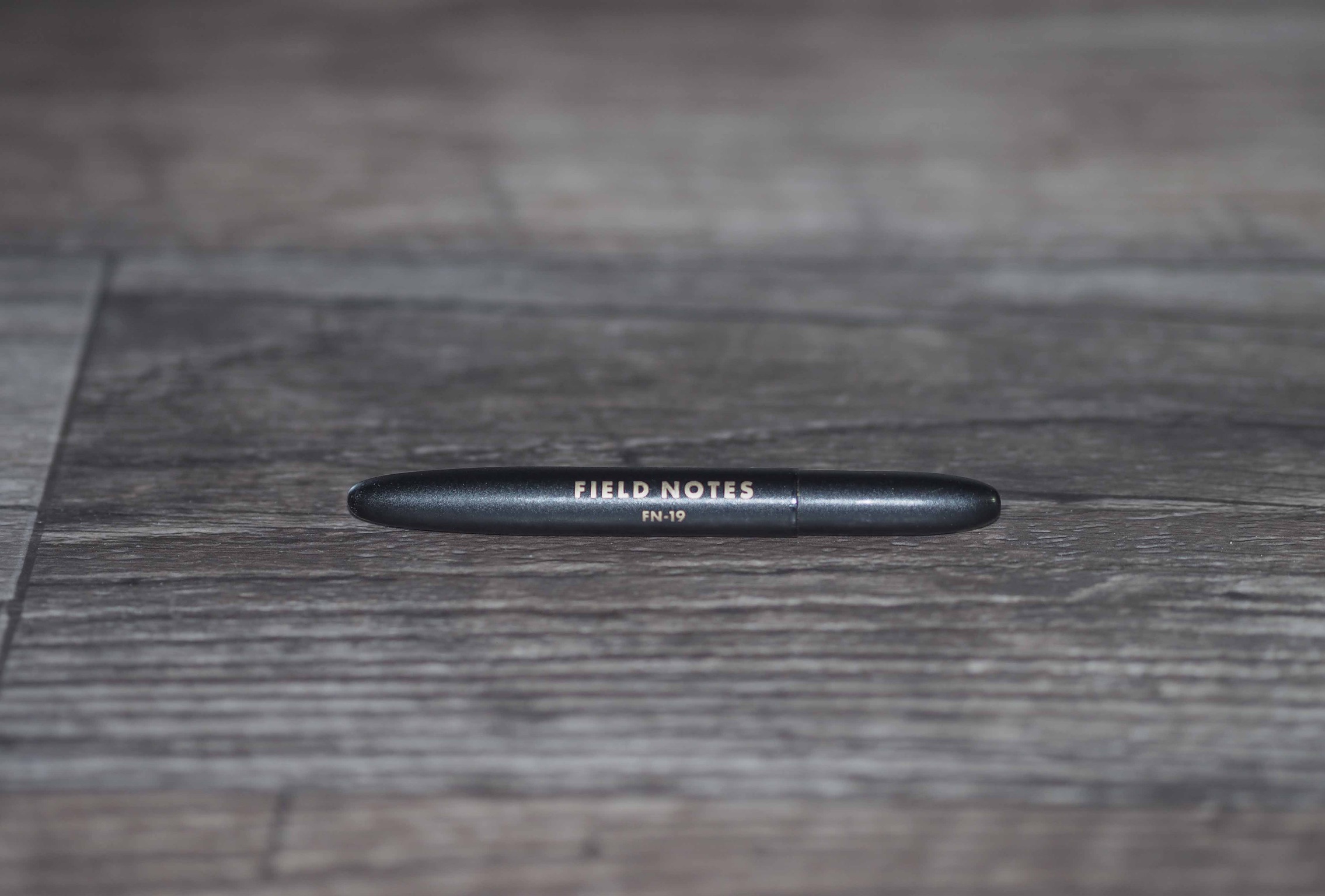
The Bullet comes in many different forms and colours. My recent obsession with Field Notes, however, led me to purchase a Field Notes branded Bullet Space Pen. When Josiah and I purchased our Colors subscription, we threw both matte black and chrome versions of the Bullet into our order. When the pens arrived, it took a mere three days to lose my chrome version. Josiah was gracious enough to sell me the matte black version and I’ve been an excited man ever since.
The chrome Bullet offers the same writing experience as the matte black version but has a few minor differences. It accumulated fingerprints like my iPad screen and it became surprisingly slippery with a sweaty palm. To combat sweaty palms, Fisher mills a grip into the tip of the pen. This milling may not look as minimal as the rest of the pen, but it did a great job of fighting my sweaty palms. The matte black version doesn’t use the same milling process and, as a result, doesn’t handle a wet hand very well.
For all intents and purposes, the matte black option is the best option. The Bullet is meant for carrying on your person and needs to handle the wear and tear of daily life. The matte black version does a better job of hiding scuffs and fingerprints and will better suit those who use the pressurized refills to their potential.
The Bullet has a surprising amount of heft and I am grateful to find that its weight is noticeable in my pocket. If not for the weight, the Bullet would slip under the radar in my pants pocket and I would certainly be more susceptible to losing it.
This is undoubtedly where the Bullet shines. Between its relative heft and its perfected portable design, the Bullet is the easiest pen to carry around. It fits beautifully into a pocket and even hides nicely in the little pouch of my Hellbrand Leatherworks Field Notes cover.
This heft is also responsible for adding what little comfort there is to the Bullet’s writing experience. The all-brass body lends the Bullet a very minimal design but doesn’t hold up for lengthy periods of writing. The plastic grooved grip on the Zebra F301 is probably a worse experience for longer writing periods, but the Bullet gives it a run for its money.
For the most part though, I don’t think any savvy pen users will notice the poor comfort. In fact, I wouldn’t be surprised if users don’t use the Bullet after signing their name or jotting down a note in their memo books. Why? Because they won’t use the pen as their everyday pen. The Bullet may be the best everyday-carry pen, but it isn’t the best everyday pen. Maybe I’m experiencing a one-off, but I have found my Space Pen cartridges to give some of the worst writing tests I’ve tried. And it all starts with the blunt end.
I probably became spoiled when using the brilliantly fine F301. The fine tip meets the paper at a visible angle and gives direct visible feedback as ink rolls onto paper. This visible feedback is non-existent with Fisher’s medium refills. The blunt end is actually obtrusive to writing. Because you can’t see where the pen meets the paper, the natural tendency is to change the angle at which you are writing. Once this angle reaches a comfortable viewing angle, you reach the angle where the ballpoint doesn’t properly roll on the paper. It’s a catch–22; I have to sacrifice visible feedback for proper ink flow. And I can’t stand this.
When held in the awkward posture of little angle to the paper, the Space Pen writes smoothly and effectively. It doesn’t surpass or fall short of the standard ballpoint experience. Jetstreams offer better ink flow and the F301s offer thinner, more precise lines. The medium Space Pen line is slightly too thick for my liking. It is thick, bold and undoubtedly true.
There’s no difference in feel between a gravity-dependent cartridge and a Fisher pressurized cartridge. Between the blunt tip and the awkward writing angle, you can bet I’ll be up for a fine cartridge when I purchase my next refill.
Verdict
I think it’s pretty obvious who the Fisher Bullet Space Pen was made for.2 The pressurized cartridges can write anywhere and in anything, but on general paper, they barely hold their own. The pen isn’t comfortable to hold and its minimal and portable design makes it very susceptible to misplacement.
However, The Bullet Space Pen’s job isn’t to be a good writer. It’s not even to look good.
It’s job is to be the most portable and most durable pen you can carry on your person at all times. It’s job is to be the pen you pull out when you couldn’t possibly have expected to need a pen. It’s your safety blanket. Your backup plan. Your last resort.
There is no doubt that the Bullet thrives in this environment. I needed to write down a few notes in church last week and I didn’t have my trusty F301 at my side. But there was the Bullet, sitting unassumingly in my pocket and dying for a little attention. The Bullet came through in a moment’s notice and I was able to jot down an important thought for later.
At this point in time, I fully recommend the Fisher Bullet Space Pen as your everyday-carry pen. It is small, portable, minimal and durable. It writes good enough — and in enough situations — to warrant it a place in your front pocket. And it can be refilled over and over.
If you’re feeling like being a devout, you may as well grab the Field Notes Bullet Space Pen). That Futura font adds the subtlest character and will show how serious your Field Notes collecting has become.
You can support The Newsprint by purchasing a Fisher Bullet Space Pen here.
Save for the terrible experience of having a Chrome Bullet Space Pen slide out of my pocket into the deepest parts of my parents-in-law’s couch. I don’t think I’ll see that pen ever again. ↩