Cover Image: A lucky snapshot I took on my iPhone while sailing to Liberty Island on a ferry. Edited in VSCO Cam.
I’ve written about New York City in the past. I have an insatiable love for the city. While our first few hours in a New York City bus were a nightmare, every moment following blew away our expectations.
I love the anonymity of the city. I love the rambunctiousness of the city. I love the spontaneity of the city.
So Jac and I are going back. And we’re going back to celebrate our first anniversary in the middle of July.
New York City is an order of magnitude larger than anything we can experience in the Canadian Prairies. New York and its suburbs house almost two-thirds of Canada’s entire population, so there is no conceivable way for we “country bumpkins” to understand such a great city.
On the docket: a Yankee game, a Broadway show, the Bronx Zoo, a Central Park bikeride, the Museum of Modern Art and a trip to the top of the Empire State Building. We spent four days in New York last summer and didn’t come close to completing our to-do list. We hope to slash away another quarter of the checkboxes this time around.
Despite my numerous hobbies and extravagant obsessions, traveling remains high on the priority list. I feel bad revisiting a city we’ve already seen, but if it ain’t broke, why fix it?
We hope to fly into Los Angeles next summer to celebrate our graduation and into London a few years down the road to finish off our European bucket list.
If you find yourself in New York in the middle of July, get in touch.
Subscribe to The Newsprint
Enjoy these posts? Subscribe to get more, delivered right to your inbox.
My constant tinkering, consistent impatience and distasteful discontent has turned The Newsprint into a victim.
I’m sorry all.
I am truly sorry. Seriously. There’s nothing worse than having to read meta posts every week. And, at my rate, I’ll probably end up deleting my Squarespace account.
…
Of course, I’ve done that as well. Why?
Squarespace is awesome. I am creating a new website for the museum I work at and I have put a proposal forward to use Squarespace. Squarespace is very easy to use, is incredibly quick to learn and is constantly updated. I can’t think of a better CMS for the majority of people. It may even still be the best system for me.
However, I want to try something new. I researched Ghost extensively and stumbled upon Sven Read’s incredible Ghost themes and his free Readium 2.0 theme screamed elegance. I downloaded the theme, opened a free trial account and began tinkering.
And boy was tinkering fun. I couldn’t stop tinkering. Tinkering may be my new online hobby.
Ghost is more challenging than Squarespace ever was, in both good and bad ways. I like how it forces me to learn more about backend code and backend design. At the same time, I don’t like Ghost’s current limitations.
Switching platforms isn’t all about wanting to try something new though. I genuinely need something new.
Over the past few months, I’ve bounced around inside the walls of the Squarespace Newsprint’s narrowly defined scope. By that, I mean talking about productivity, tools, apps, pens and paper can become long in the tooth every now and then. I’ve grown tired of needing to buy new memo books or new apps just so I can write something for The Newsprint.
Like any curious cat, my interests change with the wind. Two weeks ago, I wrote about my mirrorless camera search. I couldn’t help but feel uneasy about posting an article on cameras when The Newsprint’s scope was meant to eliminate photography content. My desire to write overcame scope that time, but I couldn’t guarantee it would happen again.
The last major reason for the switch is because of my incessant pageview worry. A small conversation on Twitter the other day really made me ponder my goals with The Newsprint. I have checked my analytics at least 10 times a day for the past three months and I am constantly checking my Carbon Ads profile to see how much money I made the prior day. I am ridiculous. I know. Don’t lecture me.
So I’m going to eliminate my pageview worries. I have jettisoned the Carbon Ad solely because I don’t want to do this for the money. Carbon Ads have been incredible to work with and I highly recommend their service. I am so grateful for their hard work and their invitation to jump aboard.
Ghost still costs money, however, so I’ve chosen to maintain the “Store” section of The Newsprint. Any products I do review — and I will continue to review products — from here on in will be entered into the store with an affiliate link. If you want to support The Newsprint monetarily, you can do it by supporting developers and business owners as well. They put more work into creating products than I do in writing about them, so they deserve some of your money as well.
The switch to Ghost has three major implications for readers and they all make me want to cry. First, all past permalinks are now essentially useless. Ghost uses a different permalink markup than Squarespace and the amount of effort needed to make all the changes is not worth the time. I apologize for any 404 Errors this switch will cause.
Second, I have to ask all my RSS subscribers to resubscribe to the new RSS feed URL. Squarespace’s RSS statistics were always very volatile and I’m excited to jump over to Feedpress and experience some stability. You can subscribe to the new feed URL here.
Third, although Josiah found an incredible way of importing all Newsprint content from Squarespace to Ghost, images seem to have been lost in the fold. Most articles with photography now show empty photo containers. I apologize for how “constructional” this looks, but I also look forward to replacing those photos with new photos and a new camera. Thanks for bearing with me.
All in all: Ghost, Readium and a new foot forward. I love Ghost’s split-screen writing view and its ease of use. I also like the foundational creed of Ghost’s efforts and I want to support their cause.
I’m also wanting to get back into photography and I think this Readium theme handles both photography and longform writing well. I hope to add some really cool hero images to some posts and I want to try out some in-depth photo essays.
Perhaps the biggest thing that isn’t changing? The Sunday Edition. It’s here to stay and I love curating that list every week. It seems to be a fairly big hit, so the least I can do is continue the best part of the site.
This is easily the most selfish decision I’ve made with The Newsprint. The Newsprint’s growing audience — which actually surpassed 2000 RSS subscribers this past week — is surely going to take a hit after such a switch. I apologize to those readers and I hope you decide to visit from time to time.
For those who continue on with The Newsprint, thank you. I want The Newsprint to be more reflective of me than of the products I use. Although those products are quite reflective of me, they aren’t the whole story. Hopefully the new Newsprint will look a bit more like Josh and less like a robot.
The most common question I field on The Newsprint is whether Omnifocus is worth the premium price. It’s hard to give anything but a common answer:
It depends.
With Omnifocus 2 for Mac’s update this past week, much talk has been devoted to how Omnifocus can be used to conform to different people and different uses. Usually, these workflows are intensive and complex, so it’s hard to know whether Omnifocus would work for less complex situations.
There’s no better way to find out if Omnifocus suits you than to try it out for yourself. No tool is a one-size-fits-all answer and Omnifocus is no different.
Unfortunately, the Omni Group’s 14 day trial is too short to truly understand if Omnifocus suits you. Further, the iOS App Store doesn’t offer trial periods. Your best bet is to buy the cheapest option. At $20, Omnifocus 2 for iPhone is the cheapest way of getting into the Omni Group’s GTD task manager.
TL;DR: Buy it. Try it. You’ll probably fall in love with it. And you’ll probably end up buying the iPad and Mac version to join it.
There is a longer story here though.
Omnifocus 2’s polarizing redesign has scared off some Omnifocus 1 users. It has a few design choices that don’t make immediate sense. It uses big words — which are immediately seen in Omnifocus’s main screen — that appear overwhelming upon first glance. And Omnifocus’s entire premise is one of power and extreme efficiency.
However, it could be your perfect task management app. It’s my perfect task management app. It may be someone else’s perfect task management app because of its implementation of start dates. Or because of customized perspectives. Of all task managers out there, Omnifocus appears to be the most polarizing — you either love it or hate it.
All I can say: try it. Don’t let the $20 stand in the way of a potentially life-changing tool. The $20 I spent has changed my life.
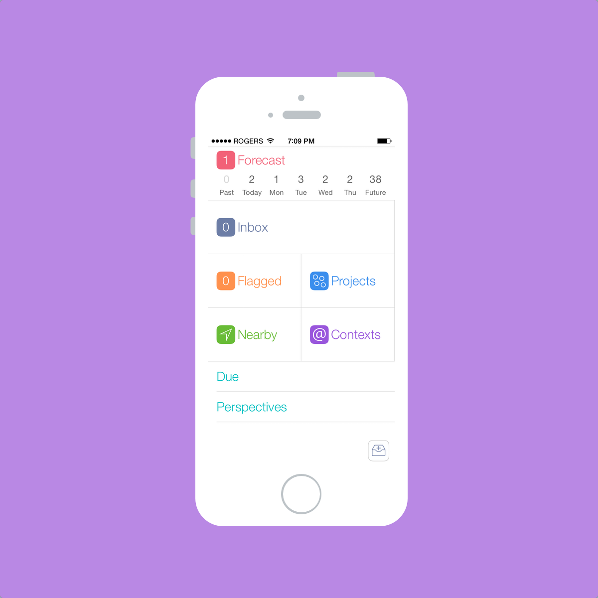
Omnifocus 2
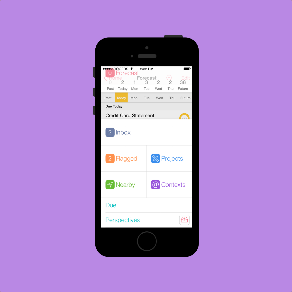
Omnifocus 2 for iPhone opens up to what I perceive to be an overwhelming main screen. Launching the app brings you to a screen of large and confusing words that will immediately overwhelm a beginner. These small choices immediately introduce Omnifocus as a power-user app.[1]
I’ll try, to the best of my understanding, to outline what each of these big words actually means. I don’t have a great idea of what they all mean as I don’t use all of them. But I’ll try anyway.
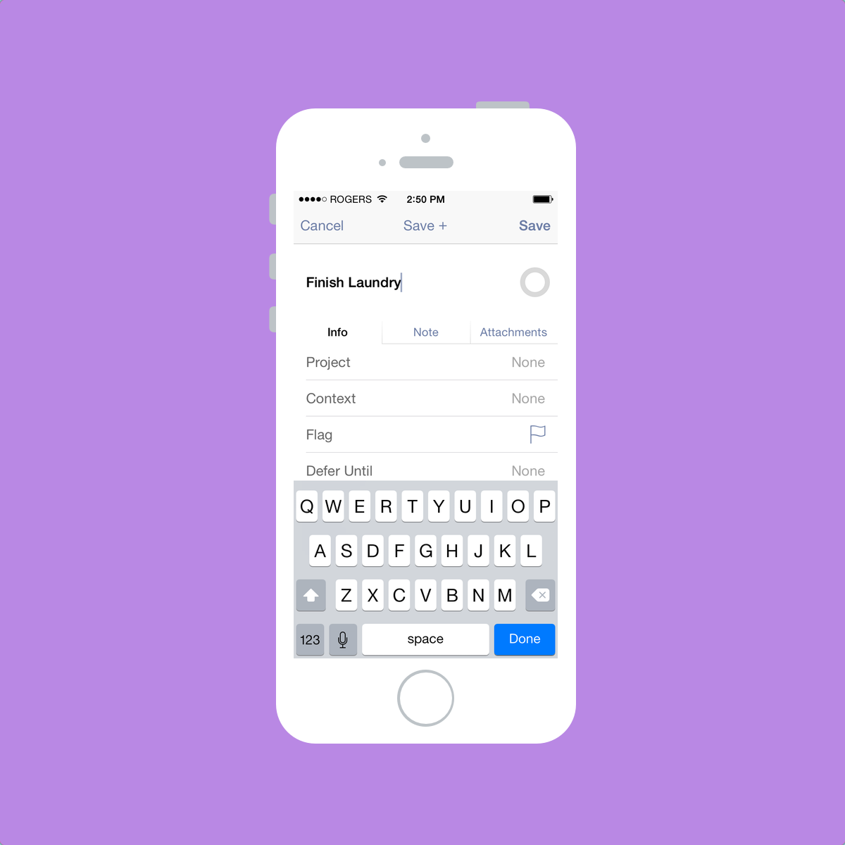
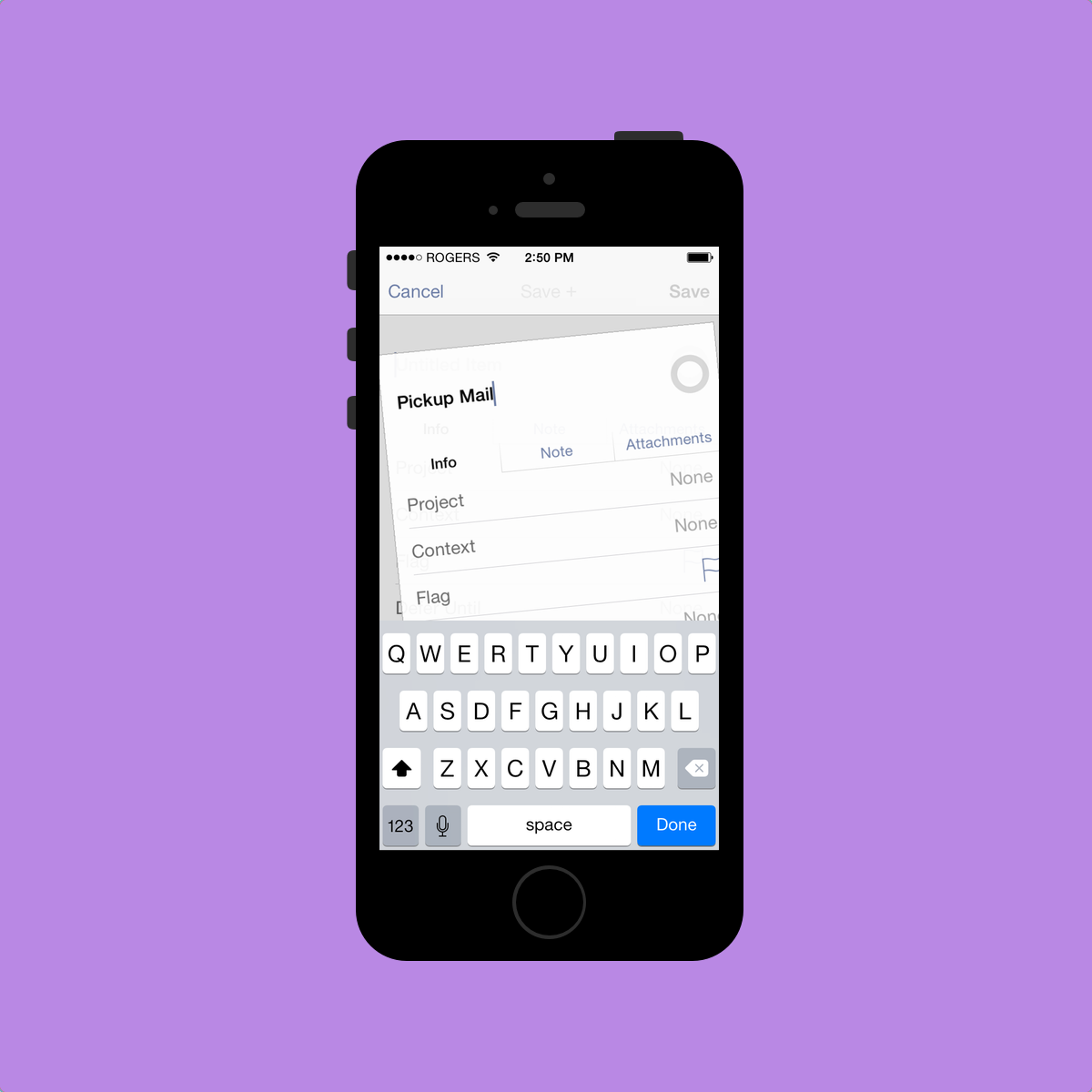
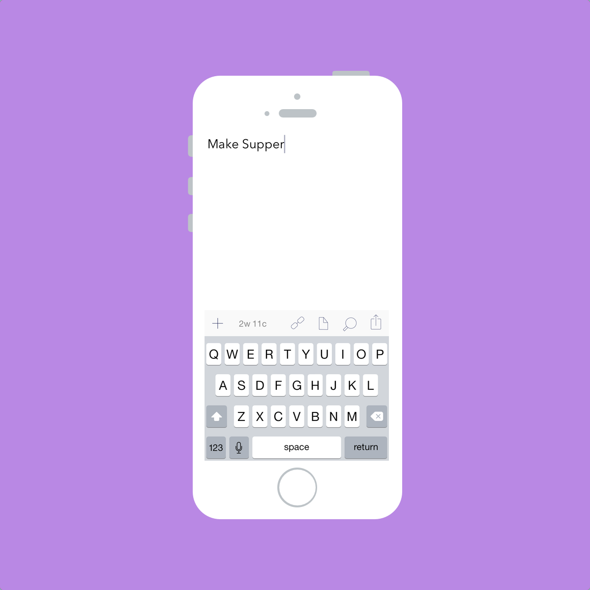
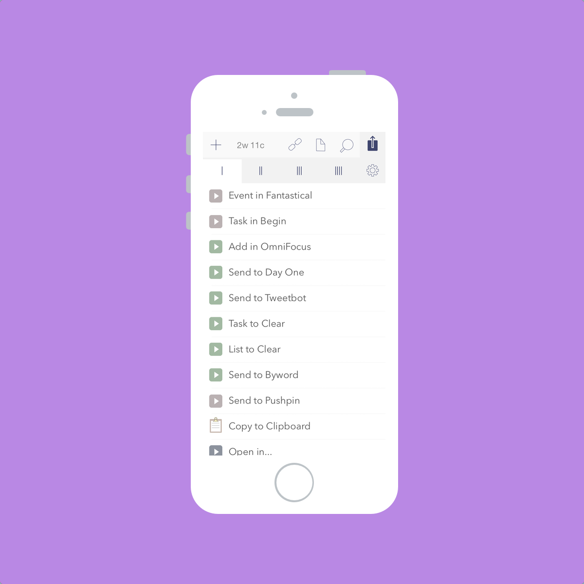
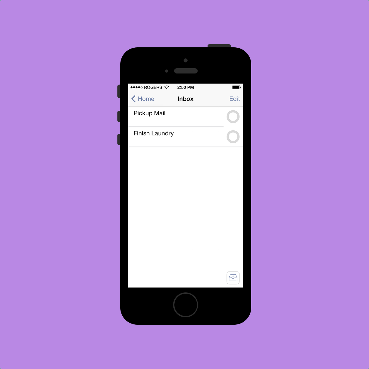
Staying true to David Allen’s Getting Things Done system, Omnifocus’s first main option is the Inbox. This is where most of your tasks start. When it comes time to determine what you need to get done, a good brain dump is key. Getting everything into your Inbox should be your first priority. You can also quickly input multiple tasks at once by using the “Save+” button at the top. If you are in need of quickly jotting down tasks, I would recommend putting them into Drafts or Scratch first and then processing your Drafts/Scratch queue later on. Omnifocus’s Inbox is just not fast enough to use as my main brain dump pool.
At this point, tasks in your Inbox can be left in your Inbox until you have time to delegate them further into Omnifocus’s system. You can assign a Context, a Project and/or a Location to your task.[2] Once one of these characteristics are assigned to one of your Inbox tasks, the task gets pushed deeper into the app and out of your Inbox. Bingo! You’ve processed your tasks!
When processing your Inbox, you can also assign due dates and start dates to your tasks. I’m only learning now about start dates and their potential and I won’t talk too much about them. If you want to learn more about them, David Sparks wrote an awesome piece for Omnifocus’s new Inside page. In his article, David outlines start dates and how he uses Omnifocus to manage his workload as a lawyer. I really recommend it.
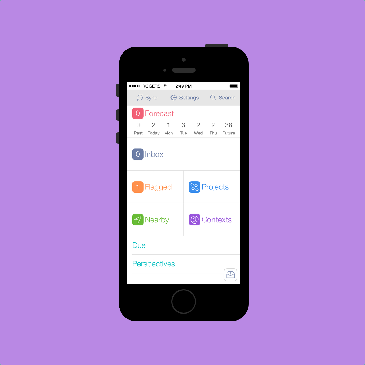
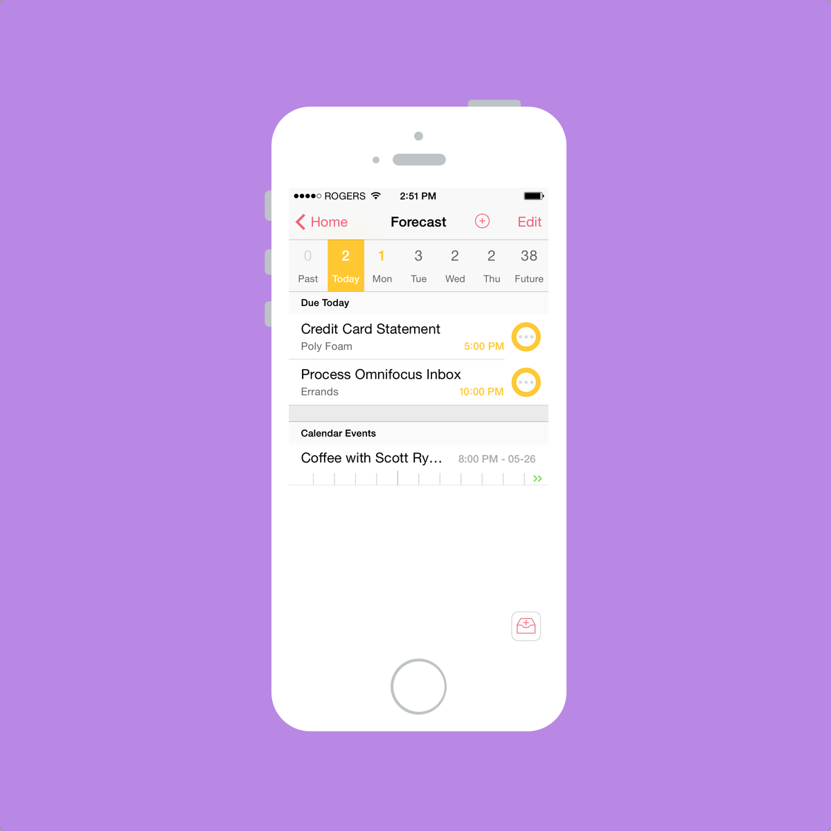
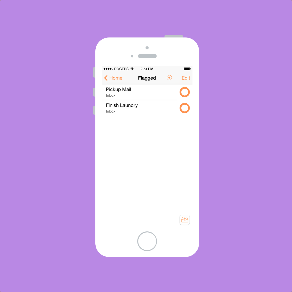
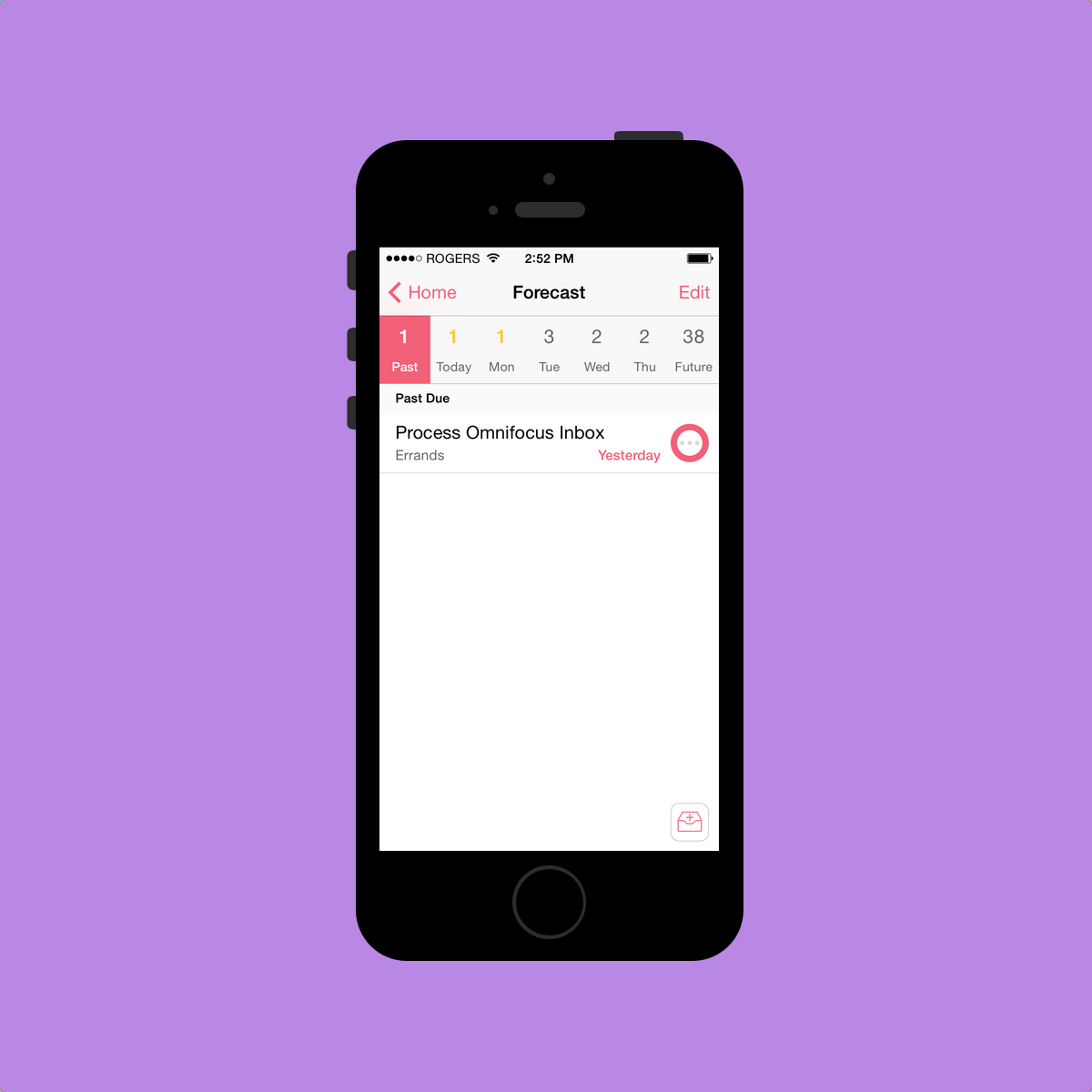
Items that have been flagged or that have been given a due date also have a neat “status circle” color change. Omnifocus uses a circle to give status to an item and the color of that circle changes. According to the Omni Group’s video, impending tasks are “amber” (which looks yellow to me) and overdue tasks are “red” (which doesn’t look red to me). Repeating tasks have three big dots in the middle and a flagged item turns orange. I actually find these status circles to be the only Omnifocus aspect that are self-explanatory. These circles feel natural, look great and add personality to Omnifocus 2.
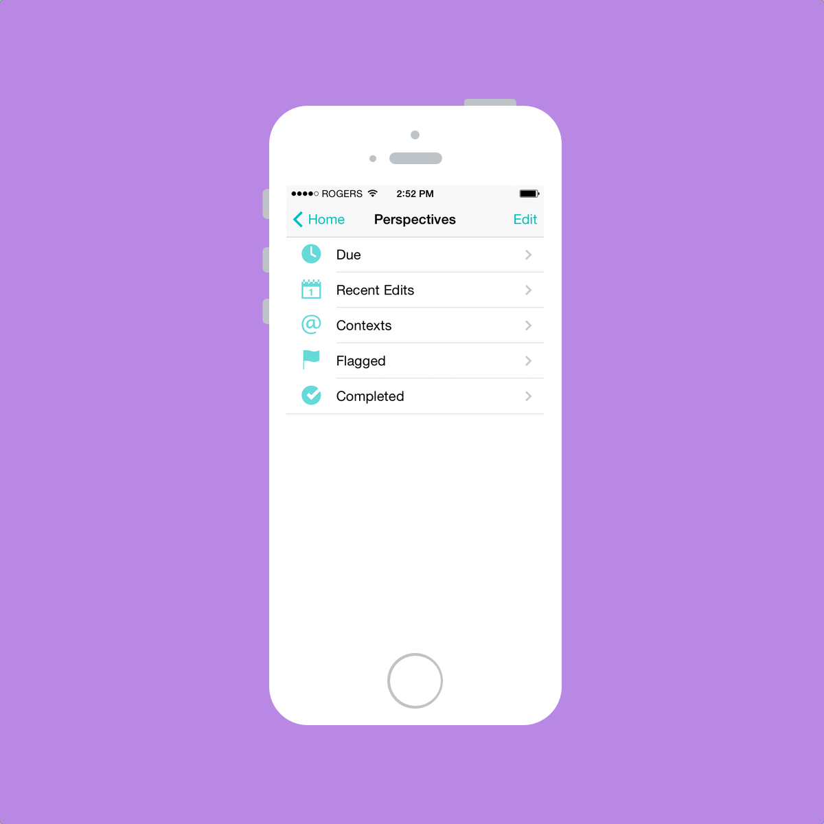
Contexts, Projects and Locations are considered “Perspectives”. Perspectives are different “views” that allow your widespread tasks to be viewed in different forms. For instance, as you can see on my main screen, I can see all my tasks that are due in the next 48 hours. I can also view my completed tasks or my recent edits as well.
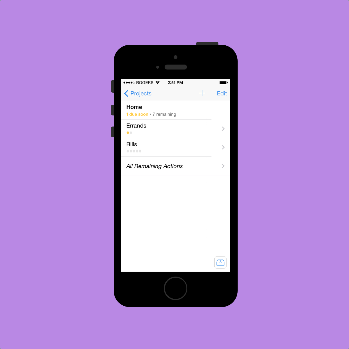
Contexts, to my understanding, are usually where or how you complete a task. I have five different contexts: Errands, Office, School, Home, and Museum. Any tasks that need to be completed at the office are sent to my Office context and museum tasks are sent to my Museum context. Simple. I use “Errands” as an out-and-about context. Maybe I should name it “Out-and-About” instead. Whatever. Contexts could also be a person or a group of people or a company, but I don’t use contexts this way.
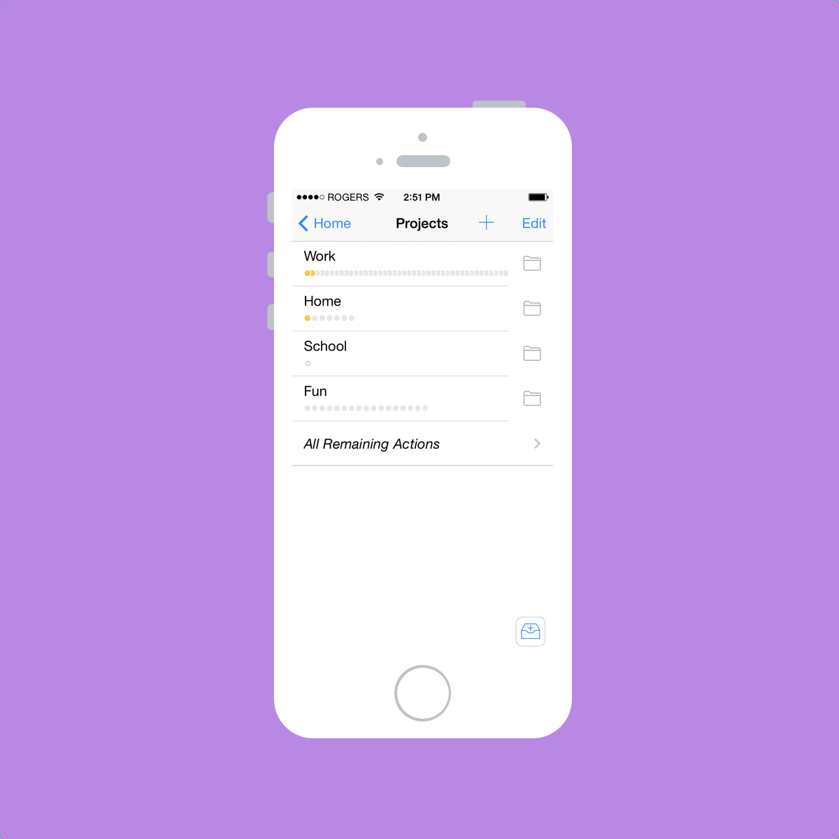
Projects, again to my understanding, are exactly that: your projects. They are specific plans that have a group of tasks which need to be completed to complete the project. I don’t think I could make that anymore difficult.
Inside my Work project folder, I have specific projects created for each of the clients I do work for. Inside my School project folder, I have a Homework project, an Assignments project and an Exams project.
Now all these different perspectives are trumped by the Forecast view at the top of Omnifocus’s main screen. Forecast is the embodiment of a perfect task manager for me. Forecast takes all your due dates, all your perspectives and all your calendar events and notifies you of your impending tasks. In essence, Forecast eliminates the majority of the need to visit your Contexts or Projects pages. If you process your tasks appropriately (and with due dates, as I’ve most recently learned), Forecast will show you what needs to be done today or tomorrow.
Forecast is what sets Omnifocus apart for me and why it is one of the few apps that has never left my iPhone’s homescreen. As long as I properly process my Inbox at the end of the day, I can trust that Omnifocus will tell me what needs to be done and when it needs to be done. Plus, it even incorporates my calendar’s events to show me when I will have time to get everything done. I love Forecast.
But you knew all this stuff already. Up to this point, I think I’ve just reiterated what the rest of the internet has spewed about Omnifocus and GTD. Overall, this spewing has laid the groundwork for my personal Omnifocus experience. By that, I am referring to recurring tasks.
As a bookkeeper/wannabe accountant, I have to complete the same tasks for clients every month or every week or every day at very specific times. Tasks like payroll have to be completed every two weeks and employee tax deductions (known as “source deductions”) need to be completed by the 15th of every month. I have to pick up a client’s mail every Tuesday and Friday and I have to pick up another client’s transaction documents on a daily basis. I have to pay accounts payable at least once a month by a specific date, but there are other instances where bills need to be paid on a more frequent basis. Keeping track of all these recurring tasks is a bloody nightmare.
Omnifocus eats these recurring tasks for breakfast. As I stated earlier, as long as I process my Inbox appropriately the first time, I can rely on Omnifocus to remind me and show me when each of these recurring tasks is due. I don’t need to input each of these recurring tasks into my monthly calendar because I don’t need to be constantly nagged throughout the month. In fact, with David Sparks’ start dates paradigm, I believe I can streamline my recurring tasks further. I’ll have to work on this part.
I’ve now stated how I use Omnifocus and why it works for me. However, there are a few areas where I wish Omnifocus was a little less “jumbo”.
Omnifocus doesn’t handle single, random tasks with the same level of ease as simpler apps like Begin or Clear. I’ve come to feel Omnifocus is too powerful for simple tasks. As a result, I keep a simple to-do app on my homescreen to accompany Omnifocus. I know I’m not the only person who does this.
Omnifocus’s learning curve is also very steep and this undoubtedly deters some potential users. Not only is Omnifocus difficult to learn,[3] it is cumbersome to use with simpler workflows. It doesn’t handle task input quickly or efficiently. It’s not meant for compiling lists either. I think Omnifocus on the iPhone will always need one — or even two — companion apps to fully quell all task management woes.
In regards to that polarizing redesign I mentioned earlier, Omnifocus 2 does have some awkward design choices. When in Forecast, there is a little “+” inside a circle in the top bar. It looks awkward and out of place. And it even feels awkward to touch to create a new task — it’s just not in a natural spot. Omnifocus’s go-back animation is also awkward. When swiping from the left to go back a menu, the top and bottom fall in rather than a sideways animation that would seem more natural. I just don’t get these two awkward nuances.
Verdict
I’ve laid the groundwork. I’ve discussed what effect Omnifocus has had on me and why I find it useful. I’ve outlined what it does well and what it does poorly. I’ve done exactly what everyone else has done on the internet since Omnifocus was released way back when. So what was the point of writing all this?
Because, after all the incredible writing on the power of Omnifocus, people still don’t know if it’s worth the Omni Group premium. While $20 isn’t expensive for great software, it is expensive in relation to the rest of the software on the iOS App Store. Omnifocus 2 for iPhone is inherently met with apprehension because of its high price tag.
I’m here to tell you that Omnifocus 2 has saved me $20 by efficiently handling my tasks. And it saved that $20 within the first week after my purchase. Omnifocus has pushed my organization level to an entirely new dimension. I never would have thought a piece of software would be responsible for improving my organizational reputation. I would go so far as to say Omnifocus has altered my job resume — I can state I am extremely organized and extremely detailed. Omnifocus is my organization proof — my organizational means to a successful end. No other app can garner that kind of praise from me. Not even close.
Despite its downfalls, Omnifocus has changed my life. I’ll never give it up.
How do you know if Omnifocus will have the same effect on you? It might be hard to determine. If you’re asking if Omnifocus is right for you, the only answer I can give is to tell you to buy the iPhone app. It’s the cheapest way to give yourself a long-term trial of a proven GTD system.
Hey. It’s only $20.
In a sense, you could say that, between the pricing and the initial launch screen, Omnifocus 2 has an element of prestige. Realizing you are qualified to use this app is one of the first steps to mastering Omnifocus. ↩
Locations appear to be available only on the iPhone and iPad at this time and can’t be assigned from the Mac app. I don’t use Locations whatsoever, so please excuse my exclusion of its potential. ↩
I only learned about start/defer dates this week after buying Omnifocus for my iPhone within the first week of its release. ↩