Happy Sunday everyone! My wife has been on holidays this week and it was the first week of post-tax-season life (I talk about tax season a lot, don’t I?), so we’ve had a pretty casual week. We spent a good amount of time sitting around the tub, hitting the golf ball, soaking in the sun at the beach, and eating good food. After an eight-month work marathon, I almost forgot what it was like to take a deep breath.
But, oddly enough, the next session of a course I’m working through is taking place this week, so there’s no true break until after next week. And it’s this course that is cause for this week’s reflection.
I’m sort of a lifelong student — not in the “I’m always learning about new things sort of way,” but in the literal sort of way. I’ve been working through courses at a post-secondary institution almost every year since 2009. I never really became sick of it… until this week.
For my line of work, school is an inevitability. It’s never-ending. After this course, I could take a trust and estate planning designation, an even more specific course on capital reorganizations, and I could eventually go after an actual masters degree with more letters at the end of my name. I suppose this is how they keep people hooked.
If school isn’t an inevitability in your line of work, then there will be other forms of sacrifice and investment you have to make before you can make it truly big. The question is whether you’re willing to undergo 10 or 15 years of constant examinations, test-taking, studying, and investment into your future-self. It’s nearly always worth it — both in a self-realization sort of way, and a financial sort of way — and not enough people make the investment. Most people settle for “What I’ve got is good enough”. If it’s good enough, then most likely, so is your salary.
That’s not meant to be a shot at all. It’s generally a fact. And it’s good that lengthy investment equates to higher pay in the long run. If there isn’t a correlation between investment and return (higher salary), then people will literally never complete the highest forms of education offered.
But I also sympathize with those who have hit “Good enough!”. I feel I’m there. I don’t know how many further designations would truly benefit my current work.
More importantly, I’m so sick of school. I’m so sick of constant educational commitments, late nights, weekends of paper-writing, deadlines, and seminars. I’m so flipping tired of them. 2026 will mark 16 years of post-secondary schooling of some sort, and I can’t help but feel like I have hit my peak “give a crap” level. I’m so done.
I’ve learned a good deal along the way. Tax and accounting, of course. But also the education system, what instructors and facilitators are truly looking for in a response, how to showcase depth and breadth of thought and knowledge, and how I best learn.
It’s this last facet — how I learn — which is likely going to be the best tool going into the future. I know I learn best through memorisation and mistakes. Studies may tell you memorization isn’t a sign of learning, but anyone downplaying the importance of memorization hasn’t attended school for long. Memorizing criteria and facts is a core skill for any educational endeavour.
Lastly, I have to tip my cap to AI. I’m a year away from leaving the post-secondary world for the foreseeable future and AI has only been introduced right at the very end of my studies. AI is the greatest educational tool invented in the history of mankind. I said this about the iPad (and I still feel the iPad is the best device for handwriting, reading, highlighting, and cross-referencing notes) and AI has most certainly taken the crown.
AI quickly offloads the information storage to a machine and allows your brain to make creative connections and create new things. Once you’ve learned a topic with great depth, AI’s ability to make short work of searching and querying is groundbreaking. There’s no chance I could store a library of Canadian taxation information in my brain and still figure out ways to make connections. Instead, AI can handle all the quick searching and referencing, and I can focus on the particular points brought up by a client that can trigger a useful query.
I truly hope current professors and instructors don’t attempt to eliminate AI from their instruction. Adapting to a new tool is an important aspect of being a modern student. Students should use AI properly: for proofreading, for suggesting connections, for referencing vast amounts of information, among other uses. Instructors need to find ways to let AI do what AI does best and push students to focus on inferences, connections, and new lines of thinking.
Sixteen years of school is a lot of school. I’m excited to put it behind and equally excited to see how tools are adopted by students and instructors alike.
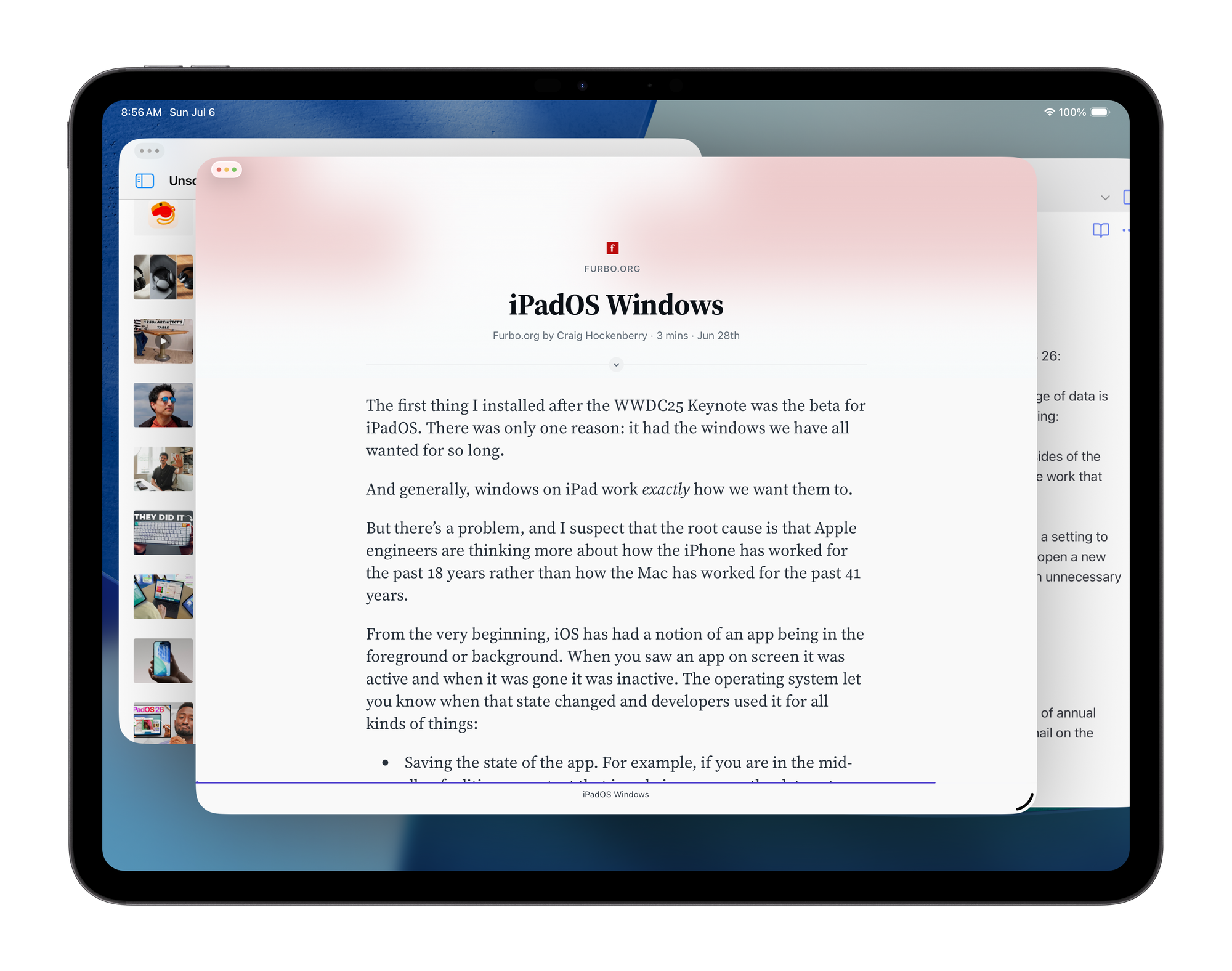
Craig Hockenberry on iPadOS 26 Windowing
Here’s a fun little excerpt about how syncing works (currently) in iPadOS 26:
If you’re using iPadOS 26 and noticing that the saving/syncing/exchange of data is not happening, there’s a stupid trick you need to do to get things working: Tap on the home screen to hide the windows (they slide off to the sides of the display). That makes all the apps on screen inactive and triggers the work that they need to do.
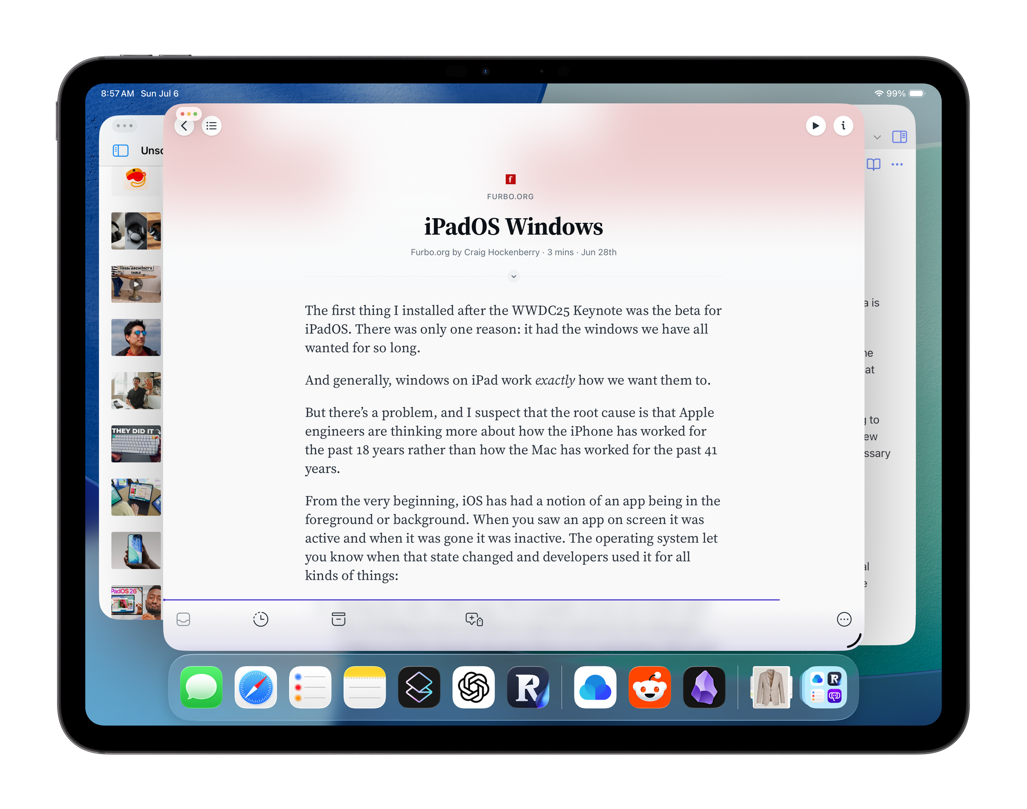
Not that my little recommendation would be useful for others, but I’d like a setting to keep the dock visible at all times while windowing in iPadOS 26 — if you open a new app, it doesn’t automatically slide the dock away. This would eliminate an unnecessary swipe up from the bottom to find an app.
This is what I mean:


To me, the dock in iPadOS 26 is more important than the dock on macOS. Launching an app requires a tap somewhere on the home screen (assuming a keyboard isn’t connected) and iPadOS 26 does not yet have a Launch Pad like macOS (tapping on App Library on the right is like Launch Pad, but auto-categorization still requires extra taps and swipes).
Switching between apps is also more difficult now, as certain apps can be entirely covered by other apps. How do you reactivate an app you can’t see? You need the dock to make that app active (again, knowing full well Apple has tried to fix this by doing a slow swipe up from the bottom of the screen to show all active apps). A simple tap on the dock is far faster and more precise than the slow swipe and tap.
Lastly, I’d like to have an ability to increase or decrease the size of the dock as well.
Very Bad Advice
Another hard-hitting Collaborative Fund post from Morgan Housel. My favourite bit of bad advice:
Let envy guide your goals.
I feel like 95% of public opinion has its roots in envy.
The Second Cup
MKBHD’s Nintendo Switch 2 Review
I appreciate Marques’s comments about the Switch 2’s price. “In a world of annual $1,000 smartphones, $450 doesn’t feel like that much” is blunt, but correct. One thing I feel he missed, though: the screen scratches super easily (like, the most easily of any tech screen I have owned for the last 10 years), so a screen protector is a must-buy.
How to Style a Sports Jacket
Simple, but effective Instagram reel with a few great sport jacket ideas. You can never have too many sport jackets.
Everyone says they want opinionated design until they get it
Amen. Nail, meet hammer.
"The ceiling on my appreciation is high, but the floor is high, too"
Marius has been posting quick blog posts showcasing his highlights from his reading. I’m enjoying the quick, interesting blurbs he has captured. The best part about this form of writing: not every highlight needs a comment to be worthwhile intake. Just including the highlight presents the author’s taste and detailed attention. I like it.
Happy Sunday everyone. Hope you all have a wonderful week ahead.