There's so much to say about this wild (for me) experiment. We could talk about why someone might want to move from macOS to Windows 11 right now. We could talk about how to transition from one operating system to the other, specifically in terms of applications or file storage. Likewise, we could discuss high-level fleeting topics too, like whether all laptops should have touch screens or not.
My scope is limited today: Here are my very, very initial impressions of the new Surface Laptop 7 after about three hours of use. These impressions revolve around hardware, mainly, but will venture off from time to time, I'm sure.
The Surface Laptop's Physical Chassis
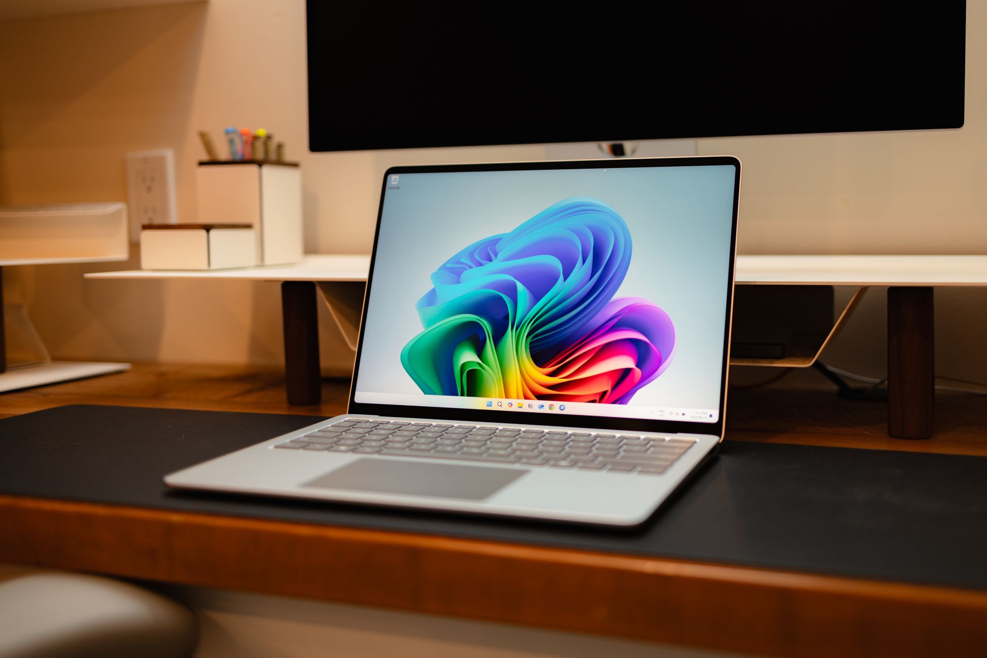
This is the very first non-Apple device I've ever found to be beautiful. The Surface Laptop 7's hardware here is unlike any non-Apple laptop created, but is a lot like a MacBook Air. This Platinum colour is very reminiscent of any Apple silver colour, as is the wedge shape, the logo-free display bezel, the haptic-only trackpad, and more. But why reinvent the wheel? The MacBook Air is a winning physical design, and so is this Surface Laptop.
The aluminum finish feels slightly less dense than any MacBook I've tried. This also keeps the Surface Laptop lighter in the bag. The aluminum finish does feel different to the touch though — when running my finger back and forth across the body, there was a sort of tingly, scratchy feel. Perhaps this will go away over time.
I forgot how much I missed the wedge shape of past MacBook Airs. The shape is extra comfortable for writing. I can't help but feel this is the most blatant Microsoft rip-off in terms of the visual design of the Surface Laptop. But again, winning combo.
The wedge shape hides the Surface's thickness. For an ultraportable like this, the Surface Laptop is actually quite chunky. The Surface Laptop is just a shade less than double the MacBook Air's thickness, likely due to Microsoft hiding a fan inside the Surface Laptop. And really, you don't notice the thickness on its own. You just notice it when up next to a thinner laptop, though.
Overall, the Surface Laptop's design is a winning formula for me. It's a cold-blooded rip-off — and a bad comparison — to the MacBook Air. But it's a great, great rip-off if you ask me.
The Keyboard

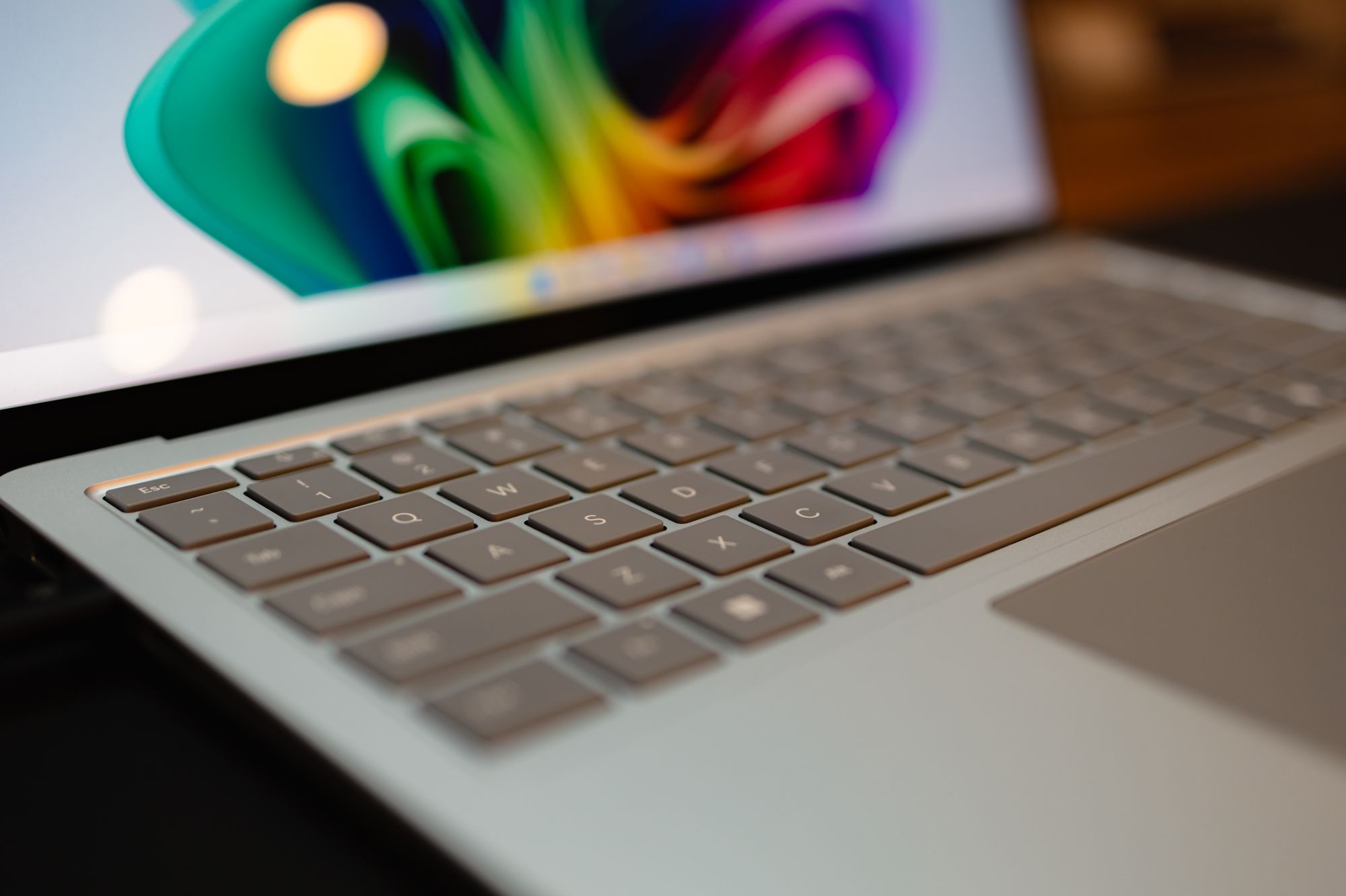
Microsoft has the best laptop keyboard on the market right now. Surface keyboards have been great for ages — the Surface Ergonomic is one of my favourite keyboards of all-time, and the regular ol' Surface Keyboard is equally great.
The Surface Laptop's keyboard is softer than Apple's option (I expect this is due, in no small part, to the thicker chassis and more space underneath each key to dampen the bottom of the keystroke) and has a tremendous bounce back after bottoming out. Of course, Apple's keyboards are spectacular out of the box as well, and I'll be curious to see if this Surface keyboard holds out in the long run.
There are a few other keyboard niceties here as well:
- Home, End, Page Up, and Page Down all replace relatively useless function keys found in other keyboards and laptops. This is a giant win in my book — there's no more two-handed finger gymnastics required to navigate lengthy PDFs or worksheets in Excel.
- Simply tapping the Fn key in the bottom row flips between media keys and F-keys in the function key row. This is far better than Apple's option of having to lock things in place in the System Settings.
- The dedicated Copilot key, in my opinion, is a waste of key real estate. I don't use the right side modifier keys at all, but this is still a waste of space.
- I tend to prefer the shape of Microsoft's arrow key layout. Apple enthusiasts are big fans of the inverted-T shape, but I feel full-size right/left keys are better for navigating. Full-size keys are also easier on the fingers.
Of all impressions, the keyboard stands alone. I'm in love with the feel of this keyboard, and it may well be the element that overcomes a number of other Surface shortcomings.
The Display
I have the sense that those who use a MacBook Pro with a Studio Display don't immediately notice the difference between the Pro's ProMotion display and the Studio Display's lack thereof. Admittedly, I'm not sure if I notice it all that often, either.
I immediately noticed it on the Surface Laptop, though. 120 Hz just seems to jump out at you. Perhaps it's because I haven't normally seen it on any PCs in the office. But the smoothness of this display has really stood out to me.
So, too, has the shape of the display. The rounded corners look very Apple-like (though there's an odd difference in the curvature of the display's corners and the lid's corners, which may be distracting for some design-minded folks). The display is a 3:2 aspect ratio, which differs significantly from what I'm used to from the MacBook world. The extra vertical real estate is very much appreciated.
Lastly, the glossy display is the best non-Apple display I've ever seen. Whether there is incredible colour accuracy here, I'm unsure. But the rainbow Windows 11 blob wallpaper just jumps off the screen. This isn't as good as an XDR Display found in any MacBook Pro right now, but for whatever reason, it seems just as good.
Quick Aside: USB-A Port
A proper comparison of the Surface Laptop's I/O options is to the MacBook Air and not the MacBook Pro, but stay with me here — I truly appreciate having a built-in USB-A port in this laptop. Clients submit financial data on USB-A drives all the time, so I keep a USB-C to USB-A adapter around at all times. I need that adapter at least 10x more than I would ever need a USB-C to HDMI adapter.
We do, however, regularly connect our laptops to our conference room Samsung Frame TV via HDMI. And for this task, having a dedicated HDMI port in the MacBook Pro is fantastic. During tax season, I use this port multiple times a day. During the off-season, I use it maybe once a week.
I use a USB-A adapter probably twice a day, all year long.
It never occurred to me how annoying that USB-C to USB-A adapter was all along. I'm going to have a hard time giving up that dedicated port if I don't stick with the Surface Laptop.
Wrap Up
I could write for days right now (though everything would mostly be garbled, incomplete thoughts bubbled up in a honeymoon phase) about the Surface Laptop. Time will tell. For now, the Surface Laptop 7 has provided a great first impression and opened my eyes to the world of enjoyable non-Apple notebooks for the first time in my life.
I'm excited for the remainder of my testing period this week.