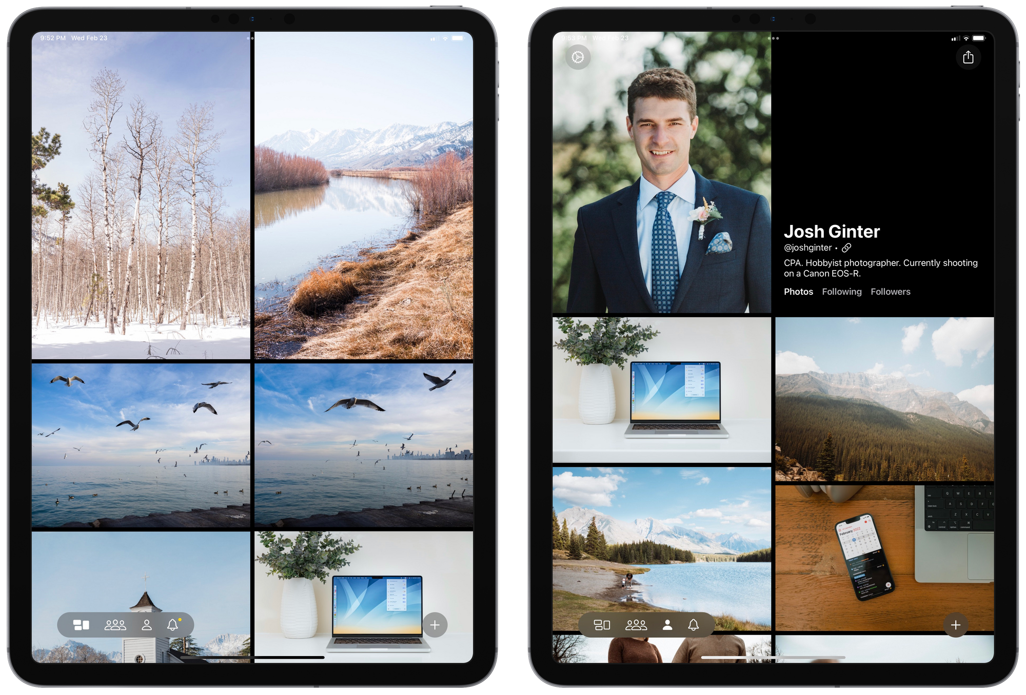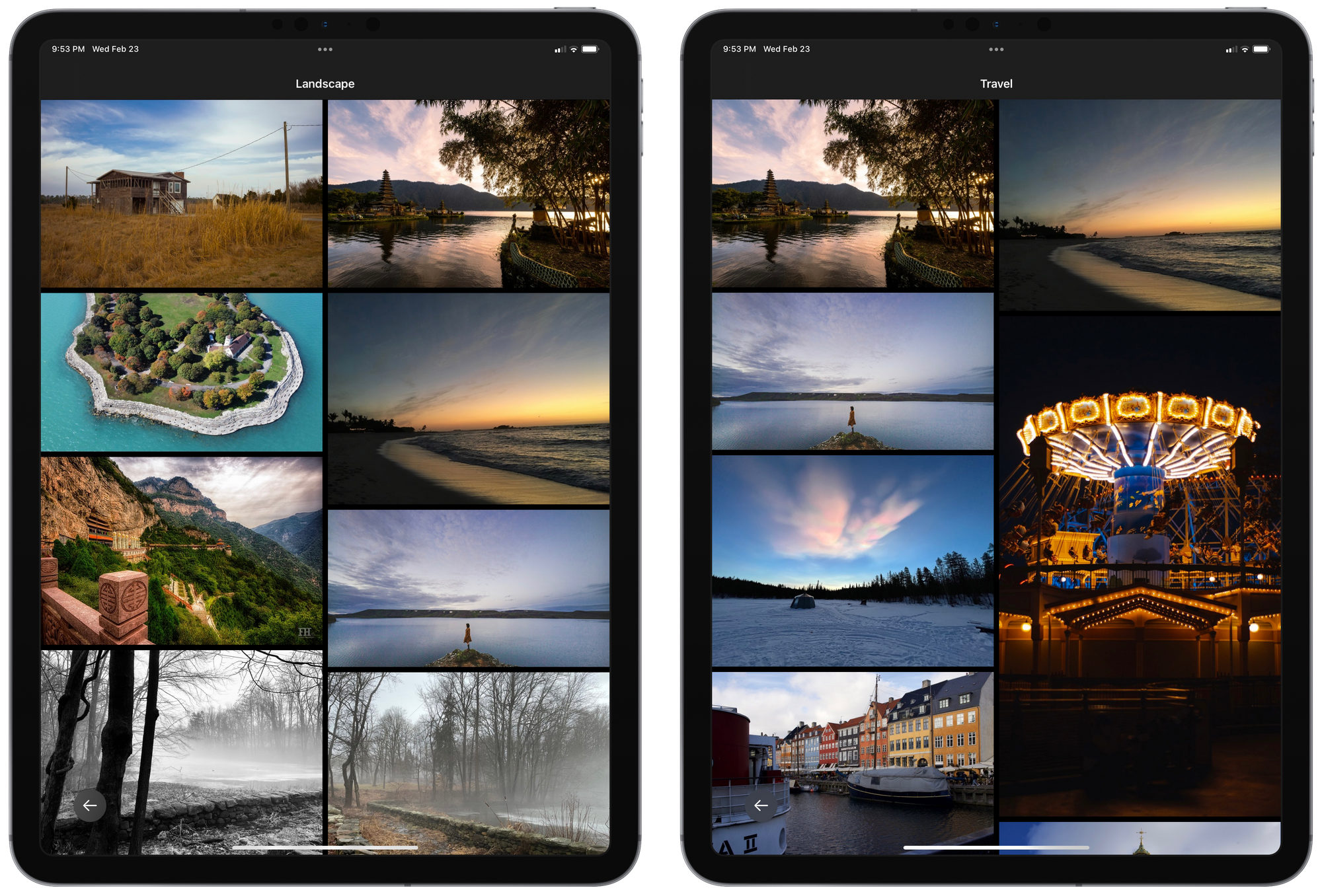
Glass on iPad is everything I wished Instagram on iPad would be — beautiful, easy-to-access and easy-to-post, and wonderful for browsing and exploring great photography.
The iPad is my photography device. I don’t shoot photos with the iPad, but I tend to do all my photo editing, cataloging, and sharing via iPad. With both Instagram and Glass on iPhone, I’d export photos from Lightroom for iPad to my camera roll and wait for the camera roll to sync with my iPhone. After syncing, I’d share on both platforms.
Now, I don’t need to wait for the sync. Now, everything can be done on iPad: import, edit, and share.

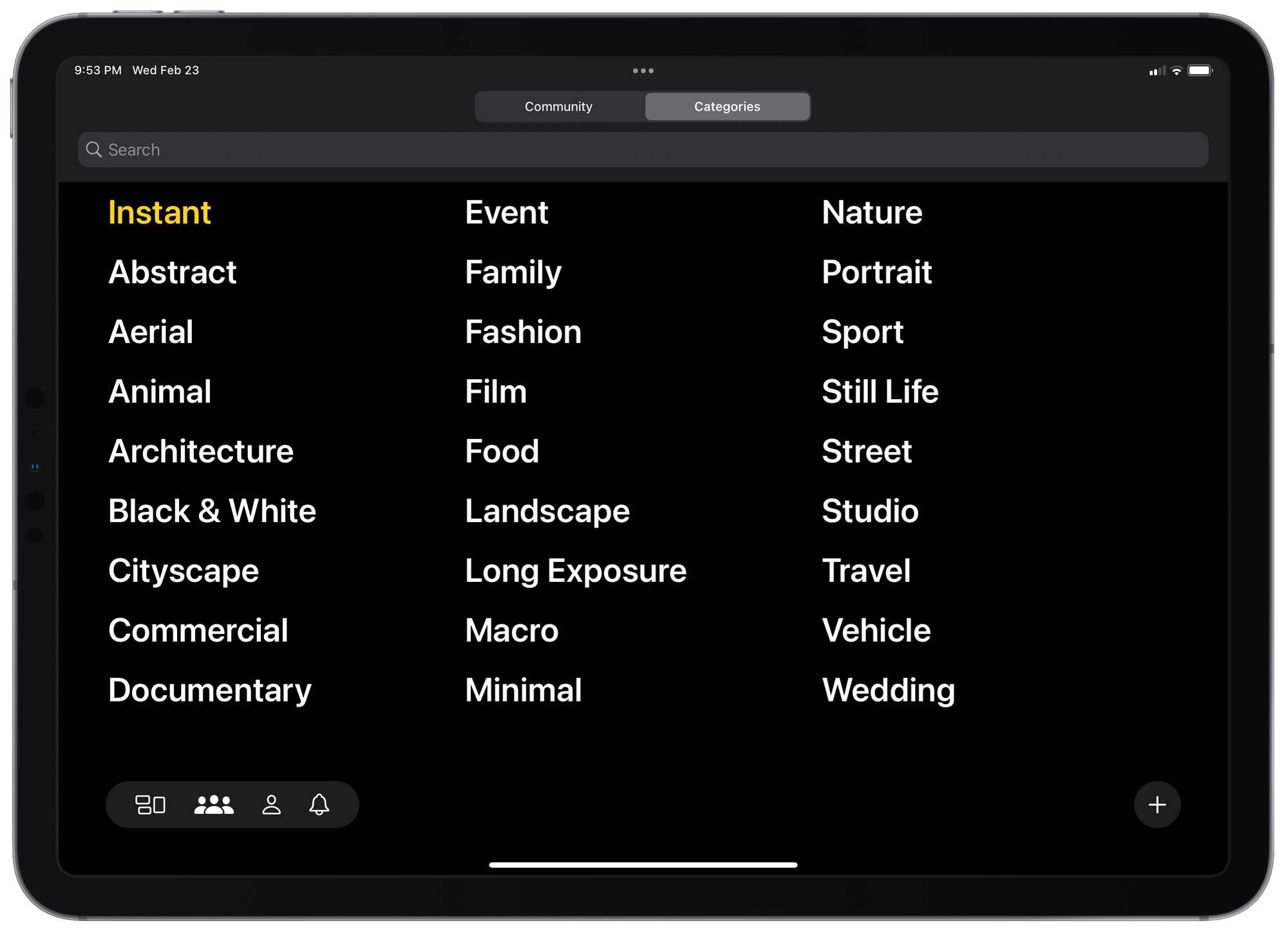
Glass on iPad is very much Glass on iPhone, just more beautiful. Galleries are big, immersive, and nicely structured. Photos are front and center, with no weird borders or odd UI elements. Sharing, categorizing, and browsing all behaves exactly the same on the iPad as it does on the iPhone. The entire UI truly gets out of your way on the expansive iPad display — it’s just all photography.
I recognize that Glass isn’t given the same attention now as it received in its first month or two after debut. The current setup — appreciations, subscription-based, chronological timeline — is likely not conducive to discovering new photographers or new photography. Instead, Glass may well be an echo chamber of photographers shouting at other photographers.

I’m sticking it out still, though. I’ve been posting semi-consistently throughout, and I’ve discovered other photographers in the process. Is my timeline super active? Not at all. But I still find photos I appreciate and I ensure I take the time to provide a comment.
I’m also very impressed with the team’s willingness to iterate and bring features everyone has been calling for Instagram to adopt. Glass on the web? Check. Glass on iPad? Check. Ad-free? Check.
Just the other day, my wife exclaimed how every third photo on Instagram is either an advertisement or a suggested post. I, too, have noticed how every third story is an advertisement. I’ve discovered some really cool goods via Instagram ads, but I truly despise how often I see them.
For this reason alone, I’ll provide some cash to the Glass team in exchange for a chronological, ad-free, photography-conducive app that showcases brilliant colours and textures in an otherwise invisible UI.
Having this on the iPad? Well, it’s a tease of what an ad-free, well-designed Instagram on iPad could be.