I’m not sure where I stand on the whole premium Bible conversation. On the one hand, it’s tremendous to feel genuine craftsmanship and exquisite materials all combined to reflect the Bible’s masterful literature. On the other, the more beautiful the Bible, the more difficult it may be to pick up and genuinely use.
Perhaps my path only exacerbates this issue. My first premium Bible was the Crossway Single Column Heirloom Legacy, a single-column masterpiece built for photographers, type and font experts, and designers. I can’t find any element of Heirloom Legacy to complain about, at least on a design front. Almost everything in that Bible is perfect.
But boy do I baby that Bible. I’m sure it doesn’t need to be babied, but I baby it. The only pen that’ll touch that paper will be a Pigma Micron, and the only page that will see any ink are the introductory pages at the beginning. The Single Column Legacy sits on my mantle at home and represents all things beautiful about a physical Bible.
There’s something to be said about a Bible designer who finds the correct combination of great materials and great craftsmanship, yet also invites you to use the Bible.

Schuyler’s ESV Quentel is the first Bible in my collection to nail this combination. All but a few quibbles add up to a delightful Bible that you will want to use rather than admire, study rather than read, and reflect rather than daydream.

I’ve referred to the Quentel as a “workhorse” in the past, and after a long period of testing, I can confirm my first impressions.
Full Transparency: EvangelicalBible.com sent me this Bible free of charge, though I did pay for the shipping. Further, this Schuyler Quentel copy must be of a prior generation and has a small defect on the front cover. I don’t think either of these variables contribute anything to the review whatsoever, but it’s good for everyone to know. Finally, I have purchased a copy of the newest Schuyler Quentel ESV, which you’ll see in a bunch of photos in this review.
The Quentel
The more premium Bibles I have a chance to put my hands on and try, the less the materials and craftsmanship seem to matter. It’s not that they don’t matter, it’s that premium Bibles are all unbelievably well made these days. Even Crossway’s Chinese-made premium Bibles are of a higher quality than anything we saw 10+ years ago. Each Bible has its own set of high quality craftsmanship characteristics, but no premium Bible is going to disintegrate on you in the near future.

Instead, what stands out to me is the layout of the text, the font selections, the formatting, the reading and study tools, and the purpose of each Bible. Crossway excels at producing great reading Bibles and R.L. Allan sets the bar for cross-reference Bibles. Schuyler’s Quentel has its own unique magic as well, which I hope to delve more into.

But to sum up my thoughts on the Quentel: If you purchase a Schuyler Quentel ESV, it’s not the “Schuyler” portion of the name that sets it apart from other premium Bible makers. It’s the “Quentel” portion of the name that sets it apart. The Quentel format could be the pinnacle of dual-column layouts available right now and, if you’re not into single-column Bibles like the best from Crossway, the Quentel should be your first look. No matter which translation, the Quentel’s dual-column layout really is the best out there.
Design and Materials
I’ve scoured EvangelicalBible’s site to determine the exact specifications of my ESV Quentel and I’m fairly certain this is a past generation model. For one, the black goatskin plus blue ribbon combination is nowhere to be found (at least in EVBible’s current selection). Second, there are some slight misfirings on my copy (like some extra bleeding of the art gilt around each page and the slight defect on the front cover) which make extra difficult to determine the make and model. Fortunately, I have a retail copy to compare to.

It’s surprising how little I care though — again, it’s the “Quentel” part that matters here.
This Quentel was designed by the Bible makers at 2K Denmark and printed and bound by Jongbloed in the Netherlands, a name which has already found its place on this site in prior Bible reviews. Both of these companies are world renowned Bible designers and printers and ensure every Quentel is of the highest quality.

The front and backside goatskin leather is supple and flimsy, though not as flimsy as the Crossway ESV 80th Anniversary Omega I reviewed a few months ago. It’s also less pebbly than the Crossway Single Column Heirloom Legacy, providing a more smooth to the touch feel.

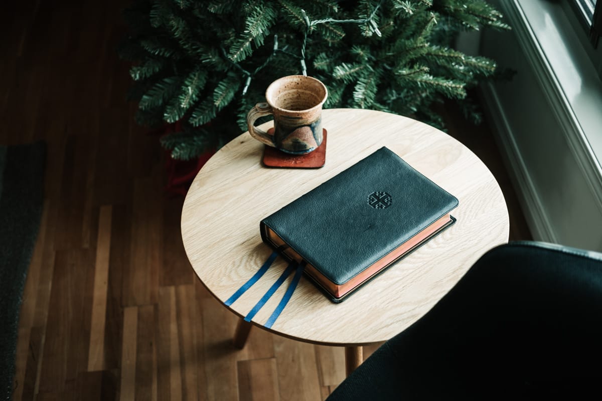
The front is debossed with Schuyler’s Jerusalem cross logo — an artistic flair in an otherwise workhorse design. The spine has six brilliant ribs with minimal branding to be had.1 The covers are edge-sewn to provide more durability between the front goatskin leather and interior goatskin liner. There’s a gold gilt line running around the edge of the inside cover. And the covers extend about a half-inch beyond the paper block, creating a generic-sized yap that is neither too big nor too small.
I could yammer on and on about each individual element of the Quentel’s physical design and materials, but again, the fact is that almost all premium Bibles have these physical features. There are only a few elements that differentiate the Quentel from other Bible makers.
Ribbons
Based on EvangelicalBible.com’s product photos, all Schuyler Quentel Bibles come with this long, beautiful, Berisford ribbon trifecta. These ribbons truly set the bar when it comes to premium Bibles.

No matter your position — be it at the front or back of the Bible or at the gutter or edge of the paper block — the ribbons are long, easy to use, and allow for proper maneuvering through the pages to find your saved spot.

Two small points of contention on my end:
First, I wish the ribbons were multi-coloured. I think multi-coloured ribbons both look more fresh and aesthetically pleasing, but they also provide extra utility. Some people are colour-specific readers and studiers (why do they make multiple highlighter colours, after all?) and having an extra colour or two could potentially benefit someone whose mind works in this fashion.

Second, I wish there was a fourth ribbon. Despite being hilariously short, the ESV Heirloom Study Bible provides four multi-coloured ribbons — perfect for study, colour-coordinating, and saving multiple locations. Two ribbons for the Old Testament and two ribbons for the New Testament is generally how I work.
Lay Flat Binding
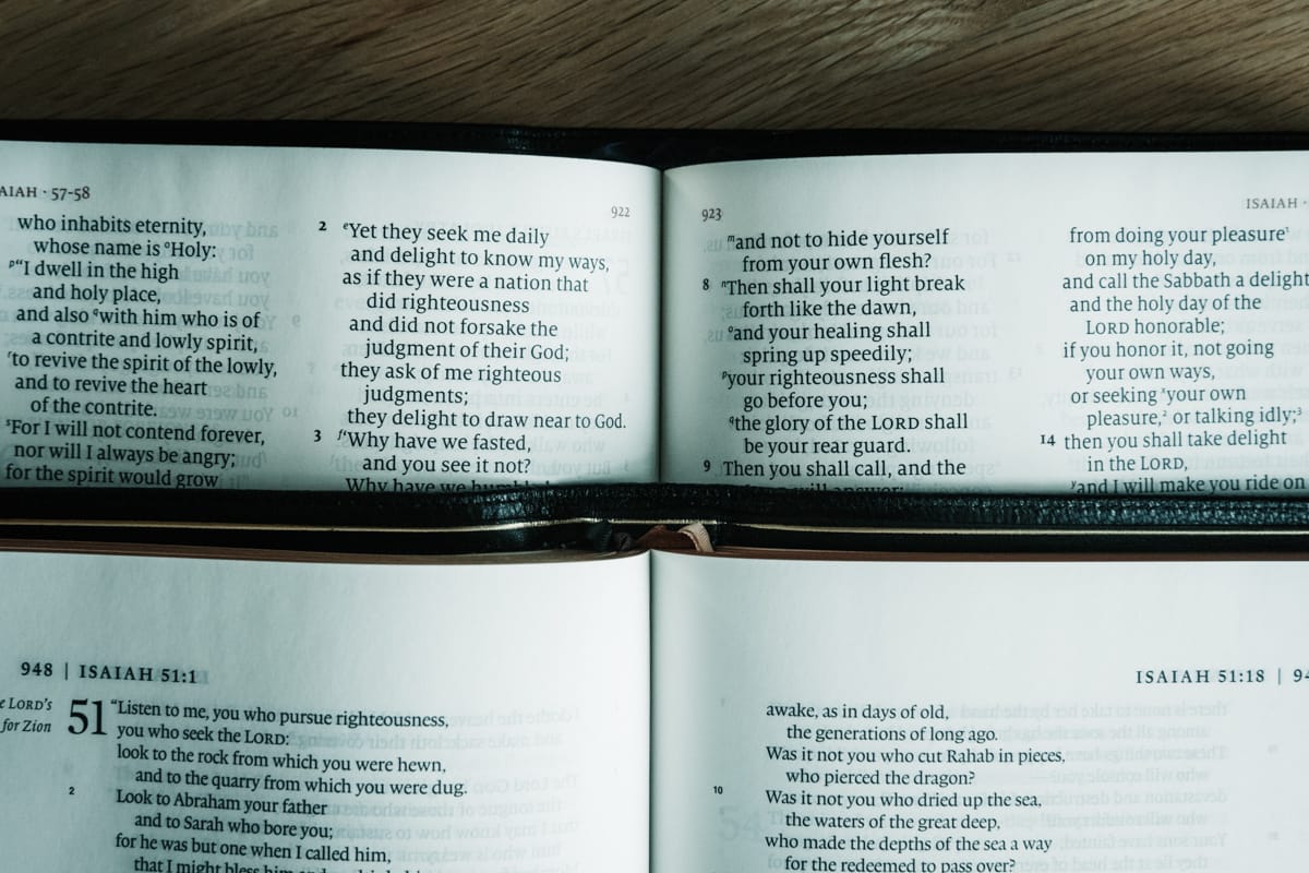
Because of the Quentel’s formatting and layout, lots of text flows into the gutter in the middle of the book block. So while you’re able to scan each individual line quickly in the dual-column format, you may end up having to crank your neck slightly to find the last few characters hiding in the gutter.

As a result, the Quentel’s lay flat binding is of the utmost importance. While I’m happy to report no major issues, I’m also not able to say my copy has the best lay flat binding in history. You’ll immediately notice the stiff, heavy binding when you open the inside front cover, and this stiff binding permeates right through the book block.
You can rest assured that this binding will last a lifetime. But if I had to nitpick about anything in my Quentel copy, it’s that too much text gets covered in that gutter thanks to the not-so-lay-flat lay-flat binding. I expect newer copies of the Quentel will have this ironed out with ease.
Paper
Schuyler has experimented more than any other premium Bible maker over the last few years when it comes to paper. Original Quentel copies sported paper thickness of 45 GSM, providing a genuine heft and thickness but a perfect opacity for reading. Fast forward and Schuyler has shipped both 36 GSM and 28 GSM Quentels (even in the large size variety) in an aim to find the best combination of thickness and opacity.
My Quentels sport a 36 GSM paper variety, which is noticeably thicker than the 28 GSM and 31 GSM of my Heirloom Single Column Legacy and Heirloom Study Bible respectively. The paper is wonderfully thick, with minimal show-through. Add in line-matching (another one of those features basically considered table stakes at this point) and you’d be hard-pressed to be distracted by any text on a previous page.
The 36 GSM paper does create a thick and heavy book block, which depending on your intended use, may be a dealbreaker. However, the thick and heavy book block is likely more a result of the chosen font size than it is the thickness of the paper.
The other differentiating factor here is the paper colour. Schuyler has gone with a very off-white — borderline eggshell white — paper, providing a differing contrast between text and background paper than other premium Bibles I’ve tried. In bright daylight, it’s very soothing on the eyes. In darker situations, however, I’m lukewarm on the paper colour — I think I’d tend to prefer a brighter white background for darker reading environments.
Finally, I’m only adding this in as a descriptor for any pixel peepers — my Quentel’s art gilt lining the outer edges of each page tend to bleed onto the front-facing side of each page. There’s no distraction whatsoever in use, nor is there anything to complain about. I’m noting simply because my Quentel copy is a slightly-damaged copy to begin with and I’d fully expect this issue to be corrected in any retail purchase. My recently purchased Quentel ESV doesn’t have this issue. I think I’m safe in saying quality control will not be an issue.
Finally, the Quentel Layout
Again, to this point, there’s very little that differentiates the Quentel from any other premium Bible. The exterior and interior materials are all of exceptional quality and the 36 GSM paper provides a wonderful opacity for reading and study.

But all of that is secondary to the actual Quentel layout. Schuyler’s decisions in the layout department are what set this Bible apart from other premium Bibles, and are equally responsible for my “workhorse” moniker above.
Dual Column
Not that I’ve received a ton of feedback on my Crossway Single Column Heirloom Legacy review, but I’ve had a fair number of readers ask if I thought that Bible was an appropriate purchase for reading (as opposed to study). For whatever reason, the single column layout seems to be associated to reading while dual column layouts are associated with traditional study and verse-by-verse reading.

Of course, those associations aren’t wrong. But I’m not as big a fan of single column layouts for reading as I originally was. To me, there are too many characters spread across a single line of text in most single column layouts, providing too much left-to-right scanning and making it more difficult to quickly pickup the correct line when moving down the page. Single column layouts work wonders when showing off poetry or the Psalms, but I find long-form reading to be more tiring with this layout.
Dual columns have the exact opposite problem. They are ideal for quickly scanning four or six or seven words at once before quickly jumping to the next line — you can almost absorb all the words on a line with one look, eliminating any actual left-to-right scanning. But poetry and the Psalms were never written with dual column layouts in mind.
To me, single column layouts are beautiful and aesthetically pleasing, perfect for showing off God’s Word, for reading the wonderful wisdom inside the Psalms, and for better paragraph breaks to keep like thoughts and clauses together. Dual columns, conversely, are better suited for quicker reading.
The Quentel is the breadwinner of dual column layouts. Text is divided right up the middle, with large red numbers denoting chapters, bolded numerals for verse numbers, small caps for topic breaks, and a dividing line at the bottom for cross references. By moving the cross references to the bottom of the page, each column is provided that much more horizontal space, making it easier for the dual column layout to house the large Quentel font size.
Font, Font Sizes, and Colours
I grew up on giant print Bibles — my dad didn’t have particularly bad eyesight or anything, but my childhood Bible had giant font for easier reading. I toyed with a few extra small print Bibles in my university days, but squinting never grew on me.

Thanks to the unique dual column format and large book block, the large Quentel strays more towards the giant print than the small print. The 11 point Milo font jumps large off the page and is one of the most comfortable texts I’ve ever read.
This Milo font isn’t your standard, run-of-the-mill Bible font — I think more of Georgia when I think of Bible fonts. This is still a traditional looking serif, but it has a slight modern twist to it that enables it to feel fresh.
Beyond that, Milo makes exceptional use of ascenders and descenders to make an 11 point font feel even larger than an 11 point font. Lowercase letters which normally ascend to the middle of a line (like the letter “n” for example) ascend closer to 3/4 of a regular line height, with capital letters and lowercase letters with full line ascenders utilizing the extra 1/4 line. The result is a more readable small font that utilizes a full line height (and beyond, in the case of descender letters like “y”) in a unique way.
This Milo font and the corresponding ascender/descender characteristics are most notable when read at smaller sizes, like the Personal Size Quentel’s 8.5 pt. font. On a full size Quentel, words jump off the page. On a Personal Size Quentel, the 8.5 pt. font is perfectly readable, whereas other Bibles with 9 pt. fonts often feel smaller. All this to say, I think Milo’s unique characteristics are best suited for smaller font sizes as opposed to larger font sizes.

The ESV Quentel comes in a black letter typeset only, with the only red lettering and numerals coming in the form of chapter markers, book and page numbers at the top, and cross references at the bottom of the page. For the little bit of red on each page, I can say the red lettering is done well — it’s quite common to see these red letters really brighten up and provide an awkward contrast with the background of the page.
Study Materials and Extras
It’s really hard to compare any non-study Bible to a study Bible, at least in terms of study materials and extras. Apples to oranges: If you’re looking for a Bible to take your learning beyond the text on each page, you should look at the ESV Heirloom Study Bible or MacArthur Study Bible, among others. But apples to apples: The Schuyler Quentel has most of the concordance, cross references, and Bible maps you could need.
The concordance lies in stark contrast to the actual Biblical text, specifically in terms of font size. Each term is printed in small caps Quentel red, with three columns spanning each page. There’s a generous amount of terms to be searched here. While you won’t need a magnifying glass, those with glasses may find themselves squinting at concordance terms.
The Quentel comes with 12 Bible maps which are labelled nicely in a table of contents at the start of the maps section. These Schuyler maps colours are really pleasing and provide a lot more topographical detail than the Heirloom Single Column Legacy, for instance. The maps are also printed on a thicker stock paper, ensuring overhead light doesn’t reflect poorly like it does with glossy paper. There’s even an index to the maps, if you need further location information.

And, colour me surprised: There aren’t any note-taking pages in the back of the Quentel. You get Revelation 22, a table of weights and measures, a table of abbreviations, and then you jump straight into the concordance. The Personal Size Quentel comes with note-taking pages, but does jettison the concordance to keep the smaller size. Something to think about, depending on how you intend to use the Quentel.
Your Workhorse Bible
In the middle of writing this review, I purchased and received a few Schuyler Quentel Bibles for my wife and newborn daughter (an heirloom present which I hope lasts her entire life). This marked the first time I had a chance to compare any of my current collection to the widely loved Schuyler Personal Size Quentel.

Fortunately, my original take still stands: The regular sized Schuyler Quentel is a dream workhorse Bible. It’s the Bible you’re most likely to use when you’re at home or at your desk. It’s the Bible you’ll be happy to bring along with you if you don’t have a smaller option. It’s the Bible you won’t be afraid to give as a gift to any friend or family member.
Until today, “premium Bible” had a specific connotation in my mind — one of genuine beauty, craftsmanship, and pleasing aesthetics, but one that I wanted to cherish and treasure for as long as possible. The Schuyler Quentel changes that connotation. “Premium Bible” can wholly and fully mean “everyday use” Bible as well.

Bible makers continue to outdo themselves, so I may end up eating my words. But the Schuyler Quentel sets the bar for everyday, general use Bibles. This Bible will be treasured in anyone’s hands.
You can purchase the Schuyler Quentel ESV exclusively at EvangelicalBible.com in a variety of colours. At $200, this is one of the more expensive Bibles available on the market, but you can be sure the craftsmanship and material quality will last your entire lifetime.
It should be noted that my excitement for this Schuyler Quentel’s spine is probably overboard. Schuyler absolutely nails the spine, making it the easiest and most beautiful Bible to be picked out of a stack of premium Bibles on a book shelf. ↩