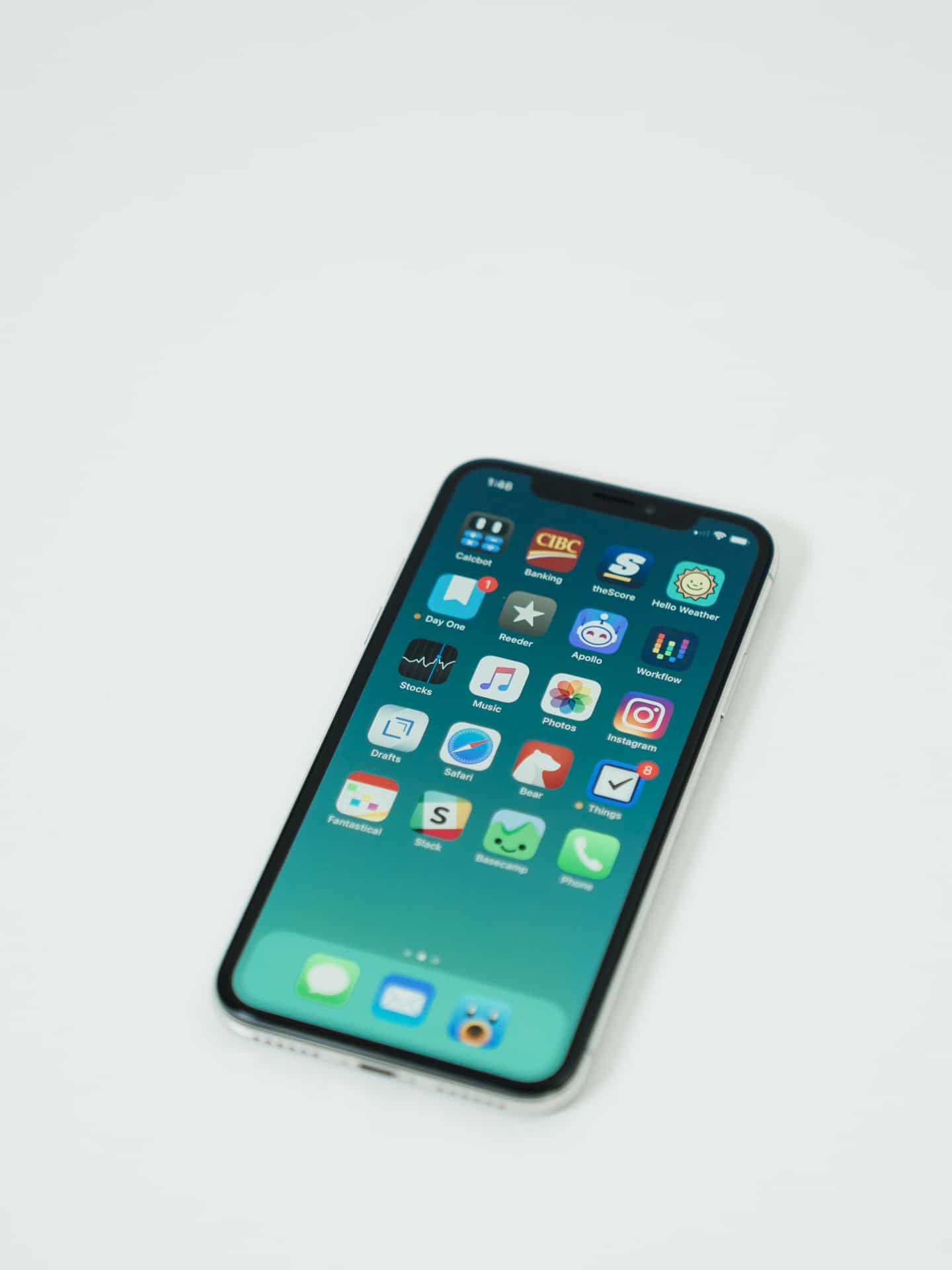
{% include image.html img=”https://static.thenewsprint.co/media/2018/03/iPhone-X-14.jpg” title=”iPhone X” caption=”The Silver iPhone X.” %}
The iPhone X is, quite simply, the greatest iPhone I’ve ever laid hands on. In many ways, the X is the pinnacle of Cupertino’s design prowess to date, incorporating stainless steel, glass, and quartz in a tech-laden device sure to embark Apple on the right foot in its next ten-year journey. Without sounding too religiously-blinded, I have a hard time finding things not to like about the X.
You’re sure to have read many a review by this point in time, and judging Apple’s relatively impressive shipping times for such a shortage-rumoured device, I’d bet you already have an X in your hand if you planned on buying one.
Of course, I originally purchased the iPhone 8 Plus back in September, expecting shortages to ruin the iPhone X until at least January 2018. I had other hesitations as well:
- A new authentication system in FaceID that hadn’t been tried and tested
- An all-screen display with new UI gestures that didn’t look immediately graspable
- An OLED display which had poorer colour accuracy when viewed at odd angles
- And an nearly-catastrophic price tag.
I was also particularly fond of the gigantic iPhone 8 Plus keyboard (and which I fully miss since adopting the iPhone X).
But all my hesitations and concerns were washed away within a few days. The iPhone X is a wonderfully-sized iPhone — it fits perfectly in your hand and works very well in one-handed operation (except in those far off corners, of course). FaceID is far and away my favourite authentication system to date,1 creating the illusion of a friendlier, more approachable iPhone. And iOS 11’s iPhone X gestures have taken grasp of my muscle memory so quickly that I miss the gestures on the iPad.
Why don’t other iPhones and iPads awaken when tapped?
Weird features, like Animoji, are somewhat lost on me, so my comments end there. Otherwise, the front-facing True Depth camera is a joy to use, specifically with Apple’s Portrait Mode and Portrait Lighting features. I don’t take many selfies, but my selfies look really, really good when shot on iPhone X.
The rest is history. We all know Apple is going to release a bigger and better iPhone each year. It’s fairly cyclical at this point.
The X feels different, though. If this is the form factor we can expect going forward, I feel it would be wise to document where we started.

{% include image.html img=”https://static.thenewsprint.co/media/2018/03/iPhone-X-2.jpg” title=”Wordless iPhone X” caption=”It’s such a small detail, but I’m impressed with Apple’s insistence to eliminate any blemishes on the iPhone’s body. Although non-North American iPhones still have the regulatory text plastered to the glass, North American iPhones have been able to shed the hideous glyphs.” %}


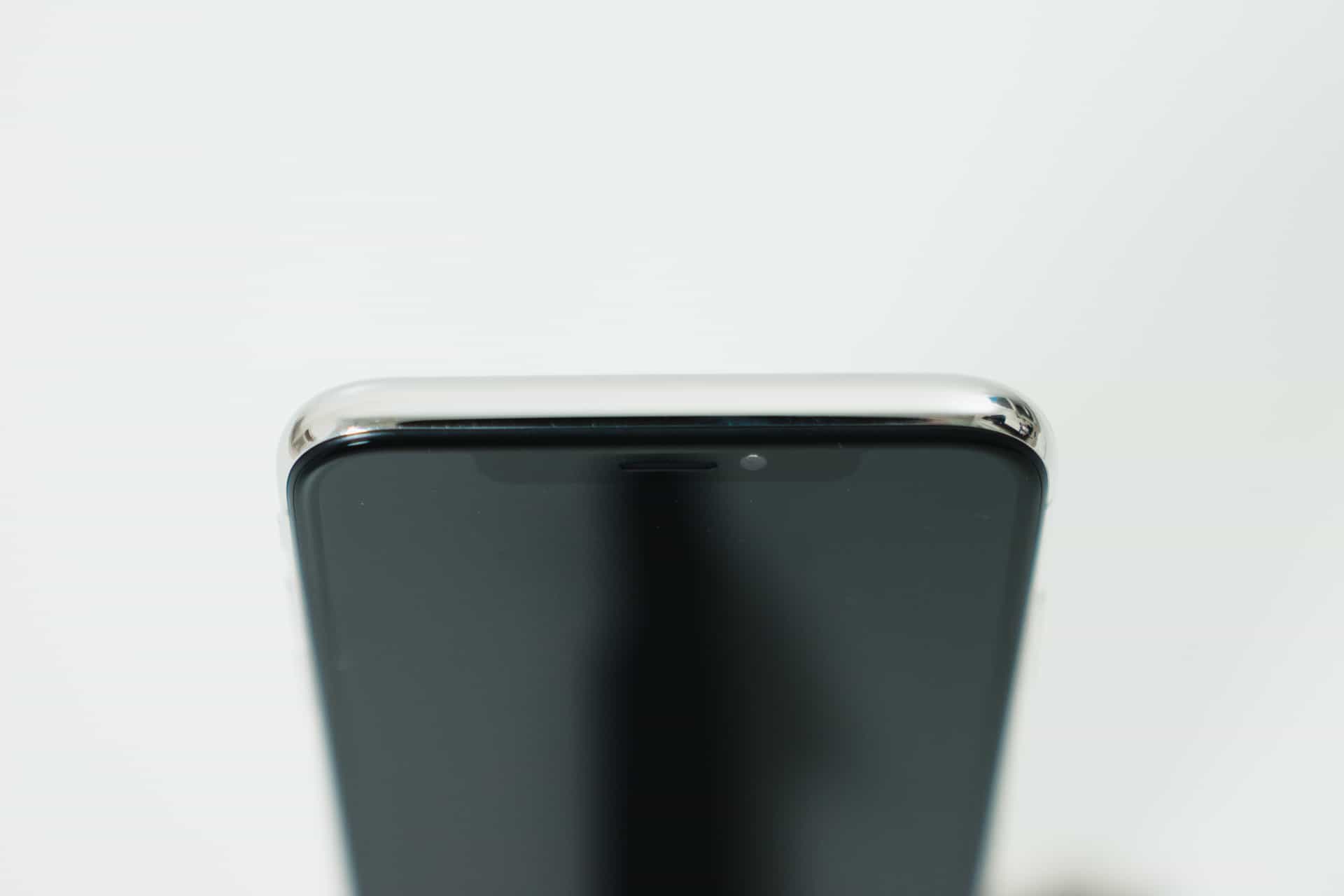
{% include image.html img=”https://static.thenewsprint.co/media/2018/03/iPhone-X-7.jpg” title=”Stainless Steel iPhone X Band” caption=”If you look close enough, you may be able to find some micro-abrasions scattered across the corners of my iPhone X. However, this iPhone has picked up the least amount of damage in its early life of any iPhone I’ve used in the last five years. I’m not sure if there is something in Apple’s material selections, but durability (so far) has not been an issue.” %}
As a whole, the iPhone X’s design is very much iPhone in nature, but with a stainless steel band keeping its insides locked away. Some have complained of their stainless steel band picking up micro-abrasions, but I seem to have come off pretty lucky in early use.
{% include image.html img=”https://static.thenewsprint.co/media/2018/03/iPhone-X-8.jpg” title=”Rounded Corners iPhone X” caption=”Rounded corners are in. Square corners are out.” %}

Simply put, the iPhone X is the cleanest, most utilitarian iPhone ever created. Aside from the Notch, there is nothing that gets between your attention and that screen.
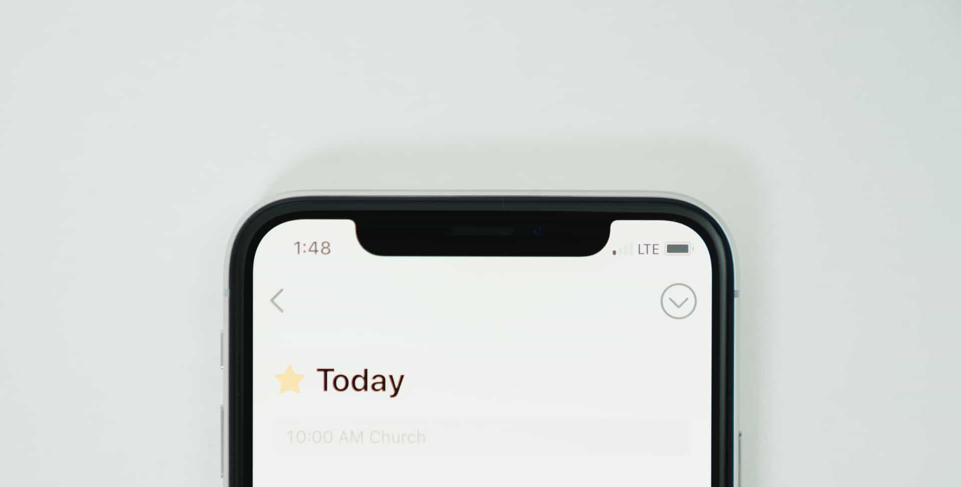
{% include image.html img=”https://static.thenewsprint.co/media/2018/03/iPhone-X-10.jpg” title=”iPhone X Notch” caption=”Many have heeped disdain on the iPhone X’s notch, but I’ve been surprised how quickly it fades away. If I had to choose between the Notch and having FaceID, FaceID would win every day of the week.” %}

I have zero quarrel with the designers who went with the Notch design. It fades into oblivion without effort, and even provides some gesture starting points for bringing down Control Center and Notification Center. Plus, the Notch gives the iPhone X that tad bit of character I believe would be lost if an all-screen-only design had been chosen.
{% include image.html img=”https://static.thenewsprint.co/media/2018/03/iPhone-X-12.jpg” title=”True Black iPhone X” caption=”True Black — or my name for the OLED screen being able to shut off individual pixels so the screen looks perfectly black — is my pick for the best underrated feature of the iPhone X.” %}


True Black is another one of those jaw-droppers you have to see to believe. I’m surprised developers who have designed multiple themes for their apps haven’t overtly supported a True Black theme of sorts. Apps like Bear, Apollo, Reeder, and Instapaper make use of the OLED display’s strengths, but I’m left pining for Tweetbot to adopt the same night-theme design.
I’m sure it’ll happen. One day.

I suspect I’ll end up with an iPhone X Plus next year when Apple decides to drop square-cornered iOS devices off the face of the Earth. In the meantime, I’ll relish every second I get with a one-handable and pocketable iPhone.
And I’ll show it off to anyone who isn’t a believer in the future of where Apple is headed.
I’ll include that stunningly pathetic back-side fingerprint sensor on whichever-Samsung Galaxy phone had it. Seriously — what were they thinking? ↩