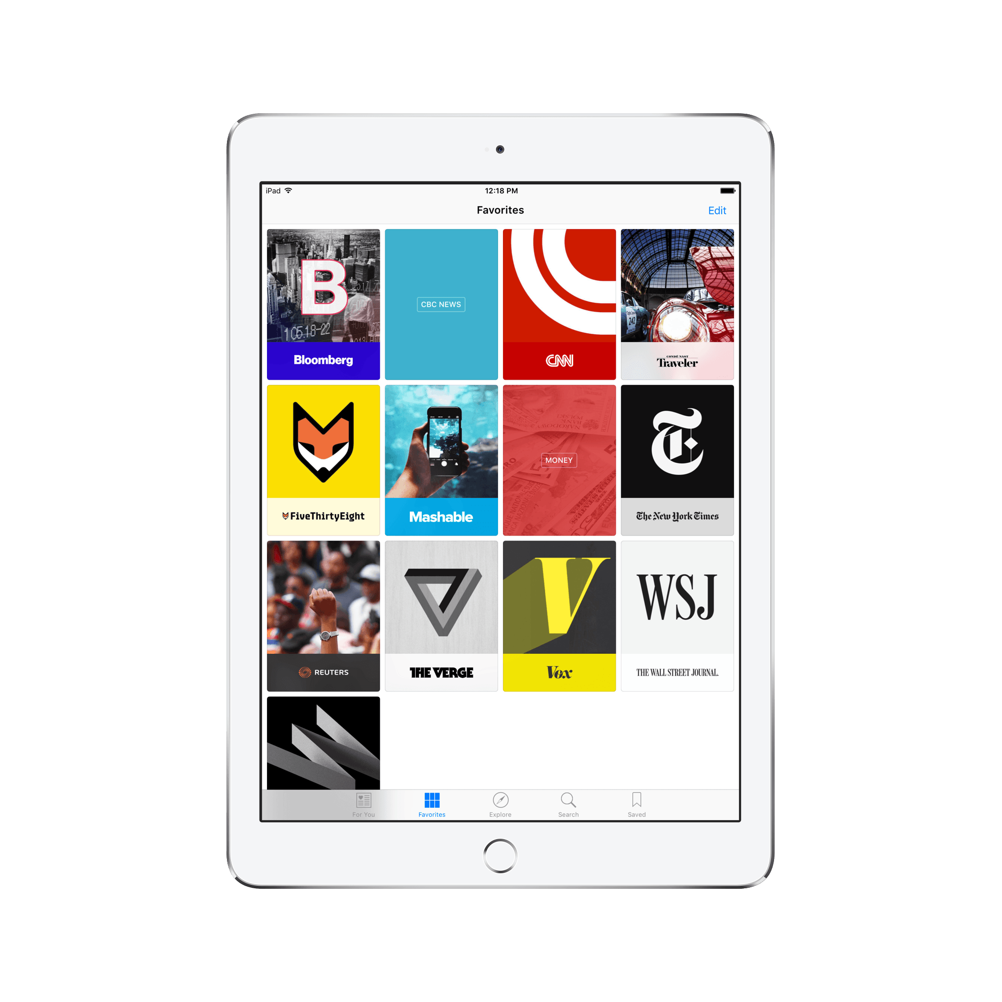
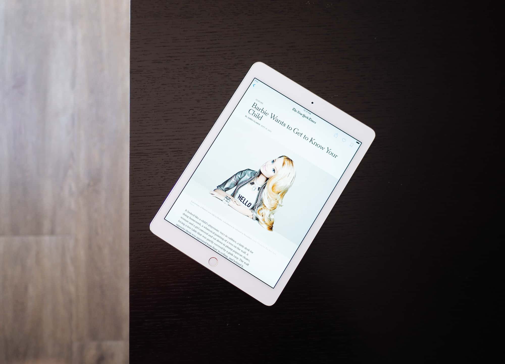
Graham Spencer’s review of Apple News on MacStories is a very well-executed and thorough look at Apple’s latest built-in app. However, after reading his thoughts, I find myself disagreeing on his review’s foundation: curation.

In his review, Graham relates Apple News to a wide variety of news-consumption alternatives. He discusses the pros and cons of Apple News in comparison to NewsBlur, RSS, Nuzzel, Flipboard, and news apps like NYT Now, Buzzfeed News, and Yahoo! News Digest. It’s hard to argue how great the App Store’s options are, and it looks increasingly like Apple News is not the hit Apple hoped it would be.
However, I believe Graham is comparing red apples to green apples — although these apps and services are, in essence, delivering the same news content, each app or service goes about delivering that content in tremendously different ways. Most importantly, the level of personal curation — read, the user’s curation — is different amongst all these options.
Let’s see if I can hash this out more clearly.

RSS, by definition, is perfectly curated news. The user signs up, finds feeds he/she likes, and adds them to their RSS queue. Every article published within those feeds hits your RSS inbox and must be read or dismissed by the user. If there is a hiccup in the content delivered by RSS, the user has every ability (actually, the only ability) to fix the hiccup.
Nuzzel and Flipboard, although different in their delivery, involve a heavy amount of social network integration to deliver news. Nuzzel scans your Twitter and Facebook feeds, finds the most shared news, and delivers it to your phone. Flipboard is the closest competitor to Apple News in my opinion, but again, the level of social networking integration automatically makes Flipboard a different platform. Your Twitter and Facebook feeds are interweaved into your Flipboard timeline, thereby ensuring many of the stories your friends share end up in your timeline as well.
On a curation scale, RSS is the most user curated, Nuzzel and Flipboard are fairly user curated, and Apple News is almost not user curated. And, as a result, they can be used in conjunction with one another.


Over the last week, I’ve used Apple News as an additive to my RSS and Twitter timelines. All the small, personal blogs I enjoy reading sit in Reeder or Twitter, ensuring I don’t miss a beat from any of my online friends. Overall, I’ve worked hard to curate my RSS and Twitter timeline down to publishers and individuals who have something to say or which post four or five times a week. This means my RSS inbox can be consumed sporadically throughout the day — or even in a one-off shot at the end of the day — and Twitter can be enjoyed on a more personal level.
But adding publications like The New York Times, The Verge, and The Wall Street Journal to an RSS inbox is a nightmare. The shear number of published articles in a day bogs down your inbox and makes trudging through that inbox a job. Adding those same publications to your Twitter timeline is also a nuisance — hearing from individuals chat in 140-character segments is far more fun than being bombarded by 140-character click-bait headlines for large publications.

Apple News steps in where my RSS and Twitter feeds come up short. Apple News’ algorithm, which finds interesting stories from major publications and curates them to articles I’ve read in the past, nicely curates the extra cruft from my Apple News feed. These headlines no longer end up in my Twitter timeline (unless a friend shares a link), and my RSS inbox stays less clogged. I feel this is a perfect blend for news consumption.
Admittedly, Apple News’ “For You” curation isn’t great. I find myself skimming through my Apple News timeline and clicking less than I would through my RSS feeds.
But, to me, this seems logical. On the curation scale, with Apple News taking up the non-curated segment, I don’t expect to click on everything. I can click on some large publication articles here and there, keep up on world news, and study some general trends in the world’s financial markets without having unbearable RSS and Twitter timelines. For me, Apple News is a perfect fit.


And this has said nothing of Apple News Format and the impact it has on the overall consumption experience. Many major publications have taken on cumbersome advertisements and make it difficult to explore their sites on mobile devices. Instead, Apple News Format finds a way to deliver beautiful content, while still maintaining each individual publication’s sense of style. RSS’ no-frills reading experience may be perfect for some, but I enjoy the occasional immersive article. Apple News Format delivers only the content, with a beautiful, immersive design, and effectively eliminates those hard-to-navigate advertisements.


I believe Graham Spencer’s review on MacStories was more a review of the app and less a review of the platform. In that light, Graham’s review is fantastic. His review is thorough, touches on all of Apple News’ features and shortcomings, and outlines how the app is used.

However, I’m afraid people reading his review will quickly jettison Apple News to the “Stuff” folder on their third or fourth homescreen. I believe Apple News is a perfect way to limit the grasp major publications have on your Twitter and RSS timelines, and gives those major publications a beautiful, ad-free platform to deliver their stories. Apple News may not be for everyone, but it has become one of my most used — and most enjoyed — apps since iOS 9 was launched.
I say give it a chance.