Update
This post has been updated with new photography as the original photos did not migrate over from the past website version. Only photography has been updated — all written content remains the same.
Ever since Joe and I sort of combined our efforts to create a Hybrid Journal — through which Joe has gained a little popularity — I’ve been on the prowl for great journaling tools. I’ve tried both Moleskine and Field Notes memo books and I’ve heartily settled upon the trusty Field Notes variety.
As a result, I’ve become a bit of a “Field Nut” and I’ve fallen in love with the limited edition Colors books. Now, I want to collect them all.
I thought my new passion was one of those things that cool kids collect. At least until I read this tweet:
@joshuaginter Thanks for footnoting my @fieldnotesbrand tumblr. Your elegant article almost makes it seem like our obsession isn't shameful!February 27, 2014
“Shameful”? I was so proud of my obsession. I am so proud of my obsession. Field Notes books are entirely cool. They are made in nostalgic colours and are printed with unique printing techniques. They even use edgy language in their documentation. Field Notes are anything but bland.
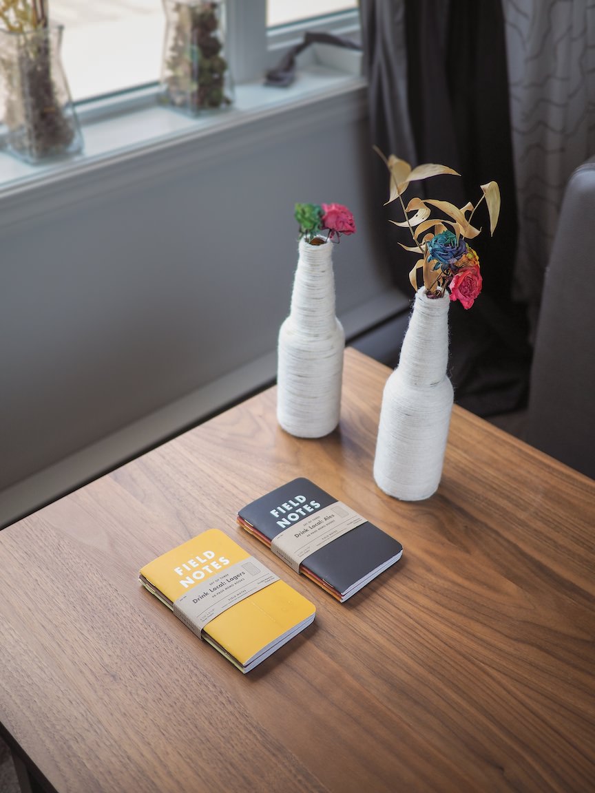
I picked up my first pack a few weeks ago. Although I can’t bring myself to write in the Colors editions, I have at least opened them to feel their texture. And as I look at my growing collection, I think I bought the wrong edition first. I absolutely love this edition and it has set the bar extremely high for future Colors. The Drink Local edition is one of the most unique Colors editions to date and they will sit atop my book shelf in all their glory well into the future.
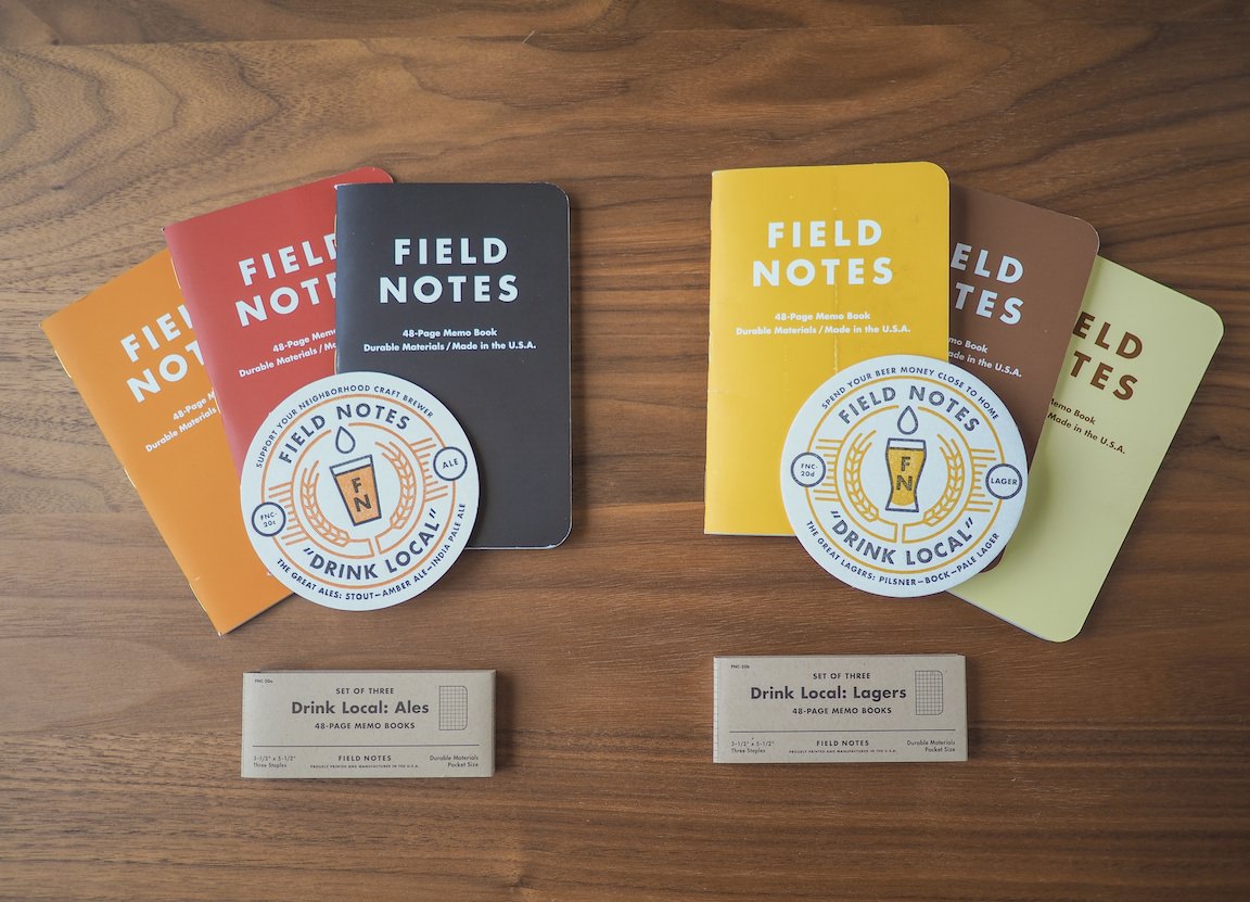
Drink Local: Ales

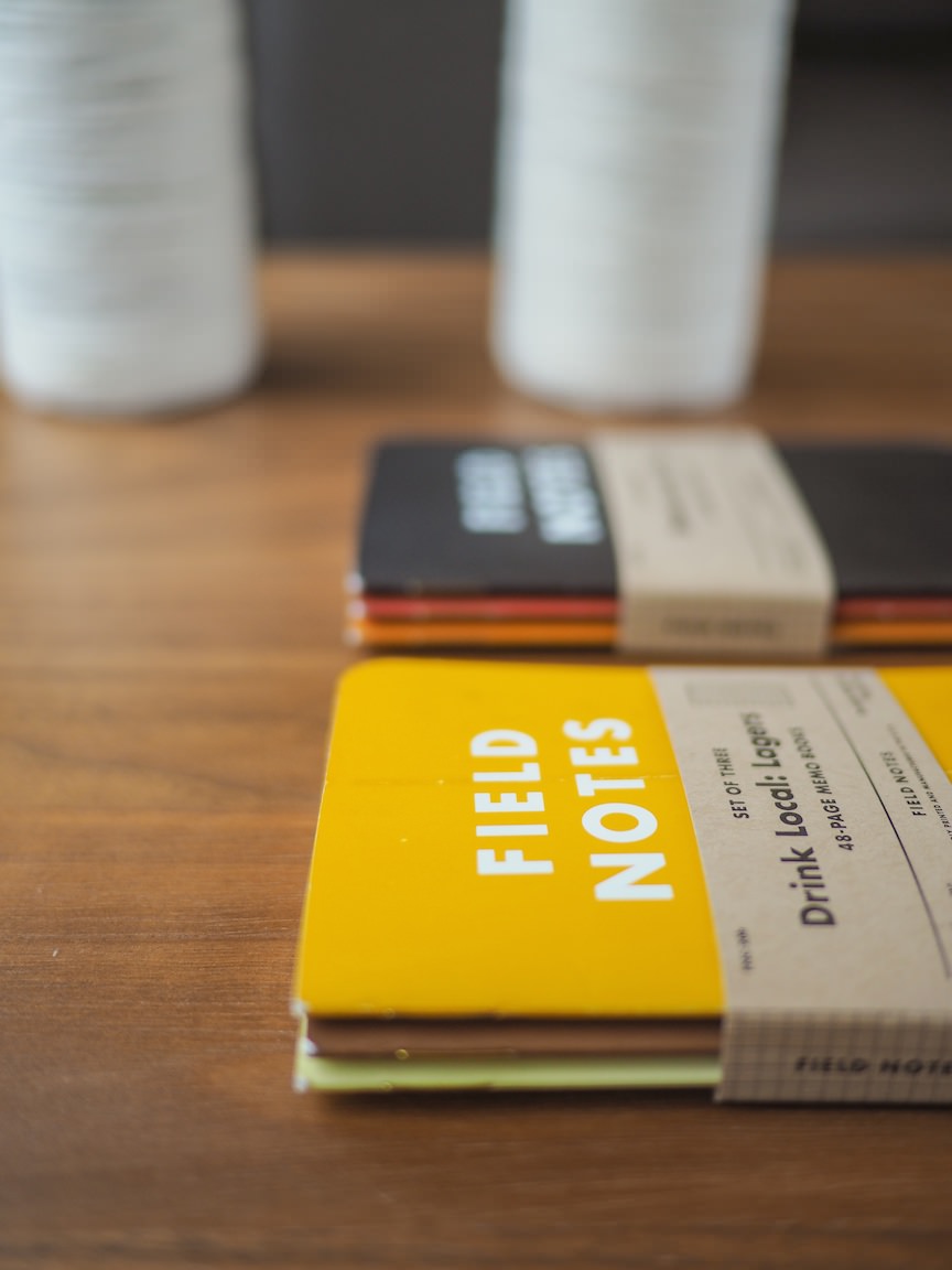
Drink Local is one of only two editions to come in a six pack. These six colours are divided into two three packs devoted to two major categories of craft beer. The Ales three pack comes in colours best described by their inspirations: Stout, India Pale Ale, and Amber Ale. Like many other Field Notes Colors editions, Ales colours closely resemble their real-world incarnation.

Ales are held together with three gold staples and use a slightly modified version of the kraft Finch Opaque Smooth innard paper. The full grid paper is dyed ever so slightly with a “Hefeweizen” ink and is entirely reminiscent of a cold beer.[1] And, because the paper is the same as the standard kraft Field Notes books, you can expect the same high profile experience.
The Ales covers are superb on the outside. They are printed on a New Page Sterling Premium paper with a “soft touch” varnish. This varnish lends a matte, rubberized texture to the covers. I love the rubberized feel and I blame this texture for ruining my judgement of future Colors editions.[2] I want all my covers to have a soft, rubberized texture. It feels as unique — if not more unique — than it looks.
The inside cover is a different story. The black colour (I presume “Stout”, but I may be wrong) looks fantastic with white type, but provides great difficulty in writing with a standard blue or black pen. There is about zero chance someone will be able to return one of these books if I ever lose one. I also like to write pertinent information for my new journaling system inside the front cover; the black inside cover essentially eliminates any chance at organization.

Drink Local: Lagers

Three lighter colours round out the Drink Local edition. Pilsner, Bock and Pale Lager offset the “stout” Ales with laid back colours. When looking for realism, I feel Lagers colours are more accurate than their Ales brethren. If you haven’t read the back cover or have no prior knowledge of the Drink Local edition, Lagers will instantly remind you of a genuine beer. Ales, on the other hand, may not.
Lagers books are identical to Ales books in terms of physical characteristics. They utilize the same material for the cover and the same dyed Kraft paper for the innards. Gold staples round out the entire edition. The lighter Lagers colours would create an expectation for a lighter inside cover, but the black cover remains throughout the six book edition.
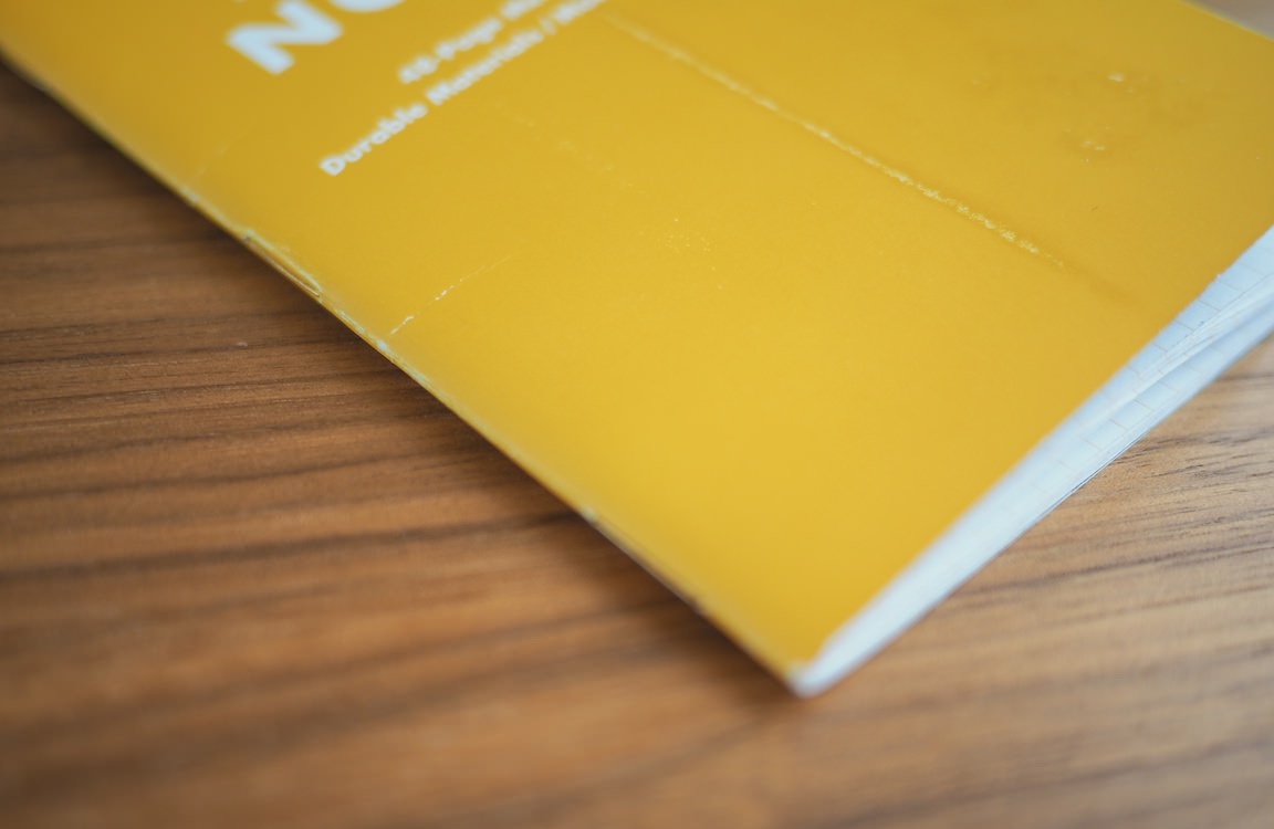
Both Ales and Lagers appear to have white covers that have been printed with their respective colours over top. The result is a white paper that shows through in the case of wear around the spine. I would not venture to say that this is a weakness, but rather a result of the printing technique. Books like Pitch Black or the kraft versions have coloured paper throughout, allowing small signs of wear to stay hidden. If I had to choose, I would choose white, soft-touch, rubberized paper over kraft paper every time.
Love at First Sight
As I hinted earlier, my Drink Local sets are the nearest and dearest to my Field Notes heart. The Ales three pack was my first purchase and I immediately fell in love with the rubberized feel and the original inside back cover. The normal Kraft innards lead to a traditional feel when writing and make the entire Drink Local edition feel right at home.

And that’s the point. Drink Local highlights craft brewers and the fine skills involved in brewing an exceptional pint of beer. Craft brewers utilize local ingredients and add unique personality to an otherwise generic drink. Craft brewers represent their neighbourhoods and regions as good as any hobbyist. It only makes sense for Field Notes Brand and their nostalgic notebooks to hearken to local brewers.
So, in turn, support your local brewers. And Drink Local.
Despite my small experience, I’ve come to associate beer and beer gardens with the great city of Munich… which is in Germany… which basically means “Hefeweizen” makes perfect sense. ↩
Except for the Expedition edition. Now that’s just plain cool. ↩