There are very few apps on my iPhone that hold the title of a “Category Introducer”. By that, I mean to say that few apps introduced me to an entirely new medium or workflow category. Apps like Omnifocus, Fantastical, Tweetbot and Editorial are good examples of apps that improved upon a piece of software that I previously used for a specific task. The few “Category Introduction Apps” which come to mind:
- Reeder and RSS
- Instapaper and Read-It-Later
- Day One and Digital Journaling
- 1Password and Password Management
I believe I can add Overcast to this prestigious list. Yes, I listened to the odd podcast prior to Overcast. But never before has my podcast list been this long and I never imagined being able to get through these shows in such a short period of time.
Below, I’d like to explain why Overcast works for me. It may not work for everyone, especially if you’re looking for a synchronized cross-platform app. Further, I’m not incredibly knowledgeable of the audio and podcast world — this review aims to be more qualitative than quantitative.


Overcast is the work of Marco Arment. Marco’s past work and past experiences are evident throughout Overcast. The use of white space and typography[1] flow elegantly throughout the app — just like Instapaper and The Magazine. Small features also shine, like the animated EQ Bar that overlays the podcast artwork in the subscription list view. Nearly everything about this app is absolutely delightful.


Navigating through Overcast is fairly straightforward. After you have chosen a podcast from the main view menu (as seen in the introduction image), you’re quickly shot to a list of all unplayed episodes of that podcast.
Tapping the info button gives you some information on that specific show and tapping the show title will either begin downloading the episode or begin playing the episode if it has already been downloaded. Overcast supports background downloads, so I’ve generally found each episode ready to go whenever I’m up to listen.


Why does Overcast have to download the podcast to memory instead of streaming the episode? Because Overcast’s two major features — Smart Speed and Voice Boost (which are an in-app purchase) — need to analyze the downloaded file before they can be played.


Smart Speed analyzes the downloaded episode and shortens areas of downtime or pauses in speech to speed up listening time. This is handled brilliantly. Conversations sound smoother and less robotic than a generic speed boost option. There is even an indicator in the settings menu to indicate how much time you have saved by using Smart Speed. I would wager Smart Speed alone is worth the in-app purchase.
Voice Boost is equally impressive. Voice Boost also analyzes the downloaded file and boosts areas where speech is quieter. This eliminates the need to manually up the volume when a quiet speaker takes the mic and, generally speaking, makes the whole listening experience easier on the ears.
These two hallmark features are what sell Overcast for me. They are so well executed and act so invisibly that I usually forget I have them turned on.


The actual playback screen is very simple and clean like the rest of the app. The same animated EQ Bar found in the main menu can be found in the playback screen.


Other in-app purchase features, such as a sleep timer and a continuous playback option, are found in a menu from the playback screen. Again, everything is laid out simply and highlighted with colour and text.


The only slight misstep in this playback screen — and, admittedly, in the entire app — is the hidden ability to swipe the podcast artwork upwards to find show notes and show links. Prior to downloading Overcast, I had read about this feature in other reviews and I knew how to navigate the playback screen appropriately. However, first time users who have no prior knowledge may need to stumble upon these hidden notes and links out of sheer luck.
Once you do find these show notes though, there seems to be no better place to keep them.


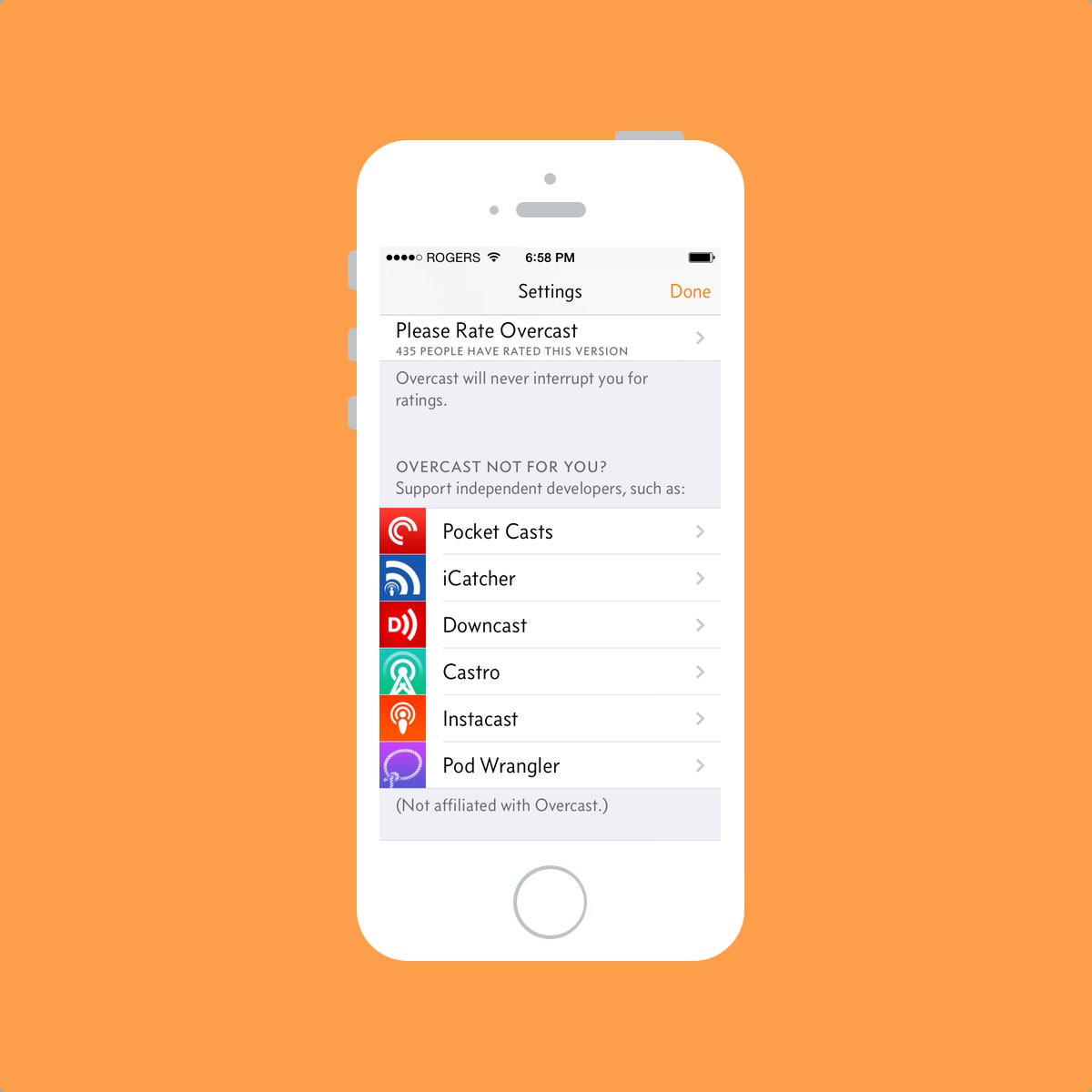
Marco Arment was a guest on Myke Hurley’s Inquisitive podcast and he discussed the mindset behind Overcast’s settings and options. Without spoiling too much of the fun, Marco concluded that options for every kind of feature would turn Overcast into a convoluted mess.
I tend to agree.
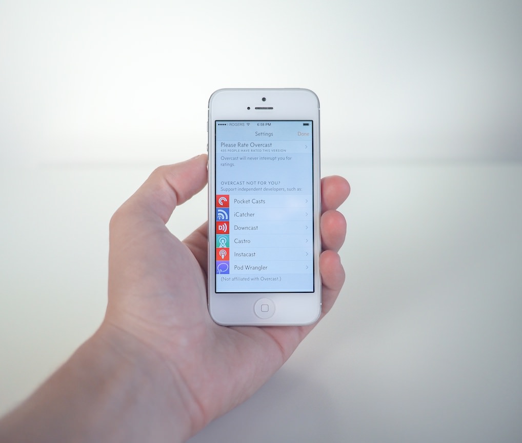
As a result, Overcast doesn’t have an endless settings menu where every feature can be turned on or off. Best of all, if you are looking for a feature Overcast doesn’t offer, a thoughtful list of other podcast apps are ready for your click — a classy gesture in a classy app.


Overcast’s podcast directory is much like its settings menu: short, simple, to-the-point and very classy. Searching the directory is simple and I’ve had no problems finding specific podcasts within seconds. If you have a podcast URL on your clipboard, you can tap the “Add URL” button and pre-populate the URL field to make searching that much quicker.
Once more, Overcast’s use of whitespace and typography creates logical divisions within the podcast directory and maintains the design aesthetic throughout the app.


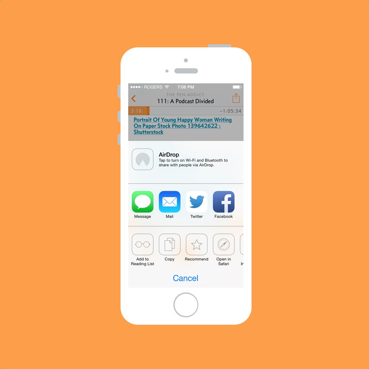
If you’ve finished a show and deem it one of your favourites, you can use the share sheet to recommend the episode. By recommending a show, Overcast can use your Twitter account to send your recommendations to your followers. Overcast doesn’t tweet on your behalf, but rather reads the recommendations of the people you follow and shoots the results into the “Recommendations from Twitter” section in the podcast directory.
Like Smart Speed and Voice Boost, recommendations are handled invisibly. It’s probably the best way to handle recommendations as well — after all, the people you talk to and trust are probably the ones you follow on Twitter. I love the trend of invisible features that developers are adopting these days.


Once you’ve downloaded and subscribed to all the podcasts your heart desires, you can create playlists and organize your podcasts accordingly. I don’t subscribe to enough podcasts for this to be of use, but it’s nice to know it’s there.

I didn’t embark on a mission to review every aspect or to critique each design choice found in Overcast and I’m not the first person to write about it. However, I wanted to outline how simplicity, typography, whitespace and a few invisible features have turned me into a podcast listener.
Overcast has a few current flaws according to most people, namely the lack of a dedicated iPad app and the ability to stream episodes. I personally have no problem with these flaws, but your mileage may vary.

With all the hype surrounding Overcast and its development, it was hard to objectively state that this would change how I use my iPhone within a few days of release. Instead, after a good month to six weeks of use, I can assuredly state that Overcast is on my iPhone and has introduced me to a new format of content.
Is there an end to content formats? There’s not enough time in the day to give the attention so many artists deserve. For me, podcasts are one of those formats I will continue to give my attention to well into the future. And it’s all thanks to Overcast.
You should probably try out Overcast if you haven’t already. It is free after all.
Concourse by Matthew Butterick. ↩