
For the first few months here on The Newsprint, I wrote about technology and application workflows. It was the topic I was interested in at the time and my interests have changed pretty drastically ever since. I still keep up-to-date on the iOS software front, but it isn’t where I choose to spend as much money.
That doesn’t change the utility of the iPhone and its incredible applications in my life. I use my iPhone hundreds of times each day and it continues to improve my efficiency at work and my fun at home. Straying away from writing about technology gives no indication of my love for my iPhone.
And despite my love for pens, paper and analog tools, I still use my iPhone for on-the-go notes and lists. Fountain pens top my go-to notetaking tools, and if I can’t use a fountain pen, I choose my iPhone instead.
Right now, I take notes in Vesper.

I know. Vesper. I can’t believe it. It’s an app that doesn’t integrate nicely into chain-like workflows and it doesn’t (yet) have an iPad or Mac app to sync my notes.
But I think that’s why I love Vesper.
I finally feel content with my notetaking app. I’m so excited to finally be able to say that.

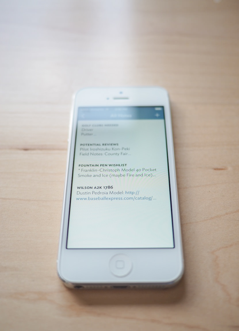
Vesper’s main screen shows a list of all your notes. Each note can have a bolded, small-caps title line with a small summary of the note just below. White space is used to separate notes in the main list view and this helps the whole experience remain simple and minimal.
Each note can also be tapped and dragged to another spot in the list, allowing for a reordering of priorities if necessary.
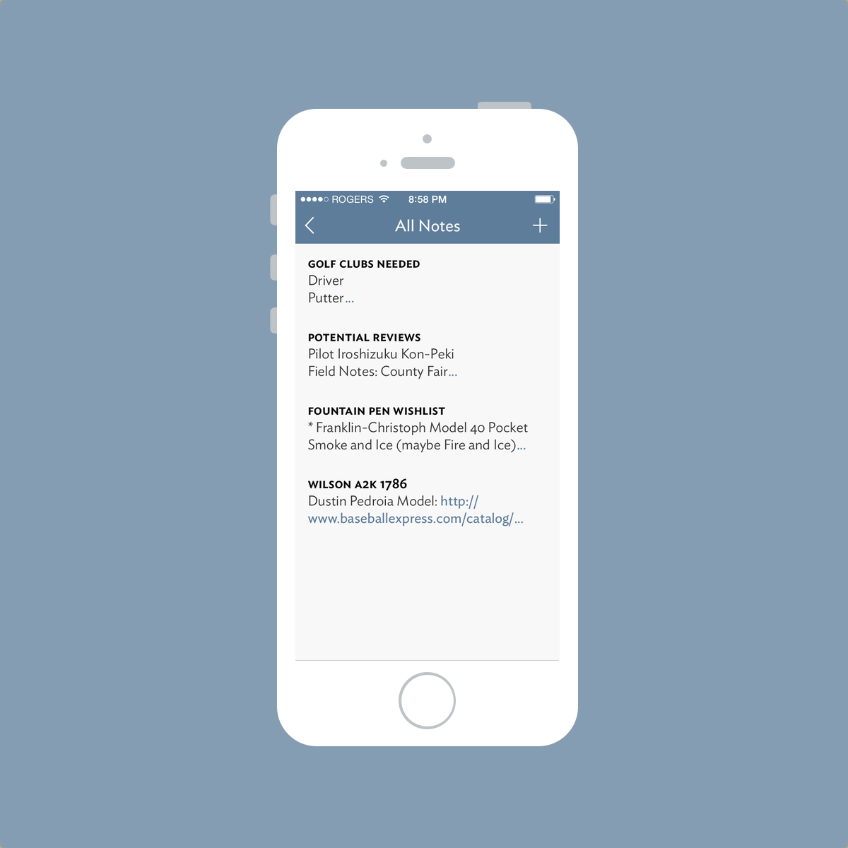
This main list view is a fantastic introduction to the straightforward design of the app. Vesper’s main colour scheme flows throughout and I have never felt lost within the app.
But more importantly, this main list view introduces Vesper’s focus on typography. I love Ideal Sans. In fact, Ideal Sans is the font that introduced me to the world of beautiful sans-serif fonts and is the only font I wish The Newsprint incorporated other than Avenir.
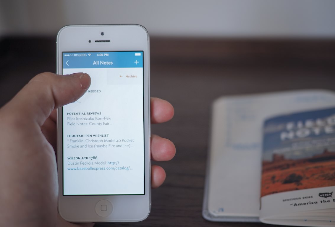

Once a note has been created, the note can be archived directly from the main list view.
Like in the main list view, the archive nicely implements photos that are added to your notes.

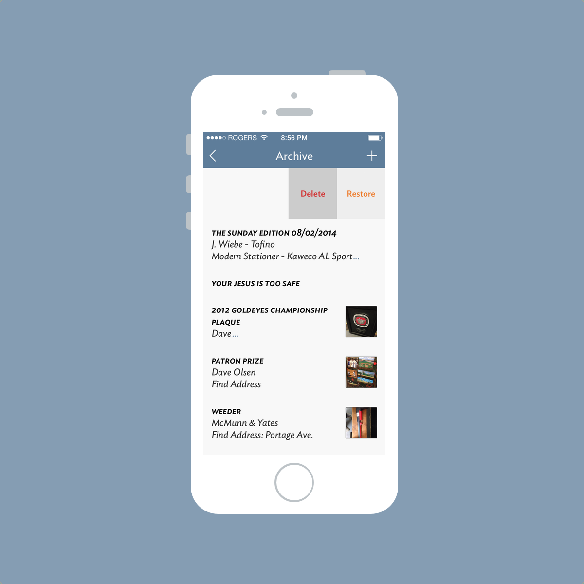
If I find myself without a pen and memo book and I have a thought or journal idea, I quickly jot it down in Vesper. Once I get back to my written journal, I can write the contents of the note in my book and expand on them if necessary. From there, it’s a quick swipe-and-archive. If I need to un-archive the note, I can perform the same swipe-and-unarchive move and the note reappears in my main list view.
Obviously I can’t replicate the snapping of a photo in my written journal afterwards, but being able to snap a photo helps clarify the context in which I created the note. A simple photo can remind me of a small detail while I’m writing my thoughts out at the end of the day and this has been a lifesaver.
I find Vesper’s archive to be better implemented than popular notetaking apps like Drafts or Scratch. An archive should be neither hard to find nor hard to use. By making the archive accessible, Vesper strikes the right balance for me.

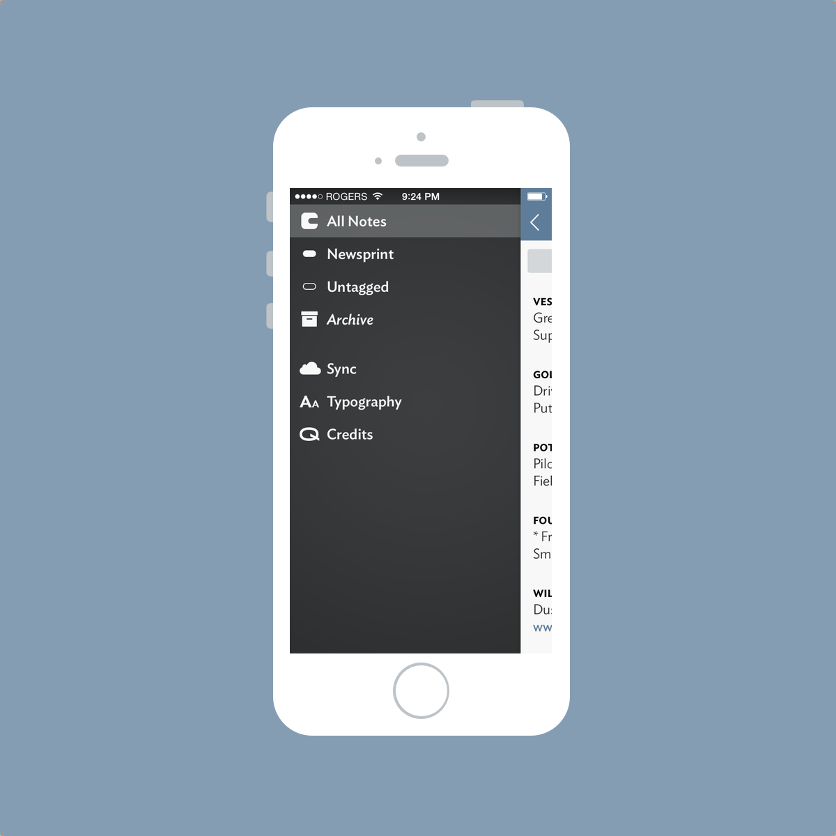
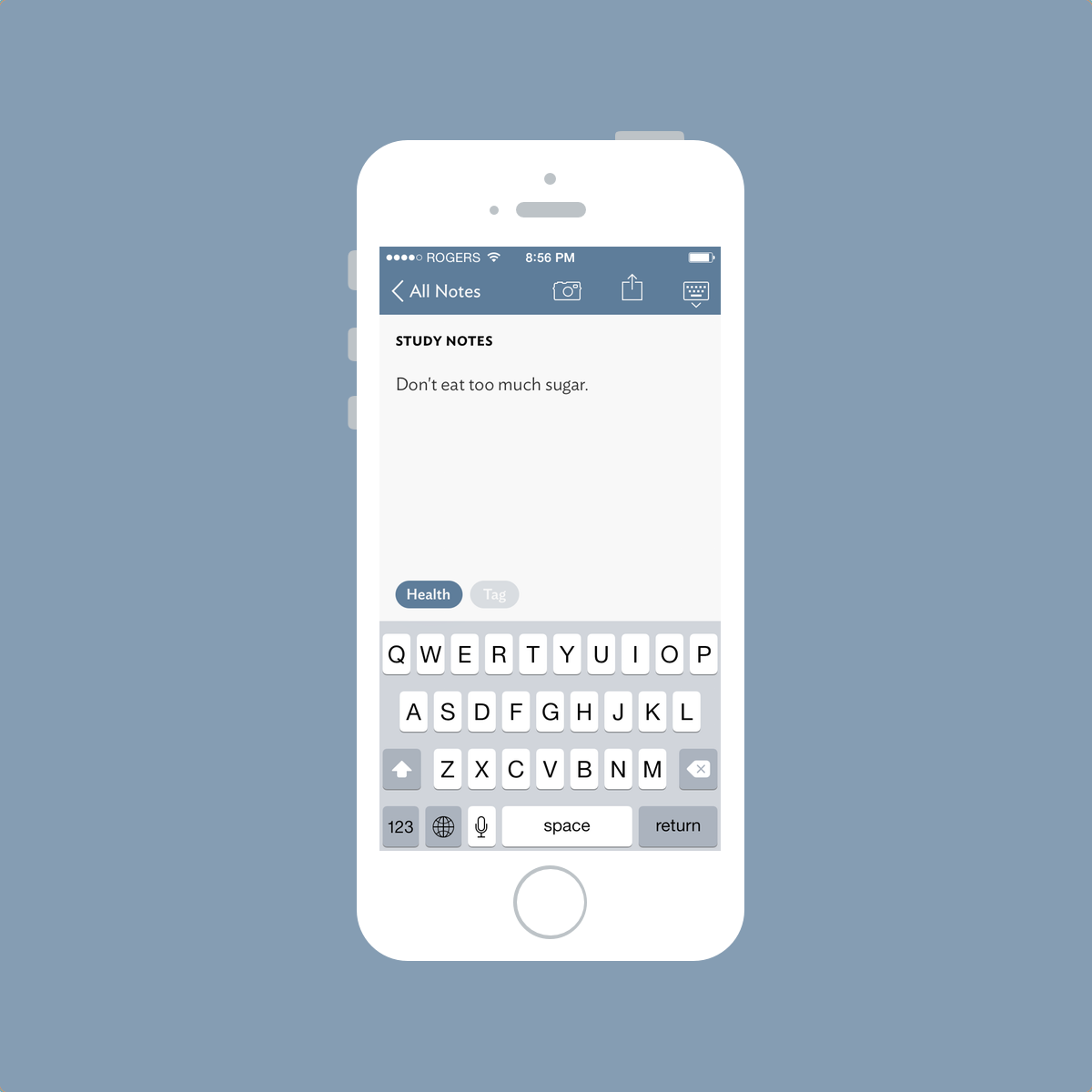
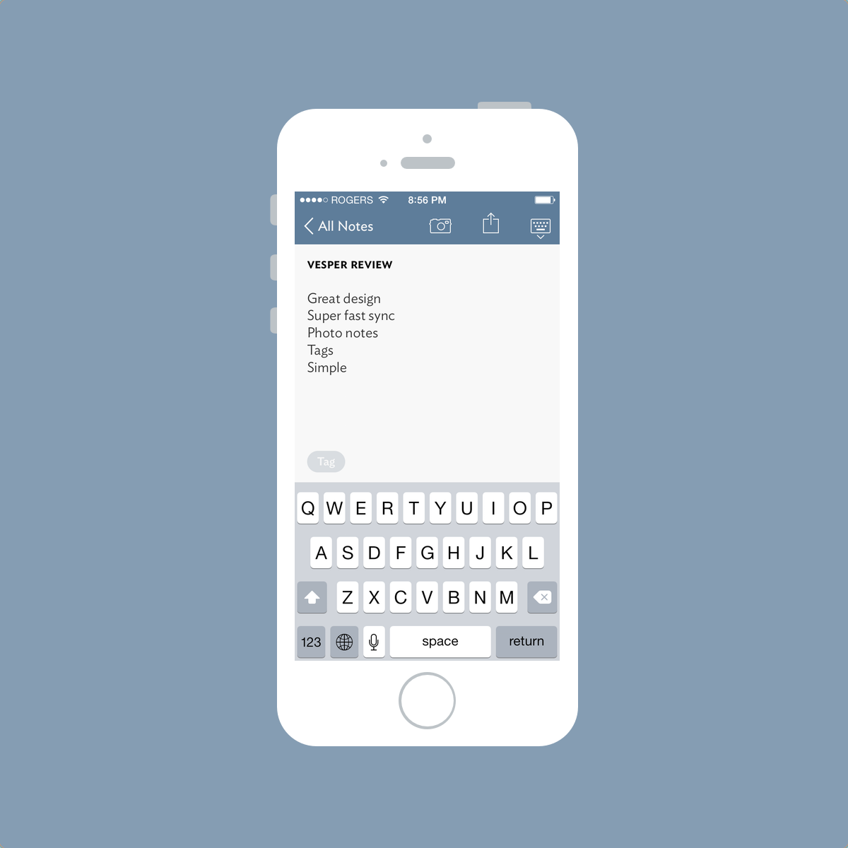
Each Vesper note can be tagged for quick and easy categorization. These tags are added in the bottom of the typing area and you can drill down your list of notes by accessing your tags in the left pull out menu.
Again, Vesper’s focus on typography becomes instantly recognizable. Your tags are noticeable underneath “All Notes” in the left pull out menu, and the archive — which is denoted by italicized typography — is shown for quick access.
Again, there’s nothing difficult or confusing about this navigational menu. The main list view remains partially visible on the right side of the screen and you never lose sense of where you are. There just aren’t enough options in Vesper to make the app difficult to use.
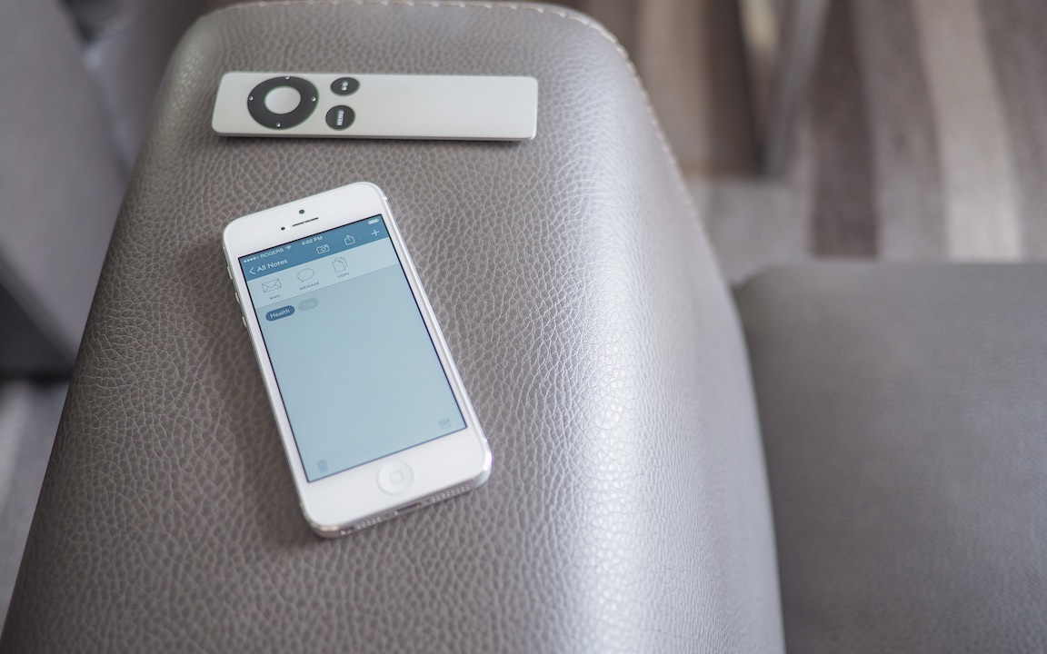
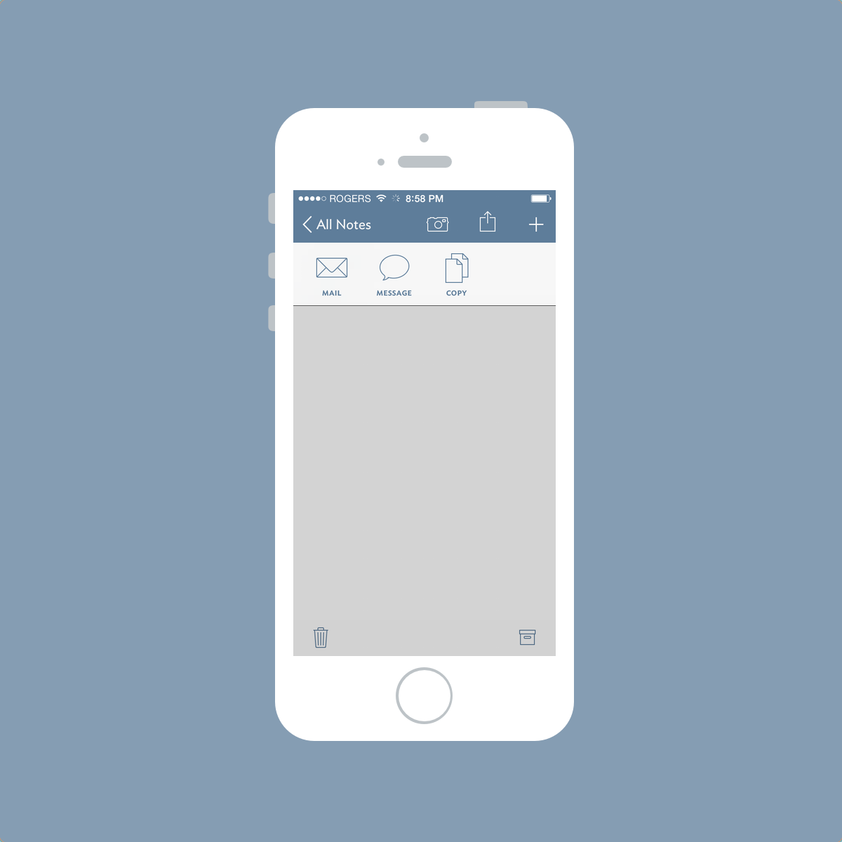
Vesper’s share sheet is where many users may become frustrated. Once a note has been created and tagged, Vesper’s share sheet can send the note to a new email or message, or it can be copied to the clipboard for use in another part of your iPhone. Unlike Drafts or Scratch, Vesper’s share sheet is void of high-utility workflows.
For some people, Vesper’s inability to directly cooperate with other apps via its share sheet is a dealbreaker. I find, however, that Vesper’s sharesheet forces me to input my notes into my written books for safekeeping.
This is the moral of my Vesper story. It fits into my analog workflow better than any other notetaking app. And it took me a bloody long time to realize it.
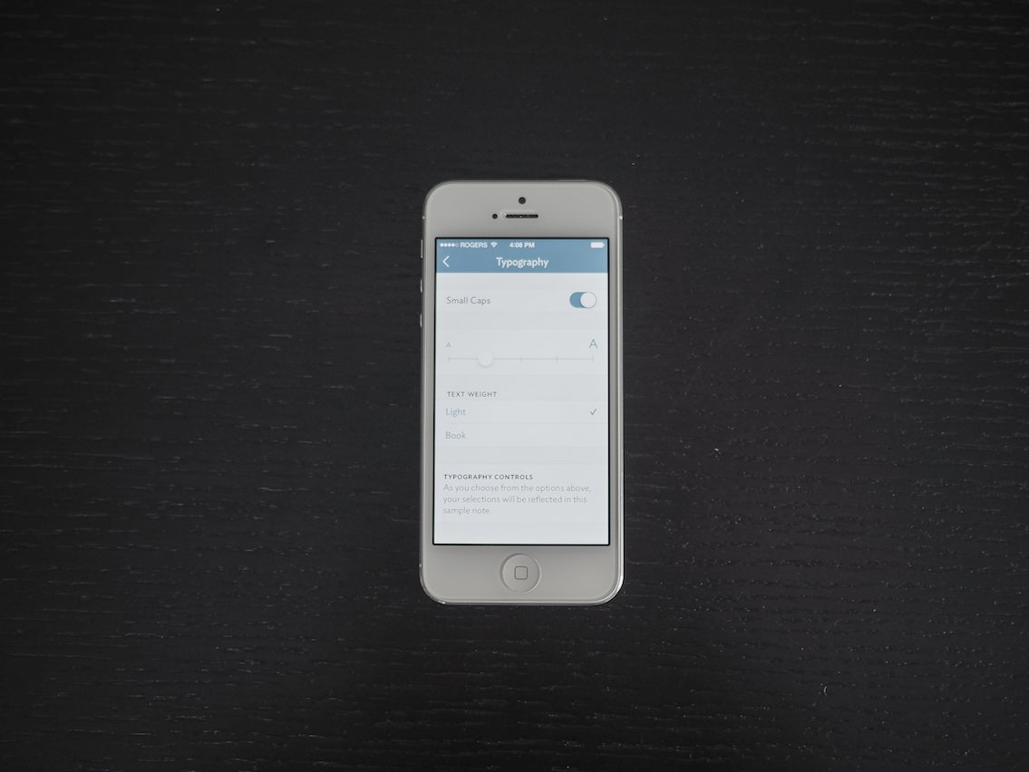

The continuous devotion to typography describes my infatuation with Vesper. I’ve become fascinated with different styles of penmanship and I am constantly looking for new ways to write beautiful letters. The personality (or lack thereof) exuded from my written notes is essentially mimicked by Vesper’s typography.
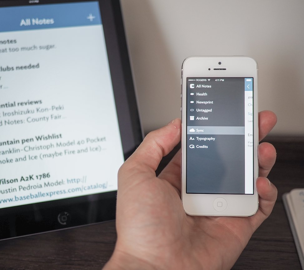

Vesper won’t remain an iPhone-only app forever and its star-studded development team has already announced the development of a Mac version. To keep the two apps in sync, the Q-Branch team has created a super-efficient syncing system that appears to be lightning fast and nearly invisible in operation.
At this point, Vesper Sync remains mostly a backup service unless you find yourself using two iPhones, restoring a new iPhone or want to sync your notes to the scaled-up iPhone version on your iPad.
But looking to the future, the possibilities of Vesper Sync are endless. I foresee myself using Vesper to generate link ideas for The Newsprint’s Tumblr and syncing them quickly to my Mac for posting. I understand that this can already be done with an app like Simplenote, but somehow I think Vesper’s syncing engine will blow away its competition. I’m looking forward to finding out.
I watched this really neat video recently and it really inspires the cohabitation of analog and digital. We don’t have to choose one or the other. Instead, we have the benefit of choosing an analog or digital tool based on that tool’s strengths.
This is super empowering.

Vesper stands as my favourite notetaking app for notes on-the-go. I still maintain an intense Field Notes habit where I stash all my thoughts, ideas and lists, but I can’t always whip out a pen and paper whenever I want. For those moments, Vesper stands elegantly ready.
Vesper doesn’t have URL-scheme workflow features or an iPad or Mac version to accompany it, but this works out to benefit my habits rather than hinder them. Vesper forces me to jot down my digital notes at the end of the day instead of shooting them into Day One or into Clear.
And Vesper’s typography makes its design the best in the iOS App Store.

Some people hesitate to purchase Vesper because of its current feature set. I argue this is Vesper’s area of strength. If you find yourself trying to incorporate digital and analog habits, I wholeheartedly recommend giving Vesper a fair shot. It’s only $3 after all. It’s in my dock, and that has to speak for itself.