There’s nothing quite like cracking open a new pack of Field Notes books. Breaking the vacuum-sealed-shrinkwrap has become a tradition for many a Field Nut — the older the edition, the more sacred the tradition.
Sometimes though, breaking the seal is the climax of the story.
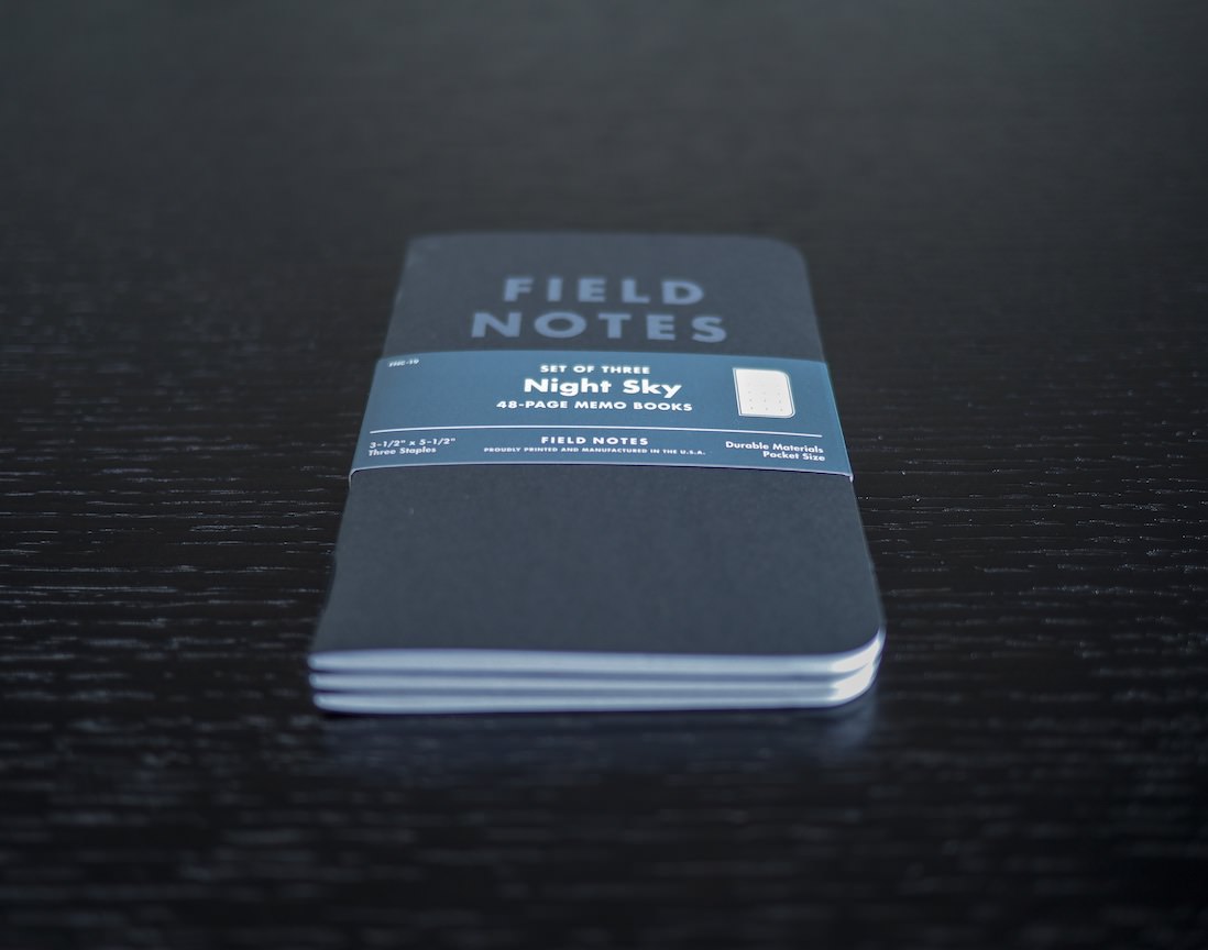
I’ve had a hard time getting my hands on some “older” Field Notes Colors editions since I began searching for them in December. I was able to buy every edition dating back to Winter 2012 through a retailer except for Summer 2013’s Night Sky. Night Sky is the most elusive edition I have acquired to date.[1]

Mikey Reiach (@mikeyReiach on Twitter) graciously sent me a pack of Night Sky a few weeks ago. Alongside the three-pack of books was a thoughtful handwritten note that had been sealed with an old fashioned wax seal. I really can’t thank Mikey enough for his generosity. The least any of us could do is give him a follow on Twitter.
Now, Night Sky.
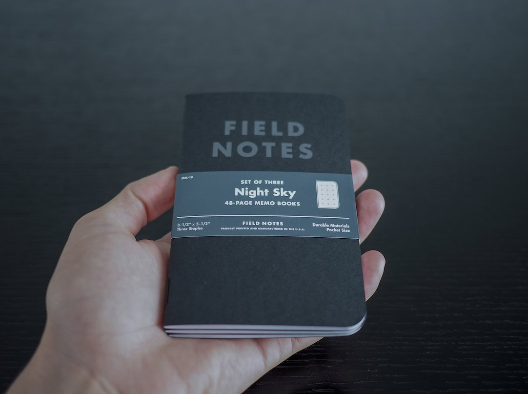
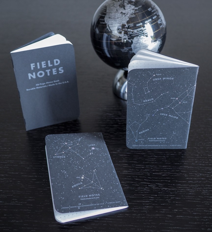
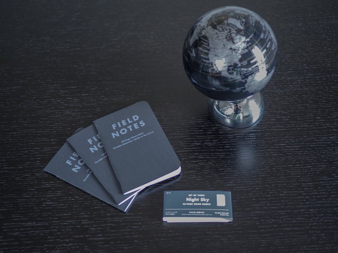
Night Sky was Field Notes Brand’s 19th COLORS Edition and was one of the most popular Colors editions ever. Night Sky is adorned with constellation mappings of three major summer night skies and each map comes complete with shiny bits of reflective foil that glisten at different viewing angles. Like every edition before and after, Night Sky embodies a theme from cover to cover.
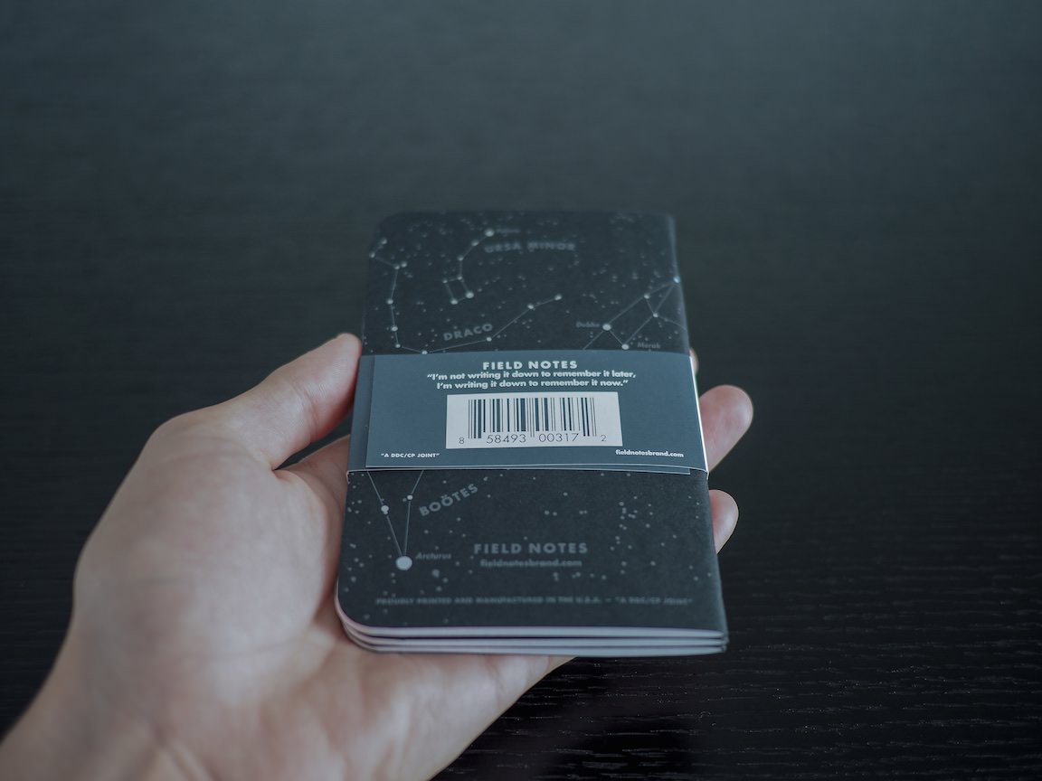
Night Sky’s covers are made from the standard 100#C French Construction stock found throughout many editions. The standard stock covers are made from black paper throughout, eliminating the cracks of white paper that show after some use in editions like Cold Horizon. The “Blacktop” colour is complimented nicely with a “Stealth Grey” cover lettering that looks like a deep blue/green in some lights.
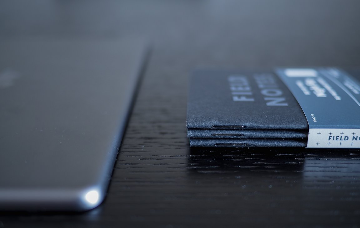
Night Sky is held together by three shiny black staples that continue the starry night theme. My personal preference leads me away from these staples however — when opened to the middle of the book, the jet-black staples contrast too greatly with the bright white innard paper and end up being a distraction. I’m probably nitpicking though.

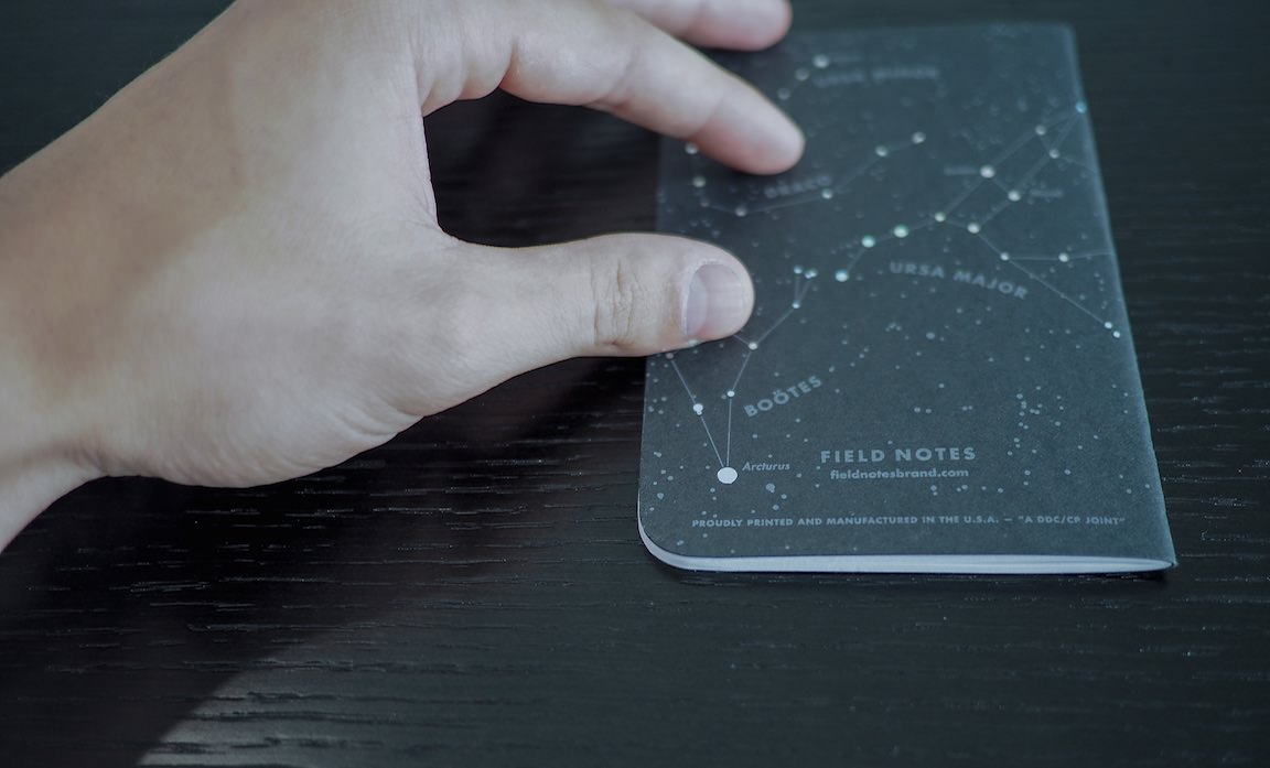
The renowned back covers are where Night Sky derives its character. Each book highlights a different portion of the summer’s night sky by connecting the starry dots like we did in our colouring books as kids.
Those shining stars truly shine — the reflective material Field Notes Brand used glimmers in an array of colours depending on the viewing angle. There’s some pretty interesting information regarding how the Field Notes Brand crew stumbled upon this reflective material in their Colors Recap series.
Perhaps the niftiest part of these back covers (and inside back covers — more on that in a bit) is the amount of information to learn. I had to sit down, read and examine the constellations and their descriptions after cracking open my Night Sky three-pack. In true Field Notes style, you don’t buy these books to just use them.

Despite Night Sky’s external cover beauty, Night Sky’s inside covers are hit and miss. The Blacktop colouring extends to Night Sky’s inside covers and effectively eliminate legible — even viewable — inside documentation. I know I can’t have the best of both worlds — that of uniform colour and a useable inside cover — and I know that I’m probably in the minority, but I still wish for an inside cover like the one found in America the Beautiful. If I have to use a silver Sharpie, I don’t have a winner in my hands.
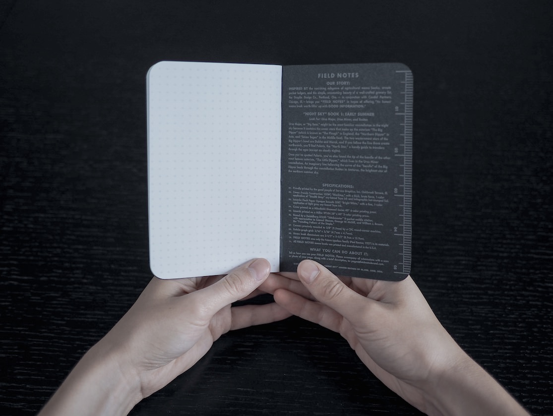
As mentioned earlier, the inside back covers are packed full with interesting constellation and astronomy information. I really like how Field Notes Brand moved away from the list of “Practical Applications” for this edition and instead offered a small, astrological resource. In fact, if not for this small difference, little would differentiate it from its Pitch Black clone.

Jumping further into Night Sky’s innards only leads me to more of a letdown. Night Sky is packed with the standard bright white 50#T finch paper which is thin and light, but not very adept at handling your writing instrument of choice. Field Notes paper is infamously non-fountain pen friendly and I don’t enjoy having to carry along a secondary pen just to write in my memo books.

Standard 50#T paper and standard bright white colouring par the same old course for Night Sky, but its reticle graph is a unique characteristic awaiting dissection. The light gray reticle grid is one of a kind in the Colors line.
The reticle grid is a combination of the dot grid introduced in Fire Spotter and the popular graph grid found in most Field Notes editions. However, I find the reticle grid far more distracting than any other grid type. The large grey-on-white reticles are psychologically distracting when I’m writing and I find myself wishing Night Sky used the simple dot or graph grid.

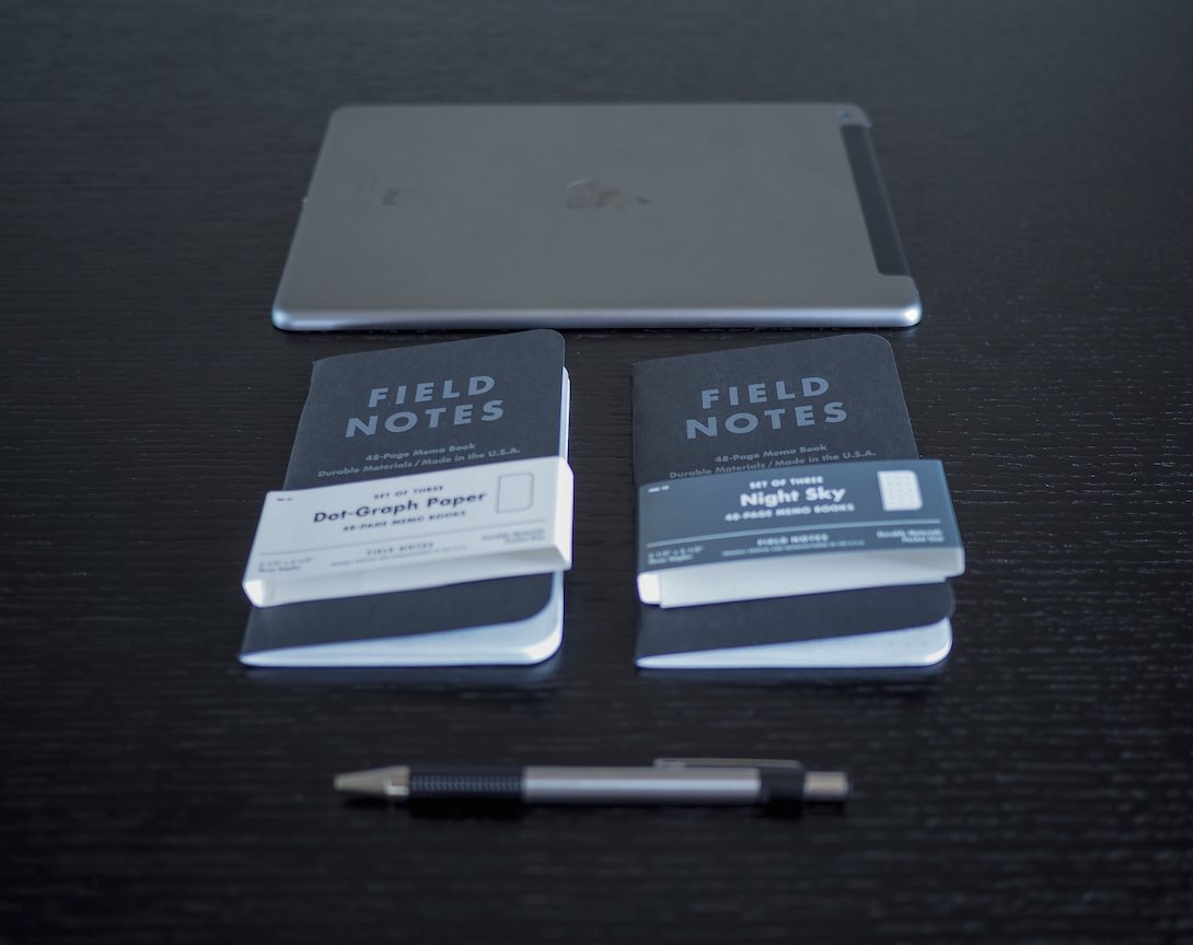
I would assume Night Sky’s immense popularity led to the creation of Pitch Black. Like Fire Spotter and Red Blooded, Pitch Black was made seemingly out of extreme customer demand. Field Notes Brand’s crew stuck to their guns and cloned Night Sky, save for a few key characteristics.
Upon viewing the two editions, one would be hard pressed to determine which is which. Both have the same Blacktop front cover and the same Stealth Grey Field Notes logo plastered on the front.

Flipping over the books tells you the true story: Pitch Black was stripped of Night Sky’s one sensational characteristic. The beautiful back cover constellation maps were removed from Pitch Black, a decision which I assume catapulted Night Sky onto a pedestal.

Opening Pitch Black reveals the second biggest change. The simple dot grid is a favourite of many customers and Field Notes Brand adopted the dot grid for mass production.
In essence then, you can enter the Field Notes Brand Shop and walk out with their famous kraft notebooks in a blank, ruled or graph-grid format, or you can purchase their wildly popular black notebook with a dot grid. I like how they have given standalone options with all their different printing and design techniques. I wager we will come to see a larger Arts-&-Sciences-sized standalone product in the near future for this very reason.
With the awkwardness of Pitch Black and Night Sky out of the way, I’m left to ask myself where Night Sky ranks on my list of favourite Colors editions. The answer to that question is heavily affected by Pitch Black.
Night Sky’s shrinkwrap-breaking just wasn’t inspirational or jawdropping. Perhaps I knew what to expect. Perhaps Pitch Black ruined the party. Perhaps Night Sky is too generic. The beautiful back covers are the one aspect of Night Sky that I truly admire and they will be the only characteristic of the Summer 2013 edition that I show off when I pull out my collection.

I’m very curious as to why Night Sky was far more popular than America the Beautiful before it. America’s paper is of a higher quality and its theme is as unique as Night Sky. I wasn’t around for the Summer 2013 Field Notes release hype and perhaps the marketing campaign inspired something within customers that I’ll never understand.
For now, Night Sky sits one spot above Pitch Black on the list of my favourite Field Notes editions.[2] I’m not in love with Night Sky, but I can’t rank Night Sky lower than Pitch Black because they are the essentially the same notebook.
I’m probably the odd man out here. Night Sky was one of the most popular Colors releases at the time, yet I’m sitting here dazed and confused as to why I couldn’t find them for a reasonable price on eBay. Now that I have a pack (thanks again Mr. Reiach!), the letdown is complete. The beautiful back cover starry night just can’t overcome the expensive collector’s premium.
Save yourself some money and buy a pack of Pitch Black. You’ll get the best of Night Sky for a fifth of the money.
Here’s my shameless promotional plug: If you find yourself sitting on top of an extra pack of Travelling Salesman or National Crop, and you don’t see yourself ever using them, I am more than willing to pay a good price. Please don’t hesitate to get in touch! ↩
I should also mention that America has hopped over Arts & Sciences for third place on the list. By the time I reach the end of my first America book, I wouldn’t be surprised if I choose it over a second Drink Local. We’ll have to wait to find out. ↩ </ol> </div>