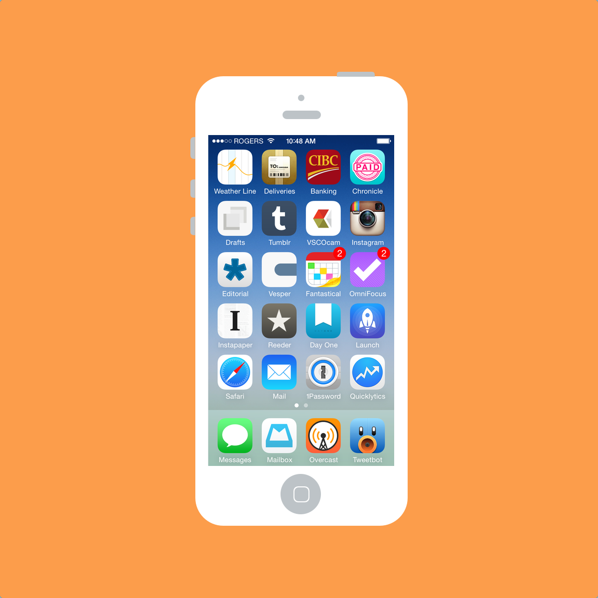
According to my homescreen, August is a month for change. It has gone haywire.
I’m trying out a few different organizational ideas on my iPhone’s homescreen in August. First off, I have filled my dock. Second, I have filled my entire homescreen for the first time ever. Third, I’ve put my most used apps in the most comfortable position for my right thumb to reach.
I have, however, found myself hunting and pecking more often than I would like. But change is fun.

Pretty different than 31 days prior.
- Weather Line
- Delivery Status Touch
- CIBC Banking
- Chronicle
- Drafts
- Tumblr
- VSCO Cam
- Editorial
- Vesper
- Fantastical 2
- Omnifocus 2
- Instapaper
- Reeder 2
- Day One
- Launch Center Pro
- Safari
- 1Password
- Quicklytics
- Messages
- Mailbox
- Overcast
- Tweetbot 3
I’ve acquired a few new apps that are surprisingly easy to use and delightfully designed. I really enjoy Chronicle’s ability to track bill payment amounts over time. Chronicle reminds me of my upcoming bill payments just like a calendar app, but it also tells me if I’m paying more than previous months. Pretty neat.
Apps like Delivery Status Touch, CIBC Online Banking and Quicklytics were all on my second homescreen a month ago. By adding these three to my first homescreen, I’ve effectively rendered my second homescreen as a giant storage folder.
The big addition, in terms of publicity and in terms of lifestyle, is Overcast. Prior to Overcast, I listened to one or two podcasts via the 5by5 website and never bothered to jump into a podcast app. I tried Pocket Casts after seeing the great review on The Sweet Setup, but it never stuck.
Overcast sticks. I really like Overcast’s “Smart Speed” and “Voice Boost” features. Surprisingly though, they aren’t the kicker for me. Instead, I love Overcast’s web application. By syncing to my Mac, I can enjoy podcasts without relying on my iPhone’s dwindling battery. I can’t tell you how much excitement this brings to my podcast-listening life.
Not only has Overcast garnered a spot on my homescreen, it has jumped into my dock. I never imagined a podcast app would enter my dock, but between its delightful podcast playback features and its exceptional app icon, I’m hooked.
Why three writing apps? Well, I’m not sure. I very rarely take notes in Drafts on my phone these days, and when I do, I rarely need to shoot them into a different app. Many of Vesper’s best features are done just as well — if not better — by Day One. And most of my writing for The Newsprint is done on my Mac or iPad instead of my iPhone, so Editorial has begun to collect dust.
I have a fear of letting go of these writing apps though. In effect, it was this genre that inspired the purchase of countless apps and the use of the iPhone for more than just Twitter and RSS. By purging my homescreen of a text editor, I will have turned over a new leaf. Perhaps I’m not ready for that yet.

Writing about my homescreen over the last few months has really enlightened the psychological aspect of my iPhone. Often, I’ll keep a well designed app on my homescreen because it exemplifies the delightfulness of the iPhone itself. The iPhone is still the most beautiful and the most breathtaking smartphone on the market. From time to time, these little apps remind me of the giddiness the iPhone can conjure.
I seem to use my iPhone less and less these days. But whenever a new app is launched, I’m the first in line to purchase it. I can’t imagine the rollercoaster ride my emotions will take when the iPhone 6 is announced