Editor’s Note: I wrote this review in Spring 2014, but the review has needed to overcome some hiccups. I’ve reshot the photographs for this review as the photos didn’t transfer from past platforms.

I’ve been waiting a long time to write this review. I would have hammered out a review within a week if Expedition even remotely resembled the rest of the Field Notes Colors editions.
But Expedition doesn’t. It’s completely different. It’s a niche product within a niche product line. And for its purpose, it’s pretty sweet. Beyond that purpose, one might question Expedition’s place within the Colors line.
I think Expedition is the oddball child of Field Notes Brand. When in its environment, it stands out from the crowd with a stroke of genius. But it falls utterly flat when outside its environment.
For some equally odd reason, I have a conflicted love for Expedition. I love its intended purpose. I love its striking colour. And I love its potential. But only when my ink has finished drying.
Expedition
The 17th Colors Limited Edition by Field Notes Brand is the Expedition Edition. Expedition marks a major extension of the Field Notes Colors product line and its basic utility is different than all prior editions. The entire memo book is made of a synthetic paper that is waterproof and tear-resistant. The front and back cover colours have been chosen carefully to align with the change in utility and the innard paper is incredibly durable. I highly recommend you watch a few of the durability testing videos on the Field Notes Brand website.
Expedition’s front cover is printed on Yupo waterproof and tear-resistant Bright White paper in a very striking High-Visibility Orange. The back cover is made of the same material and printed in a Low-Visibility Black. Both front and back covers have been coated with a clear varnish that adds to the aesthetic appeal.
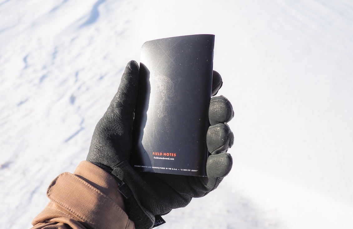
That clear varnish helps bring a glare when seen in the right light and a little easter egg has been hidden in the printing of the covers. The Expedition Edition was created with Antarctic Explorer Ben Saunders in mind. Ben used Expedition to outline the retracing of Captain Scott’s 1795-mile journey to the South Pole. Incredibly, Ben made this trek on foot. The beautiful Antarctic map found in the glare of Expedition’s front and back covers are a tribute to Ben’s incredible journey.
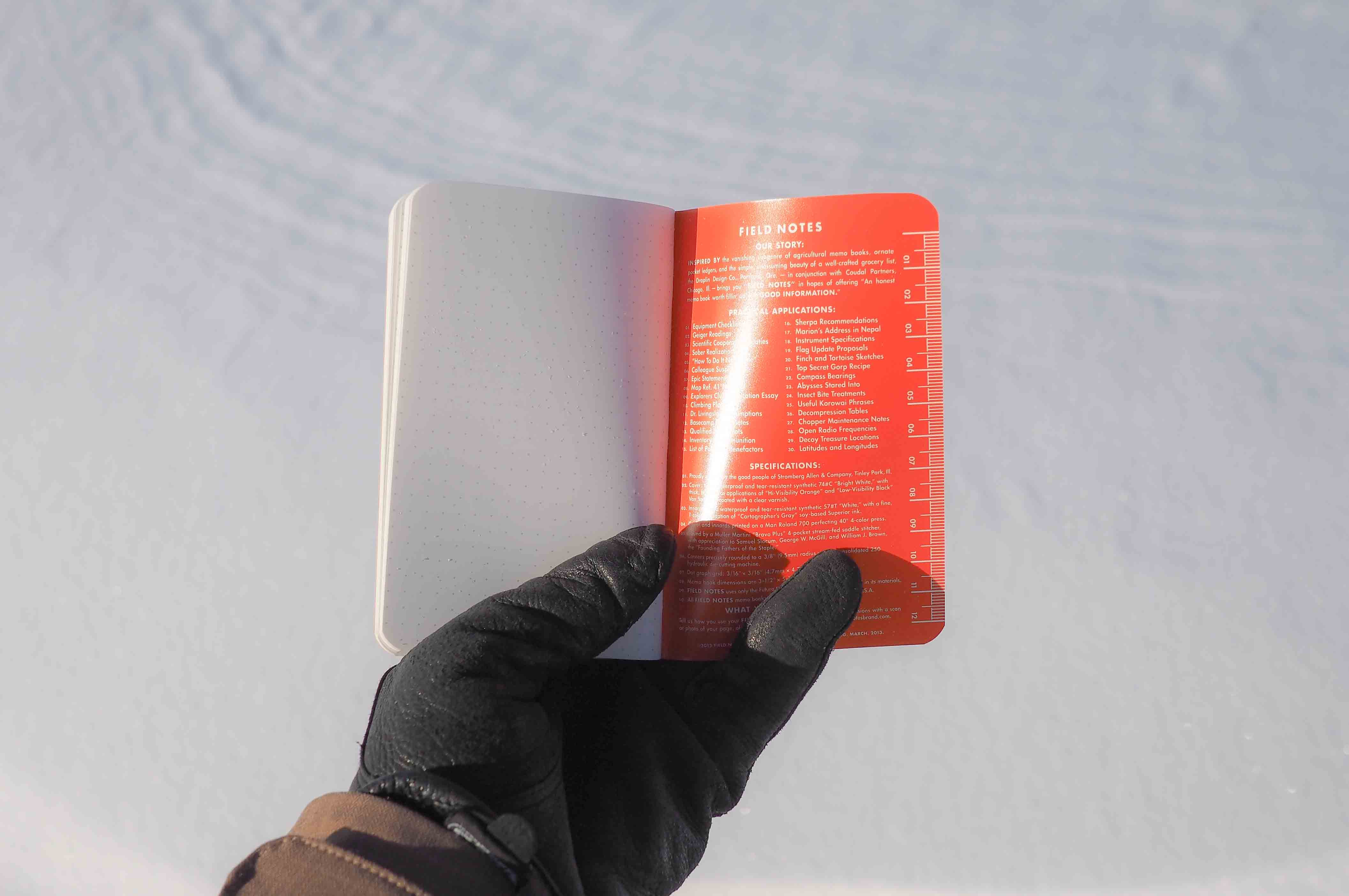
Jim Coudal consistently talks about the themes of each Field Notes Color release. Expedition’s theme is immediately clear (both physically and metaphorically) because of the High-Visibility Orange front cover. The orange makes an immediate first impression and, I would argue, the right first impression. What does the bright orange colour signify in your mind? For me, bright oranges relate to extreme as baby blues and baby pinks relate to babies. They are a direct correlation. This is perhaps the most perfectly executed colour I have in my Colors collection — it just screams extreme.
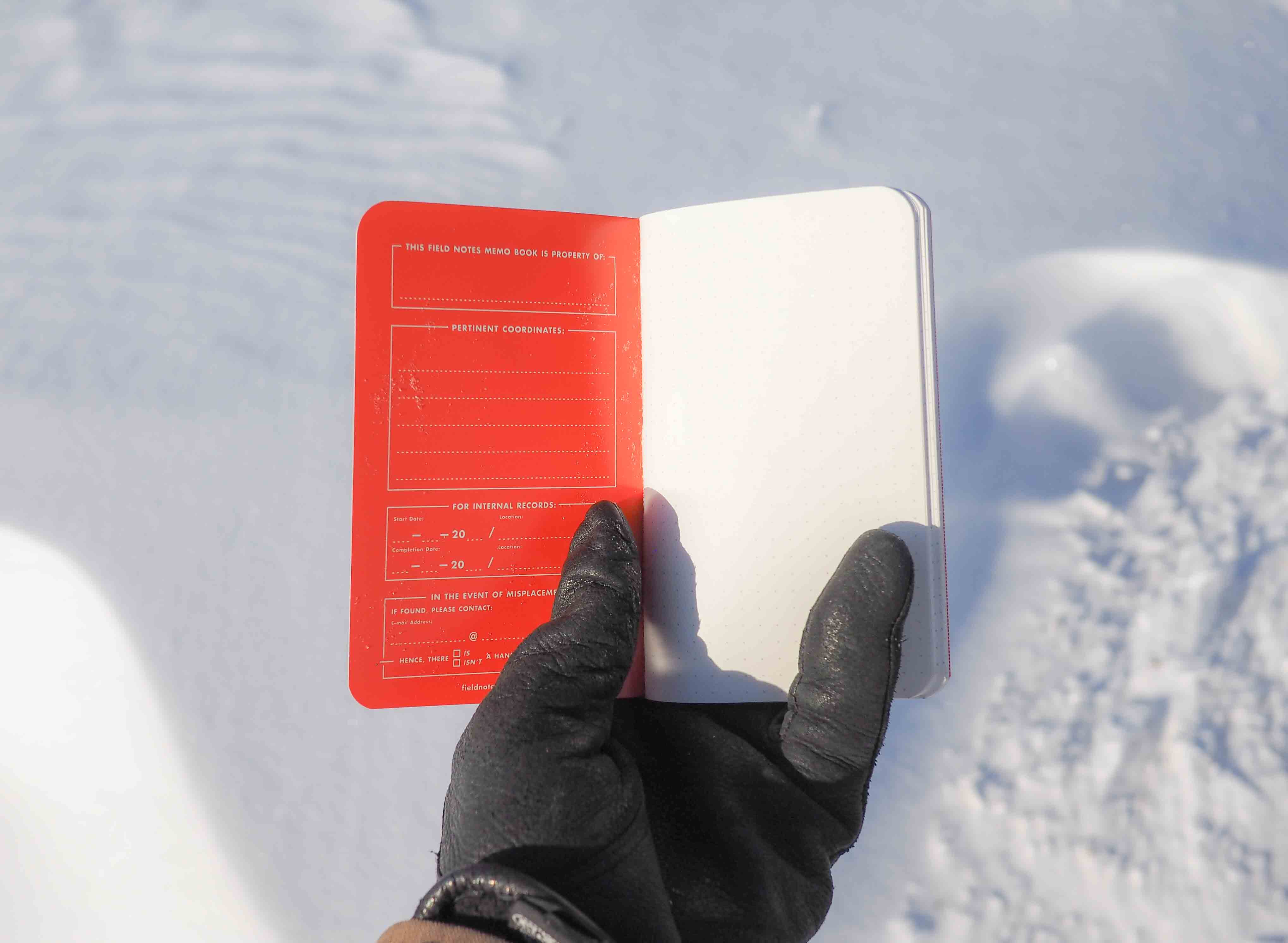
The inside covers are printed on the same High-Visibility Orange found on the front cover. I’m fairly indifferent with this design choice. Blue ink dries distinctively darker on the inside covers and the added thickness to the Yupo covers makes writing inside documentation slightly more difficult. And, much to the chagrin of many Americans, the inside back cover ruler is printed in the Metric system.
Of much more importance is the innard paper. I use quotation marks because Yupo waterproof and tear-resistant synthetic 57#T White isn’t actually paper. Yupo is completely artificial and reaps the benefits of an artificial writing medium. In terms of ruling, the Yupo is printed with an application of Cartographer’s Gray to yield my favourite dot grid.

Now, normal paper is porous. Pores allow for standard fountain inks, gel inks and ballpoint inks to dye the paper’s fibres. I don’t know as much as I would like to know about paper and how fibres are dyed, but I knew immediately upon touching Expedition’s Yupo that it was different. Yupo is nonporous. This allows for its waterproof utility but also renders water-based inks, like fountain and gel inks, completely useless. Head on over to Brad Dowdy’s Expedition Pen Tests to see how different types of pens hold up. Brad concludes that ballpoint inks and pencils are the best bet for proper writing in an Expedition book. I only have ballpoints kicking around my house so I tend to agree with him.
After determining a ballpoint pen of choice, the actual writing experience in Expedition is completely unique. Writing is super smooth. Like butter smooth. Actually, it’s like writing in butter. Ink flows perfectly onto the Yupo and I love the unique feeling. You’ll have to try for yourself though.
Another side effect of that nonporous Yupo is the necessary drying time. I find I need to leave my book open for a good five to ten minutes before my Jetstream’s scribblings have properly dried. This certainly defeats one of the main purposes of extremely durable paper. Many would (correctly) assume Expedition to be the go-to outdoor memo book. When outdoors, most people need a book to quickly scribble some notes and immediately return the book to their back pocket. Because of these drying times, I returned to my book with ink on both sides of a spread. This is downright annoying, even in the best situations.1
The Yupo paper’s unique characteristics aren’t all negative though. With a Fisher Space Pen2 — which can be used upside-down, underwater and in zero-gravity — Expedition can be written on in entirely different environments than any other memo book. Farmers can jot down notes in a torrential downpour thanks to this pen/paper combination. I think that’s pretty cool.
On the same note, and despite the waterproof Yupo paper, Expedition books aren’t 100% immune to the side effects of water. I tested the waterproof paper by running some water over a few pages with dried ballpoint ink. The Yupo papers tended to stick together because of the water and I had to dry each individual page. I woke up the next morning to find two of the pages stuck together and an ink-dyeing of the opposite page in the spread. In effect, there was some ghosting when it dried while adhered to another page. The ink is still completely legible and there is no noticeable loss in colour. This isn’t a deal-breaker whatsoever, but the waterproofness of the Yupo is still prone to some symptoms of water.
The tear-resistant aspect of Yupo’s durability is best described by watching the video on Field Notes Brand’s website. If you don’t have the time, the video shows yupo paper holding six bricks before ripping. I’m not entirely sure about where and when tearing-immunity is of the essence. I’ve never once worried about my kraft and Pitch Black books tearing. Again, having said that, I’m not the general use-case. This tear-resistant Yupo is still pretty impressive.
Expedition’s bellyband is made of the same Yupo as the innard paper. It’s nice to see a bellyband which can be put to good use; once opened, the bellyband is a great resource for testing your ballpoint pens and for testing the tensile strength of Yupo. Ripping the bellyband is, needless to say, quite difficult.
Verdict
Coming to a final verdict on Expedition has been difficult. I’ve read a bunch of reviews and people seem to either love or hate Expedition. Like the general consensus, I’m completely conflicted.
For one, I love the High-Visibility Orange color.
For two, I love the Yupo writing experience.
But for three, I hate the necessary drying time.
I don’t matter in this case though. Expedition isn’t made for people like me. And once I realized this, deciphering my feelings of Expedition was a piece of cake.
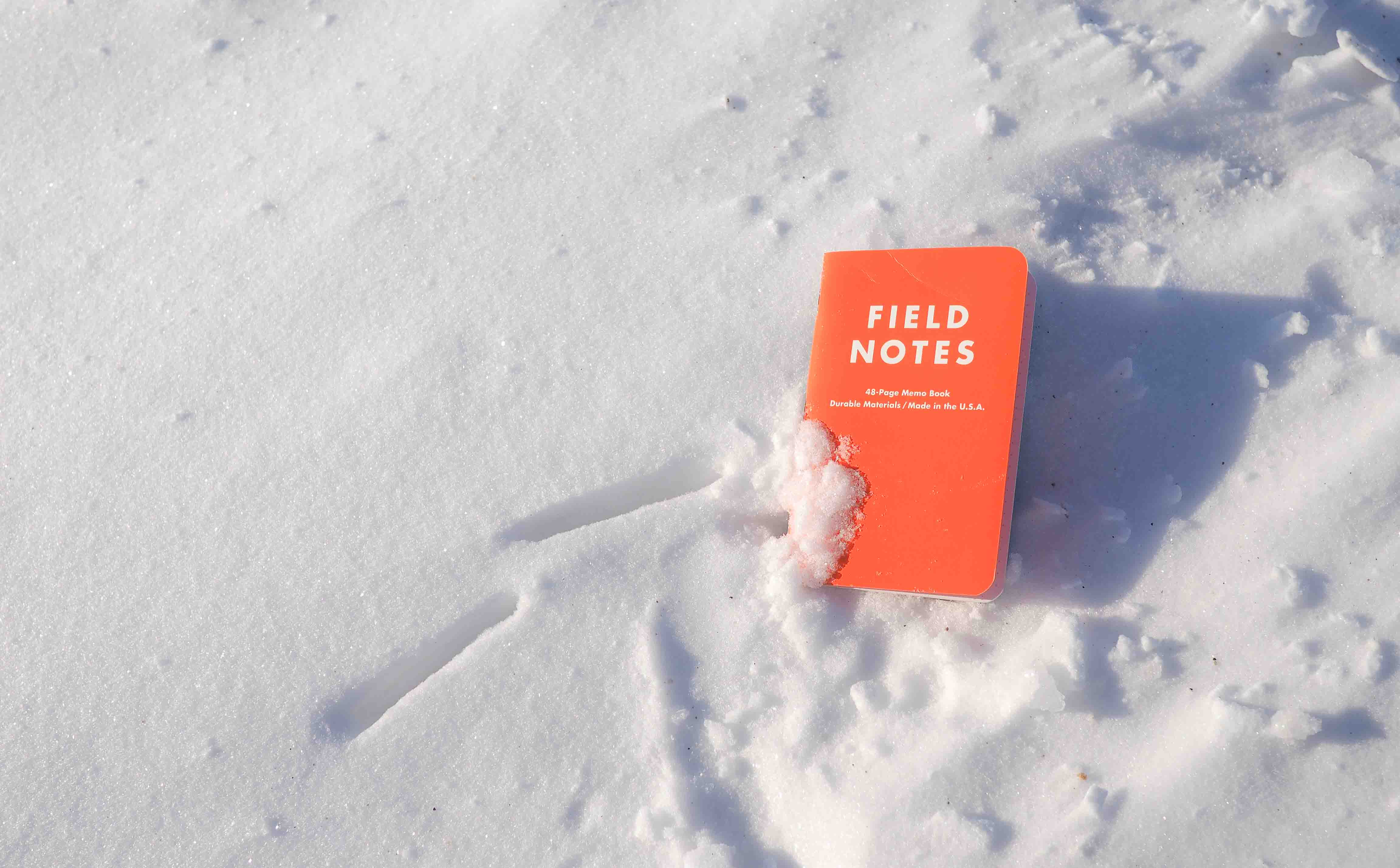
Expedition was designed for extreme use-cases. Expedition is meant for the outdoors. It’s meant to be battered and bruised. It’s meant to be drowned underwater. It’s meant to be frozen. Expedition’s target market is far smaller than any other Color edition ever released and the very fact it has turned into a product beyond its Colors Limited Edition timeframe echoes this.
It makes perfect sense for Expedition to be its own product line as well. For those individuals who need a memo book with such durability (and you know who you are), Expedition fills a fairly large hole in the market. From a business point of view, I’m very glad to see Field Notes Brand keep Expedition on the shelf indefinitely.
I don’t believe Expedition was ever designed for your back pocket. Rather, I believe it was designed for your utility belt or your essentials kit.
That’s why I love Expedition. I can take it anywhere and never worry about my notes. But it’s also why I hate Expedition. I’m never in a dire scenario and in need of its durable advantages. And that drying time really hinders its usefulness to me.
Feel how you may about Expedition. In the end, just remember: Expedition was probably not designed with you in mind. Unless, of course, you are reading this in the Antarctic or you are holding your breath underwater.
As Manitoban weather has finally decided to warm up, I didn’t get a chance to test ballpoint ink drying times in the dead cold of winter. Dry cold may help speed up drying times but I would need someone to confirm this for me. ↩
There is a reason Field Notes Brand so heavily markets the Fisher Space Pen for use with Expedition. The Space Pen is a ballpoint pen that is immune to many of the shortfalls of standard ballpoints. I have one on the way but couldn’t hold back this review just to test the pen. I will test its capabilities in Expedition once I get it and I will make sure to let you know the results. ↩